Recitation 5–Processing Basic–Ketong Chen

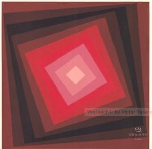
I found this images from  Victor Vasarely

I chose this because it gave me a sense of dizziness and I feel like I will be dragged into the image. And the colors it chooses are very beautiful. Aso, the center of the squares are all in the middle of the center of the image.

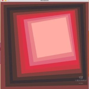
In order to create an image like this, I need to figure out how to rotate the squares in the same angle and find the same color. Here is my work:

 I fail to keep the center of the square at the same point which is the center of the image. I tried the translate() function but it did not work well for me. Here is my code:

size(600,600);
background(126,70,66);
noStroke();
rotate(-PI/144);
fill(78,59,55);
rect(20,20,560,560);
fill(55,50,52);
rotate(-PI/144);
rect(40,40,520,520);
fill(78,59,55);
rect(60,60,480,480);
rotate(-PI/144);
fill(122,69,63);
rect(80,80,440,440);
rotate(-PI/144);
fill(185,69,69);
rect(100,100,400,400);
rotate(-PI/144);
fill(203,65,73);
rect(120,120,360,360);
rotate(-PI/144);
fill(207,110,122);
rect(140,140,320,320);
rotate(-PI/144);
fill(219,135,138);
rect(160,160,280,280);
rotate(-PI/144);
fill(241,173,163);
rect(180,180,240,240);
rotate(-PI/144);

I think processing can help us to create countless shapes and combine them together to form a new shape which is a really useful tool. But you need to do a lot of calculation and be familiar with the code which is a long way to go for me.

Recitation 5: Processing Basics – Zhao Yang

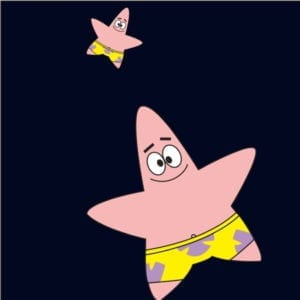
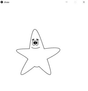
This is a picture of one of the characters, Patrick Star, in a cartoon called SpongeBob. I chose this image not only because this character is very cute in the cartoon but also because the shape of the character is just a star and the lines are very simple. So it may be easier to draw by Processing. 

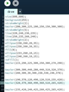
However, when I started to draw it, I found it is actually difficult to complete. First, I used the function curve() to draw the shape because I could fill the shape with color if use this function. After trying for ten minutes, I didn’t figure out the use of the function because the instruction was too simple and not clear enough. I just couldn’t figure out how the two control points work. Thus, I decided to use the bezier() function to draw it. Similar to the curve() function, bezier() also requires one start point, one endpoint, and two control points. But this time it’s easier to use than the curve() function. Even though I still didn’t know how the two control points really work, I could get a shape that basically fitted my thought. Thus, the rest of the steps were to adjust it again and again until I could get the right shape.

I used the bezier() to draw the star shape of its body and its smiling mouth. And I used the ellipse to draw the eyes of Patrik Star. Then I use two thick lines to draw its eyebrow. Finally, I get my creation of Patrick Star. 

Generally speaking, it looks like Patrick Star and it’s easy to recognize what it is. However, compared with the original image, the proportion of the figure is different from the original picture. Moreover, I didn’t draw more details of Patrick Star, such as his pants. In my opinion, drawing in Processing is a good means of realizing my design not only because it is a good method to embody your design digitally but also because you can also write more code to make it interactive. However, in terms of just drawing a picture, I prefer to use other drawing applications or just draw on the paper. 

Recitation 5: Processing Basics by Yu Yan (Sonny)

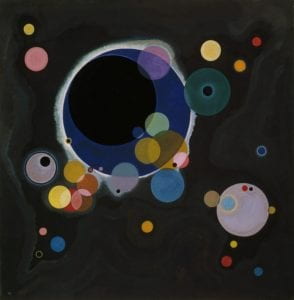
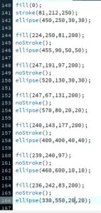
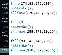
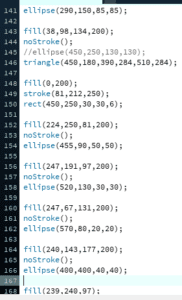
This is a picture names Several Circles by Vasily Kandinsky. (https://www.guggenheim.org/artwork/1992)

The reason I chose this image is that I like the atmosphere it presents using such simple elements. The whole picture looks like the galaxy, for the dark background represents the outer space and other colorful circles are planets. It gives me a sense of the beauty of darkness for the low saturated color that it used. 

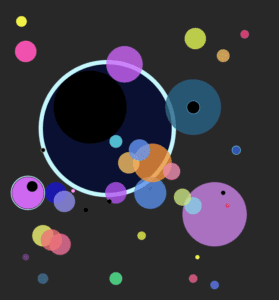
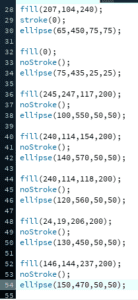
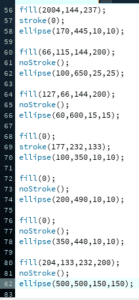
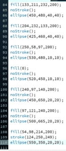
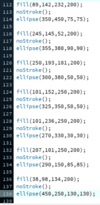
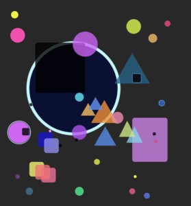
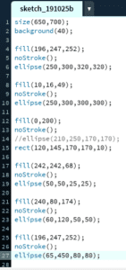
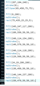
The first thing I did after choosing this image is to mimic to create a similar picture. I started by setting the size of the canvas and picking a dark grey as its color.

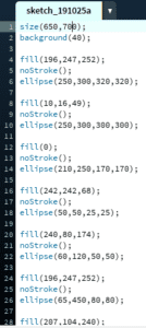
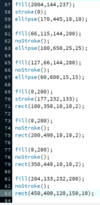
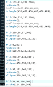
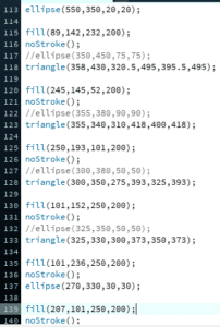
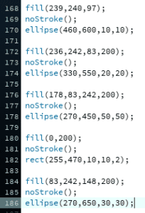
Then I began to code the circles and tried to copy the locations of those circles on the original motif as much as possible. By using the color selector, I also mimicked the color from the original one. The code that I used are in the same structure because all the figures I used are ellipses. So the first version of my creation is very similar to the motif.


Later, I tried to make some changes to my creation. So I changed some codes and turned part of the circles into rectangles and triangles so they differ from the motif. However, they still stayed the same color. When coding for triangles, I did some calculations for the coordinate of each point of a triangle. 


I think drawing in Processing is a good practice for my future design. It forces me to pay more attention to figures’ coordinates and their color, which is very helpful. Using such a technology to create art is also very interesting and novel because it makes our design more convenient and more diverse.

Connor Schone Interaction Lab Midterm Project Documentation

Context and Significance

Going into the midterm project, my work with my previous group inspired me to want to work with lights and buttons. To elaborate, while our work on the initial group project produced something interesting and potentially usable concept  in the year 2119, I was excited to take the general concept further by creating something truly interactive with the help of a relatively simple and easy to comprehend interface for those who experience it. Our midterm project followed the definition for interaction I layed out previously in that it involved a back and forth exchange between the user and the product. One thing I wish we added before the final presentation was some sort of instruction explaining how the game functions, maybe in the form of text, or flashing the LEDs in a certain pattern to prompt the user to perform the intended actions. We came to understand by the end of the process that not everyone would be familiar with the game “Simon,” so was encountered some trouble as people began to press buttons without first learning what the objective was. The way we designed the game generally fit the model of others like it, except we made it larger so as to make it more presentable to a larger audience. 

Conception and Design

Aside from our mistake in not including an effective prompting mechanism, we decided to make the project fairly simple, so as to not add any additional confusion in operating the game. We were considering adding different interactive elements like vibration sensors, or something to do with the user stepping on a sensor on the ground, but decided on a more simplistic approach for the sake of easier usability. For the same reason, we chose a design that would not clutter the space, or make it difficult for the user to intuitively understand what to do, or at least what would or would not be an option to engage with. 

Fabrication and Production

After implementing our initial code for the game, we had a fair amount of tinkering to do. For example, we decided to extend the allotted wait time between button presses so as to not catch the user off guard, especially if they had just begun a new game for the first time. After user testing, we noticed those unfamiliar with the game’s concept would start pressing buttons during the somewhat drawn out intro of all three LEDs flashing simultaneously 5 times. For this reason, we chose to cut the number of times they flashed to three, and reducing the wait time between flashes. We learned that this decision worked to grab the user’s attention without necessarily prompting them to start pushing buttons before the game actually began. 

Conclusions 

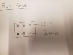
The main goal of our project was to create an interactive experience that would not alienate the user. While one may not know how to play the game “Simon” initially, we wanted to ensure that there would be little to no confusion about what in the project the user could, and could not engage with. By creating a large, plainly decorated box with three buttons, each parallel to corresponding LED lights, we noticed that. despite in some cases users’ initial difficulty understanding the goal of the game, people were rarely, if ever, confused by how to go about operating the device on a base level. As stated previously, despite the simple and easy to understand layout of the device, additional planning was necessary to effectively prompt the user to engage with the product as it was intended; in instances where the user did not understand the premise of the game itself, the intended usability collapsed to an extent. 

Key takeaways from this project included: 

  • Prompting is a key aspect of a successful interactive experience. Even though our interface was presented without too many distractions and clean, users often had difficulty understanding the parameters of the game itself. 
  • Without proper directions and/or an obvious and clear prompting mechanism, people will use their own discretion in engaging with the project. For example, we decided to shorten the time of the simultaneously blinking LEDs because users would spring to mash buttons expecting some result, and will not wait for the project if they see no clear reason to do so. 

Recitation 5: Processing Basic Isabel Brack

original

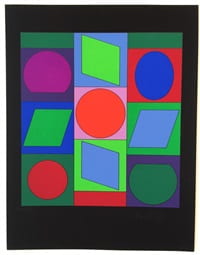
The original art piece Zaphir by Victor Vasarely
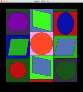
my recreation of this piece

My emulation of Zaphir

Why this piece?

I chose Zaphir by Victor Vasarely to recreate in processing because of the geometric shapes and bright colors. Originally I chose a different piece by the same artist but quickly realized it took too much time and color matching as there were over 30 different complementary shades used. I found this piece to be abstract and perplexing from the name of the piece all the way down to the arrangement of the shapes. This piece also was labeled Op art by the gallery and seller, which I found interesting as those pieces are often black and white or seem to be moving or creating an optical illusion. Compared to much of this artist’s other work, this piece focuses on a more static colorful image. But the bright colors drew me to this, and the fact that these shapes can be replicated in processing. My final piece closely represents the original art besides the fact that a small three boxes are a bit larger in his piece than mine. I choose to basically directly emulate his piece. The colors are also close but not perfect matches, the original art’s colors are more dull and deeper, were as mine are a bit more saturated.

Goals and Execution 

My goal for this piece was closely mimicking the original art, because it would allow me to learn many different functions in processing including arc and quad. This process also helped me learn how the math and spacing works in processing, getting everything to line up and be centered, especially the shapes in the center of each square. After our most recent lesson on processing, I know know how to simplify this code with for and which statements which would be helpful to make all the boxes in the background as I individually placed each, which required a lot of basic algebra. To accomplish this replication I first laid out the background and main large rectangle in the center, then filled in each smaller colored box by separating the width of the interior large box into three sections and the and creating three columns of boxes. Then, I filled all of the boxes with color. After that I started with the easiest shapes inside the smaller boxes like the ellipses first, then after the quads, which took a bit of trial and error to get the proportions correct. Lastly, I created the partial ellipse by layering an arc over an ellipse because no matter the combination of radian angles I tried for the arc, I could only create the inverse shape of what I wanted. In the end, I layered that inverse shape over a normal ellipse to create my desired shape. The most difficult aspect of this recreation was remembering which shape was which in the code, I had to label and relabel each component multiple times.

Overall, my piece and the original artist’s are pretty similar, the only small differences being his small boxes (the two green and one red) are a bit larger, the color match is not perfect, and one or two shapes could be aligned/ centered better than they are now. I think processing is a good interface to recreate a geometric piece like the one I choose because it is easier to write the code for a straight line and perfect circle than to draw one by hand. This kind of art piece is already geometric, so unlike a piece that is drawn by hand, using brush strokes, processing can recreate this art piece without it losing meaning or value from those imperfections. 

Code:

background(0,0,0);

size( 600,650); // define canvas size

fill(28,85,26);

rect(45,45,510,525); //x,y,width,height green box

fill(83,114,185);

rect(215,45,170,170); //x,y,width,height blue middle top

fill(61,250,33);

quad(235, 50, 365, 80, 365, 205,235, 170);//quad(x1, y1, x2, y2, x3, y3, x4, y4) green  middle top

fill(245,158,233);

rect(215,210,170,170); //x,y,width,height middle middle pink

fill(255,71,39);

ellipse(300,295,160,160); //x,y,width,height middle red circle

fill(61,250,33);

rect(215,380,170,170); //x,y,width,height middle bottom green

fill(83,114,185);

quad(235, 385, 365, 415, 365, 530,235, 505);//quad(x1, y1, x2, y2, x3, y3, x4, y4) blue  middle bottom

fill(193,14,14);

rect(215,550,170,20); //x,y,width,height red small middle bottom

fill(28,85,26);

rect(45,45,170,20); //x,y,width,height green top small left

fill(7,16,170);

rect(45,230,170,170); //x,y,width,height  blue left middle

fill(38,175,32);

quad(80, 260, 210, 260, 190, 380,60, 380);//quad(x1, y1, x2, y2, x3, y3, x4, y4) green left middle

fill(28,85,26);

rect(45,400,170,170); //x,y,width,height green left bottom

fill(193,14,14);

ellipse(130,485,120,120); //x,y,width,height left red circle

fill(56,47,77);

rect(45,65,170,170); //x,y,width,height purple left top

fill(123,3,167);

ellipse(130, 145, 150, 150);//top left pink/purple arc

noStroke();

fill(56,47,77);

arc(130, 147, 150, 150, radians(45), radians(135), CHORD); //arc(x, y, w, h, startangle, stopangle, mode)  

stroke(0);

fill(28,85,26);

rect(385,45,170,20); //x,y,width,height right top small

fill(38,175,32);

rect(385,230,170,170); //x,y,width,height right greed middle

fill(83,114,185);

quad(420, 260, 550, 260, 520, 380,390, 380);//quad(x1, y1, x2, y2, x3, y3, x4, y4) blue right middle

fill(56,47,77);

rect(385,400,170,170); //x,y,width,height right bottom purple

fill(28,85,26);

ellipse(475, 480, 150, 150); //bottom right dark green arc

noStroke();

fill(56,47,77);

arc(475, 479, 150, 150, radians(225), radians(315), CHORD); //arc(x, y, w, h, startangle, stopangle, mode)

stroke(0);

fill(193,14,14);

rect(385,65,170,170); //x,y,width,height right top red

fill(7,16,170);

ellipse(470,150,120,160); //x,y,width,height right blue oval