Final Project- Emily Wright

Map(Tweeter)

Purpose of Project

The idea to create this project came from my experience going throughout the American school system. In my school district, there was not a focus on current event in any of the classes, despite the knowledge of current events being an important part of education. Because of this, I wished to introduce a more interactive way to have news presented. My original plan was to take the most current events that I would find on Google, and program processing to display what ever news story I chose. While this would have worked, I wished to have information that was a recent as possible. The project “Moon” by Ai Weiwei and Olafur Eliasson, gave me the inspiration to include the news from regular people around the world, and from this we chose to use Twitter as our new source. This project was targeted more toward children, as it has a very whimsical look to it. It would be best used in a classroom setting where children can actively see where in the world they are receiving news from. This helps create knowledge on current events, and it also helps children further develop geography skills. 

Process of Creation

Coding- 

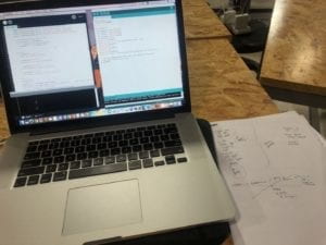
To integrate the use of Twitter’s information into our project, we used the API that connects Twitter with Processing. We had a difficult time getting this to work. In the beginning, we could not figure out how to get the permission to use the API at all. After this, it was a matter of integrating the components of the project into the API coding. We had to integrate the use of buttons, LEDs, the whistle sound, and code the interface in Processing to look nice. The most interesting part about using the Twitter API was that we would place any keyword we wanted into the code, and it would find the most recent tweet that has to do with that key word. This means that this project could be tweaked in many ways to serve more specific projects. We actually thought about focusing our entire project on climate, but we decided to keep the key word as news in order to generate more tweets. This was the most interactive project that I have made because of the programs ability to search for a keyword and then find the most recent tweet. It aligns perfectly with my definition of interaction, two parties able to receive information, think about it, and then respond. Overall, the coding proved to be the most difficult part of this project, but it reaped very cool result when we figured out how it worked. 

Physical Project- 

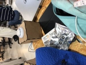
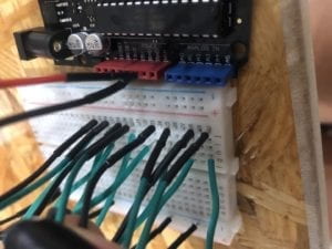
We were originally going to create the physical box by laser cutting a box, but the map that we used was far too large to cut a box. From this, we decided to use cardboard, but this meant that our original plan of our project being something that you can step on would not work. This proved to be a better option because the project would last longer through testing and presenting. After adding supports to the bottom, the project was very sturdy. The only thing that was a problem was integrating the buttons and LEDs. A lot of hot glue was necessary.

Fabrication- 

Our original fabrication plan was to print a compass and have it spin with a servo motor. We had the compass printed, but then we came back to find it after we had finished the rest of the project and it was no where to be found. In a mild state of panic, we decided to use the old printed parts from our midterm project to create another compass. While we were disappointed to have lost the original compass, our makeshift did the job. 

User Testing

Our physical project did not change very much from user testing. The buttons for Australia and the world did not work, so we had to fix that. The main change came in the interface that the viewer saw in Processing. We originally had the webcam working, and then the tweet would pop up next to the user’s face. The idea behind this was that we wanted to highlight the inclusivity of Twitter, that everyday people are able to voice their opinions. This was not received as well as we had hoped during user testing. We loved the feedback we received, and it defiantly moved our project to a higher level. We were suggested and decided to change the interface to resemble the physical map, and have the tweets pop up over the continent that the user pressed. This was to give the project more cohesion, and I think it paid off. 

Conclusions

I really enjoyed making this project. The interaction between the user and project was interesting because it took the the familiar idea of Twitter and put it into a new kind of interaction. Our final project received very good feedback, people were interested in continuing to interact with it because of the constant updates of information. My continuation of this project would be to make the physical display more like our original idea of having it be a carpet. I would like to continue to work with the Twitter API; to see what kind of projects can be made with it, and to see other ways we can spread news. 
Sort your trash; save the world – Salomé – Eric

Sort your trash; save the world 

Salomé Demangeot and Stephanie Anderson,

Eric Parren

CONCEPTION AND DESIGN:

The interaction aspect of our project came along with a lot of brainstorming ideas. In my project proposal, I imagined physical objects to place on sensors such as weight sensors or pressure sensors that would indicate wether the right object was put in the right bin. however that was ruled out since we don’t have weight sensors.

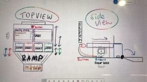
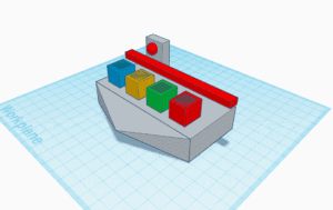
Then we thought of a lay out which would make the design look like a casino coin game such as : 

In such ways you would have the four bins in which the player would insert coins to indicate which bin they want to sort the image of the trash in. The red stick would be used to rotate and tip off the bins if the user sorts an image wrongly, and he would have to play again, if we wins then the stick would rotate backwards and press on the red button behind it which would indicate that the user won. Although we liked the interaction that came with this design, it was quite intricate and still did not solve our issue when it came to which sensor we needed to use.

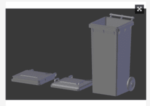
As we brainstormed, we came up with the idea to use light sensors as they are reliable and in our opinion more interesting than buttons to press. Once we had chosen the sensors, it was much easier to come up with the design, to make it understandable we originally wanted to 3D print four trash cans such as this example https://www.thingiverse.com/thing:3377785 

But we figured it would take a lot of the 3D printing materials, so we decided that the lid would be enough and we could design ourselves a clean platform to have the computer on, the lids, and the Arduino inside with the sensors. With the light sensors, we wouldn’t need the physical chips so the design would be very clean and the rest would be done through coding. Additionally for the sensors to detect the light, the users have to open the trash can, which meant they had to get used to the real life motion of opening and closing the bins. This is ideal for our project as we wanted to convey the importance of recycling in China, as I realised when coming up with these project ideas that at school, students struggle to know which bins to put their trash in as it is sometimes confusing. 

FABRICATION AND PRODUCTION:

Our coding strategy was divided as so: the sensors linked to Arduino, and on processing: instruction and cards displayed on the screen, fuse shrinking of one minute linked to a planet earth (to convey the end of the world if you lose the game), a timer displayed on the side, a counter of the player’s points, cross/check images when the player is right or wrong, and videos to show at the end depending on wether you won lost. 

While Stephanie focused on designing the cards and the platform, I 3d printed 4 of the lids of the trashcans shown above, designed the Arduino circuit that we would need and started on the coding. After user testing, the design slightly changed again upon the suggestions of testers.  As I did not have the cards yet, I focused on the one minute fuse with the earth and the countdown which looked like this: 


This is the lid used from https://www.thingiverse.com/thing:3377785

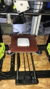
picture from the 3D lab printing the bin lids 

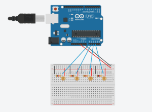
Designed circuit for 4 light sensors to Arduino 

Fuse of 1 minute and earth design video 

Countdown displayed video 

The coding for the game itself was fascinating, in order to have a functioning game we had to create numerous variables, if statements, for loops and booleans. Dividing our code in steps such as making the cards, the fuse of 1 minute, the timer etc really helped to be strategic about it and not messy. There came many challenges, from the creation of many timers (for the fuse, the timer of the game, the millis function taking into consideration the time of the intro, and the inability to add “delays” as it would delay all of our times). Something that we came up with during the coding was that we wanted the card to change to another one, only when the user got the right answer so they would keep going until they won. This was done to further highlight the pedagogic aspects of our project. 

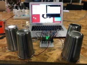
First test after coding for the sensors, the circuit and the cards code. Cups used to bring darkness to the sensors to check the cards were displaying correctly. 

User testing session 

By the time user testing came around, we had most of our project done, the design still needed finishing up pieces and we still needed to code the intro and the end videos so that the game would loop back. The feedbacks were useful for us to realise that we needed handles on the bins to make it easier for the players, perhaps add sound (which we did afterwards whenever the user made the answer correct). Additionally to add information following Tristan’s recommendation, we added “cheat sheets” in the back of the lid so that the users could see during the intro part of our game what goes in each bin. Overall, user testing was useful to polish our entire project and help achieve what I believe is reached its entire potential and more than what I ordinary thought it could be. 

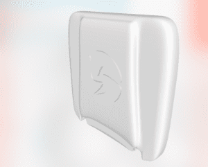
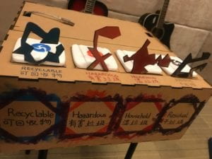
Designing using the official designs for the recycling trash cans as handles and writing the names of the bins in both languages to make it as clear as possible

CONCLUSIONS:

Our project had for goals to be a didactic interactive project where the user learns about recycling through a catchy and slightly competitive game without noticing that they learn. This was achieved through many of our coding and design techniques such making the cards reappear (not in a sequence but enough to make them learn), putting a timer with a goal of reaching 10 cards under one minute… Difficulties came with the fact that our game is for all age and all nationalities so we realised that surprisingly, young national Chinese kids tend to play better than international young-adult population who tried our game. During the IMA show, we saw many people wanting to try again to attempt “saving the earth”, and by seeing some of the cards again we could clearly see that they learned during the game. The interaction using light sensors was very effective as people were quite often surprised, almost amazed at seeing it working during the IMA show and often asked us question about how it worked.

An improvement suggested was to add a leaderboard to the game to make it more competitive but with hindsight I believe it was better done without as the game is meant to be didactic, a challenge with yourself to win, and not with others as it would create incentive to cheat and skip over learning potential.  The fast response of the game, without lagging due to the effectiveness of the sensors was a highlight. Furthermore, my project partner and I really worked well together as we both had similar ambitions, challenged ourselves with the coding and each of our qualities built on the other one’s weaknesses; combined we managed to make a well functioning interactive game. 

Stephanie and I strongly believe that this game could be more useful within the school, for example during orientation week or earth week during the semesters where we could make students play to win a prize a small prize at the end in the lunch-hall. In fact, we were approached during the IMA show by people wanting to further discuss our project and its potential.

Echo- Andrew Xie -Eric

CONCEPTION AND DESIGN:

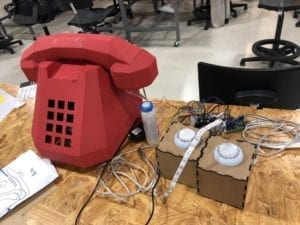
When I first conceived the final project, my partner and I decided to make a project about decompression. Because we think that modern people live under great pressure and sub-health, we need to use a way to let the people living in the city release the pressure. But there are many ways to release pressure. We are thinking about how to give users an effective decompression experience in a short time. We envisioned letting users decompress by squeezing instant noodles, but it wasn’t attractive enough and environmentally friendly. So we decided to interact with our project with sound. The original idea is to take Christmas as the theme, let users blow the snow of Christmas tree through the sound, to form the concept of decompression. But it seems like a deliberate imposition of concepts. At last, we decided to make a pure interactive game. In the echo project, we have used the sound sensor and laser cut. These two simple originals can bring great benefits. The reason for giving up instant noodles is that we can’t find the sensor that matches it, and it will cause waste and can’t be reused. Violent squeezing and slapping are all potential violence, but voices can better overcome these problems. We also gave up an infrared sensor, because we want users to trigger the game at a certain distance, but in fact, it is unnecessary. In the end, I also used paper cutting, because, on user text, we found that although many people wanted to interact with our project, they were ashamed to scream in public, so I designed a phone shaped mask to help users solve this problem.

1

2

3

4

6

FABRICATION AND PRODUCTION:

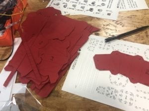
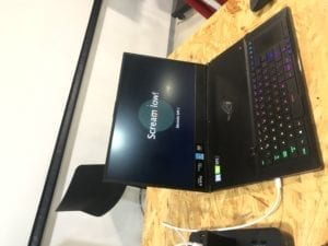
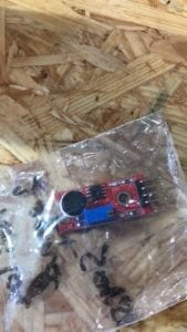
In the whole project, we didn’t use laser cut to cover the computer because of the need of saving materials. Our success lies in the fact that we have successfully measured or defined the value of the sound sensor. We chose the microphone, 3 pin or 4 pin sound sensor, and finally decided the 4 pin sound sensor. Because only this is between sensitivity and dullness, we found that defining the value is a very challenging thing. Defining the sound as high and low, defining the value needs to be tested many times, because High value setting will make it difficult to reach the high standard, and reduce the low standard. Our game rule is to put pressure on users through five rounds of games, and then design a random screaming interface to let users instantly decompress.The biggest experience we gained from user text is that we should provide a mask for users to protect their privacy, because not everyone can scream in public. In order to avoid embarrassment and protect their privacy, I designed a phone shaped mask.Another useful information is that we should help users define the range of high and low in the initial interface, so that users can give feedback immediately after the game starts.As a result, users are often attracted by the phone mask I make and are willing to wear it. This improves our user experience and is very efficient. Another modification we have made is to add a free scrolling interface so that users can release their own pressure at will.But we also give up LED, because of some technical problems, our idea is to give users feedback through the change of LED color, red is the wrong range and green is the right one.7

2

CONCLUSIONS:

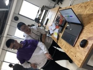
I don’t think my definition of interaction has changed much from the original one, but I have added some concepts, such as my definition of interaction is the interaction between people, people and machines, serving people and creating value. I think the final project has realized its value, interacted with the screen through sound, and really helped users release pressure in a short time. Some people doubt that this project is a little strange, but I think it’s inter lab. what we need to do is not to conform to some universal values, but to create something that can bring value, and create art through physical interaction.Finally, I let the user interact through the volume. If I have more time, I will design some refueling interfaces in the game interface that can make the user continue, because I found that few players can insist. Adding some decorations in the game interface and connecting the led into the program is what I will do if I have more time.What makes me gain a lot when I do the project is that the design of the project is not through a temporary interest but a long-term design. The concept is very important for a project. We need to make meaningful projects, with a group of special attention groups.I think it’s more important than the project to design concepts and care about social problems, or to imagine the future, rather than a meaningless thing. Prototyping is a very important thing. It’s the key factor in my opinion to constantly adjust through user testing and feedback through investigation. People first is the most important.Finally, let’s make a project, why should anyone care? I think designing a project for a certain group is the best way to help the group solve the problem, because every project we design is to solve the problem, express the value of care and transmission through the project, and interaction is an effective way to close the gap between different groups, just like our project, through Voice to attract more people to participate, pay attention to the problem of mental stress. Even if it can’t be solved, it is a way of art that expresses our value and people’s heart.

Watch Your Words- Rodrigo Reyes- Eric

Watch Your Words

CONCEPTION AND DESIGN:

We wanted a model that would actually inform the user of what they had to as they went on through the game instead of giving the user all the information at once in the beginning. In fact, we gave very specific instructions at the beginning that were at the same time not fully complete. Once users got asked what was the last word they saw and are given four-word choices, they now know what they have to do. Another aspect of the project that we really wanted people to focus on, as the name implies, is the words themselves. Our project is meant to improve eyesight and reading skills as well as memory skills. On every level, there was an array of nine words from which the code would randomly pick four. The words were programmed to blink in a pattern were only one word out of the four would show on screen, something we got inspired by my games for dyslexia as a kid. The pattern was meant to make sure the user follows the words. Each level coherently had words that were about a specific topic. For instance, on the beach level, we had shells, sea, and sunscreen. To add to this, we had a soundtrack for each level; on the beach level we had the sound of the sea. The soundtracks were meant to allow the user to have a sensory experience that would enhance their eidetic memory.  To facilitate the already complex process of this project, Sarah and I opted in having a fairly simple design for the Arduino part.  I made an Arduino case with four buttons, that we got from the Shanghai Electonic Market (really cool LED buttons). To us and to the users who tested our project, the buttons worked because the instructions on the code pointed users to refer to the buttoned case to answer. To make it obvious I engraved the case with A, B, C, D for each button.  It was a very personal project for me because we made it wishing I would have had this project helping me deal with dyslexia as I grew up. We wanted to include something else rather than just focusing it on memory and reading in the way we had it already, thus, we wanted to play with incorporating coloring into the equation. Nevertheless,  we had a time constraint.


FABRICATION AND PRODUCTION:

In this section, describe and assess the most significant steps in your production process, both in terms of failures and successes. What happened during the User Testing Session? How did your user testing process influence some of your following production decisions? What kind of adaptations did you make? Were they effective? In short, keeping in mind your project goals, how do you account for and justify the various production choices you made for your project? Include sketches and drawings.

On the User Testing Session, Sarah and I concretized our idea for the project. We were not so sure about how to make the “game” feel challenging for people, but still, make it enjoyable and easy to understand. People would tell Sarah and me separately to make it like a “multiple choice quiz” so people would feel pressured to answer correctly. Back in the testing session, we did not have a background track included in the code. We had planned to have a soundtrack but did not have time to include it. People really stressed to us how much it would help to have sound in the project. People in the testing session wanted us to have “cool” buttons for the visual aesthetic of the project, especially the Fellows. I finally got LED buttons from the electronic market that Eric recommend. Because the design we already had for the Arduino case was way too small, and the time constraint we had, did not allow us to incorporate the LED part of the buttons. 


CONCLUSIONS:

As I have previously stated before, interaction as a conversation,  a dialogue, a transmission and a tool that requires an input a process and an output. For it to be a more complex interaction, there must be an input a process and an output that can go back and forth. By the nature of it, you would need a relationship. To add to what I had said before I would like to stress in one key element: Understanding. In the communication that interaction facilitates there must be an understanding of how and what to communicate. For this final project, we wanted people to communicate with the computer so that people could get a different experience each time (words are randomized). We wanted this dialogue to feel unique and compelling each time. The buttons on Arduino could have easily been taken off; we could have just used the computer mouse or the keyboard on the computer. I think we could have done a better job with the interface’s design. So I learned from this that we could have planned even more and invested time into building something even specifically meant for people with Alzheimer’s like Eric suggested.  I love the idea of using technology as a means to bring art, and social thought together. An insightful element of the project experience was working on something that was constantly subjected to other’s opinions. OnThe User testing we got a lot of valuable opinions. Being open to hearing everything, even when it modified your initial idea of the project and modified your “art”, in the end, you do it for the people.   In fact, our idea of a video game to help people with dyslexia is something I would like to maybe propose to a tech company. 

Interaction Lab Documentation 10-Kurt Xu

WorkShop: Serial Communication

Exercise:

Arduino to Processing

processing

import processing.serial.*;

String myString = null;
Serial myPort;


int NUM_OF_VALUES = 3;
int[] sensorValues;
float cl=255;

void setup() 
{
  size(500, 500);
  background(0);
  setupSerial();
}


void draw() 
{
  updateSerial();
  printArray(sensorValues);
  background(0);
  colorMode(HSB);
  if (sensorValues[2]==1) 
  {
    cl=random(20, 255);
    fill(cl);
    ellipse(250, 250, sensorValues[0]/2.048, sensorValues[1]/2.048);
  }
}


void setupSerial() 
{
  printArray(Serial.list());
  myPort = new Serial(this, Serial.list()[0], 9600);
  myPort.clear();
  myString = myPort.readStringUntil( 10 );
  myString = null;
  sensorValues = new int[NUM_OF_VALUES];
}

void updateSerial() 
{
  while (myPort.available() > 0) 
  {
    myString = myPort.readStringUntil( 10 );
    if (myString != null) 
    {
      String[] serialInArray = split(trim(myString), ",");
      if (serialInArray.length == NUM_OF_VALUES) 
      {
        for (int i=0; i<serialInArray.length; i++) 
        {
          sensorValues[i] = int(serialInArray[i]);
        }
      }
    }
  }
}

Arduino

void setup() 
{
  Serial.begin(9600);
  pinMode(9, INPUT);
  pinMode(3, OUTPUT);
}

void loop() 
{
  int sensor1 = analogRead(A0)+1;
  int sensor2 = analogRead(A1)+1;
  int sensor3 = digitalRead(9);
  Serial.print(sensor1);
  Serial.print(","); 
  Serial.print(sensor2);
  Serial.print(",");
  Serial.print(sensor3);
  Serial.println();
  if (sensor3==1)
  {
    analogWrite(3, HIGH);
  } else
  {
    analogWrite(3, LOW);
  }
  delay(100);
}