http://imanas.shanghai.nyu.edu/~zz1224/comlab/week2/My-portfolio.html
Final Project Reflection – Julia Riguerra
For our final project, I had the idea of creating an interactive catcalling website because I felt that, with the JavaScript features we learned, catcalling would translate well into a web-based medium. Catcalling is a widespread form of street harassment that plagues metropolitan areas, though it is not uncommon in less urban areas as well. Catcalling is mostly done toward women by men, though there are cases of the reverse.
- Design
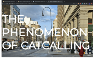
The project only features one page and contains information about catcalling, such as a definition, the prevalence among different countries, why it is important to bring attention to it, the effects it has on the individual and society, and resources for further reading. There is also an embedded Twitter feed of curated tweets concerning catcalling, including firsthand accounts by victims. The page is meant to be informative and the aim is to educate the reader on catcalling and street harassment.
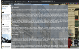
Another feature of the page is the interruptions, or the ways in which the webpage catcalls the user. Upon opening the webpage, the website wolf-whistles at you. This is what makes the website more effective:
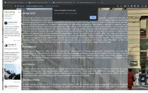
The reader is meant to be interrupted by this alert every five seconds, which is both annoying and persistent, reflecting the nature of catcalling in real life. Not only this, but we also placed misleading links that are meant to enhance the interactive catcalling aspect:
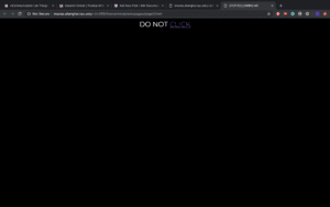
The link contained herein leads to a video about catcalling.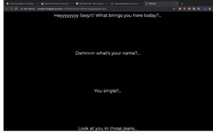
Once the viewer reaches the bottom of the page, a popup shows up containing a video featuring women telling their experiences of being catcalled.
- Process
We began by compiling the information we would feature on the website. This process was simple enough due to the plethora of information and accounts on catcalling on the Internet. We wanted to make the layout simple and streamlined, but also aesthetically pleasing. We split the work between the two of us such that I would handle CSS and styling while Taylah handled the JavaScript interactions.
I believe the components of the project all worked well together, namely design and user interaction, though due to time constraints I feel that the page is rather simplistic and could use more interactions or visuals rather than just text on a page. While doing this project, I learned how to implement Twitter feeds using Twitter’s TweetDeck functions, which allow a user to compile tweets into collections that could then be translated into source code to feature on websites. I was also able to strengthen my CSS skills through this project.
- Future
Taking into account criticism from the class and critics, if we had more time I would’ve liked to create visuals on my own rather than sourcing them from the Internet. More visuals, such as a map infographic, would’ve improved the page since many people felt the page looked too Wikipedia-esque. More interruptions on the webpage would be more interesting and conducive to the user experience, and if given more time, we would have liked to include more varied interruptions, such as audio and different types of popups.
Week14: NetArt-Project–Clover
Link:http://imanas.shanghai.nyu.edu/~zw1745/finalpro/first.html
Partner:Jamie
Description:
The user is a detective and basing on the information provided, he needs to catch a criminal and prevent the next crime from happening. At first we set the background that the user(you) is a detective and you have chasing a criminal for years. Then we told the user that base on the information, you need to find out where and what the criminal is going to do next. Then the user need to fill in a form to see whether they have collected the right information. Then there will be three endings. If you gather all the right information, you catch the criminal. If you get the wrong time, then the ending will tell you, you miss the time. Then, if you get the time and the location both wrong, the third ending will tell you, you make both of them wrong.
Process:
The preparation:
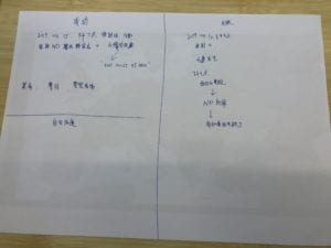
We first discussed the detail of the script. We plan to use the fire of the Notre Dame as a background. Then we find the map and decided to make a circle of the country then finally come back to Paris. Then we decided to make the investigation period for ten years. Since the fire is happen at 2019.4.15, the start date of the first crime is also in 4.15 but in 2009. We decided to set the first case in Germany, then make a circle come back to France. We set the date of the crime mainly using the number 4 and 15 so it is easier for the user to get the information. Also, we put a map down there so the user can check it. To make it more exciting, we set the time limit. We decided to set 8 clicks equals to a day and if you click 8 times, there is voice reminding you a day have pass. Also, we set the time count for each page, so after 20 seconds the page will close to make it more exciting.
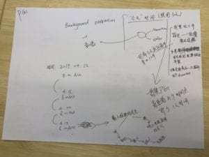
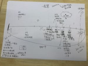
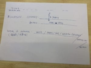
Process:
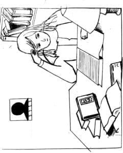
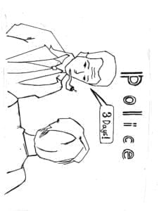
The introduction page, we first draw the picture then we use final cut pro to make it into a video and add audio to it. In the audio part, we introduce the background information.
The information part:
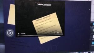
I set up the information for each crime and decided the time and the story for each crime. I hided the name Esmeralda and Quasimodo(the major character in Notre Dame) in the information, hoping the user to find it out. In one of the case, I even named the couple’s name in Esmeralda and Quasimodo, hoping the user to find it. We also use the new of the white hat man as part of our story to make it looks like a criminal who is doing religious things. We also use the count function to count times so that after 8 clicks, the audio will remind the user of the time. The css is also a difficult problem and I spent a lot of time on changing that.
The ending:
We use the white hat man as a criminal as part of our story, so we cut the news report of the white hat man who was actually a firefighter. Jamie record the audio part and it perfectly match with the video introducing the ending. Then we set a html link so the user can go back to the start page to play the game again.
Further Inprovement:
- The user sometimes may don’t know which part of the page is clickable, so they may lose information. We can add some information that the map and the form is clickable.
- We think we can make the whole story more connected and improve the introduction part to add more information and make the whole script more perfect.
Final Project Reflection – Kimmy and Helen (Kimmy Tanchay)
http://imanas.shanghai.nyu.edu/~kd2130/final_project/index.html
Inspiration
Whilst I was scrolling through my Pinterest board feed as per usual, I stumbled on a post on reimagined modern websites such as google and facebook in the style of the very old of Windows computer in the 2000s. I was really inspired by this that I started wonder what Instagram would look like in the 90s.

I’ve always had this fascination with the 90s because it was this great period of time in which the Internet has only started to become popular and widespread. At the time, simply starting up the internet took up so much time, graphics were really pixelated and computers were the size of TVs. Despite how much progress the internet has made since, people still look back on the “good old days” of the 90s with happy nostalgia, hence integrating Instagram into the 90s was an attempt to bring back that feeling.
Furthermore, as my favourite social media, I felt Instagram was the most fitting choice of social media to integrate as most people of generation use Instagram to share their personal experiences and their lives. Living in Shanghai now is a totally out-of-my-comfort-zone experience that’s it’s both extremely new but amazingly exciting. Hence, I thought of combining these two ideas in which we use a 90s Instagram look as a medium to show our experiences in living in Shanghai.
Visual Design
A lot of my focus on this project were the visuals. For the actual Instagram page and desktop, I tried to replicate the original Windows 85 to the best of my ability and the Instagram page the same layout and format as the current Instagram desktop format, I’m happy with how it came out. My immediate vision for the individual posts were the colours. I wanted bright, bold colours that also mirrored how the 90s used colours at the time and to also give each post a distinct look of their own. Hence, each post/picture had a different colour in which I tried to cohesively matched together as an instagram feed.

I then decided that the best way to present our visuals would be through photoshopped images in order to blend photographs we took ourselves into assets that we could use. For example, for our brunch post, all of the food that is shown in the photo was taken (and eaten) ourselves. Moreover, to incorporate some aspects of the 90s, photoshopping was the more obvious choice instead of hand-drawing EG we were able to incorporate Mario as an ele.me driver and make the iconic castle representing NYU Shanghai.
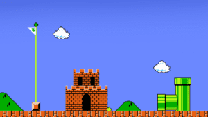
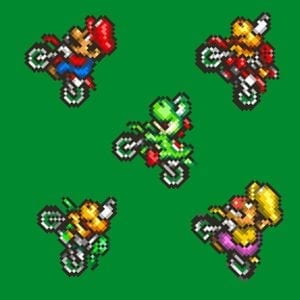
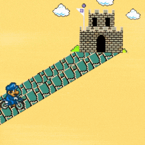
For the videos, all of the footage were also all taken and edited by us. I had an especially fun time making the “Friends” video, incorporating the popular 90s TV show. We were lucky that one of our friends often makes videos for Youtube and so we had readily available footage of us from the first and second semester. For both videos, filters were used to also replicate a VHS camera.
The visual assets alone took around 2 weeks to fully complete but out of the whole project, this was the most tedious yet most fun part to create.
Coding Process
Whilst I did some, Helen handled a large part of the coding process and putting all the visuals elements together which is quite a feat since we had over 30-40 images, videos and buttons that had to be put together. Much of the coding we used for this was straightforward as we incorporated a lot of the skills we learned from previous projects such as hover, counters, block/display/none.
The most difficult aspect we encountered with this project was the coding for the ele.me driver to move around the page. It was originally meant to be a draggable element in which the user can drag the driver to its destination, but for some reason it wasn’t working when placed onto the div window. Instead, with the help of Dave and our friend Robin, we opted for a ‘click’ then leading the driver which served a similar purpose.
Overall
I had a lot of fun making this project. Most of it turned out exactly as I had imagined. There were some things that could have been improved such as interactivity in the videos or perhaps a better foundation for the conceptualisation. If we had more time, we would have definitely created more posts of what we loved about Shanghai and included some p5 elements which would have enhanced our project even further. Moreover, we could have even added more button function to make it even more like an actual desktop besides just the close button and follow button. Despite some limitations of our project, I’m extremely proud of our project as it is a homage to everything we learned in comm lab.
Thanks to all of the IMA fellows who has ever helped me with any of my projects. I couldn’t have done any of it without them, especially Dave !!
Lastly, shoutout to Helen for being an amazing amazing partner <3
Week 14: Final Project Reflection – Anica Yao
Project: Tokio
Partner: Ruby Instructor: Moon
Design:
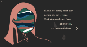
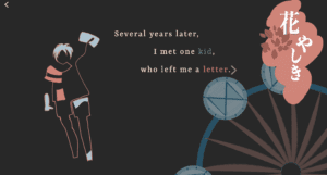
This is a story-based net art adapted from a novel ‘Tokio’ by Higashino Keigo. It tells a story that Tokio, Takumi’s son, goes on a temporal journey back to 20 years ago and helps his father uncover the truth about his family background. We want to simplify the text but amplify the art (both visual art and animation programming) so we carefully picked out 14 important scenes with its original meaning retained. It is delivered from the first-person perspective — Takumi, Tokio’s father. Every page is presented with a combination of the quote(s) and the image(s).
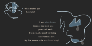
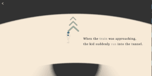
Below are the screenshots for several pages of the project:
Process:
1. Determine the topic and form:
We worked together on the topic and the form. I always have imagined pictures in my mind when I’m reading a book. ‘Tokio’ is one of my favorite novels. Inspired by both the themes ( time travel, redemption, and circulation) we decided to take the form of storytelling. Since we didn’t really want to make it a comic style. The main idea we finally applied was “abstraction” after we asked Moon for advice. As for the story, we retained the original meanings with minimal details; As for the visual arts, we replaced the concrete objects with abstract sketching.
2. Visual arts:
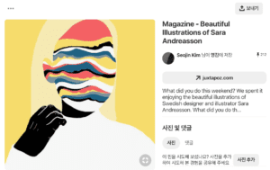
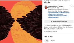
I was in charge of the visual arts. I made them with my digital panel and Adobe Photoshop. My sketching style was inspired by a series of illustrations we found in ‘Pinterest’. Inspired by Dave, we used color palettes selected from “color-hex”.
Here are 2 examples of abstract Illustrations we found on ‘Pinterest’:
Some of my ideas:
1)The conversation box: I used the irregular shape, the coarse margin and ink marks to make it more like a letter.
2)The amusement park: By organizing the layout and putting the rotating Ferris wheel I would like to enrich the audience’s visual experience.
3)Dialogue: The comparison of the size and angle of their portraits indicated the tone and mood when they walk.
3. Interaction:
Initially, we planned to use interactions other than clicking the mouse to turn the page. But for some reason, we couldn’t direct to another page by scrolling. If I had to do it all over again I may try a whole HTML page so that scrolling can work. In this case, the potential problem may be how to scroll in a div box considering we have lots of scenes contained.
Some of my ideas behind interactions on every single page:
1) Hover over the envelope: To create a sense of mystery and let the user explore by themselves.
2) Shift between Mom and Dad: By following the mouse position the user can shift the scene anytime.
4. Coding:
We both worked on coding in this project and my charge was p5 animation. With my partner’s help, I also had a better understanding of keyframe function in CSS and addEventListener in Javascript. With Moon’s help, I also learned how to build the local server with the terminal so that I could upload the image to canvas.
Here are some of my ideas behind the animation:
1) Train and running boy: These two pages can echo with each other through two circles: One is shrinking and the other is expanding. By keeping still the main objects but moving the surroundings the scene could be more dynamic.
2) The falling newspaper: I was going to create the floating or bouncing effect but I didn’t make it due to the time limit. But it’s worth a try next time.
5. Other problems:
There are some other problems we came across during the process. For example, it seems difficult to playback the audio throughout all the pages. Also, we found some interactions are not obvious enough during the user testing.
6. Discoveries:
But along the way from proposal to the presentation, I’ve learned three important things about creating a net art:
1) It’s better to perceive the capacity or feasibility before really doing it
2) Always care about users’ experience. Any detail can make a huge difference to users’ experience.
3) Art can be achieved by abstraction/conceptualization.
Future:
Taking the criticisms I received into account, I want to make further explorations about better interactions. I want to improve my skills in javascript which I’m not much familiar with yet. I will also try to figure out how to make the audio work. I really appreciate my experience working with my partner and getting inspiration from Moon and Dave. BIG THANKS to them as well as the whole class.