Update for Final Project Reflection (Winny)

During our presentation for final project on Thursday, we have received some feedback from fellows and peers, here I will add these feedback to my reflection of my final project:

  1. Video quality: our general idea for the video is interesting, but as for the quality, we should have paid attention to the lighting and also steadiness. To have better quality, we can learn about how to adjust the lighting before shooting, and also have more testing before official shooting.
  2. Website design: our website lacks clear instructions for interaction, our users feel confused about what to do or where to look. For this problem , we could first adjust the style of our website, adding clear signals to show the video section or the text section; second we could give clear instruction on ways of interacting, like scrolling, clicking; third we also need to rethink: what kind of style matches our theme and video style? What interaction does not confuse our users?
  3. Audio quality: our project lacks an organized audio system: sometimes the volume is too low/high, sometimes the audio quality isn’t consistent. Many of these problems attribute to our limited time, we could be more careful and test more before set up the final volume for each video. 
  4. Introduction of characters: we receive feedback that the three profile pictures of the characters can be more specific about their roles. Also we could add more introduction about these characters. 

Final Commlab Project Reflection (Thomas Waugh)

Design

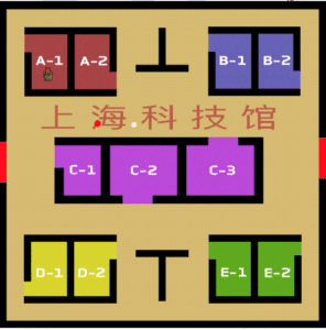
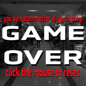
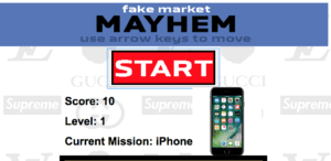
Fake Market Mayhem is a game based off of Pacman where you run around the Shanghai fake market collection items all the while running from desperate shop owners trying to scam you. Inspired by old-school game websites like Miniclip or Nitrome, the interface of the website is simple and is centered around the small box in the middle. The game is very difficult, as with each level a new enemy appears. The enemies, unlike the player, have the ability to teleport through walls while chasing the player. The player is always in search of one item at a time, which is showed not only on the game screen, but also above the game in a larger, more visible format. The background of the game is a collage of different designer brand logos whose fake counterparts are often available for purchase at the fake market. This project was inspired by a recent trip to the fake market where we were chased around by a couple of shop owners desperate for our business for about ten minutes. They knew all the shortcuts and secret passages which was the inspiration for the game design choice where the shop owners can pass through walls. When the player is caught by the shop owner, a real recording of a shop owner yelling about their products plays.

Process

This project was the hardest thing I’ve ever coded. It took so long to make and required me to learn some new kinds of coding. Primarily, I had to learn Object Oriented Programming in order to make the enemies work. Object Oriented Programming is something was something I had wanted to learn for a long time but never actually got around to sitting down and learning it. This project required me to use it and I feel like I really learned a lot through that. One of the most difficult things with it in this case was getting the tracking to work for the enemies towards the player and also changing the amount of enemies based on the level. I also struggled greatly with making the enemies reset when the game reset. Another thing I had to struggle with on this project was wall detecting. I had to figure out how to get the pixels in from of where the player was going and determine exactly what color they were in order to read where the walls were. Another obstacle I faced when making this project was the randomization of the items and making them appear in predetermined locations as well as determining when the player grabbed an item. Another huge thing I had to learn was CSS. Going into this project, I had somehow managed to have just about no knowledge of CSS and had to learn a bunch in order to make this page look good at different sizings.

Future

If I had more time, my project would be very different. I would have had walking animations and sprites for the players and the enemies and would have added a bunch of sound effects to it. One issue that I was unable to fix was the fact that when someone resizes the page after it loads, the game works at a different speed and needs to be reloaded at the new size. Also, as the critics said, the audio was very strange, unintelligible and inconsistent. If given more time, I would either make a theme song for it or just have a loop of ambient noise playing at all times. Another thing which the critics suggested was to add a goal — to give an ending to the game. In its current state, the game has no ending and becomes incredibly difficult very quickly. While I had hoped that this game would have a high skill level, I think the game is just too difficult and doesn’t reward the player enough. I do not think I would want to add an ending, but I might want to add some kind of global scoreboard for people to compete against each other.

Week 15: Final Reflection(Moon) – Susie

Link: http://imanas.shanghai.nyu.edu/~ys3041/final/index.html
Partner: Laura

Design
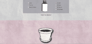
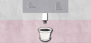
The user chooses one emotion and one person who the user wants to give a flower. If the user clicks emotion or person, the bottle in the center will shake, meaning that something is put into the bottle.

And then, the user clicks the bottle. The bottle will go down and pour something into the pot. We do not put anything here because we do not want to use any visual assets to define the emotion and person. We use sound to make the user imagine.

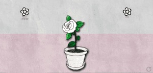
After the sound ends, the pot will generate a blank flower according to him/her choice.

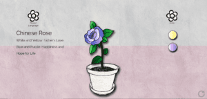
The user can check the language of the flower and its different meaning according to the color. The user can also choose the colors of the flowers. All the flowers are drawn by ourselves, which is based on real flowers. And also we did a lot of researches on the language of flower to make sure that the different meanings of different colors and flower.

Process
For my project, the first part I made was to choose the emotion and people, which are checkboxes. And based on Laura’s audio project, I also used to send a certain value to a function, which is a math thing. According to the total value, the flower would be shown. But since we want the user just choose one emotion and one person, checkbox does not restrict people’s choices. So I changed to use radio box and I decided to use array to control the value. I did a lot of researches online and wrote the code but it did not work. After asking Professor Moon, he pointed out that I used part of jQuery’s coding. And we finally got the right code. This is one of the most successful parts.
I am not quite satisfied with the animation of the box. If the user has clicked one emotion, it cannot work when the user changed to another emotion. Now I use keyframe animation in CSS and I think that it may have a better way to improve it in javascript or in another way.
If we can do our project again, maybe I would not choose a flower and I will keep the concept of filling the color. In our original proposal, we tried to fill the color into the flower. However, since our flowers are not symmetrical graphics, it is hard to draw a flower with p5 directly. So we decided to use images. Hence, maybe I will use another concept which is easy to draw in p5 so that I can fill the color in.

Future
When we were making our project, Professor Moon wanted to use drag, like dragging the emotion into the bottle and dragging the color on the flower so the color can be changed. However, the drag function cannot work. I hope that I can explore further about this part. We got some feedback from our classmates and judge. Ann wanted us to improve layout since she thought that there are still a lot of texture. So we can make the layout more clear and similar. Leon asked us about sending the flower part. In our proposal, we planned that the users can download the screenshot or send the website to the persons they want to send the flower. However, it is too hard to write them based on our website since we did not use p5 so that we should add another library that we have never learned. Leon gave us a great suggestion that we can only add one sentence “take a screenshot”. I hope that we can implement the function of download and send email on the website in the future. 

Final Project Documentation – Xavier Juhala

Inspiration

For our final project, I and Grace decided that we wanted to do something fun that would also serve us as a place where we could store some of our memories of this city that has become our home. So we decided that we wanted to document our favourite places in Shanghai. This was really fun as we got to go and film around our favourite places around the city and make videos for our project.

Concept

To make this project more fun, we decided that rather just having a website incorporating our favourite places, which was our original plan. We thought that in order to make it more interactive and user-friendly we would the site be bit more of a game. To make it a game we ended up using the p5 js we learned to recreate the images from the videos we recorded in order for the user to have to guess where that site could be as the image got built up. For that reason, we also decided that it would be to record audio of the places we went to, in order to create a kind of soundscape of the area so which would serve as an extra clue to the person guessing what site this could be. 

Process

For the process, we first started out by creating the basic design of the website using the HTML, CSS and Javascript techniques we’ve learned over the semester. Then I and Grace both went to collect the video for the website and the audio, this was a really fun day! After we collected the video and auditory aspects we worked on editing them using Premier, to crop, brighten, stabilize and increase the saturation on the videos. We also then used Audacity to edit the audio. The audio of all the sites sounded a bit similar so in order to increase the users understanding of the sites we decided to edit the audios by adding subtle sounds that would maybe be more associated with one site over another. For example for our Xintiandi audio, we added the sound of clinking glasses and plates to simulate the many outdoor restaurants that there are in that area, or we added the sound of the wind on the Bund audio to make it sound more like you were walking next to the river. All of these sounds were sounds from freesounds.org which has an amazing extensive library of sounds to use. Once all of these were edited we started to put them into the website, and this is when things started to get a bit complicated. The audio was not playing in the background like we wanted it to, instead a music bar would appear which then messed up the whole layout. We also were having problems with how slow the pointillism was being generated. In order to not bore our users, we needed the dots to appear faster as they were appearing very slowly at first. After trying for several hours to fix these problems we decided to go seek help from the IMA Lab, where Dave helped me to realize that in order to make it go faster I had to add more code that would take another point and generate it at the same time it was generate the first point (x,x1,x2,x3, etc…). writing this was time-consuming but eventually made the experience much better. He didn’t really help with the audio but after much more trial and error we finally got the audio to play in the background which was a huge relief. Another aspect we had problems on was the background, originally we were going to have a video background from a video we took, when we tried this out on its own it worked perfectly but after trying to incorporate the flexbox on top of it wasn’t working anymore. We tried several different things to try and get it to work but in the end, we decided that having a gif as the background would work just as well.

Reflection

Overall I am very proud of this project, I and Grace put in a lot of hard work into it and we ended up doing things and using code that we never thought we would be able to. Having never in my life used code or anything related to, this final project was very scary as previously for our other projects we had other people who would take the lead as they were more experienced. This time, however, it was just me and Grace and we are both very new and inexperienced, considering this however I was amazed at our final project and that we were, in the end, able to create such a stunning website. Although there are some aspects I would like to improve, such as the comments sections and the layout of the front page such as the font size, colour scheme, and maybe adding some instructions. I am very pleased how this turned out and I think that me and Grace made a great team together. I am excited to apply these skills I learned to all of my future endeavours! 

Week 14: Net Art Project Reflection Vincent – Moon

I worked with Jon on this Net Art Project, and had a extremely fun time with it. I am sad that it is over, but also happy that it happened 🙂

VINCENT AND JON’S AWESOME NET ART PROJECT:

Design:

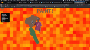
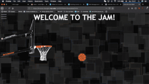
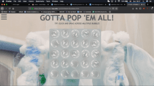
Our website’s final form is a website that is purely based around what Jon and I found interesting/amusing whilst we worked on the project. You mainly interact with the project through the mouse, playing around and looking for the elements that we’ve included within the website, hidden or not. As of now, there are four actions: bubble-wrap, basketball, British flag, and painting with Bob Ross. The point of the website is to show off both Jon and mine’s personalities, that there is no specific direction a project has to go in, just do something that you find enjoyable. What I had just said was a bit contradicting, but anyways, the point is we hope you found the website itself as enjoyable as Jon and I had.
Process:

The original thought process behind our project was to base it around “de-stressing”, which was what inspired our first action, the bubble-wrap popping. It worked really well in terms of de-stressing, because who doesn’t love popping bubble-wrap. Afterwards, we kind of ignored the entire “de-stress” part, not because we wanted to, but because Jon and I got engaged in discussing basketball, and it inspired us to make it a interactive page on our project. It was until after a couple of hours that we realized, it didn’t really correlate with de-stressing. As ironic as it is, we stressed too much over the de-stressing topic, so we decided to ignore it completely to make sure we had more content. If there was one thing that I would change throughout the entire process, it would be that we didn’t stress too much about the de-stressing, because we brainstormed and prototyped for too long and wasted a lot of time. We could’ve gotten probably one or two more interactive parts, but we had constrained ourselves too much with a specific direction.

What worked well, specifically for this project, was that Jon and I thought of all the ideas just based off of us chatting normally. What didn’t work well was when we didn’t think of ideas based off of us chatting, when we had to focus on the direction of “de-stressing”. We discovered this after the proposal, and implemented it into our final project, making it a masterpiece compared to what we had originally.

Future:

Had we had more time, I think we would’ve made something similar to the “take me to a random useless website”, but instead it would be a “make me do something random”. If we had more than 7 interactive actions, we had planned on making it the exact same format as the useless website button website. I guess in conclusion, we would’ve loved to implement even more interactive actions into our website, and made it more complete as a “random” website, once again contradicting myself.

I will most definitely explore more of these types of ideas in my own work, and I’m sure Jon will too as well. I loved having him as my partner.

Conclusion:

I have no idea whether or not you’ll read all the way down here, but thank you so much for a great class Moon! Although there were a lot of projects we had to deal with, I was always happy whenever we worked on them, and also just the overall atmosphere when working and learning in the class is just superb. I would’ve never thought how relaxed I could be in a classroom. It was an amazing experience, and I really look forward to taking more of your classes next semester/next time.

Thank you again, I hope you get wonderful students next semester and that you continue to be the awesome and perfect professor you are!