Interaction Day Feedback

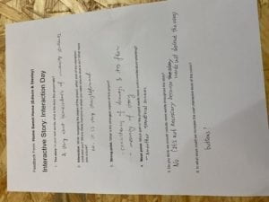
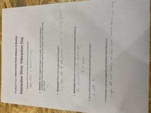
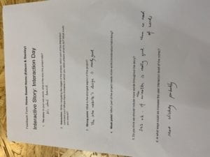
Overall, I think we’re good with our visual assets and we need more words to lead our readers to comprehend the story that we are trying to state. We also need more interactions with the readers. I intend on applying the advice given to us throughout our website as we proceed with development this weekend. 

Recitation 3 Sensors by Xintong Xie


  • Question 1

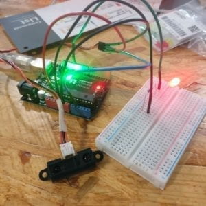
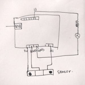
We intedned to assemble a infrared distance sensor in the recitation. We connected the sensor with a LED light, when distance is lower than 20cm, the light will turn on. I think museums will use my sensor combination. They can use the sensor to portect the relic from touching. When people get too close to the relics, the light will tutn to warn visitors.

  • Question 2

I think programming has a lot in common with recipes. Both are done in sequence, with each component having a specific function. At the same time, preparing the ingredients and understanding the necessary terms are similar. However, there is no need to have a waiting time in programming, basically fast processing; Recipes often involve waiting for the food to cook.

  • Question 3

Computers have influence the way people look for information.  In the past, people usually used books or libraries to look for information. But now, people tend to usethe search engine online and get information from different websites. Also,  computers influence the way we take notes or write documents. People like to write with Word or Excel and storage them in the computers.

Week 1-reflection on the reading by Yuru Chen(Lindsay)

From the reading, I received  a strong sense of power as a human who has the ability of communicating. Unlike Vashti and other passengers in the air-ship, who did not think communication as important at all, Kuno is a positive example because he realized that shutting ourselves down to other people would do us no good. I have the same feeling as Kuno as I understand the importance of communication. As far as I’m concerned, communication is like a bridge, connecting us to everything else in the world. If we can make good use of this bridge, it will take us to anywhere we want to be. On the contrary, the machine which is mentioned in the reading is an example of the “prison” in our head. People who lack the ability of communication are confined to this prison. Of course, the very first step is always scary. But when we are brave enough to take that first step to get involved, we will find  out that the world with communication is so much more prettier than that little “prison” in our head. 

Communication is not only about exchanging our ideas or thoughts with other people but also a way to improve ourselves and explore new regions of  knowledge. If we refuse to communicate and keep everything to ourselves, we will be trapped in our own little world. Only if we have the ability of communication can we find a way to acquire new knowledge, thus to improve ourselves. 

Final Project Reflection (Shirley Liu)

A. Design

Matt and I worked together for the final project. Our website has a very minimalistic theme using black and white as the main colors. We chose a font that was very blocky and geometric to match our theme. We presented twelve different stories of happiness told through a flipbook like animation of the animal.

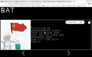
 In our website, we first briefly explained how the Chinese zodiac came to be in order to give the user some background if they have not heard of the Chinese zodiac or if they wanted to know a little more about it. We then provided a link that brings the user to the main page with all the different animals. There, the user learns of the aim of our project as we give background into the process of the project and how we went to interview many different people. When you close the information box, you are able to click on the different animal squares and see the stories of 12 different people. Once you click on one of the animals, you will be presented with a page that includes the audio clip alongside a flip book like animation corresponding to the zodiac animal. If the user wishes to see other animals, they can go back to the home page and click on the one they want to see or use the arrows located at the bottom of the page. The order the animals are in for the website is the order that they are in for the Chinese Zodiac.


B. Process
For our project, we were nervous because of the time limit due to changes in our ideas. Our time was limited because it was really hard for us to decide on a idea for the final project. In the beginning we wanted to do a mad-lib inspired project with flip books made to cater the user’s choices. However, we were not too invested in the idea and were not completely interested. After speaking with the professor, we realized that we should making something that we actually enjoyed and were excited about doing. However, we eventually came up with an idea that we were excited to work on because it included interviewing people which I thought was very interesting and pushed us to find people and hear what they have to say.  Even with limited time, we were able to finish the project on time and have a website that was functioning and what we wished to accomplish. Matt and I split up the work pretty evenly with Matt handling the drawings of the animations as well as the collection of the audio while I worked on coding the website and zodiac icon drawings. At the end, we ran into some difficulties putting all the elements together but in the end we were successful in combining all the elements.

C. Future
I really enjoyed working on this final project with Matt and I loved listening to the stories from everyone that we interviewed.  I believe we achieved our goal of wanting to create a website that presented the Chinese zodiac in a new way however we are lacking in some elements. It would be cool in the future if we were able to collect more stories from around the world and if we added an element where the user is able to tell their own story and add a flip book. Some people in our class suggested that we add stories that varied in ages to present the idea that there are things in common between older and younger generations linked to one’s Chinese zodiac sign. Moreover, if we had more time I think adding more interactive elements to display the stories in a new way would make it more interesting to the user. Being able to surprise the user for each animal would be pretty interesting because they would have something new to look forward to when they clicked the arrow button. Overall, it was a pleasure making this website as we were able to achieve something that started out as a drawing in my journal. It would be really cool to further develop our website if we ever get a chance to as the concept is pretty interesting to me. 

Final Project Reflection (Matthew Fertig)

A. Design
Our project presents people’s stories of happiness told through their Chinese zodiac animals. Our website’s style is very minimalistic, containing only black as our background and white for fonts.
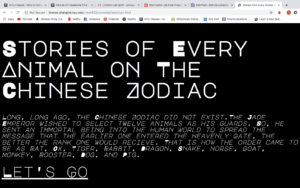
The start page (shown above) provides a background to the history of the Chinese zodiac, prefacing the user about its origin. Once “let’s go” is clicked, the user is taken to a page presenting all of the Chinese zodiac signs, represented through minimalistic drawings. This page also provides a brief background into what our project is.
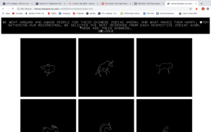
Lastly, once any of the zodiac signs are clicked, the user is directed to a page where an animation of the person’s story (corresponding to that zodiac) is being played. On the page, the user also has the option of playing the audio recording of the story being told. The user can than file through to see other stories of other zodiac signs by using the arrow buttons.

B. Process
I think the biggest concern we had when developing our project was the time limit. We were never really in love with our original idea, so we really felt pressed for time after changing our project concept. Although, I think changing the concept was necessary in order to make a project that we were happy with. That being said, after we changed our idea I think we developed our project rather efficiently. We split up the work in a way that Shirley handled most of the coding and I handled most of the artistic elements. It really made sense for us to divide work this way because the animations had to be done on one main device, also from previous experience keeping the coding to one device makes the process a lot less complicated. If I were to do this project over again, despite wishing I had more time, I think planning out our visual elements before hand would have been beneficial to our process. We were kind of lost for what we wanted our aesthetic to be, so when we finally came to a design we liked we just stuck with it. While I do like how the design turned out, I struggle to justify its connection to our project’s concept.
C. Future
There are definitely a lot of things I wish I could’ve accomplished through this project if I had more time. A lot of people recommended that we add more stories (preferably of varying ages) to showcase how there may be similarities across generations relating to people’s Chinese zodiac sign. Additionally, I think a general increase in interactivity would make our project a lot more user-friendly. Primarily due to the time constraint, our only options for users is to click through the pages, but we can definitely incorporate some other ways of switching pages that may be less traditional. Specifically, I think in our showcasing of the animations we can incorporate some fun ways of mimicking an actual flip book. As suggested by our professor, it could be interesting to have the flip book progress with the moving of the user’s mouse, playing from start to finish as the user moves from left to right across the screen. I think all of these additions could definitely raise our project to a more complete, developed stage.