W14: Final Project – Ruby & Anica

Link:
http://imanas.shanghai.nyu.edu/~sk7383/netArtProject/coding/index.html

Main Idea:
This project is based on a story adapted from β€˜Tokio’ by Higashino Keigo, in which we are inspired by the theme — time travel, redemption, and circulation. Tokio, son of Takumi, goes on a temporal journey back to 20 years ago and helps his father uncover the truth about his family background. The story is told from the first-person perspective. Since it’s impossible to show all the details, we decided to select some key plots for the audience to navigate it.

Process:
As for the teamwork I’m in charge of all the visual arts and together we did the storyboard and coding. 
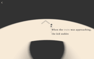
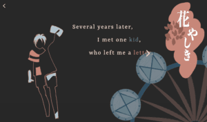
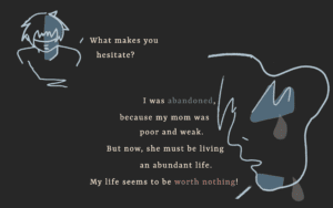
The basic layout in a single page contains quotes and pictures. We don’t really want it to be a series of comic pictures but something artistic. We got the inspiration from Moon and Dave that we can extract the abstract elements to show the concrete things. That’s why I choose to sketch the abstract lines and panels. The colors are also carefully selected to create a gloomy and sorrowful atmosphere. I drew all of them in Photoshop with my digital pad.
For the coding part,  I  was in charge of the p5 java mainly. For example, by shrinking the circle little by little with the train remaining still I want to create a dynamic environment where the train is coming from a tunnel. And the next page actually acts in cooperation with the last one. The circle spreads out, showing the boy is running towards. 

Post Mortem:
Somehow we haven’t figured out how to add the background music throughout all the pages. And the audio seemingly works only when there’s some interaction. If time permits, we also want to add more effects like dragging, (auto) scrolling and bouncing rather than just clicking to turn to another page. Through this project, I realize the significance of the overall style of an artwork and the word “conceptualization”, which leads us to think deeply about the way to present the art.

Big thanks to my partner Ruby, my professor Moon, and Dave πŸ™‚

Final Project Documentation – Tenielle Ellis

Link:  https://imanas.shanghai.nyu.edu/~tke217/Net Art Project/

“ζˆ‘”

About

For my final project, I decided to do this project individually to not only add my personal touch and let my personality shine through the website, but to also challenge how much I’ve learned throughout the semester, especially figuring out how to code myself since that was one of the most complicated processes I had to learn how to do. I’ve never learned how to code before, so this semester was my first insight into web designing. 

Design

For the design I had in mind, I wanted to add quotes that my mother would always teach me growing up. She would have quotes all over the place, and would make sure we would “Live, love, and grow” by them.  I wanted to use the most influential quotes, but also use a collage of pictures/videos from my life to visually explain them. 

I wanted to make my design of the quotes and title page to be simple because I wanted the collage of pictures and videos to shine through. I also wanted there to be a flow in the project, especially since this was a project that was more like presenting “art” and themes like “abstract” “obscurity” “creativity” “personality”. I thought this was a perfect representation of art, because to me, my project was art. I am not so visually artistic, but when there are personal touches, my creativity can flow. I thought this was a unique way of an artistic piece, and I very much enjoyed it. 

Lastly, I also wanted to include some sort of user interaction at the end. So, since this webpage was pertaining towards me and my personal life, I wanted to give the users a chance to share their personal insights/thoughts on quotes that have inspired them. I also wanted this to be saved on the screen, so that maybe they can be inspired from other quotes, or be interested by the differences or similarities between different quotes from different times. (The top line representing the latest time — closely to when the project was finished).

Steps:

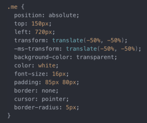
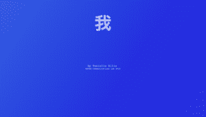
This picture below is the cover page of my website. The β€œζˆ‘β€ character is blinking, indicating that it is a button and should be clicked on. 
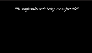
Next, it leads you to the page where the quotes are displayed. After this, the process is now timed and everything will be autoplayed (except the videos, you just have to click anywhere on the screen to play it, and click again to pause it) 
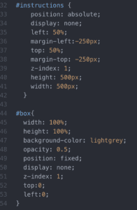
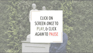
Now, you will see the video pop up (fullscreen), and shortly after a pop up with instructions guiding the user on how to move about the website. 
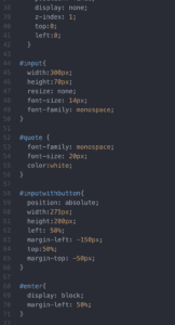
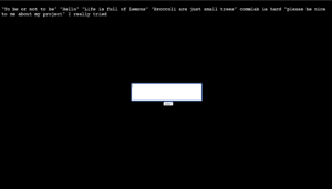
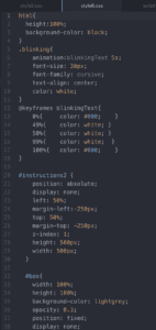
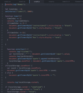
After all the quotes and videos are played (4 sets), the user will be taken to the final page below. This page is for the users to explore their creativity and have the chance to type in quotes that they were most inspired by, or quotes they want to put. Before this page, there is a mini-pop up with instructions explaining what this page is about and how to go about it. After the user puts in their quote(s) and presses submit, the quote will not only be displayed on the screen, but also be saved, so that when the user comes back to this page, they will still be able to see their quote as well as others.
Process

The process of making this website was very meticulous and challenging. I’ve always worked with partners before who have taken the role of ‘coder’, so I am not used to coding myself and making a product that is solely of my own idea. I had to go in for help a lot at the IMA lab because simple things like not connecting this html with the second css, or forgetting to grab my document, etc. It was honestly all a struggle for me. 

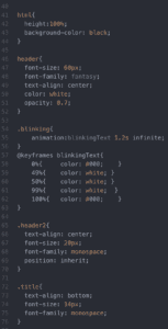
However, I really like challenges, and I think this was definitely one I could take on, but would need assistance with. I had to make separate htmls, css, and javascripts for each quote, as well as the title & final quote page. I also did all my edits on iMovie, so I just simply added that in on my html page. One thing that I kept having to fix was the position of everything. I wanted to make sure it looked presentable, so I was being very careful about centering the instructions, making sure the videos were full screen, etc. I also wanted to make sure there was some interaction with the user, therefore I set the β€œζˆ‘β€  or title as blinking, and added the “add your own quote” portion at the very end. 

Honestly, from proposal to presentation I am damn proud of myself. My presentation was exactly how I planned it to be in the beginning, and I honestly did not know that I could execute it as well as I planned it. Throughout the process, I changed some of the design as well, just according to how I felt with the allotted time, help, and creative juices.

Codes

Title page: 

HTML
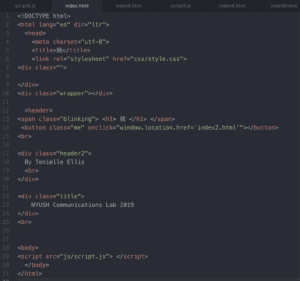
CSS
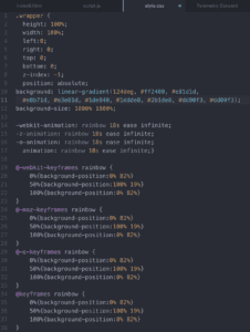
Quote #1:

HTML
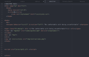
CSS
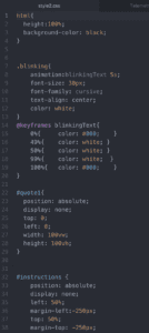
JavaScript
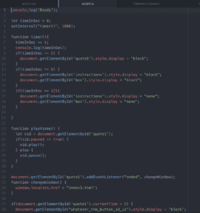
Final Page (Insert-Your-Own-Quote):

HTML
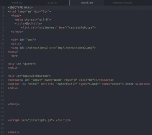
CSS
JavaScript
Future 

Given more time, I think I would definitely take into account the judge’s comments about using the medium of a website more wisely, and not confusing it for a video network, like Youtube for example. My only rebuttal, is that I intentionally didn’t want any buttons or interactivity to keep directing the person from website to website because I thought it would defeat the purpose of my webpage being art. I wanted there to be a free-flow because it would represent more of an artistic and creative side of my project. I also would like to add that I added the “Insert-Your-Own-Quote” portion at the very end which would give the user web activity to not only insert their own quotes, but to see others that are saved. Another comment received, was to have consistent design like with my quote fonts, as well as setting sort of a style or theme and go by that throughout the website.  With more time, maybe I could think of another way to execute my ideas, but use another design that fulfills the medium of a website. 

Lastly, I am very proud of myself! I achieved my goals and executed way more than I thought I could. With the help of many teaching assistants in the IMA lab, I was able to design a webpage that had my personal touch, and made it my own.
Week 14: Net Art Project (Moon) – Susie

Link: http://imanas.shanghai.nyu.edu/~ys3041/final/index.html

Partner: Laura

Description:

The user chooses one emotion and one person who the user wants to give a flower.  And then, the pot will generate a flower according to him/her choice. The users can choose the colors of the flowers.

Process:

After we confirm our project, I started doing it with research first. I found a lot of articles about flower language. And finally I chose one, which is credited below. And I read them and chose some flowers which have different meanings with different colors. I summarized the three most common emotions and four persons. Finally, we had five flowers to match the different choices.

Then, I found different types of paintings about the five flowers we choose. In our original plan, the users can choose the color and fill it in the different petals. However, since our flowers are not symmetric, we had to draw them in p5 by vertexshape() or curveshape(). While it is really time-consuming and the flowers we draw by p5 is really weird, we decided to draw the flowers in Ai by ourselves and load images into the website. Laura drew all the flowers and filled in colors. At first, we still wanted to keep the concept of filling color, while it is hard to do this with images–we did not have an efficient way to put the images of petal related with each other. So at last, we just designed to click the button and changed the whole images.

I am responsible for most of the coding in this project. Laura is responsible for the visual asset and helps me to code. There are some interesting and important coding I want to mention.
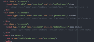
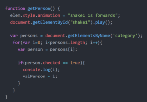
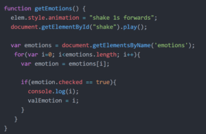
For choosing the elements and persons, I used checkbox first. Since we wanted to limit users to just choose one emotion and one person, Professor Moon told me I could use radio box. When I used checkbox, I used clickcounts and sent value to the function which generates flowers, doing the math to decide the flowers. After I changed to radio box, I used Array and used i to make the function. So do the flower language and color parts.
 

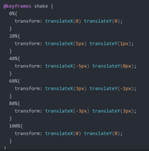
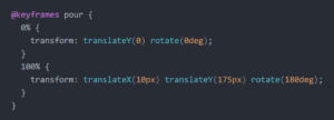
We planned to make animation for the bottle with p5 in java. And I ask Konrad about how to make the animation. He told me that it was easier to do this in CSS and taught me how to use keyframe to make an animation(THANKS KONRAD! πŸ™‚ ). 


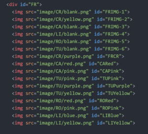
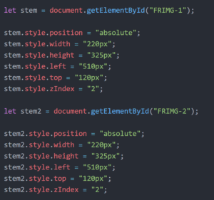
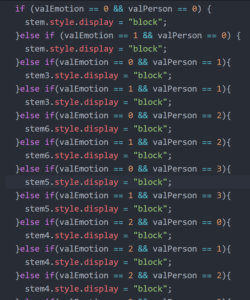
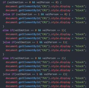
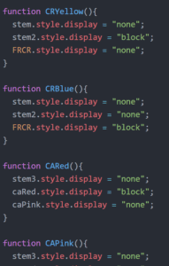
The most important part is how we change the flowers. I did not know why changing images source function did not work in java. So I loaded all the images in the html and set display “block/none” to show the flower. And I set the positions of each kind of flowers respectively. After receiving the value i from the array, I used the else/if statement to show the different kinds of flower. And for the changing colors, they are the simple buttons to decide the display of the images.


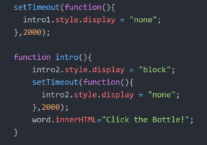
We also did a lot of user testing to get some feedback and changed the ways of interaction and selections. For example, we did not have the instruction which covers the whole page to tell the users what to do.  We put the instruction in the middle of the pages. Professor said that it was not that clear for the users. So I added the huge instructions and used settimeout to let them show and hide.


Further Improvement: 

1 In our proposal, we planned that the users can download the screenshot or send the website to the persons they want to send the flower. However, it is too hard to write them based on our website since we did not use p5 so that we should add another library that we have never learned. I hope that we can do that in the future.

2 Professor Moon wanted to use drag, like dragging the emotion into the bottle and dragging the color on the flower so the color can be changed. However, the drag function cannot work. I hope that I can explore further about this part.

Credit: https://aggie-horticulture.tamu.edu/archives/parsons/publications/flowers/flowers.html

Chloe Chan: Final Project

Link: https://imanas.shanghai.nyu.edu/~cc5581/week14/netart/index.html

Title: Where do we go in our dreams? 

Concept

For my NetArt project, I really wanted to explore something that I was interested in, therefore, I decided to explore dreams as a concept. I wanted to be able to explore a visual representation of what dreams may look like to me personally after being inspired by a project done by Joe Hamilton.  Users are able to interact with this project by scrolling. They will also have the opportunity to explore two dreams. 

Process 

To begin with, this was a really ambitious project with the  little amount of time that we had, but I had a clear concept that I was really hoping to execute. I immediately ran into problems regarding how to even construct a canvas size that was much larger than the window itself, and to start the project at the centre instead of at (0,0). I tried many different solutions, but the solution that Professor Moon helped me with was quite simple. 

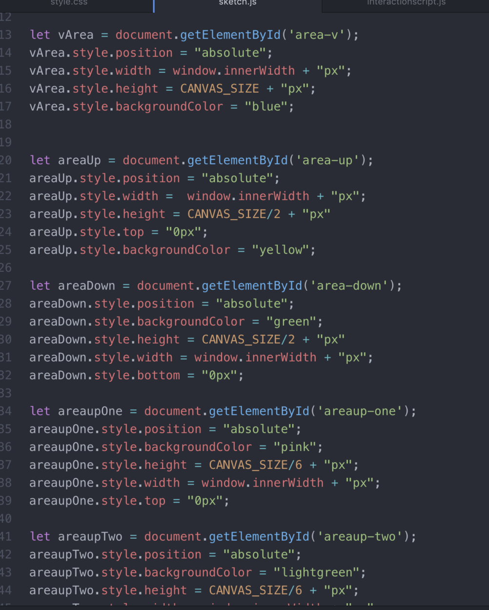
After that, I began to select the images that I wanted to use as background images, and I constructed separate containers, where there will, later on, be free-floating images added to each of these containers. These containers were defined using Javascript. 

After establishing these containers, I began to implement that background images based on a rough storyline that I had decided to follow in my head. After implementing the background, I began to select the images that I would like to use as floating elements within these containers. I cut these images using photoshop and then implemented them onto my page. It was at this stage that I realised the amount of work that I truly had and decided to cut my page in half by only allowing the users to scroll up and down and disabling their ability to scroll left and right. 

Initially I had hoped that these images would be positioned randomly within the container, however, I realised that that the page looked really unfinished, especially as I wasn’t amazing at photoshop. It was at that point that I decided to change the way that the images were displayed to the user.  

I really liked that way that Joe Hamilton had toyed with the way that some images were fixed, or scrolling at a different speed compared to the background image.  After putting a lot of effort into trying to figure out a way to accomplish this, I hit a dead end. I tried toying around with “fixed”, “absolute” and “sticky” elements but couldn’t figure out a way to accomplish the effect that Joe Hamilton achieved in his project. 

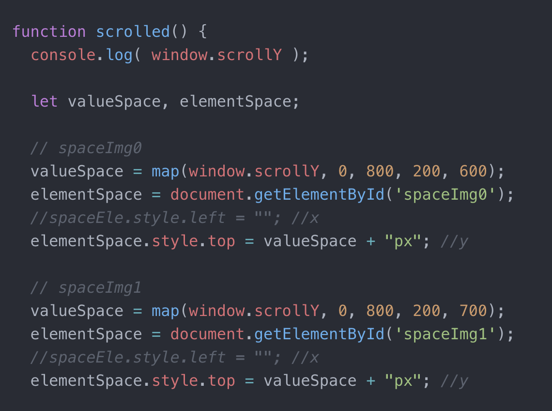
After seeking help, Professor Moon showed me how to use the mapping function in p5 which made the following process much easier. 

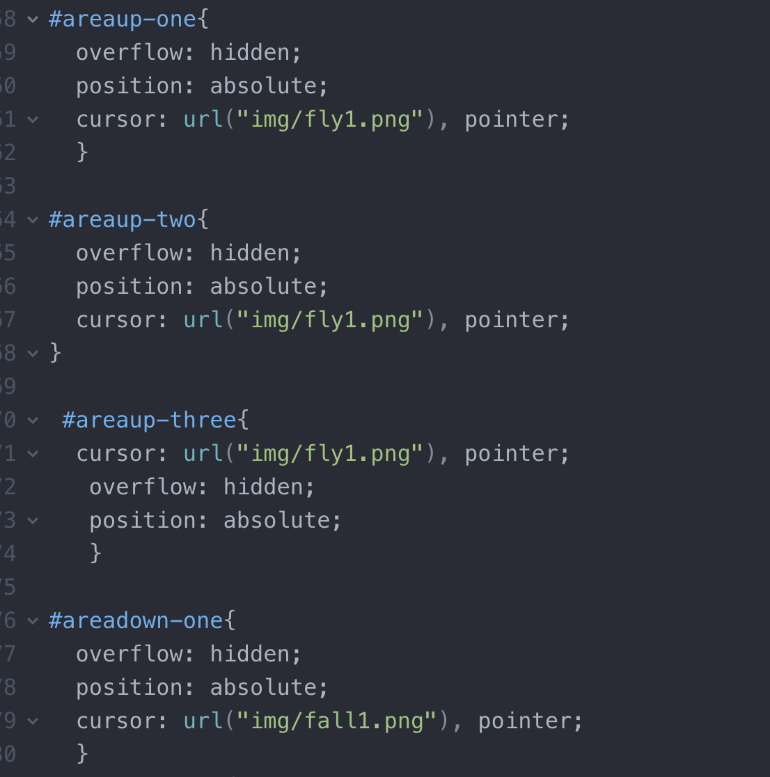
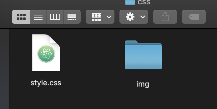
I had also changed the cursor to a stick man which was general enough that users can identify with the stick man as themselves, travelling through this project. This was also slightly difficult as I couldn’t get the cursor to change, however, I realised that the folder structure had to change and that I had to create and IMG folder inside the CSS folder and then create the cursor element in CSS. 

I had also initially hoped to create a popup at the end to interpret the dreams to the user, but again, due to time constraints, I was unable to do so. 

Overall, although this was an incredibly frustrating experience, it was also a very rewarding one. I thoroughly enjoyed creating this Netart project, and I only wish that I had more time to perfect and fine-tune some details that I didn’t have the opportunity to. 

Final Project: Data Points – Hannah Kasak (Moon)

http://imanas.shanghai.nyu.edu/~hkg245/week01/Final%20Project/

In making my project my original plan stayed largely intact. The main difference is that, while I initially planned on making each data-point clickable, I chose to make the key clickable instead. 

Concept: As someone passionate about public health, Internet Art with elements of data visualization presents an exciting opportunity to make global health issues better understood by a casual audience. Our attention to a disease is often not proportional to the danger it actually poses.  In response to this I want to represent the loss of life by specific illnesses by the appearance of differently colored polka dots.  Based on the number of people killed by a disease each year, a dot will appear in a color representing that disease. For example, every ~1.5 seconds someone dies of heart disease, so every 1.5 seconds a dot appears on the screen. 

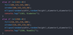
Process: My biggest concern in making my project was making the timing accurate. Initially I wasn’t sure how to accomplish this at all, but it ended up being a much simpler calculation and line of code than I expected. I used p5 to draw ellipses in particular colors and used if statements to dictate when to draw the ellipse.  

I used data from a 2016 WHO report that stated number of deaths caused by each disease that year. I then divided number of deaths per year by 525600 (minutes) to get number of deaths per minute.  I then divided 3600 (the number of frames in one minute) by the deaths per minutes to get frames/death. Using the code above, I was able to make a dot appear after the correct number of frames. I’m very glad to have learned if(x%1350==0) because I otherwise would have struggled to convey the idea of “every 1350 frames” to the program. I also feel that this simple line of code is applicable in numerous other situations as well. 

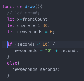
My biggest challenge ended up being the clock in the corner, which I had previously assumed would be easy to fix. My main issue was making seconds reset when they reached 60 instead of counting into the hundreds and making the time something like 03:135. 

The two lines of code directly above displayed the time elapsed. Below is the code that eventually worked, after I sought help.  My problem was that I was initially using one variable ‘seconds’ however in order to make econds “start over” and count again from zero after reaching one minute, I needed another variable “new seconds” to set it equal to. This seemingly simple exercise helped me to understand the iterative nature of the draw() function and how if-statements work when values are being manipulated. 

For creating the key and making the information popups, I created a class key-values in which I created a separate div for each disease. I used onmouseenter and onmouseleave to queue functions that opened and closed the corresponding pop-up. This was also something that I initially didn’t know how to approach because I was initially only familiar with onmouseclick and oncmouseover, which both didn’t allow me to make the pop up disappear easily. 

Overall I am pretty happy with the result because data visualization is something I find both very interesting and very important. However, I still think the project could be improved if I had more time by having multiple screen for different world regions, etc. Right now the project provides insight and comparisons between diseases, but not between different areas. While I feel I accomplished my initial goal, I think the project requires itself to be expanded upon in the future so as to encompass more data, which I am eager to do now that I understand how to approach the task.