Respond to the reading“The Medium is the Message”-Clover

After reading this article, I first found the relationship between medium and message quite interesting. Before I read this article, I never thought about the connection between these two. Medium is the message or medium can have no message. I made me think of if we create a new medium, there maybe will be another new message be created. The new medium can also change the culture or the way of the art. It may also change people’s understanding of art or trend. For example, the VR is a new application of the medium which changing the way people feel about art. VR let people have a more sensory experience to feel about art, so people stay at home can also have the experience of taking roller coaster. So if we create a new medium, we may also create a new message and a new lifestyle. Hoping that in the future people can combine AI and VR, letting people experience a new way of art.

The second thing I noticed is that there are technological and cultural differences between the various groups. There are differences in the perception of the media between illiterate and non-illiterate groups. In a sense, this also means the difference between cultural groups. There are also differences between countries. This cultural difference may because of different history or institutions, which also means that each country can create different forms of artistic expression. Mogao Caves in the east, for example, and the Louvre in the West is a great artistic expression. This historical form of artistic expression is also influencing the form of modern artistic expression. It also means that different groups can better express their culture in different ways. Different Cultures using different modern technologies may yield great artwork.

I was also surprised that the medium can have a really huge impact on society. The article mentioned that print created individualism and nationalism which really surprise me. The media is changing people’s idea and consciousness imperceptibly. From a certain point of view, the media can also control people’s thoughts. The media can even create a new art industry with huge economic effects. Or it can be used to convey a new idea, to usher in a new era. It made me realize the importance of the media. If used well, it will bring good effect, if used poorly, it will bring great harm to society. Therefore, the government should strengthen the supervision of the media and create a good cultural atmosphere.
reflection on Understanding Comics-the Invisible art__Steve Sun

After reading Understanding Comics-the Invisible art, I did realize that there is a pattern in how comic was created, that human’s imagination in the gutter between the panels links the stories, and that how abstract the comic is depend on how much does the artist want people to fit themselves in the characters and the plot. With that much essence of comics being revealed, the importance of this textbook-style comic is self-evident.

But one thing that keeps staying in my mind is that what exactly is the purpose of exploring further into the essence of the comics. What will people get from learning “what makes a comic”? Do they draw less bad comics or do they understand the comic of other artists better?

If it’s the former I would say less bad doesn’t necessarily mean good. What build up a good comic is the drawing skills and more importantly the content in it which can’t be mastered simply by studying the component of a comic and how they work. These “building bricks” can be calcinated by one consistently reading and imitating different kind of already-exist good comics and form one’s own way of narrating and scriptwriting, as well as the style of drawing.

While if it’s the latter then I’m truly sorry for the creator of that obscure comic. As McCloud claimed himself, “with the invention of printing, the art-form which had been a diversion of the rich and powerful now could be enjoyed by everyone.” (16). And by everyone, the author meant everyone who is able to get access to the comic. And that includes the not-so highly educated people who don’t understand the essence of the comics. So if a comic seems hard to understand by those kind of people, it failed.

Also, I do admit that the innovative way of narrating and reasoning and explaining in the form of comic is quite bold and refreshing, but I can barely say that I’m a fan of the idea of “a comic about comic”. When I was reading this comic, I didn’t feel like I was reading one because the narrate and explanation part seemed a little bit too long for a comic, and I can hardly see a difference between it and a novel if the paragraphs were any longer. It seemed to me that I would rather read a series of article with good detail and vivid depiction about the essence of comic than reading this.

Photoshop Assignment – Taylah Bland

This was first time using photoshop and I definitely got a little carried away by the end of the project. I attended the Photoshop workshop which was very helpful in order to know how to use the basic tools. 

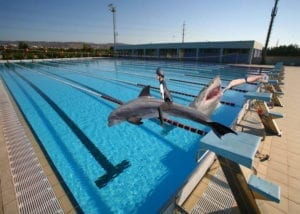
I really wanted to create something seemingly simple but as you continue to look at the picture, more and more just doesn’t seem right. 

I’m a really big fan of sharks and I decided that I wanted to do something with an aquatic theme. I began with the imagine of a swimming pool. I firstly added a shark and attempted to make it look like it was diving into the water but the shape of the sharks body didn’t want to cooperate. Instead, I knew that dolphins naturally curved when jumping and decided to use this as an idea. I selected my dolphin and used the “Perspective” and “Skew” tools to make the image fit the line of sight I was after. 

I then decided I wanted to have a swimmer diving into the pool too in an attempt to normalize the situation. After using the “Quick Selection Tool” and the “Magic Wand Tool” I was able to select the correct outline for my swimmer and position him relative in size. 

I was going to leave it at that but I started to feel more comfortable using Photoshop. I was disappointed that I didn’t put my shark in so I decided to play around and incorporate it somehow. I was spending a long time trying to find the right picture but I realized that it is just as easy to edit it in photoshop – where you can make the imperfect seemingly perfect. 

I used the “Eraser Tool” which makes the pixels conform to the background color. In this way, I was able to successfully use my shark imagine and make the shark emerge from the water. I used the “Eraser Tool” to smooth the transition between the shark and the water to make it look like they were one picture, not additional layers.  I also had to make sure I positioned the shark correctly under the diver to make it appear that the diver was entering the mouth of the shark. I used the “Eraser Tool” to slightly take away the hands to create the illusion of disappearance into the depths of the shark. 

I then decided to add a person on the dolphin and treat the dolphin like a horse. I used the “Eraser Tool” for this task after using “Perspective” and “Skew” to set up the right angle for the child to be facing. I kept the riding attire on as I felt it reinforced the symbolism of horse riding. By using a horse rider, the position of the legs fit over the side of the dolphin perfectly and I didn’t have to use the “Eraser Tool” as much for the smoothing of this transition. 

In addition, I also changed the brightness and contrast of the picture to elicit more of a shadow effect and to make the image appear slightly more ominous. I didn’t want to change it to black and white because I like the usage of color. The sunlight seemingly makes the picture appear friendly, happy and upbeat yet by looking closer something sinister definitely lies beneath. 

Taylah Bland Photoshop

CSS exercise (Jamie)Ziying Wang

link: http://imanas.shanghai.nyu.edu/~zw1745/week2/index.html

This is the portfolio I made using CSS layout. I applied flexbox to horizontally align the elements,  and padding as well as margins to adjust the size of the blank areas. The footer position was a bit tricky for me because when I wrap the webpage, its position moves vertically and it didn’t work even when I applied “fixed”. Then I realized that the footer was only fixed within itself, which means the space for the footer isn’t the whole webpage so it can not be static on the webpage. So I adjust the size of the space for the footer to 100%, and the footer can be static on the page or relative if I set it to relative position.

Week 2: Response to Understanding Comics (Jamie) Ziying Wang

Scott McCloud has an advanced perspective on how he views comics and digital forms. I’ve always considered comic books as an assembly of static pictures, for when I’m reading through the pictures, I can automatically connect them in my head and form a complete storyline. But through Scott McCloud’s analysis, the static pictures inside comics are separated, and therefore are never continuous. McCloud explains the blank area between pictures is left for the readers to fill in. The classic version of printed comics actually inspires readers’ imagination.

McCloud also brings up a theory I’ve never thought about. He explains that due to the size of the pages and the printed-version of comics, a series of pictures always have a line break and cut to the next line, it interrupts the “continuity” (even though there isn’t an absolute continuity in comics) in comics. With the improvement in technologies, we now have digital devices for online comics. But due to the limitation in people’s minds towards old types of comic books, the comics online are simply paper version comics scanned into screens. McCloud comes up with an idea that with the support of digital devices, comics can be continuous. It can be presented as a continuous, never-ending form, such as a wheel that displays comics like films. He even mentions that by the turns inside the plot of the comic, the composing type on the screen can make a turn, indicating the plot as well as getting the readers more involved in the story. I’m inspired by this idea and the latest Black Mirror series, Bandersnatch. It would be amazing if I can create a comic page on the website that creates turns when the plot twists and make the readers pick their own story when reading my comic.