CSS Exercise- Madi Eberhardt

Link: http://imanas.shanghai.nyu.edu/~mne234/css/index-5.html

Reflection:

After completing this Css exercise, I found it really interesting being able to change the font, colors, and format of the website. I definitely found it more difficult than html, as it got confusing sometimes with so much code to check and type. One problem I had was with the boxes and having to do the margins and padding.  I couldn’t quite get the format right for it in columns, so it still needs to be fixed. 

Week 2: Medium is the Message (Thomas Waugh)

The Medium is the Message talks about how the choice of the medium greatly affects the end message. This article helped me to realize that while many may believe that only the substance of the message is important, the medium is actually of equal significance. A message printed on a billboard carries a different aura than a mere text message or email. Choice of medium is very important because it really sets up the context of the message.

This is very important in this class as we will be learning how to work with many different mediums. The message that an audio recording can carry is very different than the message that a video or website could convey. An audio recording, while limited, forces the listener to pay closer attention to the media because there are no visuals to be distracted by. This limitation of this medium can also be the strength of it. One of the greatest strengths of a website is the interactivity and the fact that the website can be regularly updated with recent content, unlike a video or audio recording which after recorded and distributed, can not be mutated.

This article helped me gain a greater understanding of the way that humans communicate and helped me to create a better image in my mind about what I might want to work on in the future.

Photoshop collage – Julia Riguerra

freedom tower ph sky sky n tree

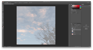
I started my collage with these three images: a worm’s eye view of the Freedom Tower, the sky above the Philippines, and the sky above my hometown. I chose these three because of my love for the sky and my yearning for home.

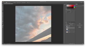
I mostly played around with the blending mode of the layers, setting the sky above my hometown as a Hard Light layer and the sky above the Philippines as a Soft Light layer. I also lowered the opacity of the layers so the colors wouldn’t be as saturated.

screenshot of sky above ht layer screenshot of sky above ph layer

As for the Freedom Tower layer, I initially wanted to use the Lasso Tool or the Magic Wand tool to get rid of the sky, but I struggled with both as they rely on the Tolerance level, and the colors of the buildings were too similar. As such, I decided to lower the opacity of the Freedom Tower layer and added a background layer with the color pink, to highlight the colors of the sky.

finished collage

Week 2: Photoshop Assignment (Thomas Waugh)

For my photoshop project I tried to combine my spirit animal, the shiba inu, and tried to express my constant state of exhaustion. The shibe looks sleepy and at the chinese text at the top reads “very tired.” I also included the shape of my home state of Texas around the border to juxtapose the Chinese text to show a mix of my home life and the new life I am leading now . For style, I added a purple color scheme to it and added pattern overlays over some of the objects as well as several saturation and vibrance layers and heavily altered the color balance of the image. I chose a white background instead of a gradient or a background image because I thought putting something in the back would make it too cluttered.

Response to Understanding Comics by McCloud – Jiannan Shi

Understanding Comics is a comic book that McCloud composed all about comics, and opens a brand new angle for me to look at comics as a medium rather than an amusement genre. McCloud argues that comics are set in the world of abstract icons, and introduces us to different comic styles, vocabulary, the use of closure effect, and time frame, based on psychological foundations.

The “cartooning” of objects makes the audience able to focus more on the sequential theme of work instead of paying too much attention to the special details; but meanwhile, to add some realistic scenes between the cartooning images creates a sense of distant, which is a technique that some artists use. In Chapter 2, McCloud introduces a triangle, in which the three vertices stand for reality, abstractness, and meaning respectively. All the comic works, no matter how realistic or abstract they are, can all find their place in this triangle. The comics, like other media such as literature and film, is deeply rooted in the artists’ culture. For example, Japanese comics utilizes aspect-to-aspect perspective to arrange the panels far more frequent than the western ones because the Eastern culture treasures the tradition of “cyclical and labyrinthine” art while the west does not.

The most impressive description of comics that McCloud introduced is the foundation of why we could understand comics: our high closure effect. We can simply complete some dissociated scenes together, and form a holistic view. In this process, some special stimuli like “the sound of chopping cucumbers in the kitchen” can keep existing from the first panel to the last one unless the author suggests that we should move our eyes off the kitchen. If the artist wants to control the sense of time in the work, it is a good way to utilize such closure effect by drawing a clock with two different times marked on it, by setting another silent panel, or to extend the length of the silent panel.