Taylah’s First Website Blog Reflection
http://imanas.shanghai.nyu.edu/~tlb394/website-1/
I had so much fun with the HTML and CSS Website Creation. This was my first time ever using code to create my own site. Admittedly it was difficult at first because I had to miss the basics classes due to a Student Government trip to Abu Dhabi. However, Professor Eckert was kind enough to assist me by giving me a crash course the day before I left so I was able to complete the first HTML component.
During the recitation in which we created the CSS Portfolio I was a little stressed because I wasn’t following everything 100%. However, I relooked at the slides and did some additional research and realized that a lot of my errors were simple punctuation error marks.
The Process
I wanted to keep my website relatively simple but effective. I really do like websites that engage you with a lot of animations and colors but on this instance I wished for a more professional look.
My favorite color is blue and I decided to create a background in a light blue with text in a dark blue. I also made my text centered to distinguish it from the rest of the writing. I kept the text in Helvetica font and quite large so it was readable by any demographic. I also placed borders around the headings to add dimension to the website.
I integrated a couple of photos in to my website as well. I really like the effects that borders have and so I utilized a “double border” (including the use of padding) n order to create an effect in which I got to have two different colors overlay to create my border. The yellow served as a pop of color to take away from the blue. I also added a full page border to create a sense that all the information was enclosed in a simple, scroll down page without the need to click for additional links.
I also linked my social media handles at the bottom on the page for further reference to anyone who might be interested in exploring more of my professional or traveling side that wasn’t showcased on the website. This was a relatively simple process to link and one that I really enjoyed.
I wanted to add an animation element to my website and so I researched how to make text move across the screen. Therefore, I utilized the “Marquee” tag to create a moving banner across the top of my website. I think by adding this effect it gave my website a little more character.
I did run into a couple of problems. The first was my inability to adjust the height and width to an appropriate dimension to see the image clearly. I played around with the heights and widths but couldn’t get the images to refrain from looking slightly off. The images look proportionate when the webpage is condensed but in full screen they look slightly distorted. Though, I guess you could see it as a positive and as a purposefully selected stylistic element (kidding of course). The Second was playing around with adding images into the background for a gradient effect but I couldn’t quite get the code to work properly so I settled for a simple, classy design.
Reflection
I was honestly really proud of my website. Although its not perfect and may not be anything special it represents the beginning of my communications lab journey. Having no previous experience of coding, I am really content with my ability to produce something that I am proud of in such a short amount of time. I will definitely be using it as the building block for the next projects and I would love to revisit it at a later date and spruce it up even more.
 To solve the “center” problem, I figured out that I need to set “display:inline-block;” in the CSS ul{} section. (reference:
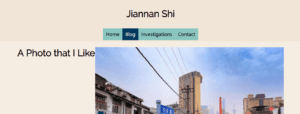
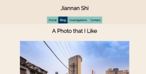
 No matter how I change the “text-align: center” of the title “a photo that I like,” or try to make the picture centered, I failed. Solution: I added another <div> dedicated for the title. And it finally looks like this: