Responce to Bruce Sterling – Demi Mishiev

Short History of the Internet provides detailed summary of, well, internet history.

It is interesting to see, how far we have advanced since 1993, the year the article was posted. It makes one wonder, what would the “fathers” of internet think about their creation today. Would they be proud? What would be their stance on net neutrality?

One interesting fact the article didn’t cover is US interest into developing ARPANET was the lead USSR made with the launch of the Sputnik. Once again, competition makes the world a better place for all of us, sometimes.

In 1993, Bruce Sterling, the author of Short History of the Internet, said, that no one own English, so according to this statement  no one could own the internet. However, Internet initial purpose to educate and bring people “closer” nowadays is seen as a way to control the population.

The initial anarchy and lawlessness allowed some organisations and institution to gaining way too much power. Media basically controls the population. Inability to proof check led Twitter to being one of the most influential platforms on internet.

While it is great to have some freedom of speech, government institutions see it as a threat, which lead US to losing the net neutrality in 2018, China being censored and Russia about to lose neutrality and get censored.

While reading the article I realised how far we have advanced and how much we are about to lose. People do not pay enough attention to what happens in their countries, which leads to global domino effect.
Response to Scott McCloud – Demi Mishiev

Scott McClouds’s Understanding Comics is an essential piece of reading for anyone interested in art or art making. It provides just enough information about the history of comics and what comics actually are.Through analysis of ancient manuscripts and wall paintings we, as readers, are explained what happened to comics that gave it the reputation it has today.

As someone who grew up reading comics, bought from the saved lunch money, I was fascinated to learn something new about the art I adore.

One of the interesting question for me was, what is the difference between the movie/ animation and comics. Both of them are representation of the sequential art. The answer was quite simple, yet, I have never looked at either this way. Time and space. Time helps the movie/ animation to progress, while space does the same for comics. Each frame can be a representation of the second or a decade, depending on the authors/ artists idea.

Scott also tries to educate reader about different comics styles. The classic left to right format is something we all used, yet, japanese comics, known as manga utilises different format. Ancient egyptian writings used to be read from bottom left, zig-zac, to top right.

Most of concepts and ideas in the book are familiar to me, yet Scott manages to present the information in a really interesting format, comics, which makes reading so much more simpler and entertaining.

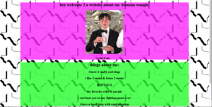
My Website with CSS: (Thomas Waugh)

http://imanas.shanghai.nyu.edu/~tsw298/week3/my-website-with-style/about-me.html

For my new version of the website about me, I added some of my favorite colors for style. I also wanted to add a background of Texas, my beloved homeland, for flair. I also made the boxes of color opaque so you could see the outline of my country better. This was very helpful for me to learn CSS and I now feel much more comfortable manipulating the style of an HTML website.

Steve Self Intro Website

link: http//imanas.shanghai.nyu.edu/~ds5665/week3/selfintro.html

This time I started with two individual websites that I made. One was all the contents of my self intro and another was the optimized (lol) css exercise. The goal was to combine these two websites together.

But I soon realized that the major problem was that the original design of the content website which was each page has a link towards the next, which was rather like a slide rather than a website. This design cannot fit into the design of the css exercise which was one home page and several branches.so I decided to alter my organization of the contents while adding more information about me (i.e. more pictures and descriptions) as it contained little of them.

For the bar on the left, I made it as a out side link bar. So I abandoned the “position: sticky” of it in css. But one thing that needed to be found out is that why the navi-box end up in the middle of the page rather than being at the near top after I put the pictures in the content boxes. I tried “position: absolute; top: 80px;right: 0;” but the box ended up overlapping with the pictures.

And for the content box, I tried to add some hover overlays on it but my trails were all unsuccessful. I tried “hover: size: 200%” but the picture remained unchanged, maybe there wasn’t such code. So I ended up just putting the pictures in the boxes.

Also, there was problems in my branch pages. I added a background color of the photo description, but it was too wide. I tried to add “width=…” but when I did the background color disappeared for some reason. So I have to leave it there.

at last, rather than having a css file for every branch pages i simply did the css

in the html using <style>.


Week3-My new website-Clover

http://imanas.shanghai.nyu.edu/~cl4690/week3-css-clover/index.html

First, I would like to add some pictures on it. Then I adjust each position to make it look nice. Then I found I am interested in the icons, so I add icons on my page. Then I change the icons’ position and it’s background color. Then I tried to add another link to it but I failed. Hope to mix it in the future.