Project Link: http://imanas.shanghai.nyu.edu/~lag614/interactive-comic/index.html
The Project Overview
The project that we created was central to the very core of our topic: communications. Everything that we did for this interactive comic related in one way or another to the concept of communication.
The premise of our story was integral to actually trying to highlight that there is the potential for nature and the technological world to co-exist. Quite often technology is depicted as an impediment or encroachment upon our lives in a negative sense. People are told that they do not appreciate the natural beauty of the world because they become consumed in the task of viewing it through the lens of a camera (or some other digital form). We are often forced into a position to make a choice between enjoying the natural world and continuing with our pursuance of technology. We found that in actuality, there is no reason why these two elements cannot co-exist. Instead of placing them as extremes, or the antithesis of one another, we can find balance between them. Our interactive comic therefore wanted to express this conclusion.
Our story follows Ivy, a name that I chose as a representation of nature, likened to plant which shares the same name. Ivy is a social media influencer who lives in a big city. Her daily life is central to using social media (instagram) as a way to promote travel destinations for people. However, upon watching a Netflix documentary on “Planet Earth” (Laila’s fantastic idea) she begins to fear that she is missing an actual connection with nature. That she is simply living her life through the lens of a screen. She decides to venture to three destinations. The Great Barrier Reef, Amazon Rainforest and the Sahara Desert as she continues her search for a reconnection with nature.
At each of these places she engages in activities to make her experience memorable such as swimming with turtles, riding camels or hiking through the forest. She uses her journal as a tool of reflection and writes it from a first person perspective.
Upon returning, she realizes that she doesn’t need to make a choice between technology and nature. Both can coexist harmoniously even in her life in the bustling city of New York.
Every part of our presentation has specific meaning
Graphics
We deliberately chose to keep the graphics very simplistic at the beginning of the piece. Laila created beautiful minimalistic drawings that showcased perfectly the emotions and storyline we wished to execute. As the piece progresses, the graphics become much greater not only in terms of resolution but of quality, detail and colour. I wished to showcase the individual progression of the protagonist as she regained the “colour” in her life that she was missing. It also symbolizes her enlightenment on her personal journey of self discovery and reconnection with nature. Therefore I used Photoshop in order to create the second half of the graphics with greater vitality to reflect the changing story.
I also included subtle watermarks within the Amazon Rainforest and the Sahara Desert. For the desert, it was a hand with sand slipping through and for the Amazon Rainforest it was the girls face concealed within the waterfall. I purposely put these into account for a deeper reflection. The sand slipping through sand symbolises the missed opportunities of not engaging with nature but also emphasizes the need to really connect with nature in the moment. This is demonstrative of the sands inability to be held definitely, emphasizing the importance of capturing the moment as it plays in real time.
The face in the waterfall is demonstrative of being refreshed, rejuvenated, and replenished quite literally with the freshness of the water. It provides both a deep connection to nature and the capacity for continual renewal. So that someone who feels like they have missed an opportunity is reminded that it is never too late to make a change.
Title Changing
I created the title button with the assistance of Professor Leon in office hours. I originally had created it with just a button and then a hover effect but we simplified it even further and made the title shake.
For the changing effect I used:
onmouseover=”mouseOverHeadline()”
onmouseout=”mouseOutOfHeadline()”>
Ivy
And also a setTimeout, “block” and “none” display in Javascript
After this we put in a time delay and allowed the “begin” button to appear. This was a simple effect that had a powerful effect. The title of the story and its continually changing nature provides the reader with a sense of uncertainty as to the direction of the story.
For the button we used: <button onclick= “hidebegin()”; id=”Begin”>Begin</button>
Difficulties faced
- Making the background images and button disappear after clicking next.
-
-
- This didn’t actually end up being too much of a hard task to fix but it was working out the right codes to use in order to make this change.
-
- Aligning the images and the text
-
-
- This was slightly difficult because we had to remember that anything written up the top of the code overrides what is written down the bottom. Often we had lines of code pertaining to margins but when we wrote the “auto” setting, it ended up clashing with previously written code and didn’t work.
- Despite working hard to try and correct this, Laila was able to fix up what exactly we needed to change. We played to our strengths on this one, Laila definitely has natural skill with coding and this was replicated through her ability to handle a lot of the coding. My skill set was seen more so in the creation, captioning, documentation and photoshop of the project. Whilst I did contribute to the coding, Laila definitely flourished in this area.
-
- Captioning for the Comic
-
- I wrote the captioning for the comic and during this time I really had to think about the best way to communicate the story whilst also the plot interesting and clear. I made a few revisions but decided upon using a journal style in order to create a personal connection to the story and also to re-emphasize the communications aspect of the task.
Reflections at the end
Whilst the project may seem that it is simplistic graphically, it is anything but. The complexity is formed within the hidden and concealed messages that each graphic presents. Whether it be a simple transition from basic image to an image of nature in full color, or the hidden elements in the pictures there is always the potential to learn more as you examine every frame.
I was really proud of how the story and the comic turned out. Although the process was fiddly in regards to changing certain aspects of the code to move certain elements it was certainly rewarding.
Considering this was my first experience with coding, content creation and design I am really proud of how it turned out. Whilst it may not be the masterpiece, I, as a perfectionist set out to achieve it exceeded all my expectations and I look back with so much joy on what we created. I look forward to developing my skills in these areas on the next projects!
I enjoyed working with Laila to create a project that we are both very proud of. Laila was a fantastic partner and is a very talented person. I really hope that we get the opportunity to work together in the future. This experience taught me so much but working with Laila also enabled me to develop my skills so much further.

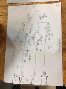
 (Blurring out the endings to avoid spoilers)