link: http://imanas.shanghai.nyu.edu/~jc8017/Project3/start.html
Comic-project-Clover
http://imanas.shanghai.nyu.edu/~cl4690/Commlab%20Project/index.html
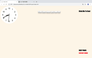
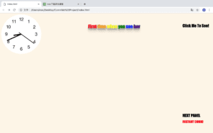
I got the idea of the project from myself. When I was in high school I was once bulled by the other so I come to this idea. To make the whole comic more simple, I create the girl with scar on her face which is a character that often appear in this kind of event.Also, I don’t want the audience to see the pictures at first, so only by clicking the button “click to see”. Because the whole thing happen in school, I want to make the website more similar to the classroom, so I add a clock which can be seen in each classroom. I search how to make a clock on the website. I first made the border of the clock, then I set the position of the minute, second and hour. During this, I learned the z-index. It is a property specifies the stack order of an element. It makes an element with greater stack order is always in front of an element with a lower stack order. Then I learned the @keyframes rule which specifies the animation code. Using this, the animation is created by gradually changing from one set of CSS styles to another. Also, during the animation, I can change it many times. I used this while also the rotate function to make the hand walk. However, I want to make the clock represent the current time, so I learned the date.get(); function which can get the exact time from the computer. I also want to make the text looks more colorful so I searched the 3D effect of text
.
I draw all the pictures by hand then I scan them and put them on the website. However, I don’t have much time to do more.
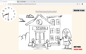
By clicking on the click to see button, the picture will appear. Then you can change the picture to see the next one.
I added another effect on the second sentence. The word will become colorful when you put your mouse on it.
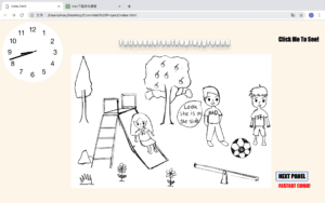
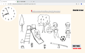
Then I tried another effect on the third sentence. If you put your mouse on the sentence it will have effect like 3D.
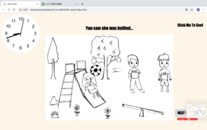
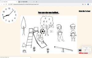
In this slide I created two button that the readers can make choice here. Also, I added a sound effect here, to stress the disappointment of the girl.
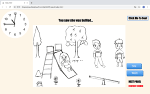
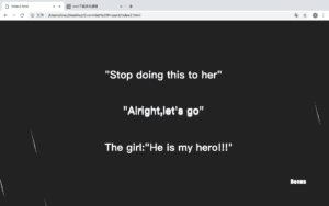
If you choose to help the girl, then a website will appear. I planed to add hand draw picture here however I don’ t have much time so I used some word that have 3-D effect. Then I added a moving background which looks like a meteor show on a Korean TV show to make it looks more romantic.
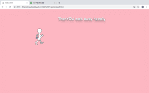
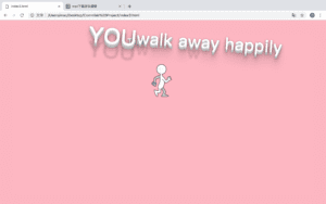
Then it comes to the happy ending of the comic. I want to make it looks more funny and make it represent the happiness and proud of the character so I made an animation here. To stress the happiness, I also made a text effect of the word, so that if you put your mouse on it, it will move.
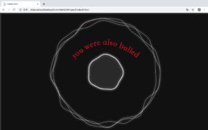
I created another ending for this story, if you just stand-by and watch, you will also be bullied. I chose this background while it’s floating and it looks scary and uncomfortable and it just looks like a ghost is floating. I also made the word in red to make it looks uncomfortable. I made it like this because I hope if students meet this kind of thing they will help their friends but not just stand-by.
I learned some of the code from w3school and Codepen.
Comic Project – Julia Riguerra
URL: http://imanas.shanghai.nyu.edu/~yz4970/week5/start/startpage.html
For the interactive comic project, Jannie and I split the work by dividing the web design and the artistic components. I worked on the art while Jannie worked on the coding.
To create the comic, I knew I wanted to use my artistic skills and familiarity with Photoshop, which I have previously used to draw recreationally. I initially wanted to take preexisting photos and draw on top of them, though this proved to be difficult when taking photos off of Google, since the resolution and size were quite poor. I did attempt this in three of the panels I drew:

Drawing the dog to scale proved to be very difficult, so I decided to simply draw the panels completely by hand, and included real photos within the panel:

This made the aesthetic seem more akin to a real comic, so I stuck with this method because it was easier and quicker. I also learned how to create gifs in Photoshop, which was a lot simpler than I originally thought it to be:

Another thing to note is how time-consuming art can be, and I often underestimated how long each panel would take to draw, which affected my time management. I spent most of my time since this project was assigned drawing, yet I still feel like I did not make enough panels. As such, I was not able to help Jannie with the coding aspect because of how time-consuming both aspects of this project are. It is also difficult to collaborate on a coding project remotely, and we were not able to meet up very often due to conflicting schedules. Nevertheless, I was able to learn a lot about content creation through this project as well as interactivity, even though I was not directly involved in the programming part of the project so much as the content.
week5–Comics Project Documentation Jialu
http://imanas.shanghai.nyu.edu/~jc8017/Project3/start.html
After decided that we are going to make a room escape game, the first thing we did was designing our plot. At first, we made the plot quite complicated, but latter we realized that the coding would be too advanced for me and Steve and the work load would be incredibly huge. So, we simplified the plot a little bit without altering the essence of the whole game.
Then we used photoshop to make the background of our game room. At first, we wanted to just use the 4 walls of the group study room in the school library as our background. But after seeing the photo we took of the group study room, we decided not to use the whole wall, instead we just cropped out some elements we need (posters, dB machine, door, windows etc.) and abandoned the rest of the things. We tried to find a nice picture of wall on the Internet but failed, so we just drew a wall by ourselves and put all the elements on the wall we drew.
We decided to put every element in one picture since it is more complicated to move a picture around over another picture. Other than that, we didn’t encounter much difficulties when coding. Justin is really good at coding, so most of the time I just sat beside him and watch how he coded. I think that’s also a great way of learning and I learned a lot from him and Steve.
Comic Project: Documentation – Jiannan Shi
Title: Let’s Help Sima Guang!
Link: http://imanas.shanghai.nyu.edu/~js9686/Interactive-Comics/index.html
Process:
In the beginning, Val and I were too ambitious about what we could do, and we have even imagined how easy the code could be when we were designing the storyboard. However, when it comes to the actual coding part, I was shocked that I’d encounter so many problems.
Inspired from traditional Chinese story Sima Guang Smashes the Vat, I propose that it is a good idea to make that linear story into an interactive one. The audience may choose different options at different scenarios, and each choice will lead to different destination of the comics. This is the storyboard that we designed for our project:
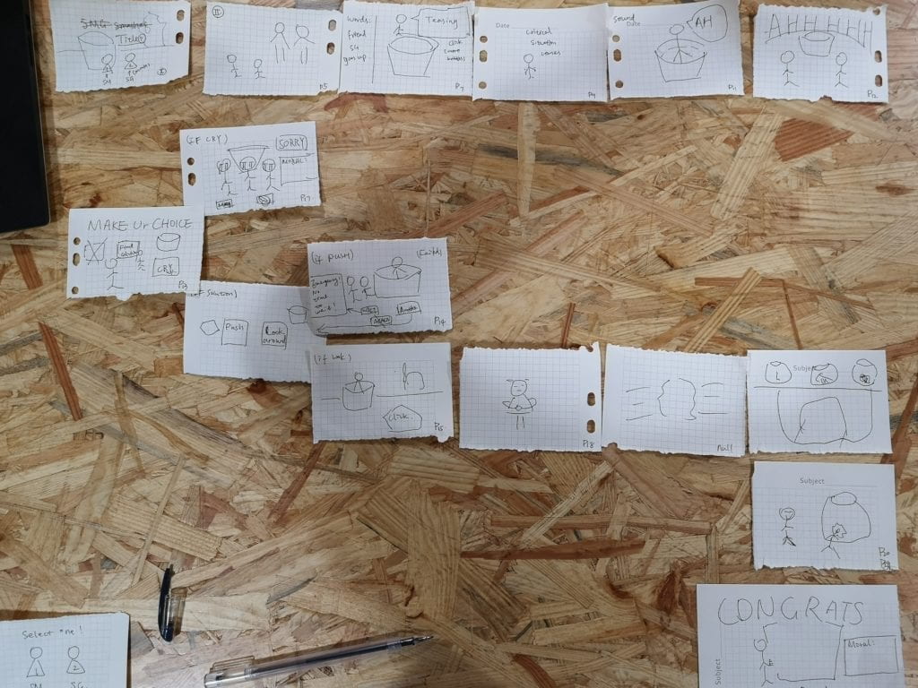
After discussion, we want to include the interactive elements in the following way:
- scroll the window to progress the plot;
- click the button to make choices;
- drag the stone to smash the vat;
- a short animation about the vat that is being smashed.
Our expectations on the assets:
- utilizing the theories learned in Understanding Comics to exaggerate emotions, and to prolong time span when necessary;
- modify the existing comics, drag elements that we need to plot them in a new way;
- draw scenes that we deem are necessary.
Then, I started arranging the first several scenes including coding and drawing assets.
I exploited and modified some of the images to my purpose of describing things. Examples are as followed:
 to
to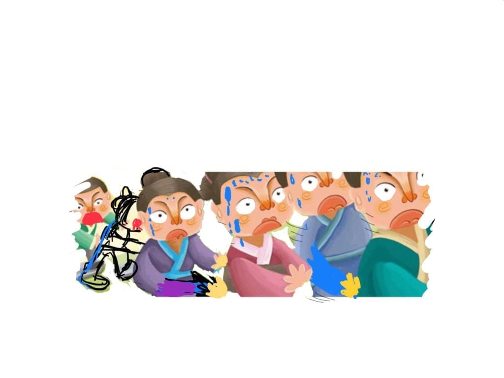
 +
+
into 
 into
into

Problems and solution:
- syntax errors
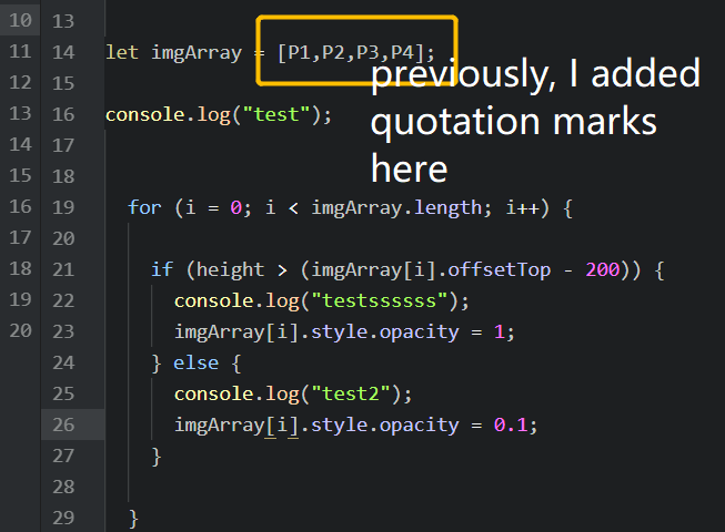
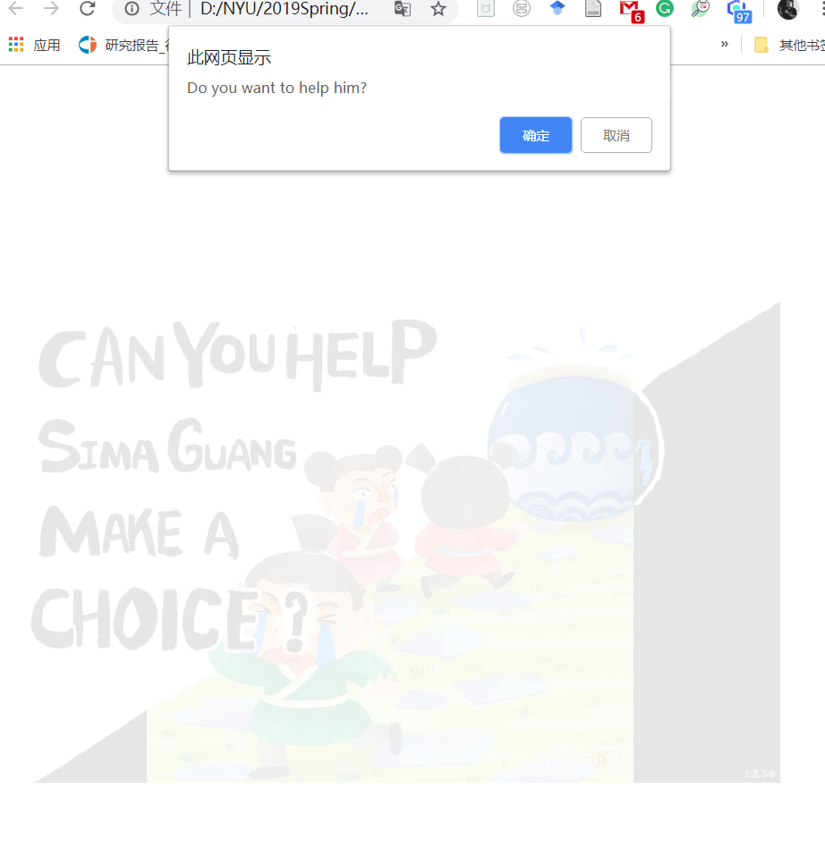 The confirm alert pops up before the opacity of the image turns to 1. I realized that the reason why it happens is that I only calculated how much pixels I need to trigger the confirm, but I ignored the fact that the size of the window may change, and pixels varies from size to size. To solve this, I changed the pixel numbers into the difference value with regards to the HTML element height and width.
How did I get the element value?
With the help from Leon, Miki, and Dave, I used the syntax getBoundingClientRect(); to get all the data shown in the rectangular of the element.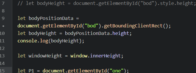
Takeaway:
- When checking bugs, punctuations are equally important as the overall logic of the code.
- When trying to utilize pixel values to do things, always consider that people may have different computers, browsers, window size, and amplification rate of the screen.
References used in this project:
- source of the original linear comics. https://ac.qq.com/ComicView/index/id/533807/cid/4?fromPrev=1
- change the opacity while scrolling the page. http://ima.nyu.sh/documentation/2018/10/13/week-6-interactive-web-comics-sylvia-lee-chen/
- detect whether the scroll position is at the bottom of the page or not. https://techstacker.com/posts/gGyGTHysrPuuJnNBk/vanilla-javascript-detect-when-user-scrolled-to-the-bottom
- drag the stone and drop it onto the vat. https://www.w3schools.com/html/tryit.asp?filename=tryhtml5_draganddrop2
- how to add button on top of an image. https://www.w3schools.com/howto/howto_css_button_on_image.asp