Comic Project: Documentation – Madi Eberhardt

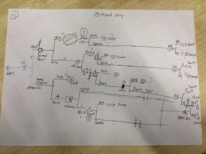
For our comic project, we wanted to do something very interactive and suspenseful by incorporating ways that the player could make their own decisions and navigate throughout the websites (comic) based on these decisions. First, we created the characters in our story through sketchpad and photoshop. We drew pretty much everything that appears in the comic (buttons, objects, and characters). Then made a detailed outline of the storyline of the comic and numbered the html pages so that we had an idea of what to do for the coding. This allowed us to code along with the outline so that we didn’t get confused with the pathways of each html page and correctly followed the story (as it gets more complicated as the story goes along).

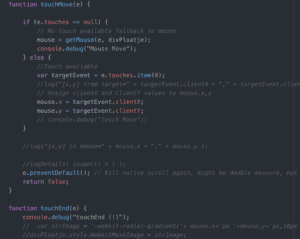
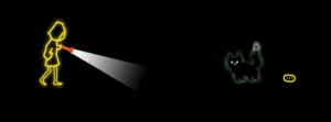
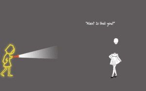
We ran into a lot of problems at the beginning of the project because our project required some coding we had never learned before. We wanted a flashlight affect with the cursor to read the text for our first page, so we needed to research this code (it involved functions with “getmouse” or “touch move”).

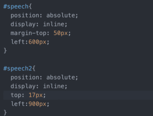
 Another aspect of coding the I learned was in CSS the position aspect of images. I kept having problems with it being “relative” and it messing with the animation of the image. I fixed this by changing it to “absolute” so the animation and position worked better with the entire page.

We also had a problem adding the music because it would play on loop instead of for a specific time. In order to fix this we had to change the javascript aspect of it by using “var x” and using a function to define the time. I learned a lot more about animation and CSS aspects of coding during the project, as our comic required a lot of it. I specifically learned more about how much the sizing and position of elements in CSS can affect the rest of the code a lot. Using the inspect tool really helped for this and helped me easily identify what to fix.


Response to Homecoming – Madi Eberhardt

After listening to “Homecoming,” it was really amazing how much the audio created a picture in my head of what was actually going on. It made you feel as if you were actually there in the moment. For example, the sound of the door opening in the beginning or her pen writing quietly while she was interviewing Walter Cruise. The background noise helped me to better understand the location and type of atmosphere she was in, like the cars on the street when she was talking to the agent. These type of noises made it very realistic. Also, by the audio literally tracking every sound to detail, it helped to better understand the emotion of the person talking (like the stressed breathing while she is talking to the agent).  

Although, at first I was very confused as to what was going on and had no idea where the story was going. It took a bit to get used to just the audio with no background information or pictures to help guide my thoughts as I listened. It got especially confusing when it switched from the interviews in the past to the present, as halfway through I finally realized what was going on. Overall, it was amazing how much the sound helped to build the story into something more than just voices or pictures. It gave the listener a very immersive experience into the scenes in which the story was taking them through every little sound made.

Comic Book Project – Demi and Thomas

http://imanas.shanghai.nyu.edu/~tsw298/Comic-Project/index.html

Story:

We follow our fellow student, Abraiz, though his journey during his second semester at NYUSH. 

Our protagonist has an option to choose 1 out of 4 classes: Economics, Statistics, Erhu or Com.Lab. 

Each option leads to a different scenario. 

In the middle of the semester, Abraiz has to make a choice, study or go clubbing. 

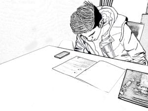
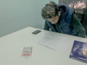
All of the pictures were made on the phone, then edited at Adobe Lightroom and later transformed into a comics with adobe photoshop and procreate. 

We tried to stay consistent with the style of the images, black and white, with the main focus on the protagonist. 

To give the project some “punch”, all of the text, text boxes and bubbles, are coloured, mainly in yellow and purple. 

 Comicbook 

 Original 

Comic Project (Thomas Waugh)

http://imanas.shanghai.nyu.edu/~tsw298/Comic-Project/index.html

For this project, Demi and I wanted to create a fictionalized NYU Shanghai experience of our friend Abraiz. There are different endings that come from making different choices throughout the comic so the reader can live the NYU Shanghai life vicariously through Abraiz.

For the code, I structured the comic into 5 Acts. The first is the introduction and class selection. The second, whether or not the class choice was wise. The third, the decision to go clubbing. The fourth, the fight cutscene resulting in Abraiz’s death if the player chooses to go to the club. The final act is the ending where Abraiz’s fate is revealed.

To load the images for this, I made Arrays for each Act and each choice and defined the image locations in there. For the choices, I made four buttons, each which call a function, button1() for example. I had if statements in each of the button functions which checked which act we were in so I could add multi-functionality to each of the buttons.

All in all, I had a really great time working on this project and I’m looking forward to working on the next one.

Comic Project: Documentation – Jannie Z

Link: http://imanas.shanghai.nyu.edu/~yz4970/week5/start/startpage.html

Me and Julia collaborated to finish this project and it turns out really great.

Ideas/Storyline:

We thought of a dog get lost in metro station. And has to find his way home. Then we think it would be cool if we use this to take the reader around Shanghai, showing them different beautiful places in Shanghai.

Photoshop:

Julia did most part of photoshop. She drew our dog: Bonnie and use photoshop to put it onto the picture. She used a tablet to draw a cute dog. And also used photoshop to do collage of pictures. And I suggest doing some animations. She also did it with photoshop. She made a few gifs so that i could use them very easily and conveniently. 

I provided a lot of photos that I took during my year in Shanghai. Based on that she created a lot of beautiful pictures.
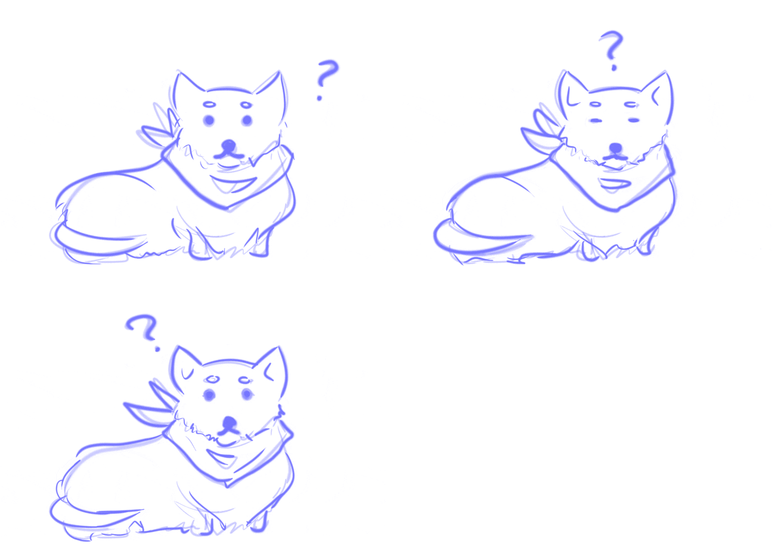
gif

(gif for our dog)

collage

(collage of pictures)

Coding & Web Design:

Format:

I did the coding and web design part. First I created a starting page, which is like a book cover. And I used prompt to start this story.

I actually put everything on the page. I hide most of them. But by clicking different buttons, different divs will show.  I used the function “display:block” and “display:none”.

display code

(display functions)

Thinking of interactive, I thought of choices and different storyline based on the choices. So I offered two routes: Pudong and Puxi. By clicking different buttons, the readers entered different functions.
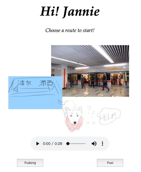
two routes

(two routes)

And under different routes, I offered different stations based on the panels we have. (Actually they are all the places I have been to because I took all the pictures. So it iseasy to make.) I did this using checkbok, which I just love.
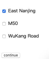
checkbox

(checkbox)

After viewing different places, two routes will go to the same ending, which saves a lot of work for me because I only have to do one function.


Design:

I thought it would be cool if we could add audios to the webpage to make the readers feel real, like some dog barks and metro station sounds. So I found some online and add it to my page.
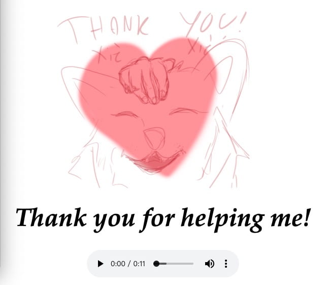
audio

(audio)

Animations:

Inspired by some exercises we did in class, I thought it would be cool if we could actually do some animations. And Julia did this using photoshop, which is very cute.

Problems:

Prompt:

I first have problems with prompt. It always pop up twice. Then I asked Leon and found out why. I used the function prompt twice. And everytime Javascript reads it, it will pop up a window.

Audio:

I wanted the audio to be autoplay originally. So that it feels more real. But I just couldn’t get it played. And after asking for help I learned that the browser actually won’t allow autoplay videos or audios to prevent opening a webpage and couldn’t find the source of the audio. So I add control to the audio. (which is very sad) And it worked.

Logic:

I had the biggest problem when reading the checkbox’s values. Because the function which shows the Puxi content will only be summoned once when you click it. And checking the values needs to come after that. Then different values result different display for the next part. I couldn’t read the values at first because I put the variables in the Puxi function. so it only happens once. So it always shows errors saying that cannot read the value of “null” or “undefined”. I worked with it for a long time and at last I found the solutions. I put these variables in the next functions. And then it worked.
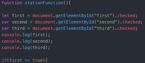
logic problem

(solved the problem)

What I Learned: 

I learned drawing and doing photoshop is such a hard work and requires a lot of time. Also, audios and videos cannot be autoplayed on webpage with sounds on.  And I became more familiar with javascript.

Future Development if Possible:

If I have more time, I would work on the design of the page more. The design we have now is quite simple and doesn’t really feels like comics. I would use more css to make the page look more fruitful and colorful.

Also, I would enrich the interactions. I wanted to do something like if you move the mouse a thing, some interactions will happen. But unfortunately, I didn’t have enough time for this. If I’m going to future develop this page I would definitely do that.