Comic Project: Documentation – Val Abbene

URL: http://imanas.shanghai.nyu.edu/~js9686/Interactive-Comics/index.html

For our interactive comic project, Nan and I collaborated to recreate the traditional Chinese fable of Sima Guang Smashes the Vat. Nan took the lead in coding for this website, while I mainly created the comic images in Photoshop. 
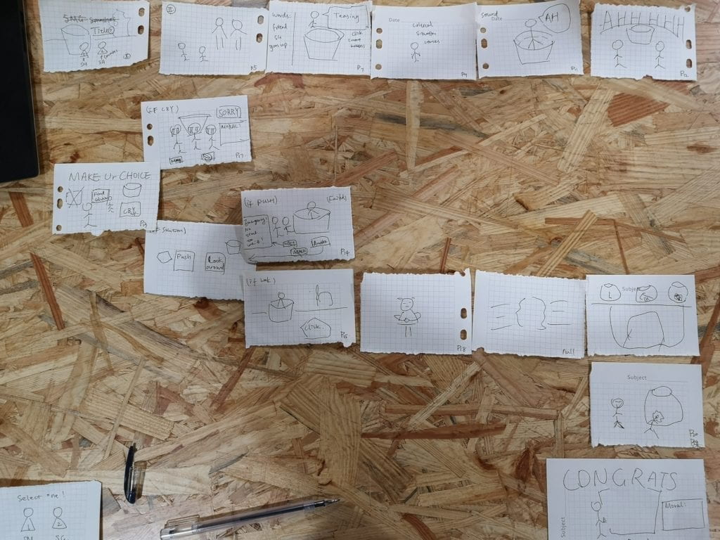
Although the original story of Sima Guang Smashes the Vat is quite simplistic and linear, Nan and I wanted to expand the storyline by allowing the user to make choices that impacted the direction of the story. The canonical ending of the fable is that Sima succeeds in saving his friend by thinking clearly and reacting to the critical situation calmly. Building off of this we created other potential endings to represent what could have happened if Sima had not been so wise, and panicked instead of remaining calm. At first, Nan and I had high expectations for what we would realistically be able to code and design within the time that we had, but upon completing the project, we realized that the coding and image manipulation was a lot more demanding than we originally thought.

For the comic creation, Nan had found an existing comic online drawn and created by a Chinese artist. (Link: https://ac.qq.com/ComicView/index/id/533807/cid/4?fromPrev=1). We used these images as the foundation for our own comic and used methods of image manipulation in Photoshop to restructure the comic, create our new endings, and aesthetically design the panels. I have a few years of experience with Photoshop and an interest in art, so it felt natural for me to take the lead in image manipulation. My intent was to transform the original images by using the magnetic lasso tool and magic wand tool for masking, the brush tools to draw text bubbles and backgrounds, and the image adjustments feature to edit aspects of color. Most of the edits that I made were kept on separate layers to organize the images and make each element easily accessible. I also rented a drawing tablet from the IMA equipment room to hand draw the text, text bubbles, and design elements (backgrounds, accents, minor drawings). Some challenges that I faced while editing was deciding on an aesthetic theme for our project. I wanted to choose something that matched the style of the original artwork, while also making the comic more surreal and abstract. Here are some before and after images from my Photoshop process.

I particularly like how this panel turned out because it added a whimsical and comedic tone to our comic. I had sourced the images of the dog, flower pot, bicycle, rocket ship, and stone from Google and adjusted their color to fit our comic. I wanted to include some colorful and absurd objects to make the choice obvious that Sima would need to use the rock to break open the vat. Originally, we wanted this panel to be interactive, allowing the user to click on each object and programming the website to respond with unique dialogue for each item. We struggled a bit with the code for this section, so Nan innovated a new interactive function that prompted the user to drag the image of the stone onto the vat to progress the story.

Due to the limitations of my coding proficiency, there were some obstacles that I encountered during asset creation in Photoshop. Originally, I had hand-drawn stylized buttons for our comic, but I could not figure out how to incorporate them into our code, so the idea was scrapped. Also I had wanted to use the CSS button feature to transition from panels without text to panels with text bubbles, but I struggled for hours with the CSS code again. I could not figure out how to get the buttons to be positioned on top of the image and I ran into many issues with debugging the code that I wrote. The time-consuming nature of art and content creation also limited the time that I could dedicate to the code. I underestimated how demanding it would be to Photoshop fourteen scenes in a week, but it was very rewarding to take creative control of the comic and put my photoshop skills to use.

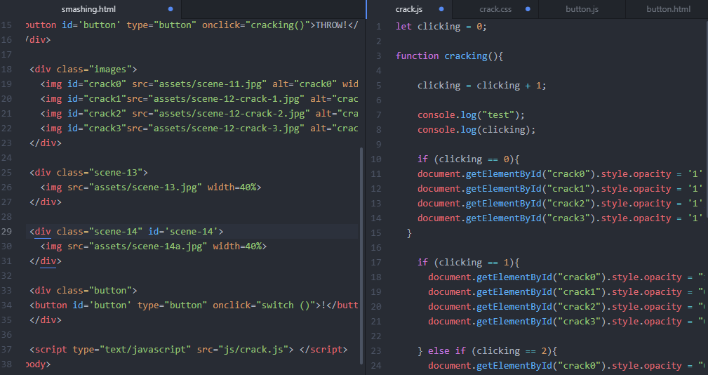
As I mentioned earlier, Nan was the driving force for the code of our website, so he worked on the code as a whole while I provided small pieces at the end for him to add. I would say that my biggest achievement in the coding process of this project was successfully implementing a function that changed the opacity of one comic strip as you clicked the button. I struggled for hours over the code for this function, mainly within CSS because I had so many elements cancelling each other out. I defined a new function in Java Script and then used else, if statements to control the opacity in increments.
If I was to repeat this project knowing what I do now, I would have planned my time better by starting the Photoshop creative process earlier so that I could have experimented more with the code. For future projects, I would like to solve more problems on the coding end so that I can strengthen my knowledge of the concepts that we have learned in class and improve my Atom skills. Overall, I am very happy with how this project came out and glad that I had the opportunity to collaborate with Nan to produce something we are both proud of.

(Sorry for submitting this report late, I had 4 deadlines/assignments due Monday and Tuesday & had stayed up all night on Sunday to finish this project, so I had felt overworked)

Responding to Homecoming—Jamie (Ziying Wang)

This is the first time I’ve listened to a podcast that tells a story in the way films display their stories. I’m intrigued by the layout of this story. Instead of telling the story in time order, it divides the story into 6 scenes (not including the intro and the outro) and allows the listener to deduct the storyline through listening to real life conversation simulation. 

The podcast starts with deep and dark classical music, it creates the overall atmosphere for the story, letting the listeners know that the story is a little bit heavy.

Then the first screen starts with a siren, and the protagonist, the woman starts her recording. The podcast was unlike other recordings which present their listeners with clear voices, instead, it tries to return to the original scene by adding noises simulating real-life noises into the audio.

Similar techniques are also used in the second scene where the woman was interviewed by an official from the Department of Defense in a restaurant. We didn’t know directly that the woman works there but we can deduct her current occupation when a waiter tells her that her break time is over. Also in the fourth scene when the woman called her boss the signal was poor and the voice kept breaking and blurring. The language used by her boss was rude but can reflect his haste.

I’m attracted by the sudden stop in the audio when switching between scenes. It indicates clearly that this scene is finished and pulls the minds of the listeners’ back if they slipped away.

The sixth scene was the conversation the woman had with the official, she was asked if she remembered a former soldier, Walter Cruise. In previous scenes, Walter appeared multiple times as part of the woman’s memory, but here, the woman kept silent for a while and finally denied their acquaintance. This leaves suspense for the audience whether the woman actually forgot about Walter or if she’s hiding it from the official. The pause before her denial is something that is left as a blank for the audience to fill in.

Overall, it’s a great entertainment way and the audio settings present this story amazingly.

Podcast Assignment (Thomas Waugh)

I listened to “The Alibi.” What I noticed most while listening is how the background track is mixed in with the main dialogue to add atmosphere and to make the audio more lively. It also has the added effect of making the podcast more interesting and engaging to the listener because it accompanies the droning voice of the speaker in a good way. The underlaying of B-Roll audio before it comes in makes the transition because audio sources less abrupt and less funky. Another important aspect of the podcast is the production of the speaker’s voice. There is no background noise when she is speaking and the room is probably padded and soundproof because there is no reverb on her voice. When she uses samples from the voices of other people, there is a clear distinction between their voice and theirs. The other voices clearly sound as if they are speaking through a telephone, complete with static and distortion as to not mix up the dialogue of the main speaker and the dialogue of the person being sampled. 

Response to “On the Rights of Molotov Man” – Julia Riguerra

“On the Rights of Molotov Man” by Jonathan Lethem confronts issues of plagiarism and reproduction in art and media, as it is now easier than ever to reproduce an image to suit one’s purposes. What I found most striking about the article was Susan Meiselas’ response to Joy Garnett’s appropriation of her photograph, because Meiselas chose to highlight not her photography as the main issue, but the appropriation of the subject, Pablo Arauz. Taking context away from art is often the essence of reproduction, and it is unfortunate that people viewing Garnett’s painting of Arauz or the many reproductions of the original photograph will not know who Arauz is or his role as a Nicaraguan revolutionary. Art is often built upon taking ideas from other sources, though the literal translation of Meiselas’ photograph into a painting by Garnett is almost exploitative. After all, no one can own Arauz’s actions or his experiences but himself.

Response to Homecoming – Taylah Bland

I really haven’t listened to many podcasts before and I must say I was very impressed with how detailed, informative and captivating Homecoming was. I would love to continue the series and didn’t realize that quite often we don’t need the visuals to understand whats happening in the story. In many ways, the usage of sound can be more effective as it attunes your senses to heighten their sensitivity to whats happening. 


I especially liked how sound was manipulated so that even though I wasn’t actually seeing what was going on, I felt as though I had insight and perspective into the surroundings. Special attention was directed to elements such as doors opening and closing, bells chiming or tape recorders clicking on and off as well as signal markers to orientate the listener to be able to immerse themselves in the story. 


When speaking to someone on the phone, the background would muffle to transition between both speakers in the foreground and background and I thought that this was a very subtle but extremely effective approach to communicating this message. Even when Heidi was having a conversation, the voice in the distance informing her that her break was almost over sounded distant, as if the two people in the ‘shot’ were isolated and secluded. 


In creative writing, we are often told “Show, don’t tell”. This can be difficult to do when you physically can’t see whats happening but the sound and voice queues employed by the producers definitely put me in a position where I was able to see what was happening without being told by the characters what was happening. 


In listening to Homecoming, I realized the importance of having very clear sound that clearly articulates what is being said. Without clear dialogue the audience is not able to situate themselves in the story and some meanings can be lost. 


Transitions are also important in changing “scenes” as its important to reinforce to the audience the context they are operating in. Homecoming employed a very clear “Woosh” type sound that was held for an extra beat that signaled the scene change. It was very deliberate. Just like all of the decisions made in the production of Homecoming which rendered it a successful podcast, in my opinion.