Final Project (Net Art) Reflection – Jiannan (Nan) Shi

Project Reflection

Link: http://imanas.shanghai.nyu.edu/~js9686/net-art/index.html

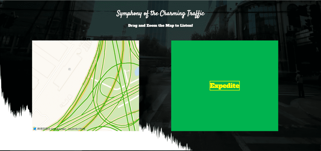
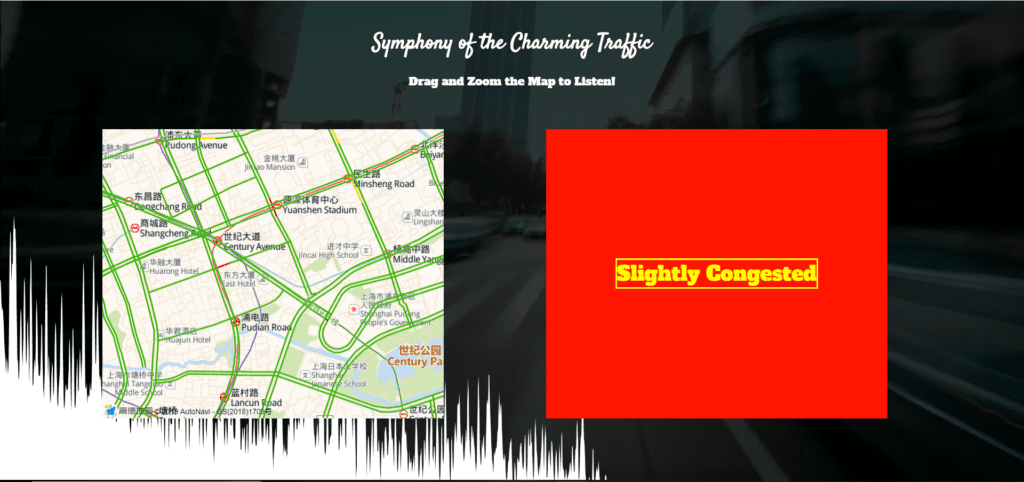
My net art project, Traffic Symphony, presents the traffic status of 40 cities in China in an audio-visual form with API from Gaode map. On the interface of this website. there are two squares in parallel with each other. The one on the left is a map where the user can zoom or drag to locate the portion that he or she wants to see and listen. The one on the right can visualize the traffic status using colors and phrases (green-expedite; red-slightly congested; dark red-congested). When the traffic is expedited, the background sound would be full of cars passing by. When the traffic shows congestion, there would be horns and whistles from the police. The frequency of horns would reflect how congested it is on the road. Meanwhile, there is a layer that is behind the two squares visualizing the traffic sound. The main background is video clips from the traffic.
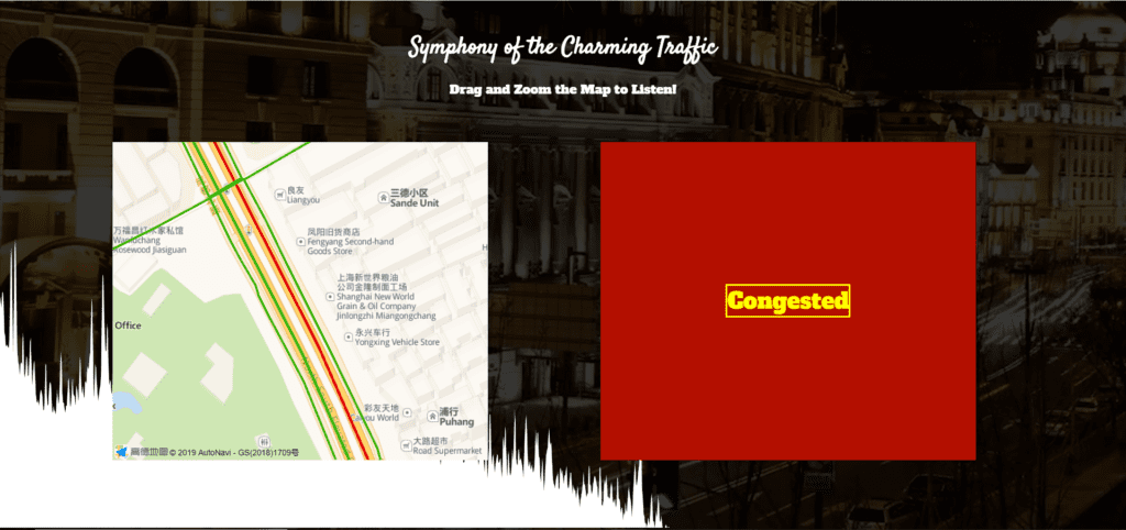
congested-red
congested status
slightly-congested
slightly congested status
expedite-statues
expedite status

Also, if one moves the map into a place or scale that I couldn’t get information from the API, the square on the right would say “unknown.”
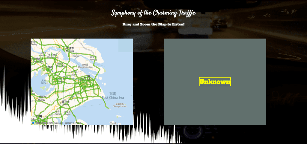
unknown-status
unknown status

Since I want to use API, I get information from Gaode to see if there are any tutorials that I can follow. However, I only get instructions on how to call the functions using the phrases that they provide. Then I tried by myself to see how to retrieve data from Gaode. This was my first attempt:
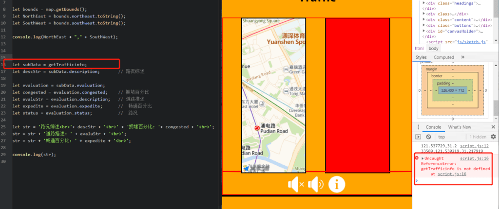
JSON-needed
JSON needed

After I put the map on the website, I found that I could not get any data. After a reference to these projects (https://blog.csdn.net/theArcticOcean/article/details/68950692; getBounds: https://lbs.amap.com/api/javascript-api/example/map/map-bounds), I knew that I need to use JSON here, and I revised my code accordingly:
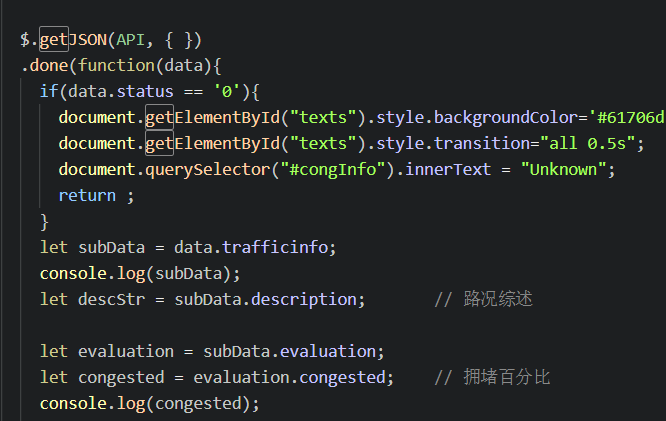
How-I-use-JSON
JSON

Since my intention is to change the beats according to the traffic status, I tried to use setInterval(“playSomething(), frequency”) to achieve it, and I put the frequency in a format like this in every traffic status:
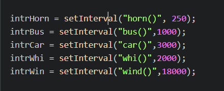
wrong
it’s wrong

But then I found that if I do this, the functions wouldn’t stop no matter how the traffic status change. In other words, the functions wouldn’t stop after changing the frequency. Then, I tried “return” function, and if I use “return,” the webpage would make no sound. Finally, for the sake of convenience, I only declare frequencies inside each traffic status and created a new function out of the if statements using the frequency generated, and tried to use clearInterval().  However, the functions would still not stop when a new frequency is declared. This confused me for a long time until I met Leon. I realized that I need to declare the variables at the top of the page out of every other functions to let them refresh according to the frequency. I realized that a variable would only work within one function, and it would not be applicable to other functions. I need some global variables to let my functions run.

Then it comes the p5.js part that I want to use to visualize the sound (reference: https://p5js.org/examples/sound-frequency-spectrum.html). By referring to the sounds examples on p5.js reference, I found that the audio files could only be loaded within p5 otherwise nothing would be recognized. Therefore, I came up with an I idea that I could read all the sounds coming from the computer to be the source of sounds. However, I found that it is impossible. I later used the mic sounds instead. But, if the user plays with my project with an earphone, the sound visualization would be nothing. After consulting Leon, I know that I can declare all the things in the script.js (map, squares, audios) using one function and then run this function within p5. By doing so, I am able to load sound files within p5 without needing to use the microphone. In order to fill the p5 canvas to the full screen instead of creating one with certain pixels, I also referred to this example: https://p5js.org/reference/#/p5/windowResized.

Due to my limited sense of aesthetics, I didn’t realize how the colored square is distracting because my main point is to show the traffic symphony. If there’s anything to change if I could redo it, I would definitely redesign the layout of the page. In the future, I would play with the API more to see what it could offer, and extend the project without the limit of traffic. If I could read the land use arrangement (which I think I could), I would find other ways to make sounds. 
Comm Lab Final Project Reflections – Justin C

Link: https://github.com/320834/Poemsite

Design:

Phase the name of our project is a website that facilitates the creation of interactive poems and short stories. The user can create these poem templates which allows the user to create stories. These templates must have spaces or blanks in which create the interaction for other people. Other users can fill in those blanks to create different stories. Below is the process of creating a template.


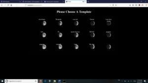
Once a template is created, the users can go to the template page to view the created templates. The user can select a template in order to fill out. Below is the design of the template page.

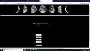
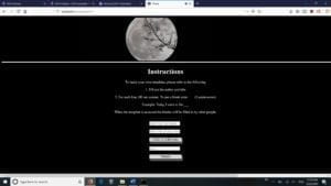
The user selects one of the templates by clicking on one of the moons. This will prompt them to another window in which they can fill out the blanks of the template. Below is an example if a user clicks on the puppy’s template.

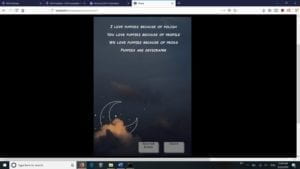
The user can choose from randomly generated words to create their stories. At the end, the poem is displayed, and the user can choose to publish it for everyone to see or delete it forever. Below is the result of filling the poem and the poem results appear.

Process:

            The creation of this website required for us to go beyond the standard html, css, and javascript format. Instead, in order to keep track of the templates made and the number of uploads, we needed a server to house the entries and templates. Therefore, the framework to we decided on is express and mongodb. Express will serve as a backend server that will handle the http request, while the mongodb will serve as our database for the entries. The plan went according to plan as we were able to successfully implement the server and the database to develop the website. The user can upload their templates to the database and each of the templates can be fetched by other users. 

            The issue we ran into was the problem of scalability. If thousands of poem templates or entries were created, how would the server handle the requests of fetching thousands of entries and templates. The time and the strain of the requests can be limited by the server. To resolve the issue, we made each poem template under 10 lines in order to limit the data transferred. The second is to use a database to store the templates and entries. Originally, we were going to store the entries and templates on a local file. However, the use of database will lower the cost of writing and finding documents.

            The other issue is how to deliver our message of wanting the users to create their stories online without any excessive instructions. We wanted our design to be as intuitive as possible and allow the users to understand on how to use the website. Thus, the design of our website is trying to reflect those goals. The introduction page is the first page the user sees in order to let them know the goal of the website. Then, the user is sent to options page were they can chose to either create a template, fill a template, or look at user generated poems. We hope the design was intuitive enough let the user know of our goal.

            Future:

            The project is considered a success. We were able to accomplish our goals. If we had more time, we would like to tweak the design more. The design could be better. Some of the elements based in pixels rather than percentages. Furthermore, we would like to add more options regarding the selection of the words. For example, we could implement a theme in which the user can choose a set of words.


Final Commlab Project Reflection (Thomas Waugh)

Design

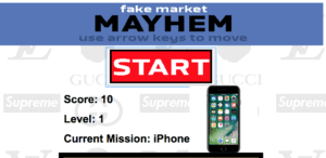
Fake Market Mayhem is a game based off of Pacman where you run around the Shanghai fake market collection items all the while running from desperate shop owners trying to scam you. Inspired by old-school game websites like Miniclip or Nitrome, the interface of the website is simple and is centered around the small box in the middle. The game is very difficult, as with each level a new enemy appears. The enemies, unlike the player, have the ability to teleport through walls while chasing the player. The player is always in search of one item at a time, which is showed not only on the game screen, but also above the game in a larger, more visible format. The background of the game is a collage of different designer brand logos whose fake counterparts are often available for purchase at the fake market. This project was inspired by a recent trip to the fake market where we were chased around by a couple of shop owners desperate for our business for about ten minutes. They knew all the shortcuts and secret passages which was the inspiration for the game design choice where the shop owners can pass through walls. When the player is caught by the shop owner, a real recording of a shop owner yelling about their products plays.

Process

This project was the hardest thing I’ve ever coded. It took so long to make and required me to learn some new kinds of coding. Primarily, I had to learn Object Oriented Programming in order to make the enemies work. Object Oriented Programming is something was something I had wanted to learn for a long time but never actually got around to sitting down and learning it. This project required me to use it and I feel like I really learned a lot through that. One of the most difficult things with it in this case was getting the tracking to work for the enemies towards the player and also changing the amount of enemies based on the level. I also struggled greatly with making the enemies reset when the game reset. Another thing I had to struggle with on this project was wall detecting. I had to figure out how to get the pixels in from of where the player was going and determine exactly what color they were in order to read where the walls were. Another obstacle I faced when making this project was the randomization of the items and making them appear in predetermined locations as well as determining when the player grabbed an item. Another huge thing I had to learn was CSS. Going into this project, I had somehow managed to have just about no knowledge of CSS and had to learn a bunch in order to make this page look good at different sizings.

Future

If I had more time, my project would be very different. I would have had walking animations and sprites for the players and the enemies and would have added a bunch of sound effects to it. One issue that I was unable to fix was the fact that when someone resizes the page after it loads, the game works at a different speed and needs to be reloaded at the new size. Also, as the critics said, the audio was very strange, unintelligible and inconsistent. If given more time, I would either make a theme song for it or just have a loop of ambient noise playing at all times. Another thing which the critics suggested was to add a goal — to give an ending to the game. In its current state, the game has no ending and becomes incredibly difficult very quickly. While I had hoped that this game would have a high skill level, I think the game is just too difficult and doesn’t reward the player enough. I do not think I would want to add an ending, but I might want to add some kind of global scoreboard for people to compete against each other.

Final Project Reflection – Julia Riguerra

For our final project, I had the idea of creating an interactive catcalling website because I felt that, with the JavaScript features we learned, catcalling would translate well into a web-based medium. Catcalling is a widespread form of street harassment that plagues metropolitan areas, though it is not uncommon in less urban areas as well. Catcalling is mostly done toward women by men, though there are cases of the reverse. 

  • Design

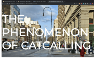
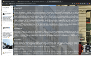
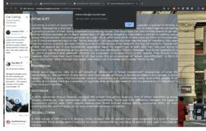
The project only features one page and contains information about catcalling, such as a definition, the prevalence among different countries, why it is important to bring attention to it, the effects it has on the individual and society, and resources for further reading. There is also an embedded Twitter feed of curated tweets concerning catcalling, including firsthand accounts by victims. The page is meant to be informative and the aim is to educate the reader on catcalling and street harassment.

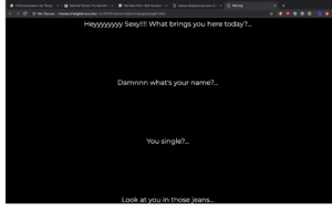
Another feature of the page is the interruptions, or the ways in which the webpage catcalls the user. Upon opening the webpage, the website wolf-whistles at you. This is what makes the website more effective:

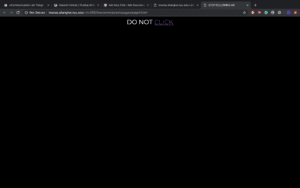
The reader is meant to be interrupted by this alert every five seconds, which is both annoying and persistent, reflecting the nature of catcalling in real life. Not only this, but we also placed misleading links that are meant to enhance the interactive catcalling aspect:


The link contained herein leads to a video about catcalling.

Once the viewer reaches the bottom of the page, a popup shows up containing a video featuring women telling their experiences of being catcalled.

  • Process

We began by compiling the information we would feature on the website. This process was simple enough due to the plethora of information and accounts on catcalling on the Internet. We wanted to make the layout simple and streamlined, but also aesthetically pleasing. We split the work between the two of us such that I would handle CSS and styling while Taylah handled the JavaScript interactions.

I believe the components of the project all worked well together, namely design and user interaction, though due to time constraints I feel that the page is rather simplistic and could use more interactions or visuals rather than just text on a page. While doing this project, I learned how to implement Twitter feeds using Twitter’s TweetDeck functions, which allow a user to compile tweets into collections that could then be translated into source code to feature on websites. I was also able to strengthen my CSS skills through this project. 

  • Future
    Taking into account criticism from the class and critics, if we had more time I would’ve liked to create visuals on my own rather than sourcing them from the Internet. More visuals, such as a map infographic, would’ve improved the page since many people felt the page looked too Wikipedia-esque. More interruptions on the webpage would be more interesting and conducive to the user experience, and if given more time, we would have liked to include more varied interruptions, such as audio and different types of popups. 

Week14: NetArt-Project–Clover

Link:http://imanas.shanghai.nyu.edu/~zw1745/finalpro/first.html

Partner:Jamie

Description:

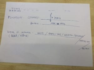
The user is a detective and basing on the information provided, he needs to catch a criminal and prevent the next crime from happening. At first we set the background that the user(you) is a detective and you have chasing a criminal for years. Then we told the user that base on the information, you need to find out where and what the criminal is going to do next. Then the user need to fill in a form to see whether they have collected the right information. Then there will be three endings. If you gather all the right information, you catch the criminal. If you get the wrong time, then the ending will tell you, you miss the time. Then, if you get the time and the location both wrong, the third ending will tell you, you make both of them wrong.

Process:

The preparation:

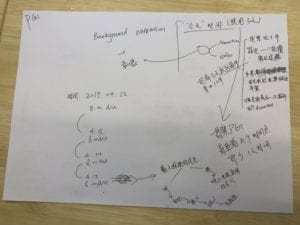
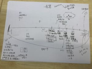
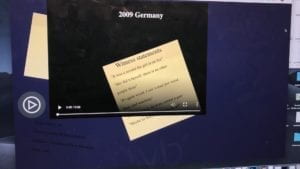
We first discussed the detail of the script. We plan to use the fire of the Notre Dame as a background. Then we find the map and decided to make a circle of the country then finally come back to Paris. Then we decided to make the investigation period for ten years. Since the fire is happen at 2019.4.15, the start date of the first crime is also in 4.15 but in 2009. We decided to set the first case in Germany, then make a circle come back to France. We set the date of the crime mainly using the number 4 and 15 so it is easier for the user to get the information. Also, we put a map down there so the user can check it. To make it more exciting, we set the time limit. We decided to set 8 clicks equals to a day and if you click 8 times, there is voice reminding you a day have pass. Also, we set the time count for each page, so after 20 seconds the page will close to make it more exciting.

Process:

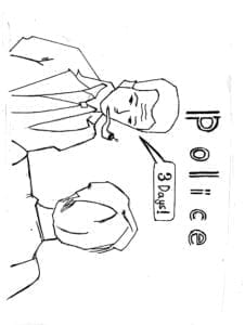
The introduction page, we first draw the picture then we use final cut pro to make it into a video and add audio to it. In the audio part, we introduce the background information.

The information part:

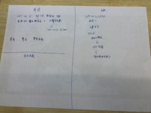
I set up the information for each crime and decided the time and the story for each crime. I hided the name Esmeralda and Quasimodo(the major character in Notre Dame) in the information, hoping the user to find it out. In one of the case, I even named the couple’s name in Esmeralda and Quasimodo, hoping the user to find it. We also use the new of the white hat man as part of our story to make it looks like a criminal who is doing religious things. We also use the count function to count times so that after 8 clicks, the audio will remind the user of the time. The css is also a difficult problem and I spent a lot of time on changing that.

The ending:

We use the white hat man as a criminal as part of our story, so we cut the news report of the white hat man who was actually a firefighter. Jamie record the audio part and it perfectly match with the video introducing the ending. Then we set a html link so the user can go back to the start page to play the game again.

Further Inprovement:

  1. The user sometimes may don’t know which part of the page is clickable, so they may lose information. We can add some information that the map and the form is clickable.
  2. We think we can make the whole story more connected and improve the introduction part to add more information and make the whole script more perfect.