Audio Project Documentation – Val Abbene

Link: http://imanas.shanghai.nyu.edu/~yz4970/week7/audio-project/audio.html

For our audio project, Jannie and I decided to create a minimalistic online gallery of personal items gathered from NYU Shanghai students and staff. We split the workload in half and both equally contributed to the audio, visuals, and code.
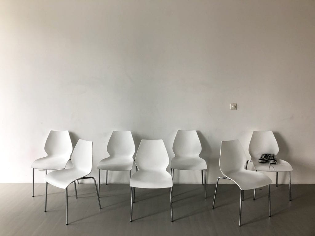
We wanted to express the importance and characteristics of these personal items through sound. We didn’t want to visually reveal these items on our display page, so we chose to only display the shadows of these objects until the user interacts with them. We made this choice to emphasize that the user should focus on the audio over the visuals of our website. Jannie had the idea to interview people about items that they couldn’t live without, so our project mainly focuses on individual storytelling. We expanded on this idea by asking our interviewees to speak in their native language, so that their story would become more personal. We wanted to have a diverse language profile in our project, so we recorded interviews in English, Chinese, Japanese, and German. For the languages that we did not speak ourselves, we asked our interviewees to provide a transcript that we could transfer into our subtitles.

The audio for our project was obtained in quiet environments using the Tascam and shotgun microphone to record. Some of the interviews were recorded on the 8th floor inside soundproofed rooms, but we weren’t able to use those rooms for all of the interviews because of their limited availability. We recorded the sound of the object first, as we wanted to these sounds to paint a auditory portrait of the object before the interview provided an explanation. Afterwards, we conducted short interviews in the native languages of our friends to add backstories to otherwise common objects. We wanted to emphasize that although the objects themselves are ordinary, their personal significance is what enhances their identity. Audacity was used to edit the audios and clean them up for our final project. When I was editing my part of the audio, I tried to create the effect that the sounds of the object was fading in and out of the interview by layering the audios. I thought that this would unite the object and persona and express that the two are needed together to create meaning. There was slight background noise in some of the audios that I recorded, so I tried to remove as much of it as I could without damaging or distorting the audio. Our top priority was to keep the audio clean and clear so that the message of our website could be easily communicated to listeners.
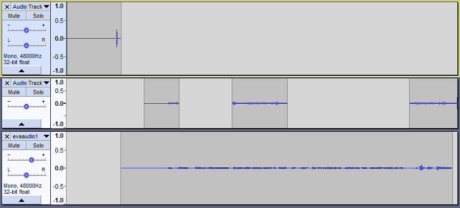
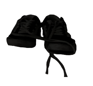
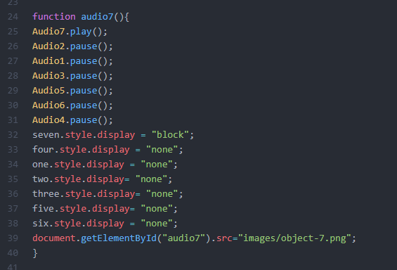
For our layout, Jannie photographed a room with seven chairs lined up to act as the background for the webpage. Throughout the course of our project, we photographed the personal items of our friends and then I edited them onto the empty chairs using Photoshop. To accomplish this, I used the magnetic lasso tool and eraser tool to mask the objects. I created two versions of each image, one in shadow and one original copy. The shadow object would be the first to appear on the website, but once the user interacts with the item and plays the audio, the original object would be illuminated. In our code, we designated each object as a button so that when the button was clicked, audio would begin playing and the object would become visible. I wrote the code to switch the two images using .getElementById and built off the existing code that Jannie wrote for the foundation of our website. Something that we struggled with while coding was the CSS formatting of the subtitles. Although we had specified in the CSS stylesheet that the subtitle text should be aligned in the center, when we presented our project the subtitles expanded past the boundaries of our image. Maybe this could have been fixed through some edits made to the <div>s.
Overall, I am happy with how our project came out and would only make some minor adjustments to perfect it. It was a challenge to make the audio come to life while using minimal visual elements , but I think that Jannie and I succeeded in meeting the expectations that we set for ourselves.
Week8-Danger-of-a-Single-Story(clover)

The first thing touches me in the talk is to record or write something that is closely related to your own lives which will be more vivid and more impressive. The second thing which touches me most is the stereotype. We cannot judge someone or something based on where they are from and where they live. We need to observe someone to draw a conclusion. Places changes and they don’t always stay in the same way. Also. we can’t get entirely rely on what we told in books. Something in the book don’t fit the actual condition. Last thing is that reflect the culture is really impressive and maybe is the greatest way to reach the audience’s heart. Also, one group may have different identities. The object have many things to be observed and needs our own observation. This also help to reach the equality between people. If you don’t fully understand the person you may draw some wrong conclusion. Maybe they have a good lives but you thought they are poor and show their your empathy which harms the dignity. Also, I think this idea is good and needs to be wide spread to people through the media.

Week 8: Response to The Danger of a Single Story by Jialu

After watching this TED talk, I really want to go to Africa. I realize that I also understand African people and their culture in a stereotypical way. When I think about Africa, the first image comes into my mind is a vast plain with giraffes, elephants, zebras and all kinds of wild animals walking under the beautiful sunset. There are documentaries made by the Chinese government showing how China helps “African brothers” build their railways and develop their countries. It is through these documentaries that I came to the realization that African people are also living in the 21st century, just like us; there are not only plains and tribes in Africa, there are also concrete buildings and people wearing normal clothes like us. however, these documentaries also made me feel that African people really do need our help. They made me feel that it is a good thing for African countries to be homogenized by China or, to be more accurate, modernization. These documentaries, they want to make me feel that way, but when I see those African people, who works on the train sponsored by China, wearing exactly the same uniform as those Chinese stewards; and buildings that are identical to those in Chinese cities rising up on the land of Africa, I just can help feeling weird. Isn’t this a kind of cultural colonization? Is it really appropriate to construct Africa in the Chinese way? Is this kind of “modern” style even Chinese style? Modernization, somehow, is making our country losing its culture and style, and we are still taking pride in it…… Back to the track, what I want to say is that I think these documentaries are also telling a single story about African people, where they are the weak and are in desperate need of help from modern and generous countries like China. All Africans in these documentaries are presented as super grateful for what Chinese government has done and claim that their life become so much better with the assistance of Chinese people. I don’t think this is the whole story. Just like what Adichie says in her talk, “The single story creates stereotypes and the problem with stereotypes is not that they are untrue, but that they are incomplete. They make one story become the only story.” I remember once reading an online article about how African people refused to live in the buildings that Chinese built for them because they were not used to living in buildings like that. This article was also telling a single story, but the story it told was completely different from the story told by those documentaries. This is why I want to go to Africa. I don’t want to hear stories any more. I want to see for myself, through my own eyes and then I’ll have my own story of Africa.

Audio project (Steve Sun)

link: http://imanas.shanghai.nyu.edu/~tsw298/commlab-audio-website/index.html

for this project my work was mainly collecting the sounds and make all the web elements on the page and make them look good (css). 

firstly we thought of making a music selector and producer where we can first select some of the sounds from each floor and then go to a new page where there is a beat machine and use the sounds the user chose to make music.

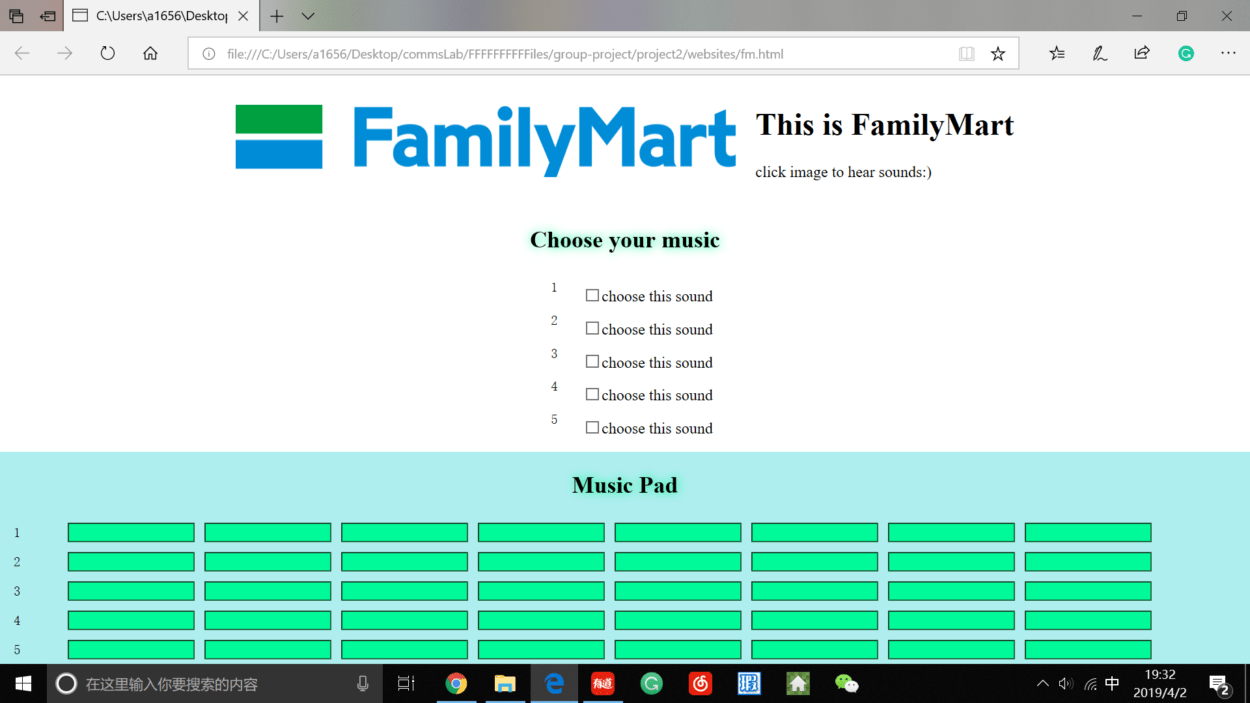
then we find it impossible to transfer information from one page to another, so we decided to make each floor a beat machine. I  actually made a touch pad (without functioning of course) of the beat machine.

the music pad that i made

but then we figured that the js coding for a beat machine is too hard for us and then we changed our minds again to make everything on one page, meanwhile we used the loops that were originally made rather than letting the user make them. so Thomas did some remixes on his computer and we put those loops on the page. 

there is still something that we could do to make the page better. one is that we could make it so that when user tried to add some tracks, the track can be added without restarting the music. and also some of the sounds’ volume and tempo aren’t quite at place so we could do more editing on those sounds. and one little thing about the background that the bg pic just didn’t seem to fit the page and the size varied from computer to computer…… i thought it would be easy to solve but nothing seemed to word when i did my css…… 

Audio Project Documentation (Thomas Waugh)

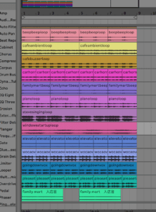
For my audio project, I initially wanted to create a drum rack similar to the one that I use in Ableton. Which looks like a grid with different instruments and different beats to arrange them into. For this, my partner and I assembled a variety of sounds from throughout the AB. I then put these samples into Ableton and EQ’d them, added effects to them, and make the sound levels equal according to what drum or sound I assigned each recording to. I then realized that I do not think that the average person is familiar with drum patterns so in order to make the user interface more accessible and to make it more of an intuitive experience with easier results, I arranged all the sounds into a song and then separated the song into different layers. Each checkbox correlates to one layer of the song. All the different layers go together in a pattern because, once again, they are all from the same song. By choosing this path, I feel that I created something that someone with no previous musical experience could use to make a song of their own made from sounds of the AB in a matter of seconds. The coding for this project was relatively straightforward as it merely consisted of programming buttons to play sounds together and adding simple audio controls. Steve originally had the picture of the AB without any filters on it, but I felt that that image did not match the mood of the project so I threw the picture into Photoshop and changed the color balance, added a ton of saturation and overlaid a pattern gradient to give it a more enticing and exciting look and to make it clash less with the content that it was framing. All-in-all, I was very happy with how this project turned out and I had an absolute blast making it and I am super excited to have a drum kit of NYU Shanghai sounds to play around with in the future.

Link to Project

it didn’t let me upload the song I made with all the sounds into my documentation 🙁