Video Project Documentation – Madi Eberhardt

Link: http://imanas.shanghai.nyu.edu/~ds5665/project3/homepage.html

Description of the Project:

Originally, the plan was to create a very interactive website in which you could dictate what a person did (like Talking Tom). Although, this limited how creative we could be with our filming process, so we decided to instead do a day in the life of Steve. It was really fun filming this, as Steve has so many interesting talents we got to include in the project. Through an interactive website, you can chose how Steve’s day goes by picking various options throughout his day. For example, you can chose what time he wakes up at and that ends up leading to how the rest of his day goes. We really wanted the user to be able to interact and make their own decisions when using our project and make it relatable to every student here at NYUSH.

Process:

At the very start of the brainstorming process of this project, we struggled a lot to achieve an idea we were all really excited and confident about. We all wanted to be able to film from interesting angles and have lots of room to be creative. Our first idea restricted us from doing this, so when Steve came up with filming a day in his life, we decided this was a great idea to accomplish this with. 

The first part of the project we did was the filming. By using the really cool stabilizer from the IMA Lab, we were able to get a bunch of smooth creative shots of Steve. We also used the tripod to get shots from higher angles above him to give a birds eye view. While we did divide up some parts of the project (Steve did lots of coding and was the actor, I did some coding and the filming, and Kat was the major editor), we actively participated in all aspects creating it so that it all blended together into a piece the three of us had envisioned. 

Issues we ran into:

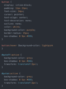
One of the issues I ran into was with the buttons on the page. I wanted them to become a different color when you hovered over to click it. Steve had figured this out before, yet we needed this to happen with multiple buttons on a page instead of just one. I ended up figuring this out by making a class called “button” and then did an “id” for each button under this class with “:active” for each.
Another little issue we all ran into was actually using the camera. For some reason our first camera we borrowed had a full SD card and would turn off in the middle of filming. This further delayed our filming schedule and lead to us having to change cameras and SD cards. This camera worked perfectly and we were able to film the next day with the stabilizer and tripod.

Post-Mortem:

After completing this project, I was overall happy with the way it came out. Although, I do feel like we were too ambitious with it. There were some things we didn’t have time to finish.

My favorite aspect of it was the shot of Steve doing his homework and the interactive aspect of being able to click the button multiple times to make him work slower or faster. 

I think that if we had more time, I would’ve liked to change the layout of the pages to be more interesting instead of just centered for each video/button. We have viewed so many creative art media projects, and I think we could’ve made the layout way more interesting. This could’ve included making the video full screen with the buttons laid over the top of the video. Also, I wish we could’ve included being able to tap on something in the video to make it change. We originally were going to do this, but we thought the buttons were better for this idea.

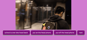
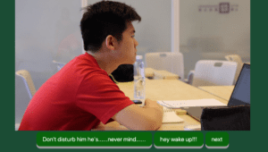
Screenshots:

Video Project Documentation (Jamie, Clover & Nan) – Jamie (Ziying Wang)

Video Project

Link: 

http://imanas.shanghai.nyu.edu/~cl4690/video-project/video-project/index.html

Screenshots:

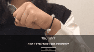
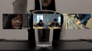
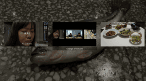
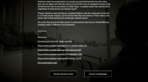
These are some screenshots of the website.

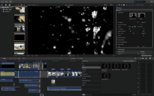
These are the screenshot for editing:

Storyboarding:

Concept:
Before starting this project, I read an article on “Chaos Theory” in Mathematics, which claims that a small factor would change the whole system vastly. However, when we think of a system, it’s a combination of numerous small factors, a change in one factor, therefore, wouldn’t affect the bigger picture.

Script Writing:

After introducing this idea to my partners, we agree that it would be a fun concept to adapt to stories. Since I learned the theory by watching a demonstration of a droplet falling on the fist, we decided to introduce this as a method of making the choices in our interactive film. By watching our intro, the user would know that they are supposed to choose by letting the droplet fall on their fists, observe its direction, then choose the direction. As the direction of the droplet flow is also determined by numerous factors: hair on your fist, size of the droplet, the density of the liquid you take… it is possible that the direction of the droplet is previously determined and that changing a simple factor wouldn’t affect the direction.

After having a demonstration of dropping the droplet as our intro video, we went on scripting three scenes that would display three continuous scenarios and in which the user can pick the choice according to the droplet’s direction.

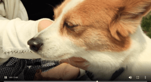
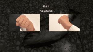
The first scene we designed was the fish market scene. We built our character as an animal lover and started the scene with a goldfish swimming in the tank. I created a scene where the protagonist pets the dog to further expand her characteristic of an animal lover. When the protagonist walks by the fish market, the water splashes and a fish jumps to the ground. Then the user is presented with their first choice, whether to pick up the fish or not, our website interface would pop up two gifs looping the droplet scene, and the user would choose as their droplet tells them to.

The second scene continues with the first scene’s ending, where the protagonist interacts with the user directly, I used a teammate and record the scene from the back of his head, implying that is the user our first protagonist is talking to. The user was asked if he/she would like to offer help to our protagonist during an upcoming math test. There, the user gets another opportunity to choose.

The third scene continues with the second scene’s ending, where the user got caught for helping our protagonist cheat, however, the third scene was just created for the user along, I implied this through only shooting from the back of my teammate’s head. The user was depressed for the F score he got in the test and walked to the river where the user makes his/her third option: to jump or not.

Storyboarding:

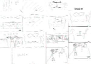
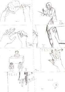
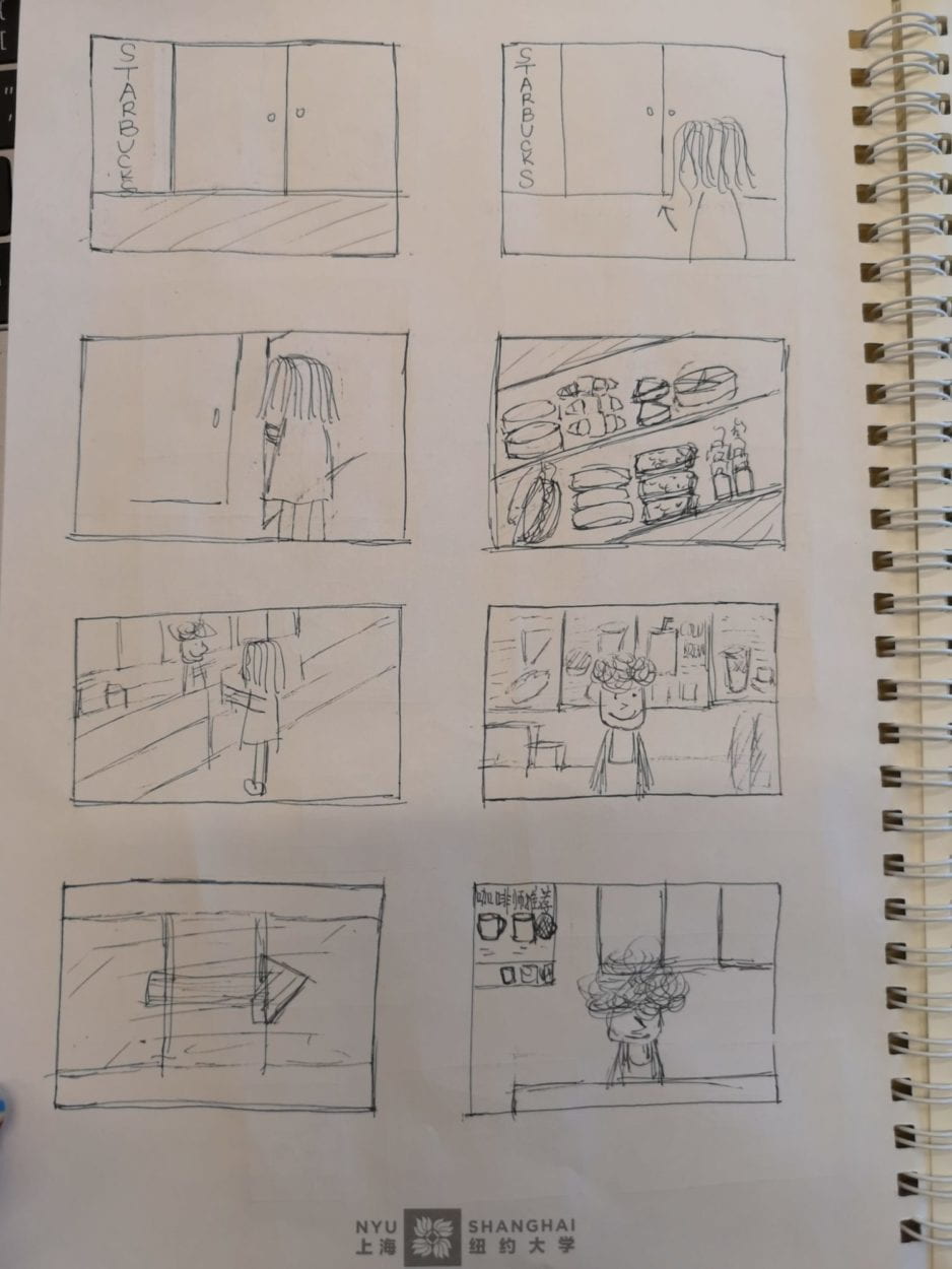
It was the first time I’ve ever done a storyboarding for my film. The three of us drew the storyboard according to the plot we sketched out and it turned out to be quite useful in filming, it worked as an effective reminder of the scenes we were yet to shoot.

Filming and editing:

We faced some difficulties when filming these written scenes.

First, the equipment. We had a camera and two iPhones for filming, but we cannot use these two types of equipment in one scene together for perspective shifting because iPhone automatically adjusts its white balance and the clips shot from the camera wouldn’t be compatible with the one from the camera. Therefore, in the scenes where we wanted to zoom or focus, we used the camera to film, but those scenes are only from one perspective.

Second, we wanted to film the fish market scene, therefore we needed to walk into a fish market, buy a fish, shoot the scenes in public, and might probably interfere the shop owner’s business. Fortunately, we met a rather nice shop owner who would like to cooperate with us and we managed to throw only twice before getting a nice shot of the fish being thrown on the ground shot.

The editing process went smoothly because I organized and named all the clips in a google drive once we finished shooting. With the storyboard we already sketched, I managed to edit the intro, scene 1 and scene 2 effectively. However, we it came to the last scene, I realized that when we were trying to film the suicide scene where there should be a water splashing shot (for this we even rented a GoPro), however, the clip we took from GoPro were all useless since the water splash was too small to imply it’s the user who falls into the water. Therefore, I had to use some supposedly bts-to-be shots and added some shifting mask and creepy background sound to create a dizzy feeling in order to imply that was the user’s view before they fall into the river, and then a sudden blackout with water splashing sound continued with the bubbling sound (to create an underwater feeling) along with a memory flashback clips which all the things happened went reversely. Finally, I found a green screen source for water splashing and added heavy gasping sound to imply that the user regretted of his/her suicide and actually floated up. For the last part, I used some bts to edit out a credit clip for my two teammates and me as a formal ending.

Website interface:

My two teammates were mainly working on the website interaction and layout, they created the hover thing: where the description of the scene would show automatically when the user hovers his/her cursor to the video’s thumbnail. They also make the background of the choosing page into a looping video. Since we decided not to talk about the philosophy in the film clips, we also created a separate page just for postscript as well as the links of the resources I used while editing.

What could be better:

We would definitely want to elaborate more on the relationship between the droplet and our theory, between the theory and the 3 scenes. And for some resources I used from online clips, I would want to film them myself.

Video Project Documentation by Jialu

Link: to be added

Description of the project

Our video project is about Starbucks in China. We want to show some amazing facts about Starbucks in China as well as cultural phenomenon that are brought to China by Starbucks. It is really interesting to look into how Starbucks operates in China and to what extend Chinese people adopt Starbucks culture. Because Starbucks is seen as a symbol of capitalism and the development of Starbucks in China actually illustrates the process of capitalist values entering into Chinese society after the Open-up Policy in 1978.

We went to three Starbucks in Shanghai—the one near Jinqiao, the one near AB and the biggest Starbucks in the world on East Nanjing Rd. Our introduction part was shot in Jinqiao and it is intended to show the phenomenon that Chinese people see Starbucks as something cool and fancy and is worth sharing on their social media. Then comes the part shot in the Starbucks near our AB by Demi. In this part, Demi criticized certain types of Starbucks customers in a humorous manner. The last part shot in the world’s largest Starbucks by Laila illustrates some facts about Starbucks in China—their marketing, merchandising, revenue, and future.

Process

Deciding the theme: Each of us posted our ideas in our group chat and then we decided to use Demi’s idea—Starbucks in China.

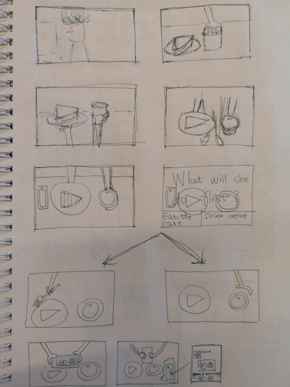
Storyboard:


Shooting: I shot my part on Tuesday morning, and Demi and Laila shot their parts on Friday and Saturday.

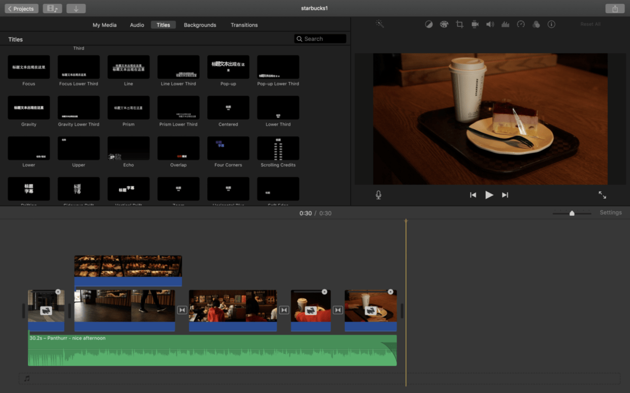
Editing: I used iMovie to edit my video clip, which I found very convenient.

            I wanted to use a long in my video but failed. Because there were so many uncertainties during the shooting process. So I had to split my shots and I used transition effects between clips in order to make the change of the scene more natural. I adjusted the speed of the video in order for it to match the beats of the background music.

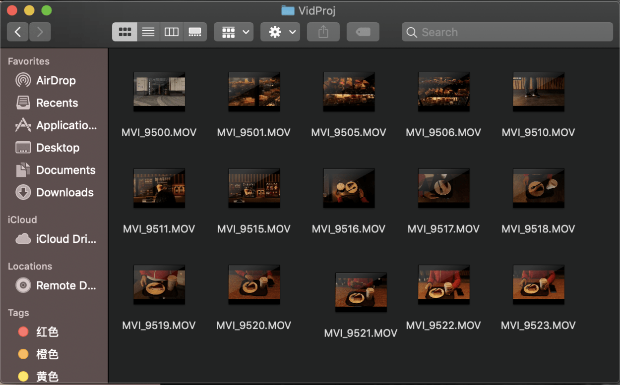
Gathering materials: We share our materials on Google Drive and Demi gathers our materials and put them into our webpage.

Post Mortem

I really like our video project and I’m really thankful for Laila and Demi. During the process of making a video, I realized that what I imagined in my storyboard can be really different from what I shot at last. Some angles and ways of shooting are really difficult for a beginner like me, so I was constantly adjusting my plan while shooting. I also realized that those shots in the movies, even the very normal ones, are not easy to make. It really takes time and effort to make a beautiful film. It needs imagination, practice and cooperation between members in the group to produce a high-quality film. Also, I realized the importance of audio in video. I really had a hard time looking for a proper background music for my clip, and I’m still not very satisfied with the current background music. I think I’ll try using the original sound of the environment next time I make a video.

Project Documentation — Jannine, Val, Thomas

For our project we made an interactive video experience based on Jannine’s relationship. Her idea was to make a series of flashbacks based on a playlist.

For this project, I was in charge of the video editing. I made some stylistic  choices while I was playing with the effects. First, I added some filters over each scene. When we go down memory lane, our memories are often blurred and have specific emotions attached to them. To try and emphasize this, I played with the colors differently for each flashback. I tried to coordinate the colors of each scene with the mood that the scene was trying to convey. I also added shadows and highlights to the memory scenes to give it a more faded, dream-like feel to it. This basically gave outlines to the most important objects and characters and objects in each scene, drawing them more into focus. Second, I tried to sync the music with the transitions between clips to make the music stick out more because, after all, this project is based on music and memories. I contrasted these effects by not adding anything to the clips that are supposed to be in the present, making it clear which clips are memories and which ones are not.

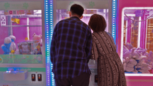
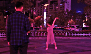
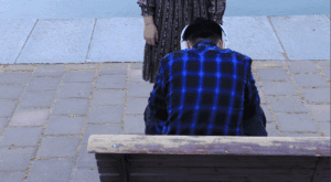
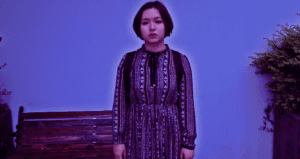
Screenshots:
Video Project – Julia Riguerra

http://imanas.shanghai.nyu.edu/~jc8017/VideoWebsite/index.html

For our video project, I suggested we make a film adaptation of one of my favorite short stories, “Carnation, Lily, Lily Rose” by Kelly Link. The narrative is rather dark and abstract, which would allow us a lot of wiggle room in terms of editing. We decided to have Taylah act in all three scenes since there is only one character, though we each chose three different scenes from the story to adapt and edit on our own. 

I took care of the second video, which follows our main character as he begins to question his surroundings. As such, I edited my scenes using different filter and effect options:


While editing, I wanted each edit to convey a different feeling within the viewer, as this is a highly interpretive and abstract narrative that the viewer is free to analyze however they like. Each different rendition is meant to tell the same story with a slightly different feeling.

To make this interactive, Justin added the feature to toggle between each filter on the website.

As far as filming goes, we definitely had issues due to a lack of resources, such as a dolly for cellphones. Some of our shots were shaky because we did them by hand, and due to time constraints, we did not think it necessary to attend an info session in order to borrow a dolly from IMA.

In terms of my editing, the project met my goals and I learned more about Premiere Pro. There were some effects I had in mind that I couldn’t figure out how to execute, such as an overlaid video of handwritten text appearing over the scene, so I scrapped that idea. Over the course of this module, I learned much about filmography and more features of Premiere, which I have used previously but I am far from an expert. Overall, I’m satisfied with how it turned out.