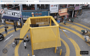
Link: http://imanas.shanghai.nyu.edu/~vra230/Video-Project/Video-Project/project.html
Description:
Our project is called “Our Story”. It’s a story about a couple broke up and the man is listening to music while reminiscing. It’s made up of clips of his memory, sad or happy.

(mainpage)
Process:
Inspiration:
At first we want to do a story about a man with amnesia wandering around the city and saw some particular things then trigger his memory. But then we found it less interactive. Since we are all music lovers, so we decided to do something like music videos. By picking different songs you trigger different memory. Happy songs means happy memory and vise versa.
Shooting:
Me and Val are in charge of shooting. I invited my friend to be the actor and I am the actress. At first I didn’t really know how to use the camera. The videos I shot were over-exposed. But then I adjusted the exposure and the lighting. And there’s also options where we can choose style. We used Landscape for the park scene and Portrait for the cafe scene.
Then we ran into problem when trying to focus. We used the auto-focus mode but it won’t work when it’s shooting videos. It only worked when we tried to take pictures. So when we zoom in we have to focus at the same time, which resulted some shakiness.
We use the tripod to shoot some standing scenes. It reduced some shakiness and it made it easier for us to zoom and focus at the same time.
We shot the scenes multiple times to get different perspectives.
We went to several places to shoot. We shot all the happy scenes in the daytime with a sunny sky. And the sad scenes we shot them in the nighttime.
Audio:
We picked six songs as the theme songs for our project. And we edited the video according to songs.
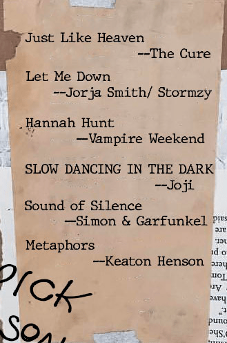 (songnames)
Editing:
Thomas did most of the editing part. He switched between different perspectives. And he adjusted the colors to make it feel like memory, but different from the intro and outro. Just to create distinctions.
Web Design & Coding:
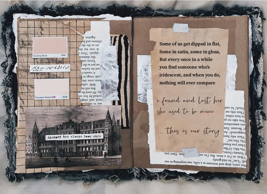
I designed the webpage. I want the videos to lay out on some old notebook to give it a feeling of nostalgia. Originally, it is like a real notebook, with a poem and some handwriting on it. But we didn’t have enough time to make this part of the webpage. 
(Original background)
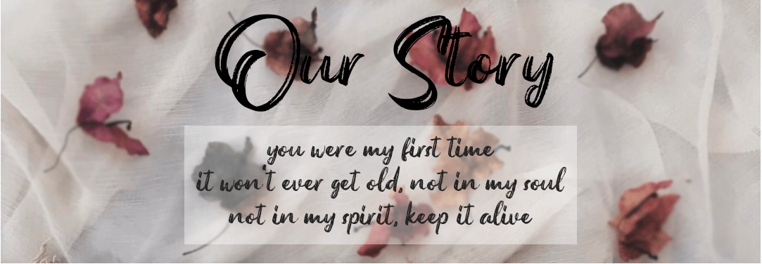
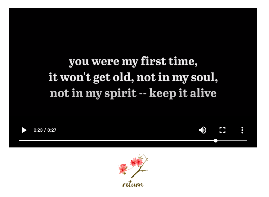
I used some lines from Frank Ocean’s Thinkin’ Bout You in the heading of the webpage, also at the very last part of outro, to make this as our theme.


(Lyrics from Thinkin’ Bout You by Frank Ocean)
I used photoshop, too. I blurred the heading background for the heading to be more obvious. I also erased the original context on the notebook and added ours.
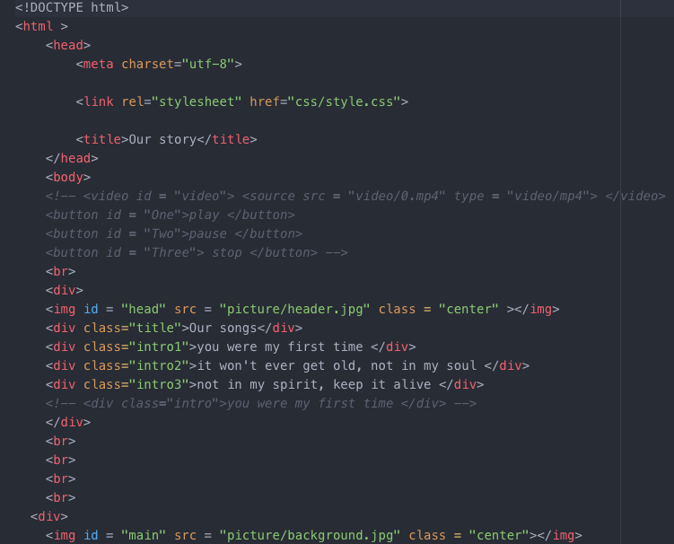
For the interaction part, we placed six divs on the places of the song names. So that we you click it it directs to the video playing page. We also have the return button to go back to the main page.

(some part of our code)
Post-Moterm:
There’s still so much we could do to improve our project. I’m not satisfied with what we have done so far. The layout is not clear enough and the outro is not done in the right way.
Problems:
Audio:
The music works well with the memories, but for the intro and outro, we wanted to add sounds like footsteps. But we don’t have enough time to make it synchronized. So we kept the intro and outro silent. But it is awkward and just don’t work.
Layout:
The original background should be the picture with poems and handwriting on it. It should change after the intro is played.
Also, the button for the outro is so awkward because we don’t have enough to fix it.
What I Learned:
- Get more familiar with the camera.
- How to use Premiere.
Future Development if Possible:
- Add sounds to the intro and outro.
- Fix the layout problem.
- Add Speed up and Slow down button for the memory. So if you want to read the memory quicker or you want to slow it down it could all work. Also add another form of interaction.
In summary, there’s still a lot we can do to our project and we could have done that earlier. But because of poor teamwork and time management, we didn’t achieve what we expected. I also learned teamwork and cooperation is also a very important part for a project.

 (songnames)