Week 14: Net Art Project Documentation – Ruby Kim (Moon)

Partner: Anica

Link: Tokio –  http://imanas.shanghai.nyu.edu/~sk7383/netArtProject/coding/index.html

Description: Our project is based on the novel ‘Tokio’ by Higashino Keigo. The theme-circulation, redemption-gave us the inspiration, and since the original storyline is relatively long, we extracted the main plots. The basic story is about Tokio, son of Takumi, going back to the past and help his father realize the misleading perceptions about his family background.

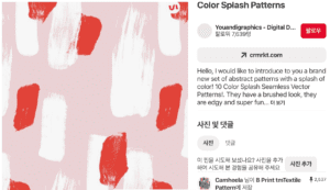
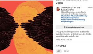
Process: As mentioned above, we first tried to extract important scenes of the story. After, In terms of the way of delivering the story, we tried to create our images abstract-which Professor Moon helped us getting inspired–and then concentrate more on illustrations and audio elements. The ‘abstract’ illustrations were inspired by some drawings that I found in ‘Pinterest’ website. 
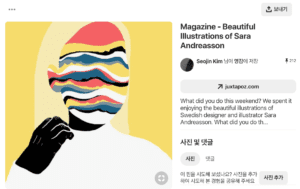
Example of Illustration Inspiration_1
Example of Illustration Inspiration_2
Example of Illustration Inspiration_3

In terms of the division of labor, we did not have a complete distinction, but Anica focused more on the visual illustrations and I focused more on the coding.  While discussing the aesthetic parts, we decided to narrow down our color scope so that we effectively keep the gloomy ambiance throughout the project. 

When beginning the coding, I kept trying to think of which layout would best deliver the content to the users. (What kind of design would let users read easily, in other words.) One of the decisions I made was to highlight some keywords in a different color. Also since I wanted the users to feel as if the characters are talking, I added a typewriter effect to the quotes. 

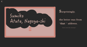
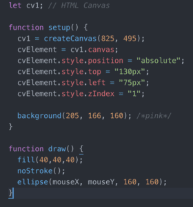
The most difficult part was definitely the interaction. First of all, it was really challenging to think of other interactions rather than merely adding the next button to each page or scrolling. Even though we still adopted the clicking method, I wanted to offer other ways that users could interact. For example, I created a ‘lock’ image button, implying that the users should unravel some questions. In addition, as the image attached below, users can hover over the envelope to see the address. In order to achieve this effect, I used p5.j. With the professor’s help, I first created another canvas and positioned it under the envelope image, by adjusting z-index and background colors. 
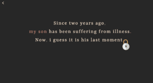
Lock button
When hovering over the envelope
Javascript for the envelope

Furthermore, in the scene where Takumi realizes that he misunderstood his parents, I wanted to create rain-falling animation in the background, which could contribute to emphasizing his emotion. While doing so, I referred to this youtube video and changed a few details afterward. 
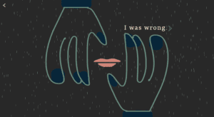
The scene including rain effect

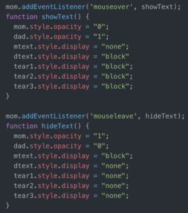
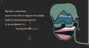
The below pictures are actually the screenshots of the one page.  Originally, they were separated into two pages. However, since we thought it would be better if the user can simply hover to see both mom and dad scenes, I used ‘mouseover’ and ‘mouseleave’ function in Javascript so that when the user hovers over mom’s image, both image and text of the mom would automatically change into those of dad.
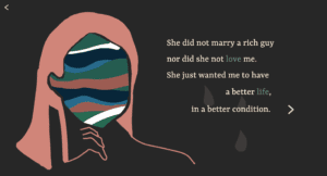
Scene – Mom
Scene – Dad
Javascript of the above page

Lastly, one of the biggest things that I have learned was dealing with images in p5.js. Basically, when the page is loaded, the newspaper is falling down from the top. When Anica was trying to create an animation, we found out we need a server to load images in p5.js. So, from professor Moon, we solved the problem by creating the local server in our own laptop, using ‘terminal’. After, I tried to make the image as a button leading to the following page. I first tried a pure Javascript syntax and it definitely did not work in p5.js.  After asking for help to the professor, I learned that I need to detect whether the distance between the element and the mouse is bigger than the image’s diameter.
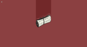
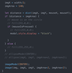
P5.js for the newspaper image

Reflection: One thing I really wanted to improve was the audio element as we did not manage to include it. We found out ‘autoplay’ is also prohibited for the audio, which meant we need a certain kind of interaction to play the music. In terms of time, we couldn’t create more interactions. So if time allows, I would definitely try to improve it. Also, I did not use p5.js as much as I planned to, so this is the part what I want to learn more. However, overall I am definitely happy that we made it and feel really attached not only to this project but also my other projects that helped me learn so many things throughout this semester.
Week 14: Final Project – Grey Net – Daisy & Milly

Link: https://imanas.shanghai.nyu.edu/~yc2966/Grey/index.html

Title: The Grey Net – Invisible Chaos

Partner: Milly Cai

Instructor: Moon

Date: May 15, 2019

Concept

As we said in the title, our project called “The Grey Net” aims to explore the topic of the “dark side” of the internet, covering topics like data breach, cyberbullying and also computer virus. The word “Grey” indicates the grey zone on the internet which the laws and regulation in the real world may not be able to cover. This project serves as an awareness-raising project which encourages people to think more about the internet environment. As the internet becomes a significant part in our daily life, we as the netizen should also be aware of the crimes and other negative things happening on the internet instead of just recognizing the good impact brought by the internet.

Process

Final Version:


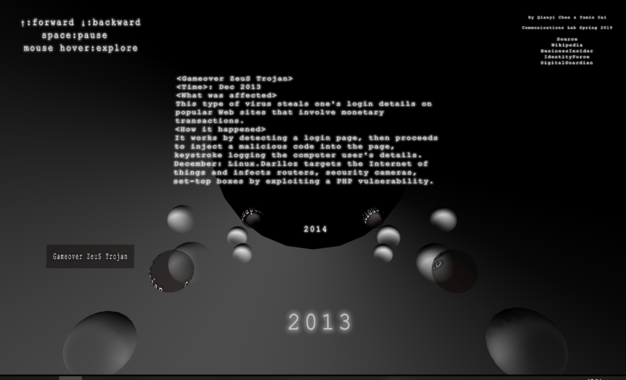
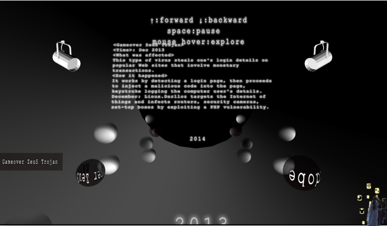
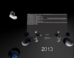
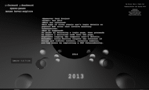
  Basically, the interaction is as shown above: click the title on the first page, then the user will see texts indicating different years. Using arrow up and down and space key they can control the movement of the spheres. By hovering on certain spheres with a special texture and see more information about the event in the middle of the page.
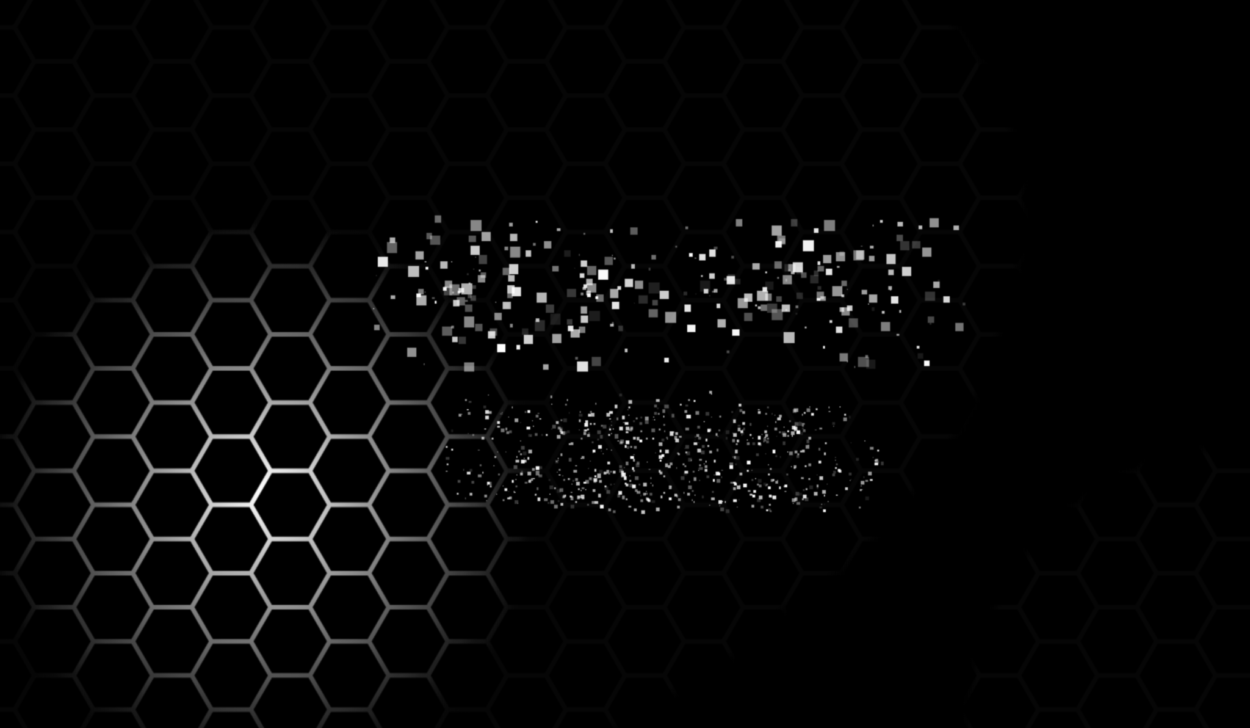
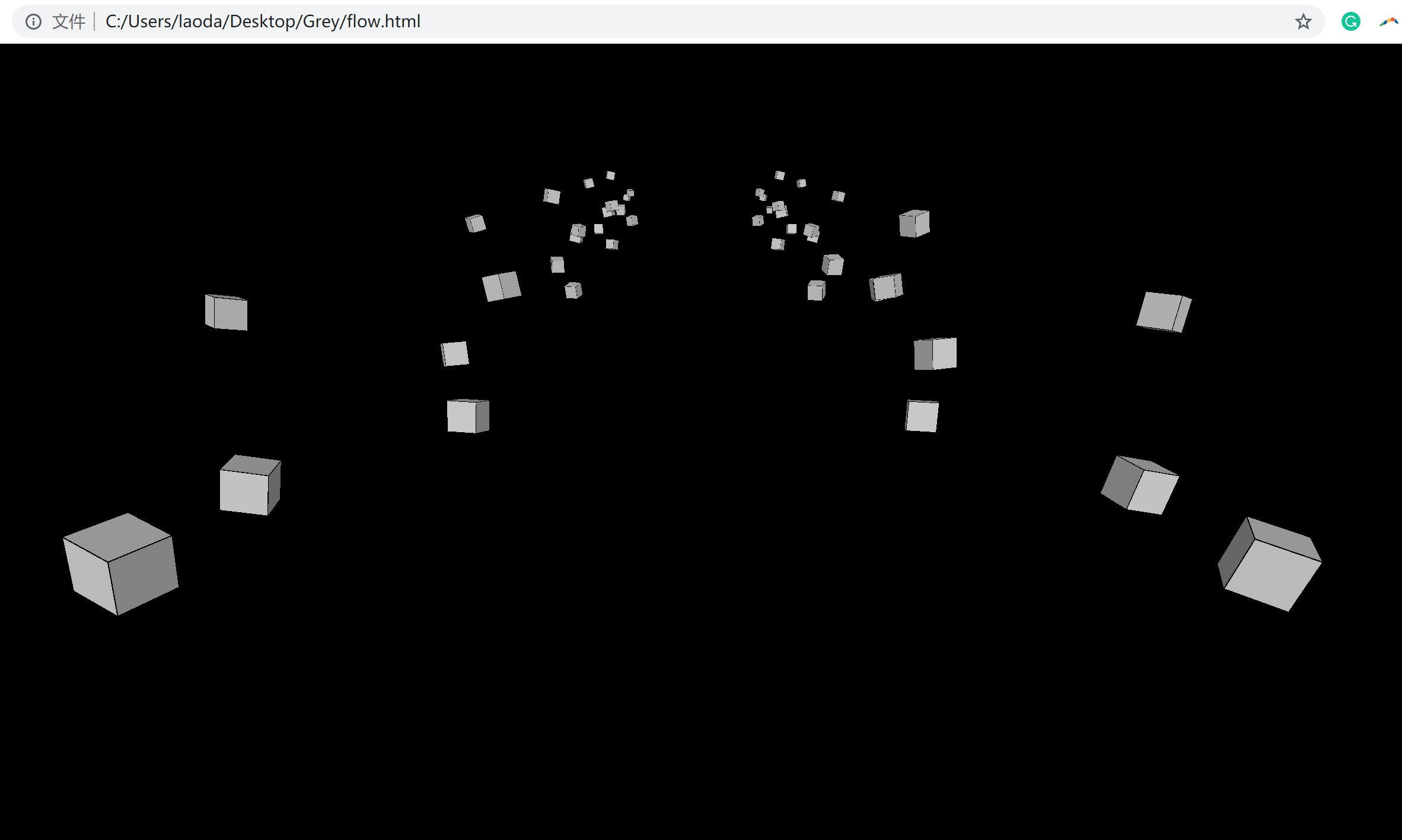
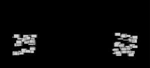
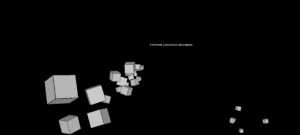
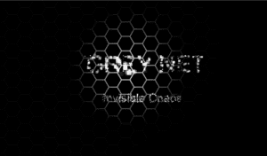
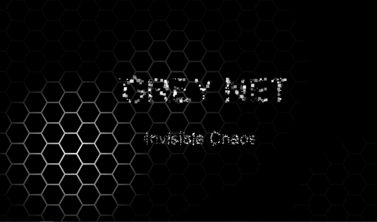
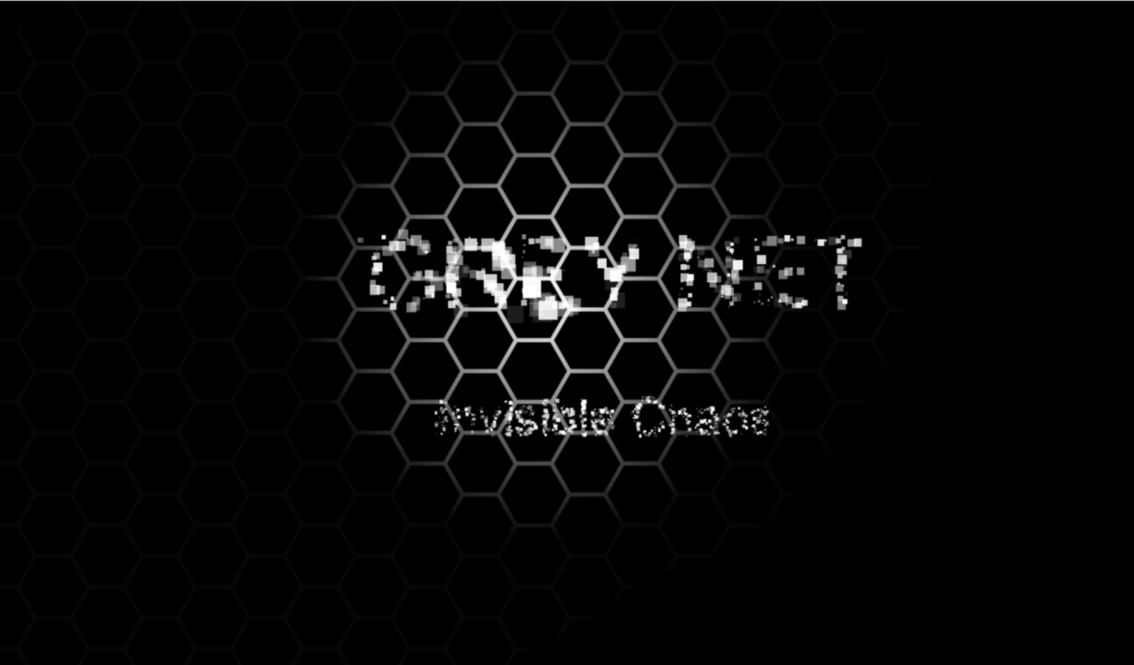
For the intro page, we actually intentional design the layout. The hex indicates the newtork; light to explore the internet that indicates the way we explore the internet (and imply that there are many invisible, hidden things); the random little squares make up the title, which is a metaphor of the way that data carries the information on the internet.

Developing Process

-Research

Before we start, we first did plenty of researches about internet safety issues on the internet, and we mainly sorted them into three topics: data breach (personal information issue), cyberbullying and also computer virus. We leveled the cases by its number of people get influenced or the financial problems it resulted and selected the ten top cases to write a summarized paragraph for each year from 2013 to 2018.  However, in the end, due to our time and labor limitation, we only choose two from ten of each year to show in our project.

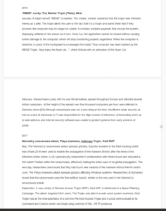
 research screenshot

-Coding

In terms of coding, we write it collaboratively and also debug for each other. And also for the intro page, I wrote the part with floating cubes and Milly made the hex part and then we put them together in one js file. We decided to build the visual in 3D after discussing with Moon, which is the point where our struggle started. In this project, we learned basics of 3d in p5 using webGL.


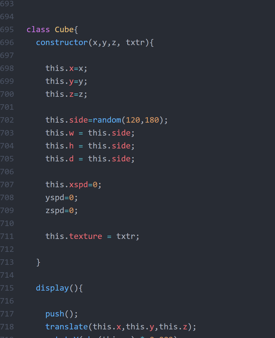
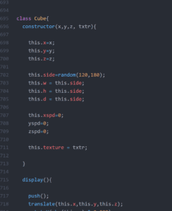
At first, we learned to create an array of objects using “class” and also learned the concept of OOP.  We first made the boxes generate automatically and used the mouse position to change the camera view.


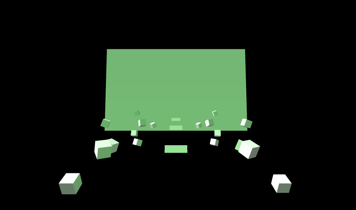
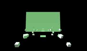
Later we modified the arrangement of cubes and also add different cube arrays as well as the “screen” where we will present the information.

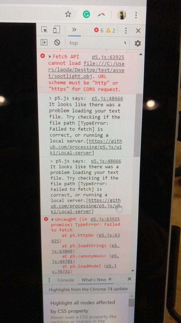
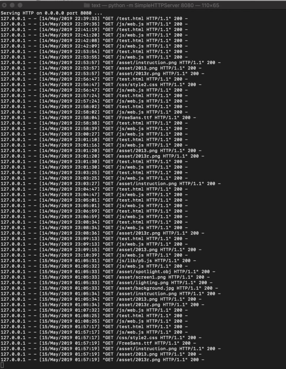
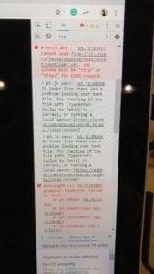
When it comes to loading images, a problem we met is that we can’t load the file when testing the website and we learned to create the local server to solve the problem.

For the rest of time we spent a lot of effort adjusting the layout design and interaction. We explored with the texture, loading object and also string array, etc. We also adjust the keyboard and mouse control for several times in order to make user-friendly and more intuitive interaction. Instead of just writing the text in p5, I edit the glowing effect in ps and save it as png so that we can have better visual experience for the users.

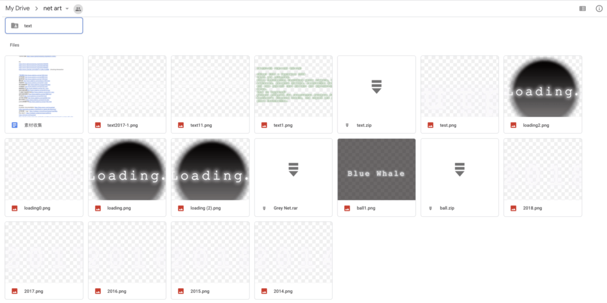
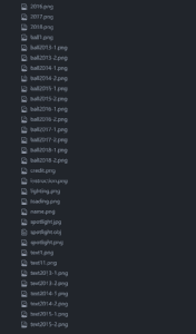
some of the assets we have

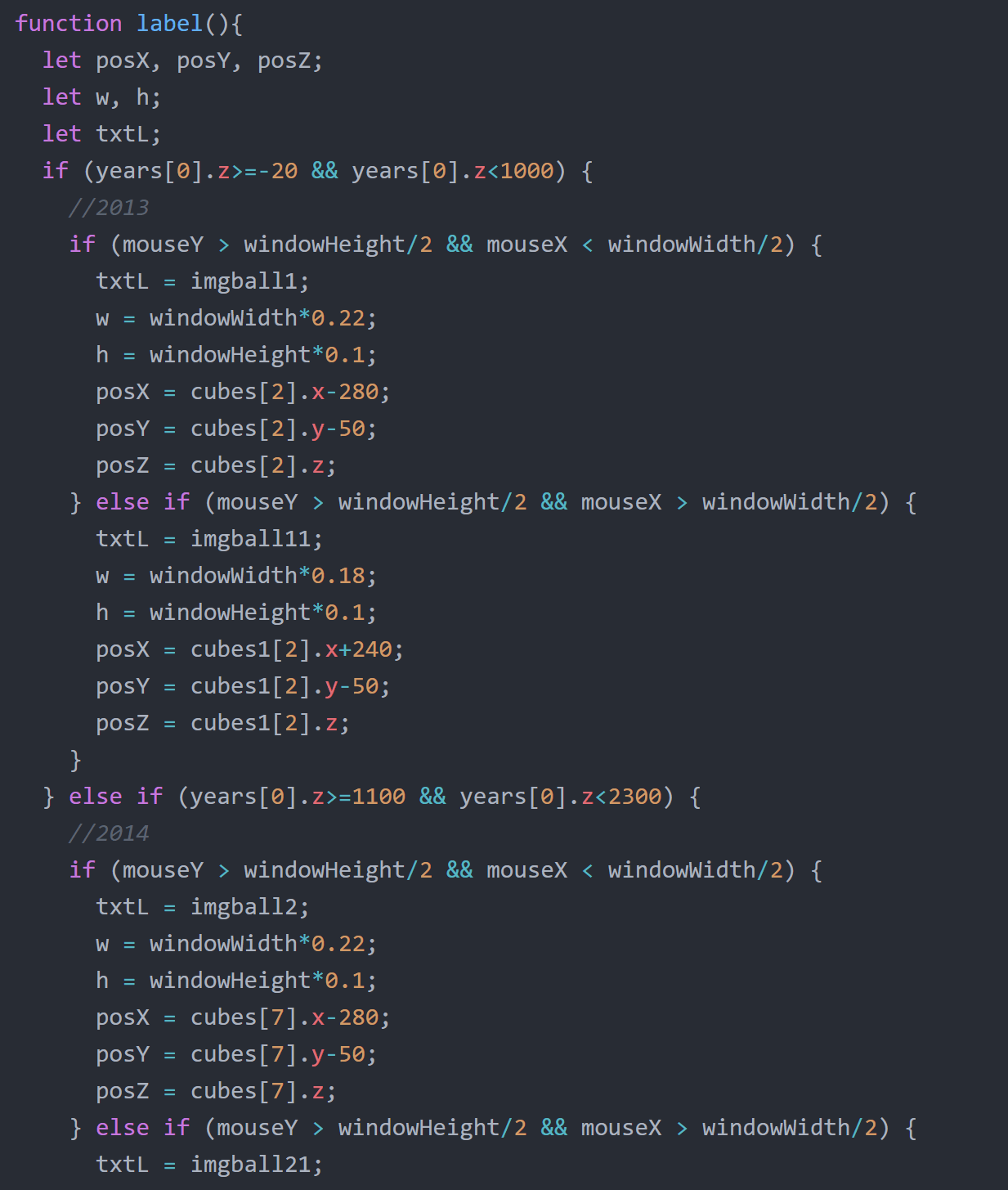
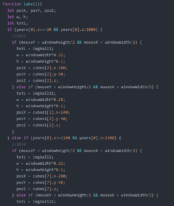
The labels appear according to the different location
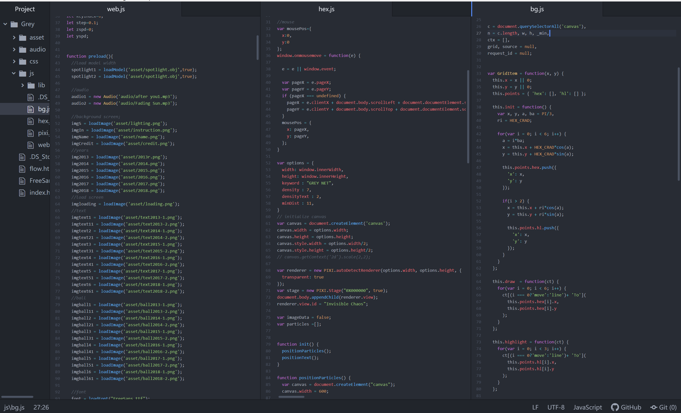
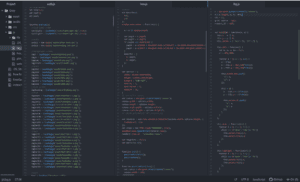
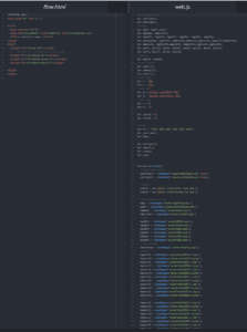
code screenshot

Reflection

Many things can be improved if we have more time. 

Firstly the content we show on the page can be categorized so that the user can be clearer about the idea we want to convey which is the topic of negative things happening on the internet. The information can also be more organized. Our initial intention is to build an archive which includes information and links for people to look at (like Wikipedia), but ended up picking two events of each year due to the time limit. If we have time we can try to find out how to show enough information in a more effective way.

In terms of design, we can also improve that by adding more features highlighting the current position. For example, adding different colors to the sphere the user is hovering on so that they can clearly see where they are. 

Taking into account the feedback we get from the class presentation, we also added some adjustment to our project including adding the source of information, adjust the instruction position and also removing the 3d model.

Before:

After:

Source Credit

Songs:

Fading Sun & After you

Cases:

https://www.businessinsider.com/data-hacks-breaches-biggest-of-2018-2018-12#2-marriott-starwood-hotels-500-million-20

https://www.identityforce.com/blog/2018-data-breaches

https://en.wikipedia.org/wiki/Computer_virus

https://zh.wikipedia.org/wiki/%E7%94%B5%E8%84%91%E7%8A%AF%E7%BD%AA

FInal Project – Grey Net – Milly Cai & Daisy Chen

Project title: Grey Net – Invisible Chaos

Partner: Daisy Chen

Instructor: Moon

Here is the link to our final project:

https://imanas.shanghai.nyu.edu/~yc2966/Grey/index.html

Description:

For this project, I and Daisy try to focus on the topic of the internet itself. Due to the fast rise of the internet before the regulations are ready in the past few years, the issue of “internet safety” and “internet morality” become increasingly heating to be discussed. Therefore, like what our project is called as the “Grey Net”, we try to use the concept of “grey zone” to indicate the “invisible chaos” and potential threats on the internet. This project is mainly aimed to raise people’s awareness to think of internet safety and morality. As a result, we may develop the environment of the internet and related fields in a healthier way. 

Process: 

Researches

Before we start, we first did plenty of researches about internet safety issues on the internet, and we mainly sorted them into three topics: data breach (personal information issue), cyberbullying and also computer virus. We leveled the cases by its number of people get influenced or the financial problems it resulted and selected the ten top cases to write a summarized paragraph for each year from 2013 to 2018.  However, in the end, due to our time and labor limitation, we only choose two from ten of each year to show in our project.

Researches we did

Concept and Form Changes

At the beginning of our final project proposal, we intended to make a game that let the user play with the harmful issues on the internet. However, along with the progress of our researches and setting up of project, we finally settled down the format of our project as an interactive digital museum. The cases would be “stored” in the floating bubbles and drift by the users, which is imitating the data flow on the internet as well as the process of linking to the internet (surfing the net).  And each time when the user is attempting to approach a bubble, the information is stored (the case) would show up on a “big screen”, which represents for the computer screen. 

Besides, with the suggestion from professor Moon, we decided to use the 3D environment to display this project.

Development

As we are facing a brand new coding field, which is related to the 3D environment and not an easy task for both of us, we collaborate on the coding almost like half and a half for each of us. We tried to learn several 3D-environment libraries, like A-frame, three.js…But eventually, we went back to WebGL on p5.

The biggest problem for us at first is to generate a series of 3D containers, for example, boxes to move from distant location towards the computer screen. To reach this purpose, we need to know the usage of “class”. Thanks for Moon’s help, we sit down and learn from the beginning of WebGL and class to generate the array for hours. This is probably one of the most helpful and interesting things I have learned from this project.

learn how to generate box and the 3D environment in p5 (1)

learn how to generate box and the 3D environment in p5 (2)

Then we keep working on adjusting the angle of view, also I added the gentle rotation of it to make the floating object more elegant. During this stage, we use the x position of the mouse to control the angle of view and mouse click to move forward, but soon we discard it for it’s in comfortable and not able to come back. 

Change the rotation angle and number of boxes

Change the  angle of the camera view

Later on, we settled down the location of the screen plane and years,  also did experiments with the lights and textures.

Experimented with light  & added the year planes

Experimented with texture

The version presented in class

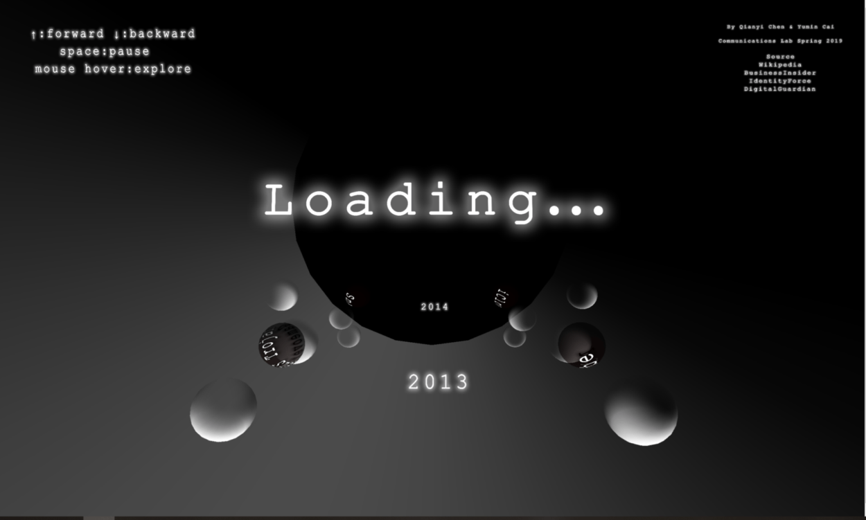
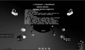
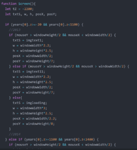
As for the version we presented in class, it’s almost the final one that could interact with the viewers by key up to go forward and key down for backward; space for pause and mouse hover for content explore. We did most of the textures in PS by ourselves that have a shining effect. As it is difficult to get the exact location of an object in the 3D environment, I tried to get the current year’s Z position and then detect the x, y position of the mouse to create the hover effect that shows the labels of the bubble as well as changing to the corresponding content on the center screen.

From the user test in class presentation and the feedback, we got many helpful suggestions from professor Ann and Leon as well as other students:

1. Discard the spotlight models which are not consistent with the general style. 

2. Adjust the location of the instruction that is overlapped with the content screen. 

3. Add the source credits.

4. Probably need to change the texture of bubbles to make it more clear to see.


Final Version

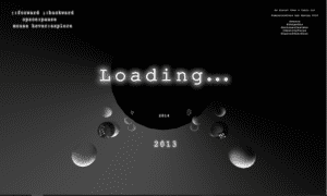
Therefore, from the suggestions mentioned above, we adjusted the design and get the final version as following:

Index page:

Hex background represents the internet connection; light to explore the internet that indicates the way we explore the internet; the random little squares make up the title, which is a metaphor of the way that data carries the information on the internet.

index page

After the adjustment, we deleted the two spotlight models and put the instruction on the left top corner. Also, we add the name and sources credits on the right top corner for this page.

content page
Coding record

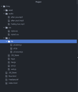
Overview of all js files

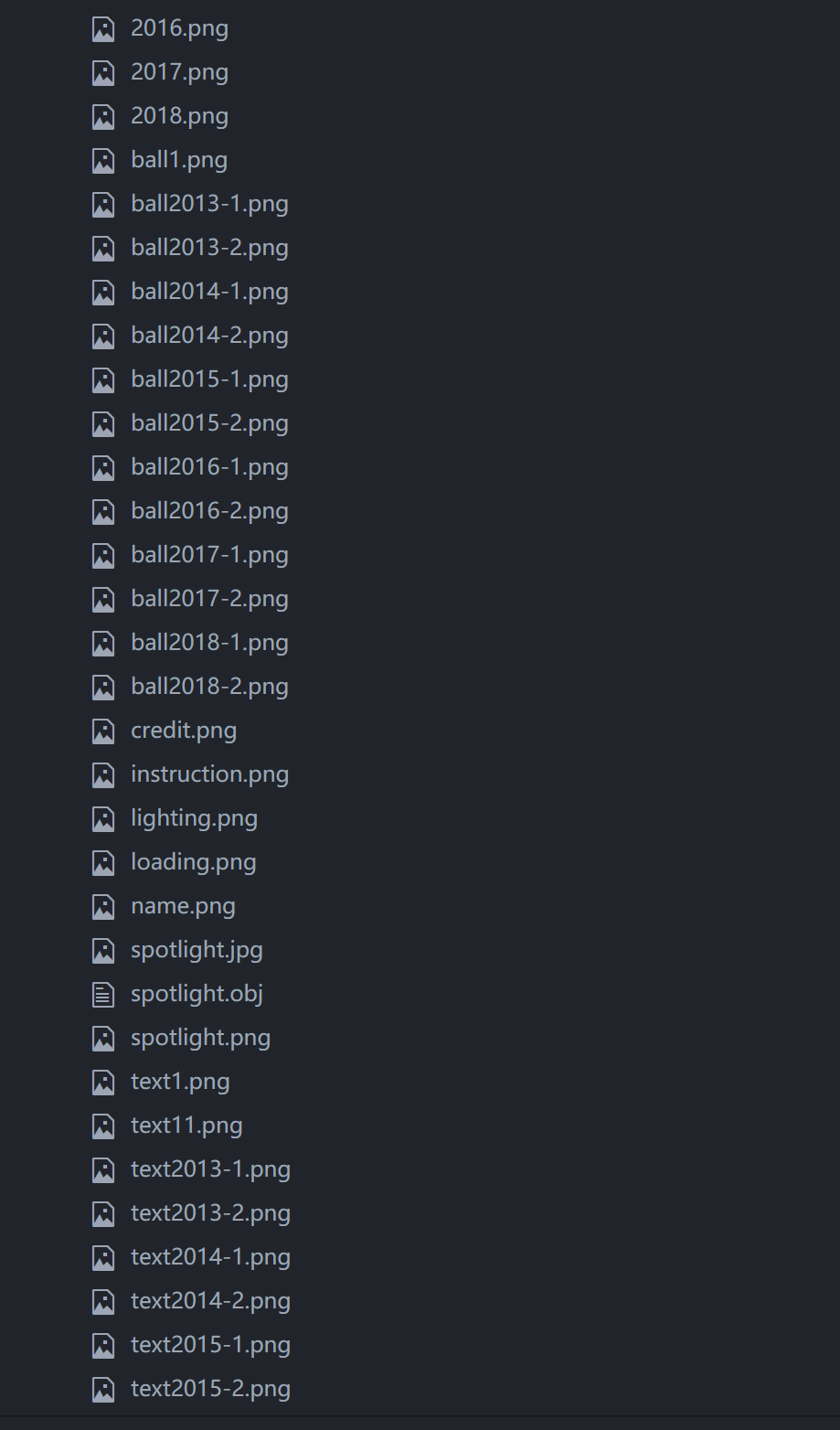
Overview of all files

Overview of all textures & loading

Learn to use the class to create cubes


The screen changes content according to the different location of the current year

The labels appear according to the different location

Problems Met & New THings learned 
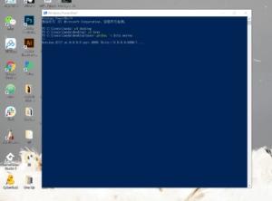
  1. local server: as p5 libraries require the API, it needs to create a local server to run the page. Thanks for Cindy’s help, we installed Python and find the way to create it in Windows.
 

2. Basics of WebGL: it’s my first time to encounter with the 3D environment on the web. Though suffered when learning the new thing, it’s really interesting to explore this new area.

3. Usage of class: it’s extremely useful to learn how to use the class to create pre-formatted objects and store them in the array.

Further Improvement

Like the feedbacks and suggestions we got in the in-class presentation, we’d like to add more cases we found to the bubbles to make this project become more strong and persuasive. Besides, the design of light and textures of bubbles also need to be improved to be easier to recognize.  And probably some hints for movement instructions instead of pure text would be better Also, the hover effect, if we could truly detect the position of each bubble, then the hover effect could be more interactive and accurate. 

Anyway, I really appreciate the process of working on this project, thanks to my partner Daisy and professor Moon, we finally come out with this lovely outcome. I really love it!

Sources Credit

Songs:

Fading Sun & After you

Cases:

https://www.businessinsider.com/data-hacks-breaches-biggest-of-2018-2018-12#2-marriott-starwood-hotels-500-million-20

https://www.identityforce.com/blog/2018-data-breaches

https://en.wikipedia.org/wiki/Computer_virus

https://zh.wikipedia.org/wiki/%E7%94%B5%E8%84%91%E7%8A%AF%E7%BD%AA

Week 14: Final Internet Art Project – Allie Dunnaville

Link: http://imanas.shanghai.nyu.edu/~op531/internet-art/title.html

For our final project, Oona and I decided to create something which reminded both of us of our childhoods. An idea that immediately starting sparking ideas for both of us was collages. I found my love for collage when I was in elementary school. After school, I would often go home and cut up newspapers and magazines then paste them inside a scrapbook. As I got older, my collages became more sophisticated, and I actually used canvases as material instead of scrapbooks.

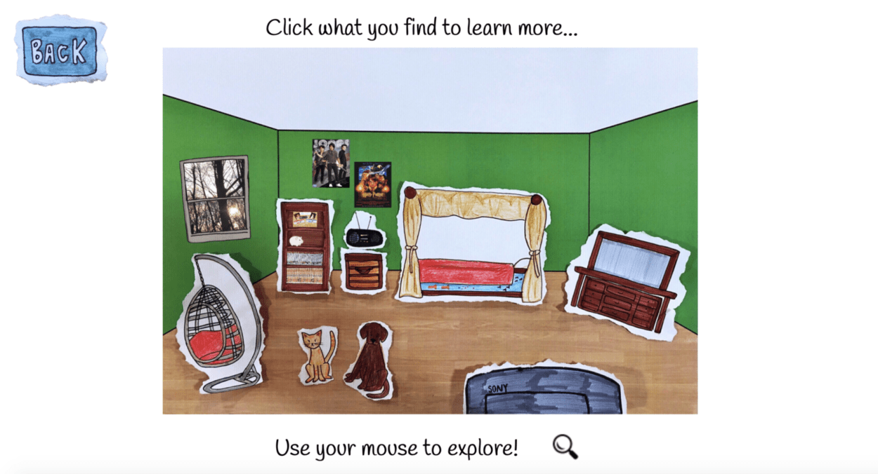
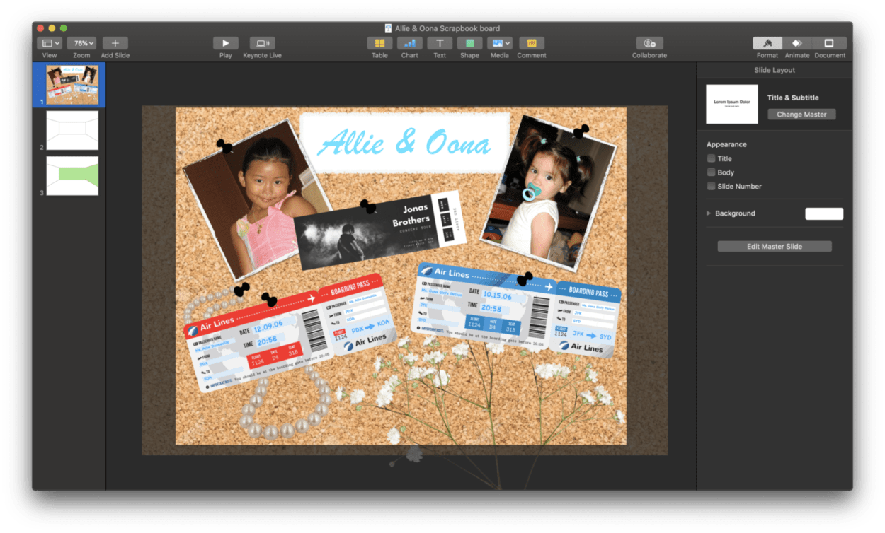
Our overall idea is combined with our love for collaging as well as the Melissa and Doug Dress up board game. The idea with the board game is that you are given different props, and you use those props to dress up a figure. With these two ideas combined, we further developed our concept by creating our โ€œdream room.โ€ Basically, our goal was to collage/design a room that we both wanted as kids. We included items such as a waterbed, egg chair, television, my dog, Oonaโ€™s cat, and many others! Users can interact with the room by clicking on different elements within the room and read hand-written notes from Oona, and I that explain why those specific items appear in our โ€œdream room.โ€ There are also pictures included beside the letters which are either about where the idea originated from (such as the waterbed gif, that is from the Goofy movie), or real pictures (such as my dog and I).

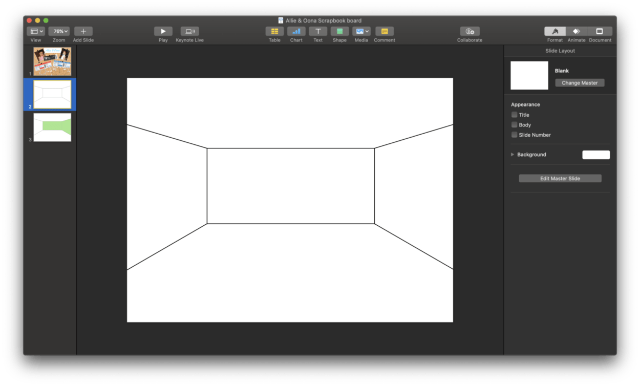
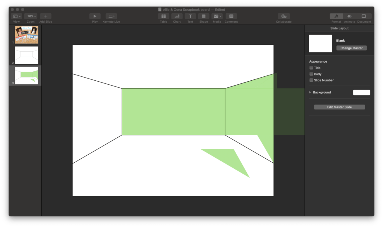
For the project, I spent a lot of my time finding images online for the room, writing the notes and converting them into PNGs, as well as designing several elements on my computer such as the backdrop, and also the poster-board/collage board. I primarily used photoshop and Keynote to develop these two components. The most challenging aspect for me in designing the backdrop was when making the depth of the room. I ended up having to use different shapes and lines in Keynote to create the proper dimensions needed to make the room three-dimensional. Because Iโ€™ve havenโ€™t learned how to use programs to create 3D elements, I ended up having to eye everything myself, and it took longer than needed probably.

While making the PNGs of the letters and some of the drawings, Oona informed me of an app called Superimpose. It allowed me to convert images into PNGs much quicker than using photoshop, which is what Iโ€™ve done in the past.

Some additional feedback we received was regarding the layout and design. After briefly talking with Professor Moon, he suggested we added paper in the background or some type of collage. We were able to implement both of these concepts in our final presentation of the project!

Overall. I am super proud of how this project turned out, especially with the limited time constraints and the rest of the major projects we had due for Finals week. Our goal was to have this project simulate our childhoods as much as possible and have a general collaged 2000s theme throughout, and I think we definitely accomplished this. After receiving feedback from my classmates and judges today, some future improvements would be adding sound effects, making objects animated when you hover over them, and also considering adding a conversation between Oona and me at the home page, which would emulate the discussion we had when brainstorming the project idea. Thanks!

W14: Final Project – Ruby & Anica

Link:
http://imanas.shanghai.nyu.edu/~sk7383/netArtProject/coding/index.html

Main Idea:
This project is based on a story adapted from โ€˜Tokioโ€™ by Higashino Keigo, in which we are inspired by the theme — time travel, redemption, and circulation. Tokio, son of Takumi, goes on a temporal journey back to 20 years ago and helps his father uncover the truth about his family background. The story is told from the first-person perspective. Since it’s impossible to show all the details, we decided to select some key plots for the audience to navigate it.

Process:
As for the teamwork I’m in charge of all the visual arts and together we did the storyboard and coding. 
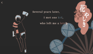
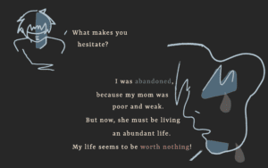
The basic layout in a single page contains quotes and pictures. We don’t really want it to be a series of comic pictures but something artistic. We got the inspiration from Moon and Dave that we can extract the abstract elements to show the concrete things. That’s why I choose to sketch the abstract lines and panels. The colors are also carefully selected to create a gloomy and sorrowful atmosphere. I drew all of them in Photoshop with my digital pad.
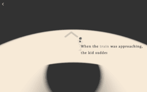
For the coding part,  I  was in charge of the p5 java mainly. For example, by shrinking the circle little by little with the train remaining still I want to create a dynamic environment where the train is coming from a tunnel. And the next page actually acts in cooperation with the last one. The circle spreads out, showing the boy is running towards. 

Post Mortem:
Somehow we haven’t figured out how to add the background music throughout all the pages. And the audio seemingly works only when there’s some interaction. If time permits, we also want to add more effects like dragging, (auto) scrolling and bouncing rather than just clicking to turn to another page. Through this project, I realize the significance of the overall style of an artwork and the word “conceptualization”, which leads us to think deeply about the way to present the art.
Big thanks to my partner Ruby, my professor Moon, and Dave ๐Ÿ™‚