Interactive Video Project Documentation – Xavier Juhala

Description

For this project, we decided that we wanted to make an interactive comedic murder mystery. We thought that it would be an interesting take on a normal murder mysteries, by allowing the user to guess who the murderer was based on clues we gave them and also allowing them to view evidence which is talked about in the video. We thought to ourselves that our acting is not very good at all so we thought that it would definitely be better to make it a comedic murder mystery, in that way we could just have a lot of fun filming the scenes and just be goofy without worrying that our acting isn’t looking too good. 

Process

Based off of our strengths we decided to separate the work for our project in three different ways; I and Grace performed and did the acting, I made the Nemesis letter as well using the Wacom tablet, while Selina worked on the video editing and Hanna did most of the coding. There was some crossover, of course, we all helped each other a bit but for the most part that was our division of labour.  We started out by making the storyboard for the murder mystery, however, we found that we mostly just filmed according to whatever came to our minds rather than following that along. We had some trouble starting out using the camera and tripods as we could not figure how to attach the camera to the tripod, so we decided we would just hold the camera when filming instead. The lighting was also a bit of an issue when filming, as we filmed at the Academic Building and it was hard to find places that had good lighting for filming. We were then however able to fix the lighting for the most part through editing so that didn’t end up being that much of a problem. Another problem that we had was that when we filmed the videos we could only see the video we had just filmed on the little camera screen, because of this, many times the video looked good when we saw it on there but then when we would watch it on the computer we would notice it was actually blurry. This was quite annoying because we would then have to refilm the whole video which was hard due to our differing schedules which made it hard to film in the first place, so filming again a scene we had already made was quite annoying. 

For the interactive part specifically, I made the letter which you see in the pop up which happens when the Nemesis is writing the love letter to my character David. In the beginning, we originally had a photograph of a handwritten letter we had made pop up, but after user testing and hearing back from our peers we decided that it would look better and that it would be cooler if we made the letter digital. Since I had used the Wacom tablet before I decided that I could make the digital version. The letter actually took me quite a while to complete especially the handwritten fancy “T” at the beginning because it was all drawn from scratch so it took me a couple tries to get it to look exactly the way I wanted it to. The handwriting part also took me several times because I was trying to figure out what kind of handwriting a deranged stalker would have so I tried several and finally decided on that one. Finally, to add a special touch, I went and erased all of the dots of the “i”s and made them into hearts to just add a little more to the craziness of my nemesis.

Conclusion

In the end, I had a lot of fun making this project. Me and my partners had really good communication with each other and we got along really well together so it was a really great experience coming up with the whole storyline and working on it together to make our finished product. If we would’ve had more time I think that it would’ve been nice to try and figure out how to use the tripod for filming because I think it would have made our final product just a little bit better. I think that if money wasn’t an issue I would like to have been able to buy some costumes for our different characters so that it would have been more obvious who was who in the film. Maybe a police outfit and a mustache for the police officer and some fake blood for the murder scene. Besides that, I’m overall really proud of the finished product. I think that we really succeed in our mission in making a funny interactive murder mystery!

Week 12: Response to “Web Work: A History of Internet Art” – Hanna Rinderknecht-Mahaffy

While reading Greene’s article, I was particularly interested in the impacts of Jodi.org’s artistic influence. These projects showcase interactive websites that center around lines of HTML code, speaking to the user “in the language of network and hardware.” I like the concept of these type of projects, because for the average internet user, the code behind the webpage is not prominent in their minds.  By bringing the code to the forefront of the sites and in one case, hacking the user’s IP address, Jodi.org brings an awareness to the power of the technology behind a website. 

One aspect that the article addressed that I never considered much in the topic of ‘internet art,’ was the idea of using internet art to address social and political topics/tensions. When I think of ‘art’ in general, the first thing that comes to my mind is colorful paintings/drawings, etc. I initially thought about internet art as an extension of this, however after reading about the filmmaker Cheang’s projects on the topics of technology and access in Asia and a website on the life of Brandon for the Guggenheim, I realize that internet art can be powerfully used as a medium to create a dialogue around prevalent social, cultural, and political issues of our time. 

Interactive Video Project Reflection: Helen

Link to our project: 

Introduction:  Our initial idea was to create a music video, we thought it would be fun because we’ve never done something like an interactive music video. However, we couldn’t choose only one song to focus on, so we chose three songs that each one of us wanted to work on. I chose the Korean song Pallete because I really like that singer and I thought non-English song would add more diversity. 

Work process: We shot 100% of our footages together in one of the IMA labs. We wanted to use the green screen but our schedules didn’t fit so we just decided to use white wall instead. For my music video I want to follow the lyrics, like creating 25 with the string lights. The editing process was mostly done by Bonnie, she color corrected and edited the footages together. Shout out to Bonnie! We had some difficulties filming at first because the tape we first used was colored so on the screen the color would appear, so we found a clear tape and shot some scenes again. Since, we were using a wall a lot of objects didn’t stick very well so we had to shoot as quickly as possible, but it was a fun process.

Coding: For coding, we were inspired by the reality vs dream video that Cici showed to us. I wanted the 3 music videos to switch when the user wanted to, but i couldn’t figure out how to pause the video and resume playing it. After 2 days, i asked one of the LA’s Mostafa to help me, and we figured my mistake, which was to just inactivate ONE line of code. Also, for the home page, I wanted to make things as ambiguous as possible, because if everything is known from the start, it’s not interesting. So, I used the pop-up function for the lyrics.

Overall we had so much fun and little bit os stress while working on this project. Even though it is not perfect, we’re very satisfied with at least finishing the project as we wanted to. So, thanks for my partners Harry and Bonnie!

Week 11: Internet Art- Kyra Bachman

http://indirect.flights/

https://hypergeography.tumblr.com/ 

Both of these are interactive collages created by the artist Joe Hamilton.  I enjoyed these two pieces because I feel like it was evocative and articulated a point in a creative way.

The first link is a collage of photographic material the artist took while he was traveling between Europe, Asia, and the Middle East. He overlays ariel view images with close-up images and brush strokes. The user moves through the collage themselves which is very cool. The intent of this piece is supposedly a tribute to ‘green-energy’ which is apparent in the photos of the massive solar panels and the Hoover Dam as well in the color contrast of the blue water. 

Interactive Video Project – Bonnie Chan

Title: Harry and the Girls

Link: http://imanas.shanghai.nyu.edu/~bc2328/commlab/video_project/lyricson.html

Our project is a video project that incorporates physical and digital interactive elements within the website and film. Our website is mainly an interactive platform that plays three different music videos, which footage is all entirely shot by our group. Our user interacts with the website while the video is playing by tapping on the video change between three different music videos. Since the songs that we picked also included korean music, we decided to also add a subtitle/caption function to allow users to understand the lyrics. Our website is mainly focused on combining physical and digital interactions for users as they watch the videos on the site. We were inspired by Namie Amurino’s Golden Touch video and thought it would be fun to do our own version of this as something that differs from the typical story picking project idea. 

Screenshots:

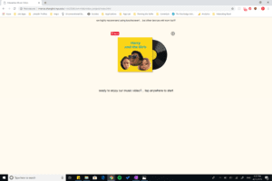
*Landing page of the website that also recommends using touch screen*


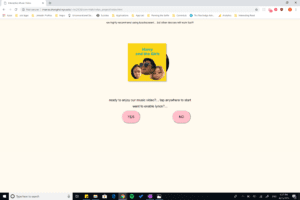
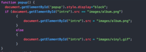
*Includes a gif of our album and allows the user turn on captions*


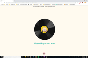
*Instruction page that tells users how to interact with the video and site*

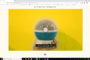
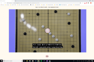
*First music video (Better Feeling – CL)*


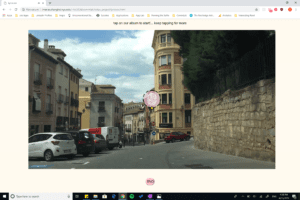
*Second Music Video (Palette – IU)*


*Third Music Video (Home – Phillips Phillips)


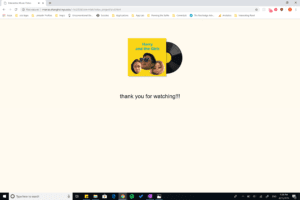
*Thank you page at the end that allows users to stop playing the videos*

Process & Struggles: 

For Film/Assets: Since we were showcasing three different videos, obtaining footage for our videos was the most difficult. We filmed most of the indoor footages Each of our songs had such different concepts, it required a lot of props and different location filming such as the footage from the museum and the street lights. Another difficult part of filming was trying to film the props in first person view without our bodies in it. Since the footage had to also seem like it was interacting with the camera by zooming/popping in, it was difficult without a green screen. Thats why a lot of the footage also went through post production. We mainly used Premiere Pro to color balance the footage to create the different background colors, masking in order to have a cleaner cut between the different footages, input captions into the video, and other effects such as speed, scale, and opacity in order to make the illusion of interactivity in our footage. Our album and gifs were created through Photoshop and we thought it would be fun and cute to add our photos into the album as well.

For Coding: The coding for our website was relatively easy to figure out, and we really wanted to focus on the footage rather than the website. We used Javascript for the buttons and video playback and HTML and CSS to make our simple and easy to understand website. We did have a little trouble trying to figure out how to get the video to pause and play at the part of the video that the user left off, but we got it to work in the end. We also had originally coded the css positioning for the website using pixels, so we had to troubleshoot and change the units of the positioning css code in order to have the website fit well for all device sizes.

Post Mortem:

I am quite proud of our website and think that the footage that we had was filmed quite well as well as the website was created in a user-friendly and aesthetic style. I have been inspired by Namie Amuro’s music video for a few years and was very happy that I was able to recreate my own version of that and create three different music videos as well. I think that the visual aspect of it was fun and I wish we had the time to also make a mobile or touch screen version of the site as well. The critique reviewers mentioned that the interactivity component of the video was hard to understand or not done very well but I thought that many users will still find the directions pretty intuitive especially since we had presented the website through a large projector and the website and function of it is a much more private user experience instead. I think that the visual aesthetics and the user functions were also done well.