Throughout chapters 1-4, I found the entire organization and structure of the work to be incredibly amusing and fun to read. The layout of the book is very interesting as it shows and explains what a comic is within a comic itself. I thought this method was captivating and helped not only explain the elements of a comic but also show them visually. As well, I felt that McCloud’s explanation of a comic medium as a sequential art or images helped me personally better understand comics on a deeper level. His discussion of artistic representation through comics and visually capturing messages through a certain order made me think of comics in a different way. As well, I also thought that the discussion and representation of comic history showed comics from a different perspective. I never previously thought about how older time periods such as that of Cortés included large scale drawings and artwork as murals that can be identified as comics. After understanding McCloud’s point of view, I realize how he sees artwork in many different forms as comics. From a historical perspective, I feel that based on McCloud’s work, a comic can be defined as any type of art following a specific order or sequence. I also thought that McCloud’s interpretation of detail in comics was very interesting. His belief that simplicity is more valuable than an enormous amount of detail stood out as very true in the sense that too much is not good. When thinking about my own artwork, this message impacts me deeply as I feel strongly that simplicity can show much more than trying too hard to be detailed.
Week 2: Photoshop Assignment – Samanta Shi
Final image: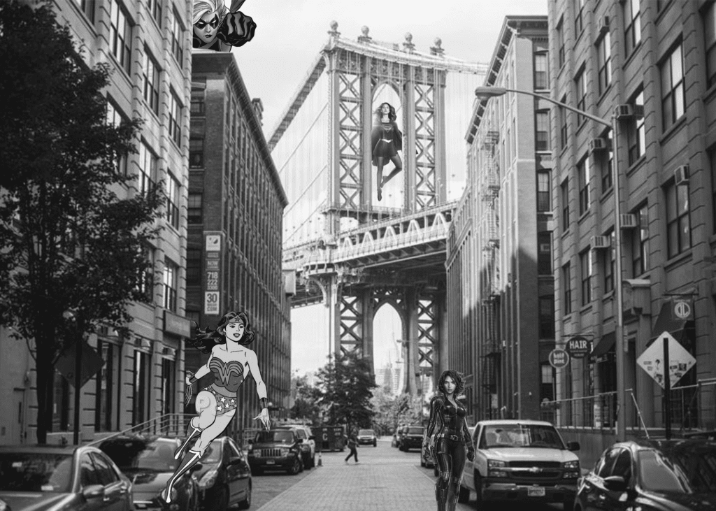
Original images:
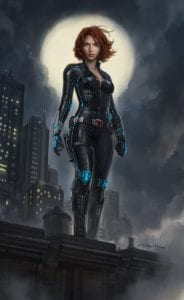
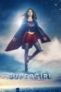
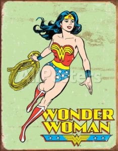
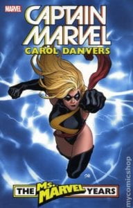
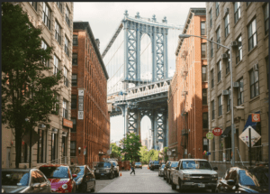
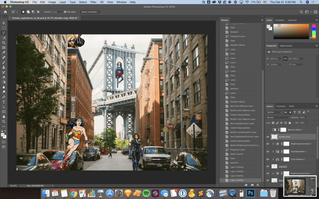
I decided to have a little fun with a few of my favorite things: superheroes and Brooklyn! I wanted to focus on female superheroes only because there aren’t as many well known female ones as male ones.
Process:
- Use Dumbo as a background
- Remove the original backgrounds from the superheroes
- Find a place for each one in Dumbo
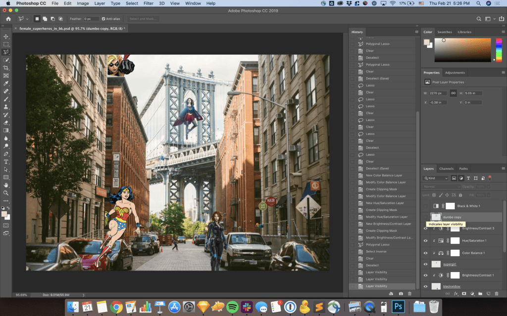
- Create additional layers of Dumbo to make the superheroes feel more embedded
- Adjust the contrast/brightness/hue of the images to match
- Make it a bit moody –> & white
Here is an example of how I used multiple layers of the Dumbo image, notice how supergirl is behind the bridge.
Week 2: CSS In-class Exercise – Samanta Shi
Here is a link to my variation of the CSS in-class exercise: http://imanas.shanghai.nyu.edu/~sls741/CSS_exercise/
As someone who learned CSS when flex box wasn’t really much of a thing, I am enjoying how easy it is to make a response grid system using flex box.
Week 2: Photoshop Collage-Selina Chang
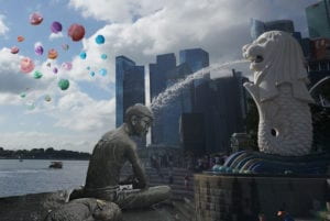
FINAL VERSION
PICTURES USED
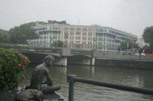
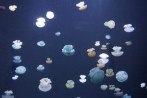
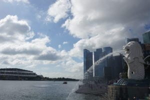
DESCRIPTION
The idea of my collage originates from the photo taken by tourists under Merlion, which is one of the most popular destinations in Singapore. Some drinks from Merlion’s mouth, others use the water to take a bath. That’s where my idea came from.
I use a sculpture that I accidentally took a picture of and make it a man showering under Merlion, relaxing, with a dog accompanying him. And I used those jellyfishes as some power from the outer world, trying to invade their city. From this collage I want to convey that we are under some threats that seems vulnerable without seeing them.
To accomplish this, I first use the quick selection tool to select the sculpture and create a new layer of it and put it onto the Merlion picture. To make it seems more realistic, I sharpen the sculpture and adjust some parameters such as hue and saturation. Then I select few jellyfishes using quick selection tool as well and put them onto the collage. I duplicate three layers and adjust the color balance, making them have some vulnerable candy colors.
Week 2: Photoshop Collage – Adam Chou
My project was made in photoshop, utilizing the elements below.


Project:
Process:
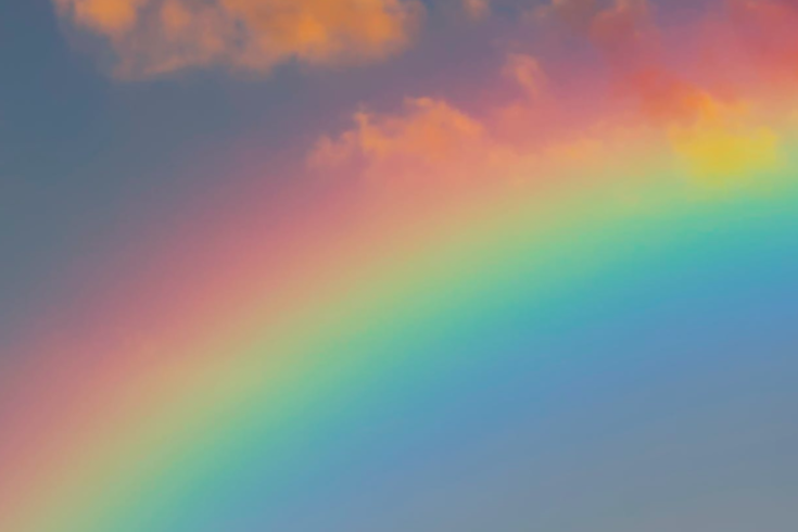
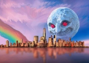
In all honesty, I chose this idea as an experiment. I took three organic ideas (the moon, the cityscape and a rainbow) and combined them. The rainbow (as well as the extension of the sky) however, took a lot of effort to make as natural as possible. Most of my time and effort was used with the blur, dodge and smudge tool to make the sky and the rainbow as neat as possible. I also added a mask to (as well as lowered the opacity of) the moon in order to make the object (although large in size) seem farther away from the city. I did this in order to make it seem more menacing due to the contrast of space.
Additionally, if it is not clear, I rotated the rainbow 90 degrees right, deleted the sky and used the blur tool in order to incorporate the colors into the sky.