http://imanas.shanghai.nyu.edu/~kx421/Wk2_Code/MyPortfolio.html
Week 2: CSS Exercise- Jikai Zheng
Process:
I started out with the example solution posted by my professor on google drive, but even though I understood partially that I had to use <div> and class to get my html page operating with css, I still needed way more help than that. So, I used this page: https://www.w3schools.com/css/css3_flexbox.asp to set up most of the code that I needed to do. Of course, I’ll still have to alter the code a bit to my style, such as font, color, and even the incorporation of some images of fireworks. However, the process was still very difficult and I will probably need to talk to a fellow or a learning assistant next week to help me comprehend more of the inner-workings of css. Although I got the page to look pretty this time, I know it will take me much longer to reach the type of clarity that allows for consistent craftsmanship.
Week 2 – CSS exercise – Adam Chou
IMANAS link: http://imanas.shanghai.nyu.edu/~ac6596/css-float-n-flex
Reflection/Process:
To be honest, I will not lie – I initially copy and pasted many of the lines of code from the site: https://www.w3schools.com/css/css3_flexbox.asp for much of my experimentation process. Because it was hard for me to differentiate the uses of all of the codes, especially for what I had in mind, I had to try out multiple lines of code in order to experiment. From that process, It was mostly deletion as well as changing values in order to fit my artistic style. I felt that because of this, the process took a lot longer for me to achieve my goals. However, I hope that with practice, I will get better.
Week 2: “Understanding Comics” by Scott McCloud – Adam Chou
To be completely honest, I have read this book before, so I already knew about all of the techniques and sense of space discussed in the book. However, on my second reading, I started to pay more attention to the form and presentation of the book. What was particularly interesting about the four chapters (and the book itself) is not just the presentation style, but also the content of the piece. The history that we know of (as described in the book) is that comics are a particularly western invention, where the combination/usage of words with pictures was first recorded. It Is, however, odd to me that although these western influences are used to accentuate the definition used, there is no mention towards attempts of what might have been a comic. When I speak of this, I think of Chinese calligraphy and other pictorial – based languages. Perhaps it is by training or simply medium, but to which what can be considered what should not be limited by simple geography and history. But then again, I am most likely talking too much on something I know little about.
Oddly enough however, he does illustrate the differences, but not the development on the eastern traditions, where there is little comparison between Japanese as well as Korean, or perhaps Chinese comics. A little more diversity would have been appreciated. There is, however, a distinct tone to which east has influenced west, which means that this narrative is mostly centered on the western style of painting. I do, however know quite a bit on some of the defined terms: icon – medium – message so I guess I will speak on that. I find it limiting that the association of these symbols are restricted to explain a comic, when they can easily (and should only be) used to describe art as a whole. The entire theory of communications is entirely dependent on the framing of the image, to which the artist does well, but also miscommunicates at the same time.
I can appreciate the sequential method to which the artist uses in order to convey the message. I suppose that it is working off of a basic understanding that we know how to read the comic, much like how Japanese manga needs you to understand that you read from right to left, instead of left to right. I find it fascinating to think about the way that the presentation has been both deliberate and accidental. An example would be my beforementioned analysis of audience and media. Then again, this could be my odd interpretations of the messages that I have, as I often find my mind wandering to other subjects (related to the topic) but tangential at best.
Week 2 : Photoshop Collage – Abdullah Zameek
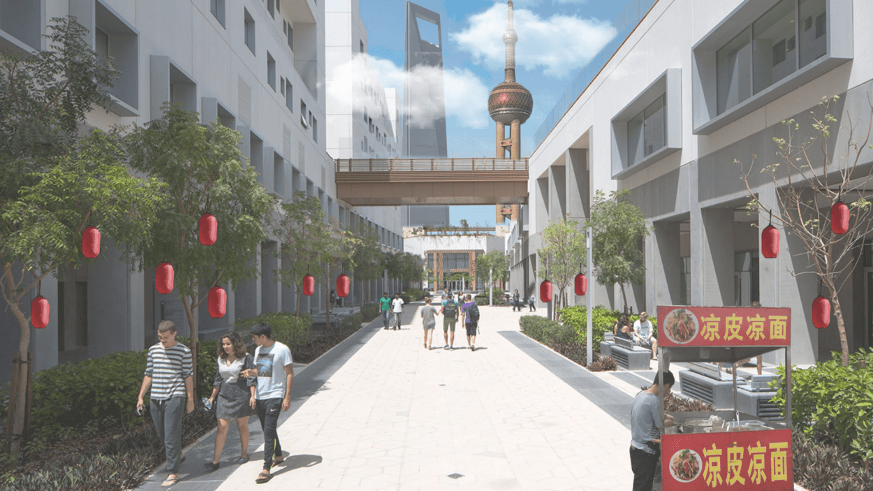
As with most creative and artsy projects, my mind and imagination came to a bit of a standstill. During class time, I was messing around with a picture of the Shanghai skyline, so I thought I might as well try and incorporate some elements from that into my project. For the base, I used a picture of a place that I’m sort of missing these days – the NYU Abu Dhabi campus. I thought it might be fun to try and incorporate some elements from what I have seen in my brief time in China so far to a more familiar setting, creating a crossover of what seems to be two very different, but familiar settings.
This was the final result:

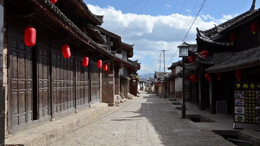
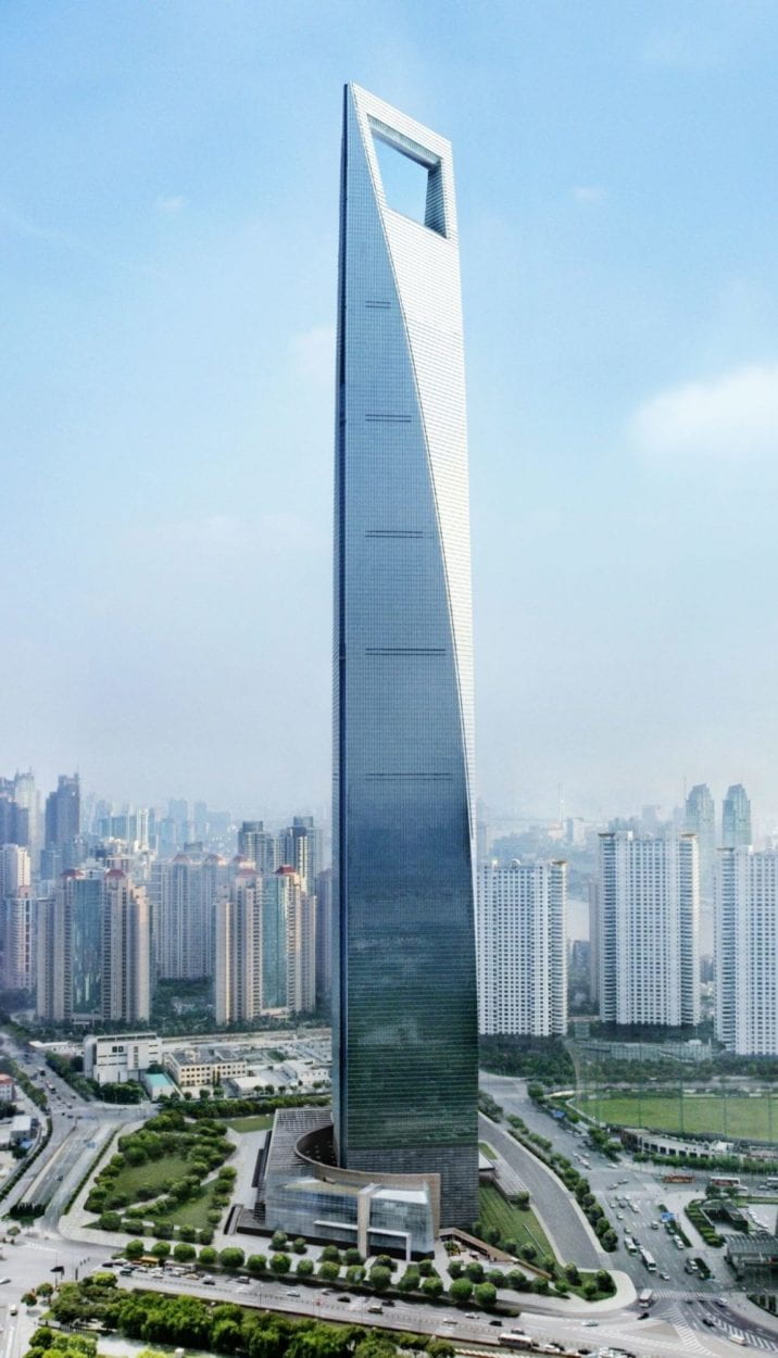
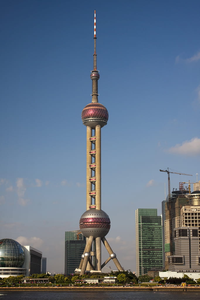
The source pictures that I used were the following :
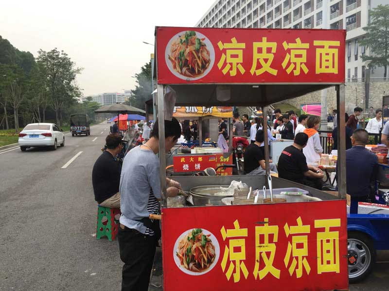
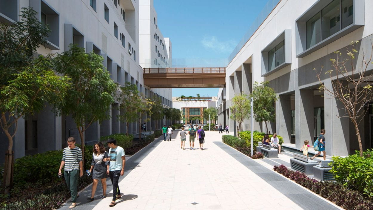
The Process:
The first step was to extract the necessary elements from the source pictures – the lanterns, the Pearl Tower, the Bottle Opener, a street food vendor and some clouds. This was quite easy to do with the the pen tool. However, if inspected very, very closely, it can be seen that the “Photoshopped” elements have very crude edges. This is because I did not create a smooth enough contour, but for the purposes of the image I wanted to create, it seemed sufficient. The next step was to add the necessary elements in. Once, I did that, I used the “History Brush Tool” to restore some of the elements from the original image that were being overlapped with the new image. This made the final image look more natural, and can seen at the intersections of the bridge and the middle of both the Pearl Tower and the Bottle Opener. The final step was to add a bit of haze and cloudiness to the scenary since that was the atmosphere I was familiar with when walking around Shanghai. To do this, I added a solid color of gray to the image, and reduced its opacity down to a small percentage to give the image a hazy feel. Next, I reduced the saturation of the image, followed by the contrast. (I used this as a reference to do this last step).
And, this was the outcome!
