Generally, comics have this stereotype in society that labels it as something bad, or not useful in comparison to books or novels. The generic reasoning as to why comics are not knowledgeable is because it is seen as a book of “fun” or a series of mostly images with very little text, therefore having others believe that there is nothing to truly learn from comics. But McCloud sees comics in a different light: as artwork of another medium. A series of pictures with little to no text leaves the reader to their own imagination on how the artist’s story unfolds. The artist creating the comic may have their own interpretation of their work, but unlike many other artistic mediums, comics are pretty open to interpretation, allowing many different perspectives of the same story to take place. Many people undervalue the worth of comics simply because it is not detailed enough, but in McCloud’s argument, less is more. Pictures offer a narrative point of view, while the color and detail within those images portray the mood of that specific scene. Comics offer much detail, but unlike texts, the detail is within the images. It is a visually captivating art form that gives the reader a chance to become the character within the comic, as McCloud describes. This can be related to our own class, as we all have different art forms that we choose to express ourselves with, where our classmates may interpret our own work differently than how the original artist sees it, but the point of these art forms is that there is no right or wrong answer, because everyone has their own opinion and their own way of interpreting certain components of art. Comics give plenty of room for one’s imagination and creative side to explore and venture, whereas typical books or texts are so defined to the point that there is no room for the reader to form their own thoughts on the piece they are studying. No two people are the same in regards that their interpretations of one single art form would be identical, because the way that one person views a certain color, expression, or motion, will not be the same as another individual. I believe that within this class, similarly, we as students are able to create anything we feel expresses our own creative side, able to receive multiple perspectives on our own work.
Week 2: Photoshop Image – Kimmy Tanchay
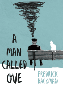
For my photoshop image, I decided to do a reimagined or alternative book cover for a book I recently read over the winter break. I got inspiration from the original book cover – using the same colour palette.
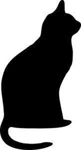
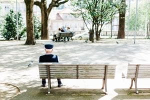
My three images I used is the one of the old man, the silhouette of the cat and the texture in the back (blended with the blue background). I decided to contrast the real image of the old man, removing the background, against hand-drawn squiggles and the cat silhouette to reflect the book character’s, Ove, unstable mental state in the beginning of the book in which he often dazes out of reality.
Final photoshopped image:

3 original images:


Week 2: Photoshop Image – Xavier Juhala

This piece was actually a lot harder for me to make than I thought it would be. I couldn’t remember how to use the pen tool that we learned to use in class so I had to find a new way to cut out the background and merge the images together. I ended up using the select and mask tool to erase the background from my images, I think this way actually ended up being easier than the way we learned in class to get rid of the background. Once I merged the two photos together – the beach and the galaxy – I thought it would be easy to then just do the same with the statue of liberty part but when I tried to select it to add it to the piece the whole image would copy and I couldn’t get rid of the background. Because of this, I ended up having to do it all over again because I didn’t know how to undo the last step. I then redid the statue of liberty, but this time saved it as its own photo with a transparent background and then added to the picture I already had of the beach and galaxy. Overall I’m pretty proud of this picture as it was my first time using photoshop by myself and it took me a really long time to do this.
Week 2: Photoshop Image – Hanna Rinderknecht-Mahaffy

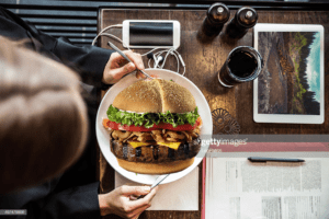
I don’t have any experience with photoshop, so this image combination assignment was both challenging and interesting. I started off by using the pen tool to outline the image of a burger, and then got rid of the background so I could put only the part of the image I wanted into the other images. I then found a picture of rainforest deforestation and cropped it slightly. I added these two layers to my third image and re-sized the two photos as needed. The final change I made was to use the erase tool to make the forest image fit in “behind”the glass.
Week 2: CSS Portfolio Page- Evan Xie
Link to the basic CSS portfolio including flex-box: http://imanas.shanghai.nyu.edu/~emx200/wk2/portfolio.html