Photoshop assignment – Khaliun Dorjderem

At first I was so confused on how to use those different tools and how to combine images. However, I watched some tutorials on youtube and just played around with the tools to finally learn to use it properly. I struggled the most on figuring out how to separate/cut an image and to form a new one. The most useful tools for me were the magic eraser tool and the quick selection tool. 

It was challenging to work on photoshop, but at the same time it was fun and addicting. I hope to learn how to use other tools to create more works on photoshop!
Week 2: Response to “Understanding the Comics” by Scott McCloud – Khaliun Dorjderem

After reading the “Understanding of Comics” by Scott McCloud, I came to realize that comic books go way beyond than what I expected them to be. Since when I was 5 or 6, I liked reading comic books because they were easy to understand and follow and fun to read than a normal book. However, I have never thought every aspect of comic books would have an underlying meaning, like how the comics are very simple not very detailed because people wouldn’t pay much attention if it is very detailed and how gutters are filled with closure.  

It made me think that comic book author not only tells a story but also understands how people interpret different things. What really stroke me was how authors emphasize their story by making the pictures simple. As a reader, I always thought they made it simple because it was efficient, not to emphasize the character. even though the art is simple, the author puts a lot of effort into it as he/she thinks about how the background color, size, and many other aspect would present the story, not tell a story. 

Week 3: Understanding Comics- Kyra Bachman

The first four chapters of Scott McCloud’s book, Understanding Comics: The Invisible Art, offers an interesting outlook on the theory of comic art. The first chapter, titled “Setting the Records Straight” establishes a definition of what exactly a comic is. It provides examples dating centuries back in history detailing ways in which different societies- from Egyptian, to stone age Roman Catholic- displayed their visual arts. I understand the second chapter titled “The Vocabulary of Comics” as attempting to convey that the vocabulary of comics should be interpreted from visuals rather than just words. It shows how non pictorial icons have an absolute meaning due to them being a representation of visual ideas. The third and fourth chapter both focus in the frames of comics, noting the importance of the sequences and panel layout which lead the viewers in a certain direction.

Overall, I found this reading to be a helpful insight on the art of visual representation. McCloud’s step-by-step examples of how to proceed with the design process is one that I found very useful. His articulation of how to appeal to viewers subconscious was something I’d never thought of before and will try to incorporate in my proceeding work- that being websites, photoshop, etc. McClouds concept of utilizing ‘the gutter’ – the spaces between panels- is one that I feel is a helpful insight that could be applied outside of comic books. Whether it is editing a film, or the visual layout of a website, there are effective ways to create an eloquent sequence that will appeal to the viewers subconscious to give them a sense of closure.

Week 3: Photoshop – Kyra Bachman

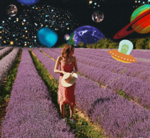
I used the technique of laying on Adobe Photoshop from a tutorial I watched online. I found the magic wand tool especially useful in eliminating the original background of this image as well as the brush tool which is helpful in blending images together cropped images. The three images that I photoshopped together is the image of the lavender field, the galaxy background, and the image of the alien in the flying saucer. My inspiration is from advertisements I’ve over the years where the negative space juxtaposes the focal point (in this case being the woman).  For my first time using photoshop, I’m happy with how it turned out!

Week 2: Combining Three Images – Grace Currier

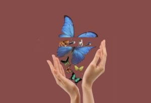
I had a lot of trouble figuring out how to use photoshop, combine images, add layers, rotate them, edit them, etc. It was a difficult process but I am very proud of the final product. It may not look like it took a lot of time, but there were many failed attempts and long hours prior to completion of the final product. I wanted to combine mediums (photography and graphic illustration) because I think combining 2- and 3D images creates something really unique.