Final Project Net Art Documentation: Evan Xie

link: http://imanas.shanghai.nyu.edu/~emx200/CitiesXCommLab%205%3A13%20/homepage.html 

Description:

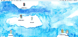
For our final project, my partner and I decided to create a web based concept that mimics a Mac desktop. We both created original art pieces, all hand drawn, and used them as a basis for our project. We wanted to design a theme based on cities we feel personal connections to. Therefore, we chose to use Manhatten (my hometown), Richmond VA (my partner’s hometown), and Shanghai since we both study/live here currently. We then drew each main city as icons for the desktop screen as well as two extra cities that are namable by the user. When clicked on, the main city icons (NYC, Richmond, Shanghai) each show a pop-up of different images as well as a soundtrack that I created from scratch, incorporating music/sounds from each respective city. We also added personal voice overs for each main city, showing our own thoughts on where we grew up as well as Shanghai.

Our project overall focuses on the idea of simple yet inttriguing artwork as shown through a desktop view. By being able to drag and click on each main city icon, our original artowork is shown to represent the beauty of each city and a personal view of some of its famous areas. 

Process: 

We started by hand-drawing all artowork and images used in the project, except for the top Mac-replica icon bar at the top of the screen. Next, after all artwork was drawn and scanned, we used photoshop to make the images into icons for the computer screen. After this, we each recorded our own voice overs for each city, and I created 3 soundtracks using Ableton Live and sampled sounds from each city using prerecorded noises since I am not currently in NYC or Richmond.  From here, my partner created the base of the code with draggable icons and then I added my own elements to the code with different images and clickable voice over functions. We then both worked on the code separately to organize and format css and js click functions. After we both finished our code, we brought it all together and finalized our project. By incorporating all images, sounds, and functions effectively, our final piece came out great. 

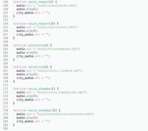
Sample code from voice overs- 

Challenges:

Overall, we were able to effeiciently and effectively make all elements of our project. However, the most challenging componants were formatting css properly with our js functions as well as making sure our code worked propery. It was slightly tricky for us to make all click functions work smoothly, but we did the best we could. 

Post-Mortem: 

Our project process and final result came out very well and met our expectations. I felt that we both worked very well and were able to bring our ideas to life. I feel very happy with our final result and feel that both myself and my partner worked hard to make it all come together. After all coding elements we learned throughout the semester, I feel that my partner and I were able to use these skills coherently for our final project. At this point, I feel that this project, as well as all other projects this semester, have helped me greatly in learning code and being able to apply it to my ideas.

Week 14: Final Project Documentation – Hanna Rinderknecht-Mahaffy

Project Link: imanas.shanghai.nyu.edu/~hrm305/elevator2/lobby

Group: Cara Chang, Hanna Rinderknecht-Mahaffy. To divide the work, Cara mainly worked on the drawing studio, while I mainly worked on the piano studio and elevator doors, although we both helped each other work out coding bugs at certain points. 

Description/Overview: 

For our web art project, we decided to create a sort of “virtual museum,” where the user can go to one of two studios and create their own art. The two studios are a piano studio and a drawing studio. The home page of the art project begins in a museum lobby which contains instructions telling the user to click on the elevators to enter and explore the studios. Once the user clicks on the elevator, they are taken to another elevator html page which shows an elevator door covering the html page with two floor button options for the two studios. Once the user clicks either of the buttons, the elevator doors will open and the user will click on the page to enter the chosen studio. The drawing studio has a blank white canvas where the user can draw their art. The user has the option to change the color of the pen tool, the thickness of the stroke, erase the strokes, or use animated stickers to draw instead of the pen tool. Additionally, there are two options to “clear” the sketch to get a blank canvas, or to “save” the drawing to the right of the drawing canvas. After saving the sketch, the user can continue drawing, and each consecutive save will update the saved drawing. The piano studio html page opens with instructions telling the user to use the computer keyboard keys to play the various notes. When the user plays the various notes, corresponding color flashes in seemingly random geometric quadrilaterals flash above the played note. This give the user both an auditory and a visual experience of what they are playing. 

Process: 

Our brainstorming process started by deciding that we wanted to have two art components, the piano and the drawing function. After discussing these ideas in more depth, we decided to combine them by having them be two ‘studios’ in a virtual ‘art museum.’ For the lobby homepage, we inserted and styled a full-page picture of a generic museum lobby. We added a text div welcoming the user to the museum and instructing them to click on the elevator to enter. 

For the elevator html page, the main goal was to have two buttons that, when clicked, would open the elevator doors, allowing the user to click to enter the studio. To create the look of being inside an elevator, we cropped a picture of elevator doors until we had two pictures, one of each side of the doors. These were then inserted into a p5 canvas inside the setup() function. Then, we created two buttons in html for the two elevator buttons for the studios. Inside javascript, the following code was employed to setup the function for when the button was clicked: 

This querySelector ‘selects’ the first button element found in the html code, and tells the computer to run the started code when the button is clicked. Then, inside the draw() function, the code to open the doors looks like: 
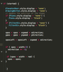
this if(started) statement runs the code inside only if the button is pressed. When the button is pressed and the “started” code runs, the xpos and ypos, which are the positions of the elevator door images, are set such that the elevator images translates off of the screen, making it seem like the elevator doors are opening on a button click. The code above also makes another button which links to the specified studio visible, allowing the user to then click on it and enter the studio. Another if() statement similar to the one above is also included for when the other studio button is pressed. 

For the drawing page, canvas was used to create a canvas and a pen drawing capabilities. We wanted to include some different drawing components rather than just a black pen stroke, so we decided to also include various colors for the pen stroke, as well as stickers which can be draw onto the canvas. To further the idea of it being a ‘create your own art’ studio, we also added save and clear functionalities, allowing the user to have more control over what they create. 

For the piano studio, the keys were created simply through a series of divs in html, and styling in css was used to format them to look more like an actual piano keyboard. To incorporate the key sounds, individual audio files were loaded in the html code and called in javascript using the following code: 
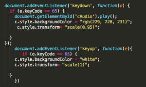
the EventListener checks for whether a key is pressed or not, and the if (e.keyCode ==65) {} code tells the computer that if the ‘a’ key is pressed, the ‘cAudio’ will play, the background color of that key will change to a slightly darker color, and the key will ‘scale’ to a slightly smaller size, giving the indication that the key has been pressed.  the ‘keyup’ eventListener returns the key to its original state of being unpressed. To incorporate a visual indication of the notes, a p5 canvas was drawn and lerpColor was used inside if statements that had the condition of if a keyIsPressed status == true AND if a specific key is pressed, a specific colored quad will fill at a set width and random height: 
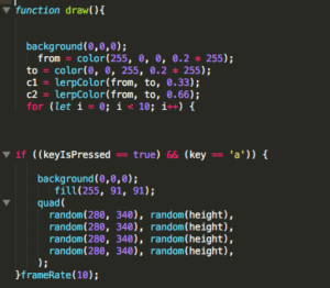
This fills the quad shape at a frameRate of 10 for a random height. This same code was repeated for every relevant computer key and each key quad was filled with a different color in the order of a rainbow. A final if() conditional says that if KeyIsPressed == false, a black rectangle would fill the entire canvas. This creates the effect that when a key is pressed and then let go, the color flash will appear and then disappear after the key is done being pressed. 

Challenges/New Concepts: 

One of the main challenges I faced while coding was in getting the elevator doors to properly translate on a button press. At first, I couldn’t get the document.querySelector to work for more than one button. I finally realized that since the querySelector only calls the first element of that type, it couldn’t read two buttons. I fixed this by making one of the elevator door ‘buttons’ a ‘btn’ instead. This then allowed me to have 2 querySelectors for ‘started’ and ‘started2’ which could be called inside the draw() function when the specific button was pressed. For the piano page, the difficulty came in the great amount of time it took to style both the piano keys, and the color bursts so that they exactly lined up and looked like a cohesive, believable auditory and visual piano experience. 

Conclusion: 

Overall, I feel like we met our project goal. We wanted to have the user ‘create their own art,’ and we aimed to connect the two art experiences through the creation of a ‘virtual museum.’ By allowing the user to navigate through a lobby, elevators, and then into the various studio html pages, I feel like we achieved the experience of moving through a museum. I think the creation of a drawing and piano studio also did a good job of balancing auditory and visual art pieces, with multiple types of interactivity, which give the whole experience more variety excitement. 
Final Project Documentation – Kevin Xu – Virtuo

Documentation and Reflection: Kevin Xu

http://imanas.shanghai.nyu.edu/~kx421/flp/trueintro.html

Project Proposal:

A virtual midi board including drums, piano, and a guitar, which also represents how a computer recognizes sounds. Using the assumption that computers can only read binary, the computer reads the notes using binary as well.

Project Description

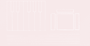
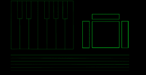
The main goal of my project was to emulate the simple layout of a MIDI board, allowing users to easily access three separate instruments on the same page. However, the second version of this website, which is the “dark” version is meant to represent how a computer recognizes notes of music. Binary is shown which can be translated into the notes which the user played, allowing the user to keep track of the notes he or she played during the experience.

Process:

In order to complete my project, I set out two main goals. One was to solve the javascript and functions of the project, while the other was to create a visual that was simple and relaxing to look at while not interfering with the user. I settled with a subtle gradient background which slowly changes color behind a clean white interface. This way, the visuals or not overwhelming or distracting but instead allow the user to focus on the music. In contrast, I made the “dark” version of the website clearly meant to symbolize a computer with the bright neon green on top of black similar to the color scheme of movies like The Matrix. I used the keydown and keyup functions in order to get the instruments to work.

Issues: 

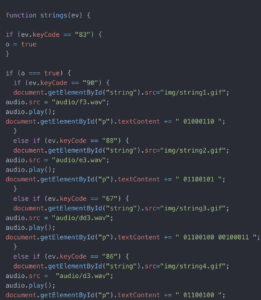
The main issue that came up with was getting the guitar to work. In order to simulate a real guitar, I wanted users to hold one key on the keyboard while strumming the guitar with 6 other keys, like the strings on a guitar. At first, I couldn’t get two keypresses to work at once, but with the help of the IMA fellows I was able to allow the strings to work with a two keypresses.

Project Reflection: 

The final product i created was just like how I imagined it to be. I wanted to create a simple layout with a focus on the instruments at hand and music which could be played on them. In the future, I would like to be able to actually learn how to code a binary to text translator to put into the dark version of the website which would allow users to translate their binary into text right in the website.

The following are screenshots of how I got my keypresses to work as well as the two contrasting layouts for the virtual midi board.

Week 13: Net Art Project Proposal – Samanta Shi

In many ways, machines today are becoming more and more human. They perform intense computations, learn from their mistakes, and respond to stimuli. However, they lack finality. My piece aims to explore, bridge, and ultimately delineate what it means to be human by contrasting themes of growth, response, and death through a coded medium.

Visually and thematically, the piece echos MC Escher’s 1953 lithograph Concentric Rinds, a series of well ordered, concentric, and circumscribed spheres grounded on an inky void with light emanating from the center. Escher was a classically trained mathematician, and technically, his etchings have a machine-like perfection to them. Intellectually though, his pieces rebel against perfection through illusions and contortions of perspective. While machines excel at performing repetitive and well organized tasks, they lack the creativity to expand artistically – or non-functionally – beyond rote tasks. Escher is still relevant in a world of perfected digital art for technical prowess and the creative genius to harness and manipulate mathematical perspective.

For my piece, I want to explore the finality and uniqueness of human life. Machines differ from us in that they can reproduce without losing knowledge. My piece aims to echo MC Escher’s genius by contrasting the technical successes of coded routines with the finality and unique spark of human life. Concentric Rinds is a whole and encompassed shape, a bright and lonely vessel in a stygian darkness. In its concentric shapes and centralized composition, my piece draws heavy visual inspiration from Concentric Rinds. It seeks to reproduce the loneliness and uniqueness of human life in emptiness. By expressing this through code, I hope to both reference MC Escher’s technical perfectionism while contrasting the distributed nature of code with the uniqueness of human life.

A fundamental condition of humanity is individual growth and reflection before ultimately succumbing to death. My piece is further inspired by Claude Monet’s early 20th century Water Lilies series, a collection of over 250 paintings that encompass the growth of a productive career while arrestingly documenting the setbacks of physical fragility. Monet was an early pioneer of the groundbreaking impressionistic style that revolutionized modern painting from austere classical perfection to loose interpretations and inferences. Tragically, by the end of his life he was beset by cataracts that rendered him nearly blind. The Water Lilies series is the final capstone on his impressionistic style. While smudged lines, blurred shapes, and blended colors hint at his subject and harken to his pioneering painting technique, the blurriness of the paintings also reveal his personal struggle with encroaching blindness.

My piece references Monet’s career as a groundbreaking painter and his struggle with physical fragility with themes of growth, encompassment, and reaction. It’s a common UI assumption that paging or scrolling will carry an audience through a medium. Building on that assumption, I will combine a growing visual ripple with a soundtrack to signify the  growth and appreciation of life. As the user scrolls, concentric shapes emanate from the center, like rings on a tree, signifying growth. At the same time, an accompanying soundtrack plays paced to the rate of scroll, encouraging the audience to explore at a reasonable pace – like life, the piece cannot be enjoyed too quickly. To represent the indelible marks that setbacks and events can leave, as the user clicks on the piece – literally triggering events on a symbol of growth – further ripples and shapes will appear like water lilies rippling on the surface of a pond. Once the user approaches the end of the experience, all of the content but a black background will disappear to represent the finality of death.

I will use JS to accomplish the scrolling effect: animate the shapes, manipulate the speed of the music, and create the ripple effects. I will use CSS to style the web page and might use CSS keyframes to enhance the animations. For the background music, I will use a piano cover by Vincent Corver of one of my original songs.

Week 13: Final Project Proposal/Description – Hanna and Cara

The concept for our final project is to create a “virtual art museum”, where the user can explore different art ‘studios’ where the user can create their own art. The main html page will show an image of elevators doors, as if the user is inside the elevators of an art museum. The user can then click one of two buttons to explore the two art studios: the piano studio, and the drawing studio. Clicking on the buttons for the specific studio ‘floors,’ will cause the elevator doors to ‘open’ (through employment of the draw() function in p5), and the user will click on the “Enter Studio” sign which is revealed to be behind the elevator doors. Depending on which button was clicked initially, the “Enter Studio” background will link to a new html page for the piano studio or the drawing studio.

For the piano art studio, a piano keyboard will appear on the web page and instructions will tell the user to press certain computer keys to play their corresponding note on the piano. As each specific computer key is pressed, its corresponding note will play and the corresponding piano key will look like it is being pressed and it will change color slightly to indicate the key being pressed.   To go with the auditory elements of the piano, we wanted to incorporate a visual representation of each note. To do this, we will assign a color to each key, so that when each piano key is pressed, its corresponding color will flash onto the screen above the piano key that was pressed. Our hope is that we can include a way to record the auditory and visual art that the user creates by playing the piano.

For the drawing studio, the web page will consist of a blank space with a pen tool and a variety of colors to choose from, as well as a range slider to adjust the thickness of the pen. We will also have a few stickers to choose from for users to have the option to add a sticker, or draw something with a streak of the chosen sticker. There is an eraser tool that the user can choose, or if the user is not satisfied, they can clear the entire template and start over. We also aim on having a background selection, where the user can choose to color in a template that we have provided, or choose to keep the space blank, and use their own creativity. Something that we want to implement is a “save” function, where if the user likes the work they have created, they can save it without fear of clearing the template and losing their work.