Internet Art Project Documentation – Adam Chou

Project Link:

http://imanas.shanghai.nyu.edu/~ac6596/Internet_Art_Project/

Project Proposal:

The project was conceived as an Internet-based audiovisual novel. The project attempts to answer the question: “What if someone were to narrate your life?” In order to answer this question, two perspectives are presented: the narrator, and the character. The narrator is unable to hear the character’s thoughts and vice versa. This creates an interesting parallel for the user to explore, and perhaps think about. The main ‘point’ of the project is to illustrate this odd phenomenon and how it is often explored in story writing for world-building. I try to illustrate this by allowing the user to choose whether or not to listen to either perspective, which presents a different side of the story.

However, this is not to say that they will be isolated from the other perspective; audio stops each time each perspective is swapped, but the audio from the other perspective is presented by the text. Additional sound is added to aid image associating with the text.

Project Description:

The work I have created is an audio-visual novel presenting the dichotomy of a third-person and first-person narrative. The idea is to represent how words can often disturb and create a different perception of reality. I have attempted to do this by presenting two different texts, with the ability to switch between them. They both tell the same story (i.e. a girl’s walk to her father’s grave), but with the inability to communicate with each other, except by what both can be heard (the voice of the main character -Miki).  The project is script-based, based off of a side by side comparison of a movie script and storyboard in black and white.

Process:

Despite the rather realistic advice of my peers, I decided to work on my project alone. I felt unsatisfied with the mediocre effort reflective of previous group members and so I thought it would be best to rest all of the responsibility on my shoulders. This, I felt, would push the boundaries of what I would be able to practice with, and make sure that I felt motivated to complete my final project. After all, if you work alone, who do you blame but yourself?

Initially, I was going to make an interactive music video, replicating an artist style that I loved. The artist’s I was going to replicate was named in love with a ghost. Essentially, the style was that a few chords were repeated, a relatively high voice was used, and the sounds of the environment were looped to create a beat. This I felt, could be applied to the setting of the IMA Lab, which is often bustling with activity. It definitely would have been a project I would have liked to see come to life.

However, I had a change of heart. The process started around the time when my previous project was being done, where I was also tasked to write a 1000 word short-story for participation in a creative-writing program within NYU.

Due to the short word count, I decided to take inspiration from two writers that I know fairly well, Natsume Soseki and Kazuo Ishiguro.

Natsume Sōseki was a Japanese writer who lived through the dawn of the 20th century, and some more. He was considered a prominent member of Japanese literary culture, helping to bring about a profound effect (stylistically) amongst aspiring Japanese writers. His work, Kokoro, chronicles one man’s regret, which ends with his suicide. The piece, in my understanding, illustrates emphasizes the association of memory to guilt, showcased by Sensei’s inability to forgive himself. In my piece, I will be attempting to mimic a light-hearted version of this sensation – instead making a more ‘slice of life’ style. Slight changes within my writing, stylistically, would be trying to keep his descriptive style while eliminating the first-person narration and having a third person narrator.

Kazuo Ishiguro is a Japanese writer based in the United Kingdom who has also received critical acclaim. His book, Never Let me Go, is a dystopian science fiction novel. It chronicles the first-person experience of a woman named Katie, who sees the two people she knows and loves, leave her. The piece plays with a bittersweet feeling of regret and loss, tying in the two for the fated plot-twist that initially shocked me. Foregoing the plot-twist due to time constraints, I chose instead to borrow the unusual inner-peace that the narrator exudes in the end scene, despite the loss experienced.

Their writing style, as well as the gripping tales they told served as inspiration for the story, which ended up being one girl’s journey to her father’s grave, where she lamented her issues surrounding a boy named Jin. The father’s gravestone would be engraved Jin, as a sort of ironic easter egg that I would put in for readers as a subtle hint to my inspirers.

Although I made it my sole purpose to work on the video project as much as I could, I began to wonder ~ what if I made a novel on a website? I, therefore, began to draw assets on my flight back to Shanghai (I had gone to Shenzhen for a weekend), as I thought about this idea.

For the art style that I settled on, I relied mostly on my own style – which was not based in anything at all. In general, I am more used to drawing in an anime style, as I often times try to replicate the artistry of some Japanese animes that I enjoy watching. Therefore, I tried to make the panels simple and hand-drawn, as the initial idea was that the story would be a voice-over of the script that was displayed, a sort of rough draft that would be displayed for the user. It was, in no attempt, a way to replicate or even imitate (visually) real life. This I thought, was something that I wanted to convey through the story and the way that storytelling works to immerse someone in a world, even if they know that the world is not real. The idea that the world is believable, however, was the goal. Therefore, the drawings are made intentionally simple and plain, to emphasize the need to pay attention to the audio. 

And so, when I finally finished my debacle of a video project, I began to expand on the story, writing an additional dialogue to explain some of the earlier hints that I had made to the main twist of the story -> who is the main character ignoring and why?

I remembered, initially, that Samantha Shi – an IMA senior and fellow classmate – had an interesting function that typed out script in HTML. I sought out how to do this.

However, when reading her code, I encountered a huge issue: I don’t understand J-query. 

Her code is displayed below.


Here is the code that presents the inner-html, which I understood to be the thing that printed the script. 


This script shows the typewriter function, which was used to print out.
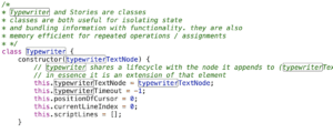
The typewriter function is printed here, where a constructor was used in order to make a more efficient version of what I would eventually construct.

Not wanting to learn an entire library for the sole purpose of a solo project,
I decided that the first task that I had was to translate this into Javascript.

Initially, I started with the basic website and CSS, and learning how strings and substrings worked.

This meant that I had to construct a run function that would print out a line. What I ended up getting looked something like this: 

    function runtext() {
        
        var str = document.getElementById("scriptwriter").innerHTML;
        //changes scriptwriter to equal the text string length minus one character
        str = str.substr(0,str.length-1) ;
        //gets the character of ss using charAt
        console.log(scripttype);
        str += scripttype.charAt(ss);
        //sets scriptwriter to equal new string"str"
        document.getElementById("scriptwriter").innerHTML = str;

After this, the purpose was to automate the function, and so it ended up transitioning into this. 

function runtext() {
        
        var str = document.getElementById("scriptwriter").innerHTML;
        //changes scriptwriter to equal the text string length minus one character
        str = str.substr(0,str.length-1) ;
        //gets the character of ss using charAt
        console.log(scripttype);
        str += scripttype.charAt(ss);
        //sets scriptwriter to equal new string"str"
        document.getElementById("scriptwriter").innerHTML = str;
        // adds to counter of var ss
        //autoscrolling feature
        var write = document.getElementById("script");
        write.scrollTop += 100000;
        //if (Boolean(stopplease = true)) {
            console.log('whatthefuck')
            //look at this
        while (stopplease == true){
        ss++;
        console.log('yeet')
        }
            console.log('excuseme')
        //}
        // stops the text from running after narrator[0] reaches 0.
        //else
        if (ss > scripttype.length) {
            clearInterval(gottagofast);
            
            console.log('Ihopethisworks')
            //idk why this works but it just does -> autoplay feature but delays the play after 500 miliseconds
            setTimeout(play, 500);

            document.getElementById("scriptwriter").innerHTML += "<br><br>";
        }
        document.getElementById("scriptwriter").innerHTML += "_";
    }

This whole process took about a week of work, with me borrowing the help of Tristen and Dave for extensive periods of time. BIG SHOUT OUT TO THEM. 

In the meantime, to make sure that I had enough time to do the rest of my work, I decided to finish the majority of the artwork that I would be using.

There were no switching perspectives yet, it was just an idea to have one huge line of text print and have images displayed.

However, I went to Nimrah just to check in with my concept, where I realized that my concept was lacking: In its current state, the project did not fulfill my initial goals, and some suggestions came to light. What about contrasting the views of the narrator and the main character? 

And so, I had more work to do with the initial script function that I had initially made out. 

Having two run side by side, as well as functionality – that proved to be a very difficult task for me alone. Thankfully, I had the time and patience of the fellows to help work with my issue. 

Prints out each script line individually at the same time (this is how the scripts can be swapped: 
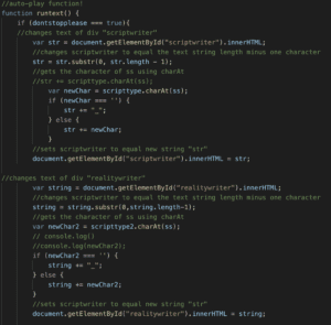
Autoscroll Feature for the text (so that the user does not have to scroll down):


Stops function if line printed length is larger than script length:  
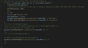
Pause Function:
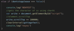
The final code looks something like this, with booleans attached in order to improve functionality when the script is paused and played. 

Essentially, the hardest part of this was constructing and learning the pre-programmed functions I was using in javascript – this is why I have so many comments in my code. 

A huge part of this project was learning how to read my own code, understand, and reuse terms in order to fix functionality. Unfortunately, I am still lacking in skill – I still need more practice in order to really become comfortable with these functions. However, I think the instruction I received in the duration of this project is quite nice. 

After this was figured out, the efficiency of my code was considered. 

Because I was calling three separate files to play/display during different lines, I had to have something more efficient than writing out ‘document.getElementbyId(”).src = ”;

Initially, the “if/else if” method I was using looked something a little like this, for a few hundred lines of code: 
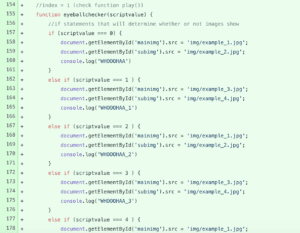
Therefore, I was recommended a ‘dictionary’. which proved to simplify this method a thousandfold.
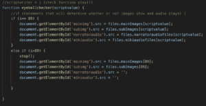
Essentially, the few hundred if/if else statements turned into about 14 lines of code, which makes it very efficient.

I also learned the use of arrays and how to call arrays within arrays, which was very useful. 

The structure of the dictionary is like so:

var: files – mainimages – subimages – narratoraudiofiles – mikiaudiofiles .

Two separate arrays were used to maintain consistency, which are called story and story 2 for the different scripts that they were to type out.

I cannot post an image of the dictionary, but because of the amount of files that it holds, it goes from line 484 -> 1404.

An incredibly vast dictionary indeed, for the 90 audio files and 53 image files that I created.

I think the majority of my time was spent on making the dictionary, as I needed to hard code in all of the images, audio files, and text and make sure that they were all working. There were often times where I needed to go back and recreate assets because of this, as there was much confusion surrounding it.

Additionally, even after finishing all of that, I found that I was not done with my project.

On Monday, two days before my final presentation, I was suggested to add some audio besides the voice-overs that I had because of the awkward silence when no one was talking. Juggling studying for finals and 2 essays that I had to write, I eventually came up with a way in order to incorporate more audio, which included (at dave’s suggestion), an edited version of a vinyl record playing where I pitched down the audio, applied distortion, and lowered the volume.

Source: https://www.youtube.com/watch?v=41lrxMvhBdc&t=67s

Additionally, other audio files were added in order to ‘set the scene’.

Another if/else statement was constructed in order to emulate these sounds overlayed with the narration, which I found to have positive results on my project.
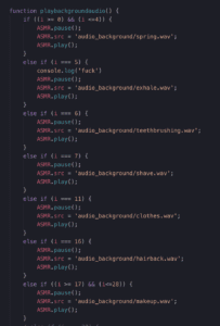
Additionally, if I may add, adding css to this website and changing the values from pixels to vh, vw and various %s took me a day to fix up. most of the time I was simply scrambling to figure out why many of my divs were displaced and all over the place, but eventually (after like 6 hours of sitting on my ass in the IMA Lab), I was able to figure it out.

Also, managing 150 different files and critiquing them so that they all fit was a pain to figure out. This was even harder than the video project because I didnt have software to mediate the interaction between files and play function like in the video project. Therefore I had to write down everything that happened and when it happened, and which image and audio files that it correlated to on a seperate sheet of paper, look at that while constructing the audio files, and then listening to them while they played out on the website and further critiquing and adjusting them. This is what I did for the final 3-4 days before presentation, while also fixing the various coding issues that I encountered. A handful of time that I just spent working alone. This is sort of why I wished that I had a partner, although I know that not many people in the class would actually sit down and actually do what I did since people had a lot of other work in other class that they were probably rushing to do. Such is the undergraduate career. It really be like this sometimes.

Issues: 

it was especially hard to create the audio for this project, as it required certain pacing in order to keep in line with the text printing.  It might be noticed by a user that the audio is not entirely synced, and I would have corrected it if I had more time, but it would have meant more hard coding, adding on to the 1407 lines of code that I already had. 

Additionally, I  wished that I could have incorporated some assets of p5 to paint a picture of the scenery that I wanted. However, it also would not have aligned with the story, which was the main focus of the project.

Unfortunately, there is one bug that I was unable to solve, at all.

Within my background audio function, there are several source file changes that occur, and these correlate with various line numbers that increment in separate functions (i.e. the variable i). 

Within the if statements that contain range functions, there are issues that occur where the function creates a new source file, but, within the range, refreshes the source file, making the file play out every time a line change occurs. I was unable to pinpoint how this might have happened, and it might be a bug within the code that I am currently unable to fix. 
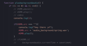
The idea was that the source file would not change, the audio would not pause and restart within each line change of the if condition playing out.

However, this is a minor consideration that could have been seen as intentional.

Project Reflection: 

This project took an excessive amount of work to create and manage, but I felt as though it was worth it in the end. I am glad that this project, unlike other projects before it, is actually completed and I adhered to the time schedule that I created for myself. 

If I were to add onto it, I would most likely try to paint and spend more time making a more animated project, as there is not that much movement within the piece which takes away from the ‘slice of life’ style of writing. 

Fortunately, I suppose this could turn into a summer project that I would go back to and fix up the assets a bit. Also if I had more time, I would probably include more text files, and add a skip and return button function so that the reader could go back and hear the text and audio play out again. 

I did not include this function initially because I thought that It would clutter the space, and I would have to reformat the CSS in order to make sure that these things aligned.

Essentially, I learned a lot and had a lot of practice with javascript functionality and the usage of many of the ideas that were covered in communications lab, while also applying some various skills in other software that I would not have been given the chance to work on otherwise. Even if this project was incredibly taxing, I would say that I enjoyed it. However, I still hunger to make something better. Perhaps the best way to describe how I feel about this project is how I presented it, which was with my feet propped up on the table, confident that it worked, and knowingly displaying my project as it was. I could work on this more if I wanted, but I am perfectly fine with not.

I think, however, if anything else was to be added, I would try to add like a color gradient in the background of the image files, so that there would be some sort of simple aesthetic that backgrounded the images. Perhaps this would come to be like a light transition from like pink to purple to blue to red to green or something, something very subtle that would set the mood of the story to be more emotional perhaps. This was something that I scrapped due to the issue of not having much script to work with (because of asset production) but essentially this would probably be the next thing that I would work on. 

It does make me sad though, that I do not find my project very interesting anymore. Maybe i’ve just been looking at it too much. Perhaps i’ll go sleep and forget about the fact that I’ve been working on this so long. 

TLDR: I guess a satisfactory personal project that adheres to the project guidelines, but I am incredibly sick of working on this project.
Final Project Documentation – “Pause, take a moment.” – Samanta Shi

Title: “Pause, take a moment.”

Link: https://samantas.github.io/net_art_project/

Description:

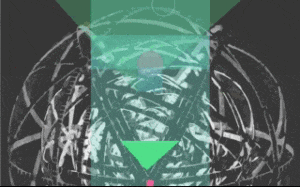
“Pause, take a moment.” is a website that randomly generates shapes and colors on top of a SVG variation of M.C. Escher’s Concentric Rinds. The background music is a piano cover by Vincent Corver of my song “Lies”. This piece encourages the user to explore shapes, movement, and color – to pause, slow down, and appreciate things for how they appear without moving too fast. The central theme is that if you move too fast, you won’t have time to appreciate. If the user scrolls too fast and reaches the bottom of the page, the experience stops and their only choice is to restart. The goal is for the user to interact with the piece in such a way that they feel mesmerized and relaxed, perhaps even encouraging self reflection. 

Process:

For this project, I was clear on the theme I wanted to address, but I struggled quite a bit with the execution of it. I spent a lot of time trying to figure out the best way to use simple shapes and movement to represent moments in life and progress. I tried a lot of variations of how the shapes were instantiated on the page, where they appeared, how fast they should appear, number of shapes, and so on.

At first, I didn’t use any color and the experience felt quite lifeless and boring, so then I decided to implement a random color generator. The random color generator along with the random shapes generator created quite a mesmerizing experience. After coding for several hours, and as I was QA-ing the experience, I found myself sitting on my couch staring at the random shapes and colors, getting lost into the music and into thought. I wondered: what is really the point of all of this? But then I also thought: wow, I just sat here for 10 minutes watching random shapes and didn’t even realize it.

As for the code, I decided to use this project as an opportunity to practice OOP. I used github to track all of my changed, so if you look in my commit history, you will see a lot of frustration in the comments (lol). My project is just short of 400 lines of JavaScript, which for such a simple experience, sounds like a lot, but I really enjoyed creating this piece. (Even though, at times, I would yell I HATE JAVASCRIPT ¯\_(ツ)_/¯).

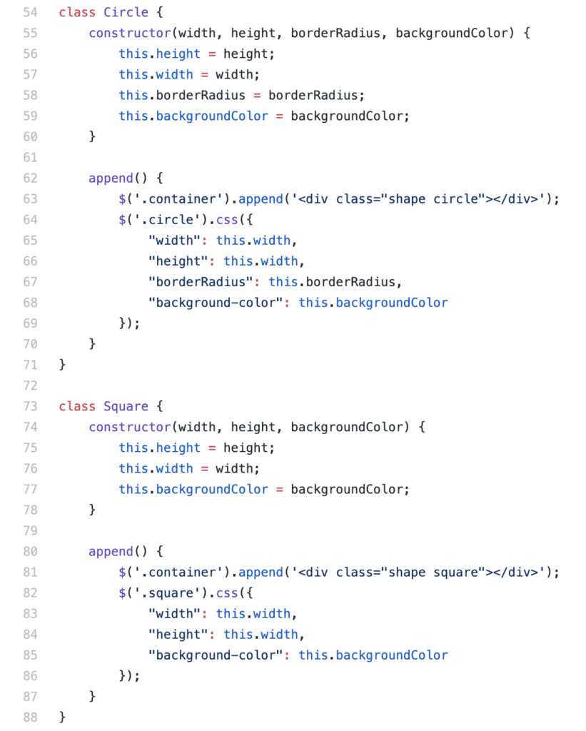
Throughout my process, I tried to be diligent about organizing my code. Below are some examples of how I structured my code.

I utilized classes to define the basic parameters for the shapes.

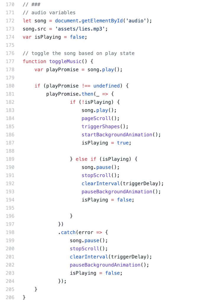
Then, I instantiated these shapes using my triggerShapes(); function, which I call in the toggleMusic(); function, so that the movement and the music is connected. toggleMusic(); then gets called in the init(); function, which gets called upon document.ready. 

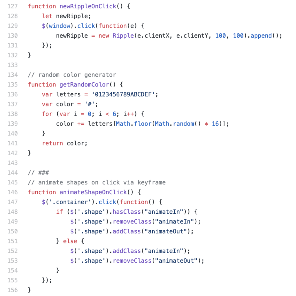
I also created separate functions for features such as the circle that ripples based on mouse click, generating a random color (found online!), and animating the shapes on click. The function animateShapesOnClick simply toggles a class in the CSS which utilizes a keyframe animation to transform the scale property. 

As I shared my project with friends, I realized that it would be helpful to make a mobile friendly version of the piece, so that people can access it on the go. So I implemented a media query to make it responsive. I changed the introduction to make more sense for mobile, for example instead of “press enter to start” you tap a start button. I also removed the background image (Concentric Rinds variation) on mobile as the dimensions were not mobile friendly. 

Challenges:

One thing that I struggled a lot with was utilizing scroll to instantiate shapes at a reasonable pace. Triggering shapes based on user scroll proved to be very difficult because, if the user scrolls too fast, then too many shapes would instantiate and the browser would slow down and stop functioning. I tried to incorporate a scroll speed listener as well as a setTimeout function, but none of these solutions worked well enough for me. This is why I ultimately decided on triggering shapes only based on a setTimeout function and not upon scroll. However, since the page auto scrolls, it appears as if the shapes occur upon scroll. So I ended up hacking together a solution. 

I also struggled a bit with the audio, learning that Chrome does not allow audio autoplay. I found a solution online that helps catch an error with audio playing:

Post mortem:

I believe my project was successful in accomplishing the goals I set for myself. I was able to create an internet art piece that utilizes JavaScript to provide an experience and convey a message. If I had more time, I would have added more features, such as changing the saturation of the color based on scroll position. I also would have made a mobile friendly version of the M.C. Escher background image.  However, I wouldn’t have added too much, as I enjoy the simplicity of the project.  

Net Art Documentation – Jikai Zheng

Project Name- CitiesXCommLab
Created by: Jikai Zheng and Evan Xie

Our link: http://imanas.shanghai.nyu.edu/~jz2477/Cities/cities.html

Description: For this project, I actually had two ideas, but Evan liked the one about cities more, so we went with this one. The original question I had was: How do we fall in love with cities? That became the premise and source of inspiration for the whole project. I shared a photo of an old mac desktop background with Evan, and we agreed that it would be cool to have recreate something looking like that for the final net art project.

A brief description of what we were going for: A website that looks like a desktop, with folders that are icons of cities, some representative of our own hometowns, which were Richmond, New York, and Shanghai. When you clicked on some of the untitled icons, you will be able to name it after a city. With our cities, Richmond, New York, and Shanghai, we drew some artwork, scanned them, and edited them in Photoshop. Actually, all the artwork in this website were all made by us with minimal digital processing. You will also be able to drag all the cities like actual folders on a mac desktop.

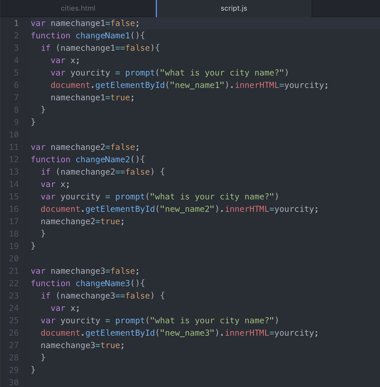
Process: I first got started with coding the html and css. I’m also getting more familiar with javascript, so it wasn’t as intimidating this time. These next screenshots are some examples of the coding we did.
These were booleans, because of the true/false statements, I used them to allow people to name the untitled citis. 

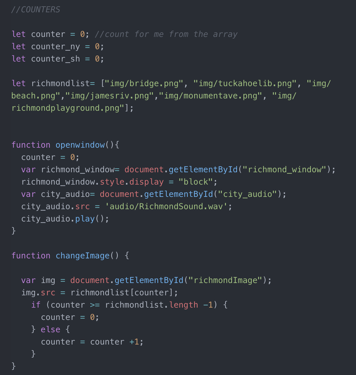
Counters, and also arrays for Richmond. Also, the openwindow, changeImage, and closeImage (not shown) were vital in making the slideshow work and incorporating audio. 
However, there were many things we did for this project that wasn’t concerned with the code. Evan did all the music for the project. We also wrote a small blurb about our cities and found a quote for them, which we recorded in a voiceover. As mentioned before, the art was pretty much all handmade, and that was the most fun part about this project for me.

Challenges: Some issues included the sizing of the images within the imgframe, and also some minor tweaking for the background to be less bold and bright. We tried very hard to rework css, in the sizing of some of the photos, and that happened to be the hardest part of coding this project.

Post Mortem: Our project, in the end, really did reach the goals I had in mind in the beginning. I felt that I got to input a bunch of the coding sessions we did in some earlier classes such learning draggable, addEventListeners, and arrays. It made me really proud to know that I could understand whether something was a boulean or an array or a counter. Those would be the first indicators that I finally understood what each function of the code was for. From this point on, I don’t feel so wary about coding, especially with javascript, and I’m glad I learned these skills in this class.

sent.ai.rt – Final Project – Abdullah Zameek

Introduction and Project Rationale: 

I had a very clear idea of what I wanted to do for my final project for Communications Lab for a while. I had been exploring different facets of Machine Learning for most of the semester, and while doing so, one particular topic struck my fascination more than any of the others – Neural Style Transfer. What this does is as follows – imagine you have two images, Image A and Image B. What if you wanted the content of Image B to be presented in the style of Image A? This is precisely what Neural Style Transfer facilitates. But, what I wanted to do was one step further, what if you could have an entire video stream be relayed back in some different style? And, what if the video is reactive to changes in your environment? When thinking about the latter question, I thought of different ways the user can spark some sort of interaction. Could they maybe press a button that switches styles? Or, maybe  as slider that you drag that progressively changes styles? I thought about this for a while, but none of these screen-based options seemed to excite me much. If I was the user presented with  a strange video feed,  I wouldn’t want to have to do much to cause a dramatic change in the behavior of the feed.  It needed to be reactive, it needed to be responsive in the strangest, yet most natural of ways. What sort of stimulus could I capture that would be reflective of changes in the environment? Throughout this semester and what we have been discussing in Communications Lab, we have been prompted to think about different ways of facilitating interaction. And through these discussions, one of the lessons that I learnt is that we all have different perceptions of what “interaction” really means. To this extent, my idea of interaction is that even a small stimulus provided by the user should be able to prompt a great change in the behavior of the project. This is something that I wanted to really emphasize upon  in my project.
After thinking about this, I decided that I could do away with any buttons or on-screen elements, and make the most of the video feed, in particular, the user and his environment.The first that came to mind is the user’s facial expressions/emotions. – they are dynamic and can prompt a great deal of change in the behavior of the video feed, all in real time. The response could be multifaceted too – in addition to the different styles being applied, it could also be music that is relayed back, and the appearance of the canvas. And, this requires minimal effort from the user’s end, and so they can pay attention to making the video react in different ways. Above all, this was technically feasible, so I thought why not? In an ideal case, I envisioned that this piece would make for a nice installation somewhere, and this sort of interaction seemed to be ideal for such a project.  I thought of different places where this could go; one particular place was the corridors in the Arts Centre at NYU Abu Dhabi. In the past, there have been screens set up close to the IM Lab there, where there was some interactive sketch that would react to the user’s motion. These sort of projects do not require a keyboard/touch screen or any sort of deliberate input device of sorts, just  a screen and a camera.  
With all of this in mind, I set out to bring “sent.ai.rt” to life. For the sake of completion, here is a complete description of sent.ai.rt:

sent.ai.rt is a real-time interactive self-portrait that utilizes techniques in machine learning to create an art installation which changes its behavior depending on the user’s mood derived from his/her facial expressions. The user looks into a camera and is presented a video feed in the shape of a portrait which they can then interact with. The video feed responds in two ways to the user’s emotion – it changes its “style” depending on the expression, and the web page plays back music corresponding to the mood. The style that is overlaid onto the video feed comes from famous paintings that have a color palette that is associated with the mood, and the music was crowd sourced from a group of students at a highly diverse university. The primary idea is to give individuals the ability to create art that they might have not been otherwise been able to create. On a secondary level, since the styles used come from popular artists such as Vincent Van Gogh, it is essentially paying homage to their craft and creating new pieces that essentially draw from their art pieces.

The phrase “sent.ai.rt” comes from the words “sentiment” which is meant to represent emotion which dictates how the portrait responds, and “art”. The “ai” in the middle represents the term “artificial intelligence” which is the driving force behind the actual interaction.

Implementation:

Following the initial peer-review, I did not get any concerns/questions with regards to the technical feasibility, so I went ahead with planning out how I was going to implement my project. Since there were multiple facets to it, I’ll break down the different facets to detail the entire process. 

a) Gathering of Assets.
My project required both visual and auditory assets. The visual assets would be the images that I would use as the style sources for the different style transfers. When thinking about what sort of emotions I wanted to capture, these were the first few to come to mind :
Happiness
Sadness
Anger
Confusion.

The next step was to determine what sort of paintings were representative of each emotion. I decided to use color as my deciding factor, and came up with the following mapping where the color is representative of the emotion:
Happiness – Yellow
Sadness – Blue
Anger – Red
Confusion – White/Grey. 

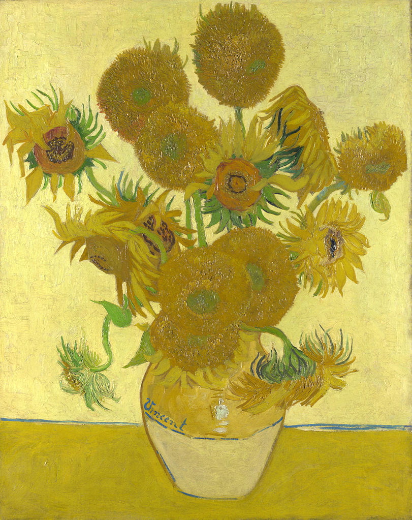
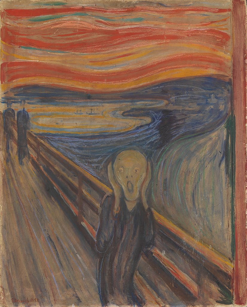
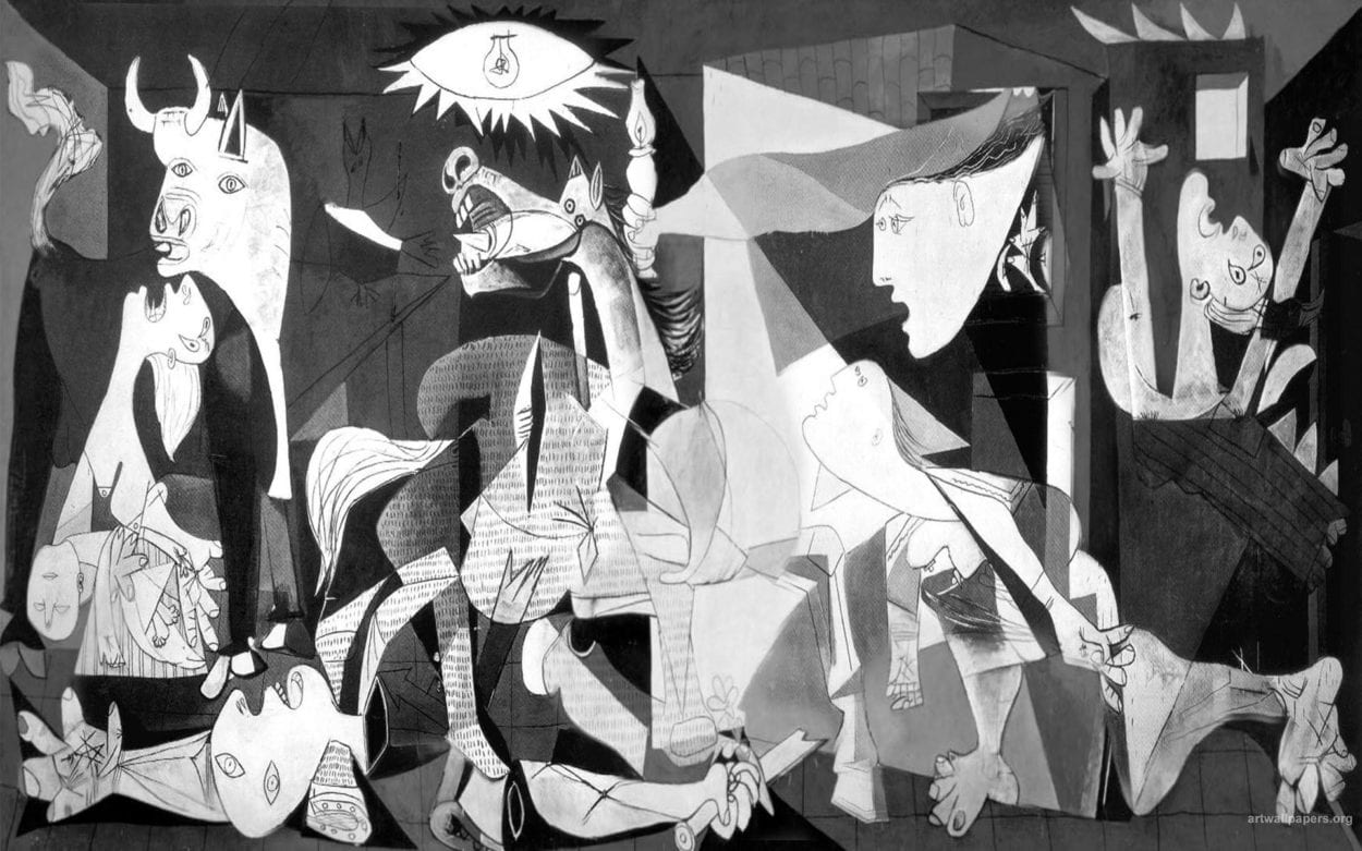
Next, I sourced out famous paintings that had these color palettes as the primary colors. These four paintings are what I settled on in the end:

fqwf
Happiness – Sunflowers by Vincent Van Gogh
faw
Sadness – Starry Night by Vincent Van Gogh
f
Anger – The Scream by Edvard Munch
qf
Surprise – Guernica by Pablo Picasso

While the selection of these paintings were somewhat arbitrary in nature, I believe that since I was more interested in sourcing out paintings with a desired color palette, these images fit the description pretty well.
In addition to these visual assets, I also needed to gather music that corresponded to the different emotions.  In order to minimize personal bias on this step, since I did not have any fixed criterion to decide what songs correspond to what mood, I decided to crowd-source these. I compiled a collection of songs after conducting a survey on NYUAD’s campus Facebook group. 

Here are the songs that I used from the results of the survey:

Happy
1) Queen – Don’t stop me now
2) Goodbye Yellow Brick Road by Elton John
3) Surrender by Cheap Tricks
4) Juice by Lizzo
5) On The Top Of The World By Imagine Dragons

Angry
1) Kawaki wo Ameku – Minami
2) Na Na Na – My Chemical Romance
3) Copycat – Billy Eilish
4) Kanye West, Jay Z, Big Sean – Clique
5) Paranoid Android – Radiohead

Confused
1) Tiptoe through the Tulips
2) clocks by coldplay
3) Babooshka – Kate Bush
4) Sleepwalker by Hey Ocean
5) joji – will he

Sad
1) Orange Blossom – Ya sidi
2) Linking Park – Blackout
3) Coldplay – Fix You
4) Hurt by Johnny Cash
5) limp bizkit-behind blue eyes

b) Machine Learning Models

There are two facets to the Machine Learning – the actual Neural Style Transfer models and the facial expression detection. 
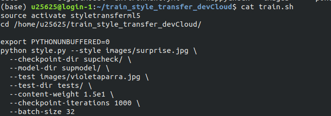
For the neural style transfer part, I used ml5js’s training script to train a model with the necessary images. 
training script

Usually, training such a model could take over two days on a regular computer, but since I had SSH access to an Intel CPU cluster from Interactive Machine Learning, I was able to train 4 of these models in under 24 hours. Once the models had trained, it was a matter of transferring the models back to my laptop via scp and then preparing the ml5js code to inference the output. 

code code

More details about style transfer in ml5.js can be found here
The code to train the actual models for the style transfer can be found here

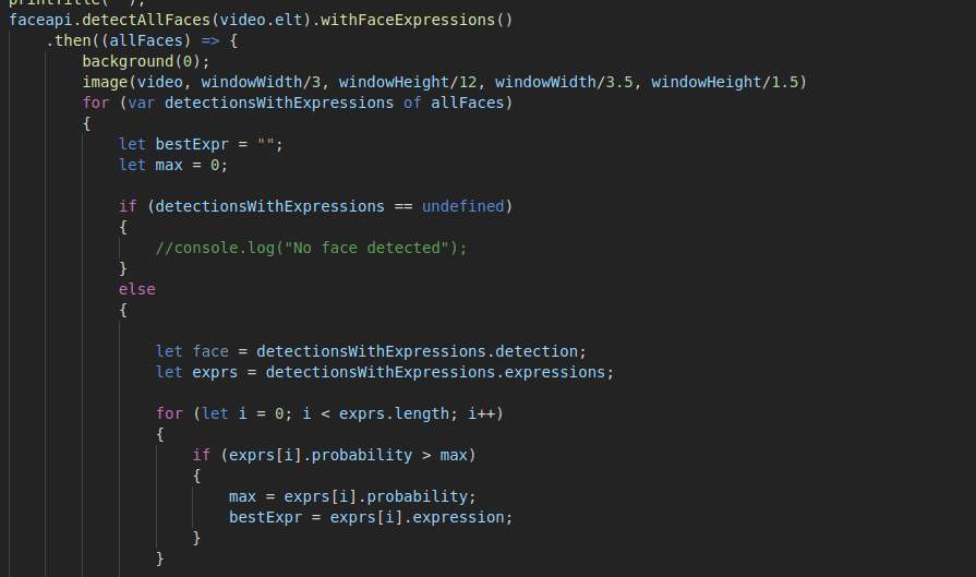
The next step was to figure out a way to do the facial expression detection, and luckily, there was an open source API called face-api.js.
Built on top of the Tensorflow.js core, the API allows various image recognition techniques with faces, and one of them is Facial Expression Detection. They provided different pre-trained models, which were trained on a variety of faces, so that saved me a lot of time in trying to train a model from scratch, which would have proven to be quite difficult in the limited time that we had.
exp

They provided a simple endpoint through which I was able to use the API in order to do the necessary detection, and calculate the most likely expression. 
facepi

After I had confirmed that the model was working, I was ready to put all the different components together.

c) Integration

This was probably the lengthiest stage of the entire process,  If I were to sum up the workflow of the piece, it would be as follows:

->Capture video
 –> Detect Expression
—–> If Neutral – > do nothing
——> Otherwise -> Perform style transfer
———-> Update canvas with elements related to the detected expression (play audio, show name of track, and display which emotion has been triggered) 
———————-> Repeat
(In addition to the above, the user can disrupt the workflow by pressing the spacebar, causing the program to momentarily halt to take a screenshot of the video feed) 

In order to create a real-time video feed, I used p5.js’s createCapture() functionality with Video. At this stage, three of my major components- the video, facial expression detection and style transfer – are solely Javascript based. With that in mind, I decided to use the whole webpage as a p5.js canvas which would make it easy for me to integrate all these components together. This also meant that any text and styling would also be done in p5.js, and this seemed to be a much better option than regular HTML/CSS in my case because of the fact that all the different elements depend on some Javascript interaction, so it was easier to do all the content creation directly on a canvas. 

The layout of the page is very straightforward. The video feed sits in the middle of the page, with different words describing the active mood lighting up in their respective colors on both sides of the video. The audio assets are loaded in the preload() function while the weights for the machine learning models are loaded in the setup() function because ml5js has not integrated support for preload() as of yet.  The face-api models are also loaded in setup(). Once that is done, the draw() loop handles the main logic. Before diving into the main logic, I also wrote some helper functions that are called in the draw() loop, so these will be described first. 

getStyleTransfer() – This function gets the index of the best facial expression detected from the styles array

playSong() – This function plays a random song from a random point for a given expression. 

stopSong() – stops all audio streams

getTitle() – This returns the name of the song that is currently being played. 

keyTyped() – This function checks if any key has been pressed. In this case, it checks if the spacebar has been pressed, and if so, it runs a block of code to get the pixels from the video feed and save it as a png image that is downloaded by the browser.

writeText() – This writes the decorative text to the screen

printTitle() – This updates the title of the currently playing song on the screen.

displayWords()- This function displays words corresponding to the given expression/mood at pre-defined positions in colors that correspond  to the mood.

windowResized() – This function helps make the page as responsive as possible. 

The first thing that is done in the draw loop is that all the text is displayed. Then, the face-api is triggered to pick up facial expressions, and once the expression has been processed, the algorithm will decide whether or not to do a style transfer. If the expression is determined to be “neutral” , then the feed remains unchanged, and if not, there is another block of logic to deal with activating the transfer for the given mood/expression. The logic for this block works in such a way that the algorithm checks the currently detected mood with the previously detected mood. This ensures that there is continuity of the video stream and that the music playback isn’t too jittery. Figuring out the logic for this part was the biggest challenge. My initial code was quite unstable in the sense that it would swap styles very unexpectedly, causing the music to change very rapidly, so you wouldn’t really be able to hear/see much because of how unstable it was. I recalled that in any feedback control system, using the previous output as part of the next input helps ensure that there is a smoother output, and so, incorporating such a feedback system really helped make the stream a lot smoother. 

d) Deployment (WIP)

The biggest issue right now is figuring out a stable way to host my project on the internet.  When it was tested, it always ran through a Python server, and once I put it up onto IMANAS, I realized that the IMA server did not have the same functionality as a Python server. So, I had to look out for alternative ways to host my project. One option that I was already reasonably familiar with is Heroku, 
My initial attempt at deploying it to Heroku was through a Python Flask application, but I ran into a lot of issues with pip dependencies. This was quite annoying and I later learnt that Flask and Heroku don’t really play well together, so I opted to use a Node app instead. After setting up a Node server, and setting the routes, the app was deployed! 
But, note, the keyword is “deployed”. Even though the app was deployed successfully, the page took an unreasonably long time to load up. This is because of the fact that I was loading 4 ml5js models onto the browser memory, and this took a really long time. And, once this was done, the page was extremely laggy and would sometimes cause the browser to crash, especially if there are multiple tabs open.  This is a circumstance that I did not anticipate, and so right now, the only stable way to run it is through a local server. While this is quite annoying and prevents me from deploying my project to a suitable public platform, I think this also raises some very important questions about ml5.js and its underlying framework, Tensorflow.js. Since both of these frameworks rely on front-end processing, there has to be suitable method of deployment, and until there is such a  method, I feel that running the heavy computations on the back-end would be a much better option. 

Final Thoughts/Future Work/ Feedback 

All in all, I’m pretty happy with the way things turned out, I was able to get all the elements working on time. However, one of the more glaring problems is the fact that the video stream is quite laggy and renders at a very low frameRate. Moon suggested that I use openCV to try to capture the face before feeding the stream to the faceAPI so that there would be fewer pixels rendered in real time. Dave and I sat down with Visual Studio Code LiveShare to try and integrate openCV but it would cause trouble on the ml5js side and since it was already quite late, we decided to shelf that feature for later. Ideally, that would make the video stream a lot faster. Another feature that I might integrate at some point is a function to maybe Tweet any photos you take via a Twitter Bot to a public Twitter page. Additionally, I’m still in the process of searching for a proper host that could serve my site in a reasonable amount of time without crashing.
After presenting in class, I learnt there were a few more minor adjustments that could have been made, after taking into account Cici’s, Nimrah’s and Tristan’s feedback. One thing that was brought up was the very apparent lag in doing the style transfer (which is something that I’m working on). However, at the actual IMA show, I found that there was another glitch which was that the program would often get “confused” when there were multiple faces in the frame, so I’m looking  for a way to make it actually detect a single face instead. 
But, again, I’m quite pleased with what I’ve put up, its been quite the journey, and as frustrating as it was at some points, I’m glad that I did it. 

Week 14: Final Project Documentation/Reflection – Cara Chang

Project Link: imanas.shanghai.nyu.edu/~hrm305/elevator2/lobby

Description: For our project, Hanna and I drew inspiration from a virtual art museum, having two art mediums for users to experiment and play with. The user is supposed to feel immersed in a world of art, where we created a Piano Studio and a Drawing Studio. The user is directed to an elevator page where they make the decision on which floor they would like to visit, either the piano or drawing studio. Once they make a decision, they can play with the functions that we have coded and create their own artwork through the virtual museum. We wanted to create a visionary experience with the drawing studio and an auditory experience with the piano studio. 

Process: To split up the work evenly, I mainly worked on the drawing studio while my partner worked on the piano studio. Once we got the main components of our code figured out, we then showed our codes to each other and collaboratively added any minor missing components/fixed any bugs that we had with the two codes. 

For the elevator page, we wanted to transport the user into two different HTMLs depending on which studio they chose, so we made the elevator page as the home HTML page, and the piano and drawing studio as two other linked in HTML pages. 

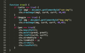
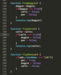
For the drawing page, I used canvas to create the page so that I would have access to a wider range of options to code with, whereas P5 has more limited options. I wanted to create a pen function, a various set of stroke widths, a set of stickers, and an erasing tool to use. Below I have attached a screenshot of the code I created to allow the user to freely choose from either of the two stickers, or the pen tool. 

When the user is using the pen function, the cat and dog stickers are disabled, and I did this using a true/false component where when one is true, the other two are false. All the colors are under the same class so that all colors are able to be used when the pen function is chosen, whereas the stickers were coded individually. 

To achieve the stroke width, I added a range slider so the user can drag and choose what width they would like the brush tool to be. There is a cool function with the width tool, where if the user drags the slider value to the maximum, the brush will create a series of choppy rectangles, creating an abstract looking creation. I wanted to create an abstract piece within the drawing studio, so the more the user drags out the slider, the more abstract the pen line becomes. 

The stickers were attached as images, so when the user clicks either the dog or cat sticker, the image is repeated over and over again as if the user were drawing with the dog/cat. 

There is also a save function, so if the user likes what they have created, they can save all their work onto a canvas that will appear next to the original one, displaying their work that they have created thus far. They can keep drawing on the original canvas, and if the user presses the save button again, the work that they have added will transfer to the saved canvas next to the original. 

As for the piano, we assigned each piano note of one octave to a specific key on the keyboard of the laptop. Whenever any note is pressed, a color bursts above the key, signifying the burst of color that users can experience in a visual and auditory manner. We used CSS to arrange the piano keys to mimic the look of an actual piano keyboard. 

Challenges: A main challenge that I had trouble with was trying to get the dog and cat sticker to become independent variables, because originally the dog and cat stickers would interfere with one another and have a pen line stroke alongside the sticker. But after a couple hours of work, I figured out how to make all components independent from one another. 

Postmortem: I feel as though we met our original thoughts of creating a user oriented workspace for people to have the freedom to play with and create their own forms of art within drawing and piano. We wanted to connect two different art forms into one place, and we accomplished that through our virtual art museum.