Final Project Documentation (Matt F. and Shirley)

CLICK HERE to see our project!

Project Description

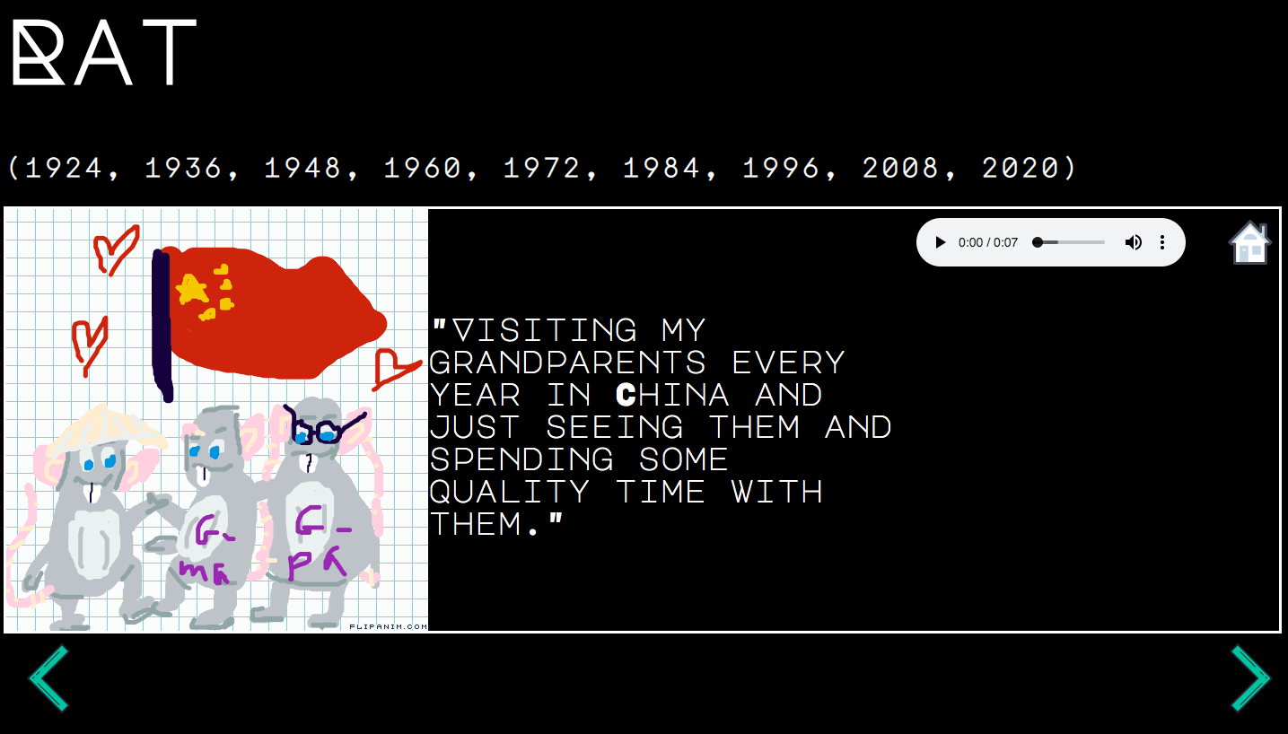
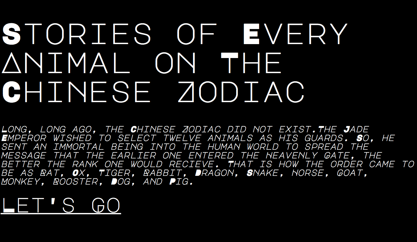
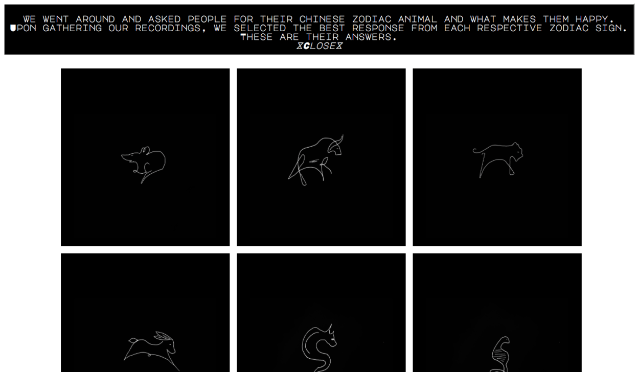
Our project tackles the traditional meaning of the Chinese Zodiac, one that attempts to predict anything from your personality traits to love compatibility. Instead of pursuing tradition, our project focuses on the stories we all share, regardless of our sign; namely, our happiest moments. We gathered stories of happiness from people that represent every Chinese Zodiac sign, accompanied by a hand-drawn flip book. The overall dark, spooky aesthetic contrasted with our light-hearted stories and illustrations serves to highlight our concept of breaking traditions. Too often people search to horoscopes or their Chinese Zodiac for answers, in place of actively pursuing their goal. We believe following this dark theme highlights our critique/ nuanced take on Chinese Zodiac.

Process

Our project suffered a delayed start due to changing project ideas. Fortunately, we were able to gather all of our assets with plenty of time to figure out logistics. Shirley mainly handled the coding, while I conducted interviews and made the flip books. I believe we split up our work rather efficiently, and working on separate assets allowed us to progress through our project in a timely manner. Because our project is more art-based (images and text), there were few coding problems to overcome and we were thus able to spend more time adjusting our layout.  

Post-Mortem

I’m very pleased with how our project turned out, especially due to the delayed beginning. I think our project actively captures what we set out to do, serving as both a visually-appealing and purposeful work on the Chinese Zodiac. Obviously, if we had more time, I would’ve loved to develop the flip books even more, both in length and interactivity. However, I don’t have any regrets with our final project and I’d be happy to continue developing it in the future. 

Final Project Documentation (Shirley Liu)

Click here to view our Final Project (Shirley Liu & Matt Fertig)

A quick view of our project:

Background: 

From the start, Matt and I had trouble trying to figure our topic for the final project. We thought about creating a madlib type fill in the blank with flip books. I was interested in doing something that focused on the Chinese Zodiac and we eventually decided to do something different from the traditional Chinese Zodiac informational page. Our final project was a composition of both of our ideas; we created a flip book stories for every zodiac. We went out and found people that represented every animal on the zodiac and asked them a question. Our project’s focus is to display what each person described as one thing that makes them happy. Along with the audio recording, we made flip books that displayed their story with the interviewees as the zodiac character in the book. 

Process:

Matt mainly handled the interview process and the making of the flip books, while I focused mostly on the coding and drawings of the zodiac icons. I had a little bit of trouble figuring out the layout of our website because of the many ideas I had. I thought about displaying the signs in a square or circle and then also having information boxes that give further information on the zodiac. However, I realized that the main focus of our project was to tell people’s stories and not to completely inform people of the traits and compatibility between zodiac signs. I had some trouble figuring out how to get all the images of the signs to change when the user hovered over. Eventually, I was able to figure that out which made the overall process smoother. I believe we split up the workload fairly and in the end we were able to create a project that we were proud of.  As we wanted to create a website that was more than just an informational page, we decided to design the layout of our website to reflect that. We believe creating a minimalistic, black and white background allows for the viewer to focus on the colorful stories of each individual we interviewed. 

Conclusion:

I really enjoyed working on this final project with Matt and I loved listening to the stories from everyone that we interviewed.  I believe we achieved our goal of wanting to create a website that presented the Chinese zodiac in a new way. It would be cool in the future if we were able to collect more stories from around the world and if we added an element where the user is able to tell their own story and add a flip book. Overall, it was a pleasure making this website as we were able to achieve something that started out as a drawing in my journal. 

Final Project Documentation: [Ta-Ruedee Pholpipattanaphong (Ploy)]

Link: http://imanas.shanghai.nyu.edu/~zy1193/project4/project4.html

Description: In the project “Food Map of China”, Angel and I decided to create a map of China with 5 different well-known foods from 5 different provinces. Our goal is for the audience to be able to move around on the map of China freely and then learn more about the food and the cultures of each place. Since we both love traveling, we see that food is a huge aspect when choosing where to go.  

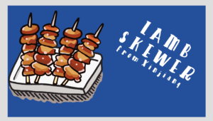
Process: We decide that we want to draw everything by ourselves so I worked on the drawings whilst Angel started the coding page of the map and then the page for the food. We then recorded the sounds of that food together. For instance, with the hotpot, we recorded the sound of the water boiling and for the lamb skewer, we recorded the sound of the oil on high heat. We find that a little bit challenging because the sounds were not loud enough through the microphone. Therefore, we also use other techniques. For instance, the sound of the oil was not loud enough so we added water to the oil and that increases the sound a lot. Later on, I went into audacity and edit those sounds. One of the most significant edits was on the amplifier so that the sound can be at its maximum level. After having all the images and the sounds, Angel sent me the codes that were used on the page. Then basing on her codes, I created the other 4 pages. 

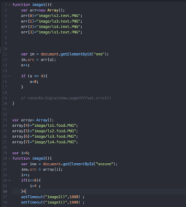
Challenges: The codes were challenging. We have an image in our minds since the beginning of the project and we want to stick to it. For instance, creating a map that the user can navigate themselves was something that needed a lot of research. Other challenging codes were the curtain function when we transitioned from one page to the other. A lot of those codes were trial and errors. We really went beyond what was taught in class in order to get our ideal project.

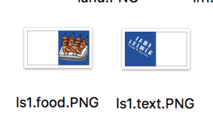
However, there are a lot of things that we could improve on. For instance, we couldn’t find a code that would divide the image into half and then the curtain effect would apply. So what we did was cropping the image manually and then naming the 2 parts differently. Then we set one side to be the text whilst the other to be the image of the food. This was really confusing at first since the order was not what I expected. For instance, we have to leave white spaces on the left of the food and the leave white spaces on the right of the text (images below). It wasn’t the position I expected. From manually creating it, the positioning contains imperfections as the image does not fit perfectly next to each other. I tried really hard to minimize the faults, however, it is really hard to position it, especially when the food overlaps into the textual part. If we have more time, I would spend more time searching for better codes so that it can be done by the computer instead of manually.

Post Mortem: This project turned out somewhat similar to our plan. However, there were changes along the way, especially after user testing. I feel like user testing was really useful because we see a lot more from the audience perspectives and not from the creator perspectives. For instance, they tell us what is not clear in our project and that we could make the text more readable. The project ended up with a lot more research than what we expected. We went in search of the backgrounds and the cultures behind this food. I am really proud of how the project turned out because we are able to incorporate many aspects into one. Even though the time for this project was considerably short, I really like working with Angel and believe that we are of great teamwork. 

Final Project Net Art (Cecilia Cai)

http://imanas.shanghai.nyu.edu/~zc1151/commLab/finalProject/index.html

The above is the link to our final project(Internet art) — Social Media’s rebellion.

For this project, I worked with Vivian Zhu, and we designed a social media webpage that breaks itself in the end. We intend to convey the message that people nowadays are spending too much time indulging in social media platforms, where many of the posts are over exaggerated and distorted. Many are constructing some fake identities on social media, showing off some particular lifestyles, which are highly likely to be inconsistent with their real lives. We construct this website criticizing such phenomena, and let the website breaks down by itself as a warning to people, raising the questions of “What if the social media websites that you live on breaks down one day? Where is the true reality? How would you rearrange for your life?”

For the production of this project, I did the coding for the entire program, and Vivian did all the photoshop and video&audio editing.  All the material we used in this project (except for one picture of the website error)  is either edited or originally constructed, including the intro video at the beginning. We designed for the text contents for the posts, and use photoshop collaged pictures for the images. The background of the webpage is also photoshopped to be overlapped, indicating the “breaking down” of the website. As for background music playing during the second part of the project, where several windows pop up, it is recorded by Vivian of my playing the piano, and collaged the piano sound with the sound of computers, such as clicking on the keyboard, and computer’s opening and closing. For the coding part, I wrote 4 HTML pages, 2 CSS files, and 3 javascript files. I also made use of the P5 Canvas. I designed for the layout and functions of the website, including the effect of the pop-up windows and the canvas. Our cooperation was very smooth, and both of us contribute actively. Although it took us a hard time to come up with a good idea for this project, we managed to finalized our intention by several discussions and browsing for net artworks online.

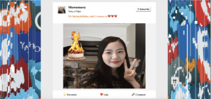
The project begins with an intro video with the effect of website loading problematically. It then jumps to a webpage with the layout of the common social media’s style.  There are three posts displaying in total, respectively three bloggers showing their “ideal life”. The first one is a girl wearing exaggerated make-ups and emerged in fancy brands, showing off her sickly “beauty”. The second one is a filtered picture of a piece of pizza, which is oversaturated with colors. But the piece of pizza is collaged with catch-ups, oils, and butter, indicating that it is actually very unhealthy to people, and photoshopped photos of food on social media has little to do with “perfect life”. The last one is a selfie with a burning cake, representing the habits of people always taking pictures for social media uses regardless of conditions in reality. Even if the cake is burning and is like to cause a fire, what the blogger did is not to put out the fire, but rather showing off on the social media of this scene. The content of this last post is inspired by a MV we watched, in which the singer criticized the publics’ indulgement in the “fakeness” of social media by showing a couple of iconic scenes. The three posts are shown in the following screenshots.
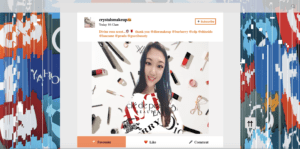
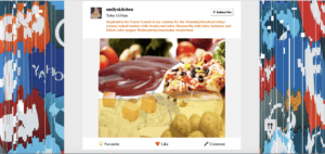
    

There are several functions embedded on this page. All the buttons can trigger corresponding effects. It is different from normal social media website though, as before you successfully “like” or “favorite” a post, or “subscribe” to a blogger, the website will pop up some confirmation messages, telling people about its perspectives towards the posts, and warning people not to indulge in them. The color of the buttons will change to orange if people persist to “like” or “favorite” a post or “subscribe” to a blogger, as shown in the following screenshots. There are also functions of the search bar and go-to-top button. 
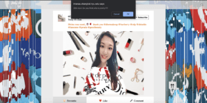
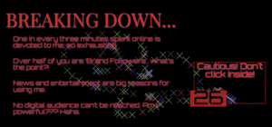
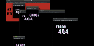
At the bottom of the webpage, there is a “click to load more” button, which will generate a pop-up window on click. The window is an audio container, and when clicking on the close button, it will play a piece of music, which is based on the rhythm of “the Beethoven virus”, and at the same time generates the continuous pop-up of windows displaying error messages, indicating that the website is broken. The effect is shown in the following screenshot. It will also open up a canvas, where a 45-second count-down is set up, and several lines of messages will display when the floating count-down item touches the border of the window. The words will also flicker after a while, and when the user clicks in the dashed corner, the canvas will be triggered, and colorful “x” shapes will be drawn along the movement of the mouse. 
 

I learned a lot from designing and coding for this project. We did some researches in the average uses of social media websites, and also in the “fashion internet styles”. I didn’t realize many of the shocking facts before actually searching for related data. For the coding, I not only explored many new functions such as generating pop-up windows and closing them, but also learn more about p5 canvas and are able to create some simple animations with it. I  gained lots of thinkings in the process of designing for the project, learning about how to change concrete messages to abstract ideas, and display them in the form of net art. I also thought a lot about the usability and features of the web as the medium and benefitted from it in creating the project.

Reflection

In the presentation for our final project, we got several critiques from our classmates, professors, and fellows. Some of them are shown below.

  • Unsure of message -> thought it was meant to show how social media is shallow
    • Doesn’t get the relationship between the art/interactivity and the message
    • Some conflict between art and message
  • Sequence works, just need to change content

The main problem we got was the unclarity of the message. As we are trying to show too much message, some of them conflict with each other, leading to confusion. 

Therefore I edited our project, removing the initial title page, for the title — “social media’s rebellion” is likely to mislead people. In addition, to make it more clear for our intention, I edited the content of the initial alert message, telling explicitly to the users that “I” (the alert messages) am speaking from the social media’s perspective, and am trying to warn people not to indulge in the virtual world on social media platforms, where the contents of the posts can be faked and deceiving. 

It reminds me that it is essential to think from the users’ perspectives and consider in depth about the way to convey the message. Although we discussed and revised our ideas and the flow of our project for several times, it still encounters the problem of not giving the message clear enough. Sometimes, it might be better to cut something from the project and stick to only one perspective, and make that specific message stronger. We did do lots of users’ tests and asked our friends to play with the project before the presentation, but most of them only gave good feedbacks about the pop-up window effect. I guess it is also because the way of using alert messages to express ideas is not that effective, as people normally tend to close the alert/confirm windows without carefully reading the contents. This also inspired me to explore other ways of presenting ideas and text content.
Final Project Proposal – Manal Masood, Kat Valachova

For our final project presentation, Kat and I decided to follow some sort of narration throughout piece. We start off by being in a crowd of different people and the person suddenly receives very stalkerish text messages. Essentially, the goal is to find who the stalker is by clicking on other people’s faces to receive a limited amount of hints while the person keeps receiving texts. The story will also be divided in three parts, or “days” in which the viewer has to be able to find the stalker. At the end of the third day, however, the viewer is unable to find out who the stalker is and then the scene is changed.As it turns out, the whole scene was an imagination of a schizophrenic person who wakes up in an hospital bed with his psychiatrist telling him that he forgot to take his medicine.
We drew inspiration from the artists of Starry Night. In this piece, the viewer is supposed to click on what seem like stars in outer space, and then a specific email from the archive respective to the star pops up. Initially, we had a very vague idea of what our project should look like but we both agreed on the fact that it should include objects on the screen that when clicked, would become brighter. Now that we have a very good idea of the direction of this project, we want people’s faces to become brighter as they get clicked on for hints. Moreover, another artist that inspired us is a modern impressionist painter Lenoid Alfremov, whose almost overwhelmingly colorful and vivid images are something we wish to reproduce in our own way with the aid of sounds, text and images, creating the impressions memories are consisted of. We would like to adopt his use of colors, and bring it into the way we use these media.
For the project, we want to use the different types of mediums that were taught to us this semester to create the finish product. We want to incorporate the use of html, css and javascript, and the use of audio to give to give the viewer a memorable experience. In terms of interactivity, the viewers get to click on certain faces in order to get the hints provided, they will also get to choose the face of the character they want, even add a name of their own.