Update for Final Project Reflection (Winny)

During our presentation for final project on Thursday, we have received some feedback from fellows and peers, here I will add these feedback to my reflection of my final project:

  1. Video quality: our general idea for the video is interesting, but as for the quality, we should have paid attention to the lighting and also steadiness. To have better quality, we can learn about how to adjust the lighting before shooting, and also have more testing before official shooting.
  2. Website design: our website lacks clear instructions for interaction, our users feel confused about what to do or where to look. For this problem , we could first adjust the style of our website, adding clear signals to show the video section or the text section; second we could give clear instruction on ways of interacting, like scrolling, clicking; third we also need to rethink: what kind of style matches our theme and video style? What interaction does not confuse our users?
  3. Audio quality: our project lacks an organized audio system: sometimes the volume is too low/high, sometimes the audio quality isn’t consistent. Many of these problems attribute to our limited time, we could be more careful and test more before set up the final volume for each video. 
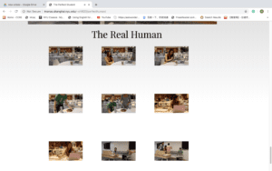
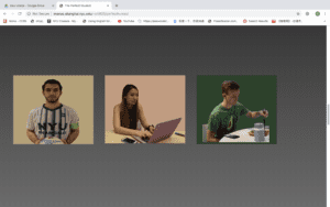
  4. Introduction of characters: we receive feedback that the three profile pictures of the characters can be more specific about their roles. Also we could add more introduction about these characters. 

Final Project Reflection Post (Winny)

Project Reflection

LINK

Design

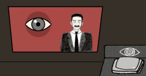
Our project presents a recreation of The Perfect Humanbased on the university life here in NYUSH. The Perfect Human is a short film in the 60s; its style is very simple and abstract, showing the “perfect” side of a human. We draw the concept of “perfection” from this short, and we shoot a new version trying to convey the idea that “perfect is impossible”.

Our project contains two parts, one is a reflection back on the original film and the other one is our videos. By clicking on buttons, users can check a series of videos depicting three “perfect” NYUSH students. Through this series of videos, users can have a sense that the image of a “perfect student” doesn’t exist; a real human’s life contains both positive and negative parts.
Process

Sebastian and I first write our script and prepare what scenes we want to shoot. For this part, we first find three volunteers who would like to be filmed, then based on their personality and interests, we create three characters of “perfect human” and develop the script too.

Then we start shooting. Since the characters are designed based on the real student, our actors don’t really need to “act” and our job is to capture the scenes we need. Unfortunately, we are not professional enough to produce high quality film, some of our films are not so stable and some of them have lighting problems. If we can start over, I would first learn about how to adjust the light input to avoid such problem.

Afterwards, we distribute our work into two parts: website setting and video editing, and I’m responsible for video editing. The process of editing goes well, generally we have all the scenes that we plan to have. One problem in this process is the narration. When we first record narration I use a Tascam but there is echoing in the background. So later I record again outside in the air. But due to limited time, we record the second time using our phone. So some of the audio also have problem. If we start over, this time I learn that we can borrow a microphone from IT that works better than Tascam in this situation.

Last, we put all the elements together and set up our website. We have some confusion on the style of the website. If we start over, we would first be more specific on the style that both of us like.

Future

In the future, I would like to reshoot some parts of the video/audio, using better equipment. This project is video-based; I think it would be much better if the video quality becomes much better. I also want to spend more time design the website. I want to implement a clear, artist layout of the website.

Another part that I want to explore more is the music. This time, I tried with traditional Chinese Erhu. I want to mimic the original sounds a little but also has our own style. If I have more time for research and another try, I think music will give our project a big upgrade.

Internet Art: The Perfect Human – Sebastian Lau (Chen)

http://imanas.shanghai.nyu.edu/~shl620/perfecthuman/

Description:

What is the perfect human? Who gets to decide what is perfect? Winny and I recreated the short film “The Perfect Human” by Jørgen Leth. We aimed to recreate it in the context of an NYU Shanghai student. By doing so we wanted to first show our own idea of a perfect human and then dispel the notion that there is a perfect human. We also wanted the user to see themselves as the perfect human. I tried to do this by having the website directly refer to the user as the perfect human. I hoped that by having the users think of themselves as the perfect human it would get the user to ponder what makes them perfect, and ultimately come to the conclusion that either they are indeed the perfect human or the perfect doesn’t exist (or is “flawed”). Our recreation highlights how the perfect human (or student in our case) can still be flawed. 

Visuals/Style:

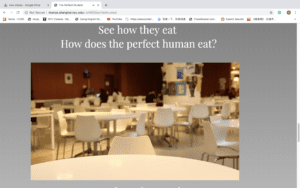
The website is intentionally plain. “The Perfect Human” is quite bare, the room is empty, and only the objects that are needed are present. I wanted to emulate both the visual and narrative style of the film. The original film was black and white (most likely due to technological limitations at the time), but I still wanted to copy the color scheme. The text comes in very short phrases as I felt like it was the same as the narrative style of the film. Furthermore, after Ann gave feedback on what kind of text we should have, I felt like it might be best if our text felt more like an extension of the art piece rather than a continuously scrolling article. I had the background slowly change from black to white as you progress from Jørgen’s films to our work. I used this to signal to the user that they were switching to a different part of the website as well as have the tone shift to something more light. I added a down arrow to the first part of the website (which disappears when you scroll) as testers had mentioned the instructions were a bit obscure (they didn’t realize the text was meant to refer to them. 

In terms of video design, I think our videos were decently well shot. In addition, I feel like our style is very close to the original film. We incorporate the close-ups from both films as well as some quick cuts from “The Five Obstructions”.  While the humans in “The Perfect Human” and “The Five Obstructions” are relatively indistinct, our humans intentionally have more personality to better personify (in our eyes) a perfect human. 

Code:

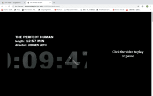
I feel like the code isn’t very notable. I had a bit of difficulty with the scrolling to change the videos at a certain point because it kept flickering, but I was able to fix it. I also had a bit of trouble where the videos didn’t change when they were supposed to, but I realized it was because they were in the wrong place for if and else if statements. I added some other functionalities like hovering over buttons to change it (making it clearer that it was a button). I also made it so that clicking on the video would play or pause it rather than having to show controls or press something else. I did this to make the website as minimalistic as possible. In addition, I don’t think I needed any more functionalities other than the play/pause button (although for the longer videos a timeline would probably be very helpful, especially for people who have not seen the video yet). Other coding included changing the opacity of buttons when other buttons were pressed so that we could force the user to go through the videos in the order we wanted them to go through them. 

Teamwork:

Winny and I divided the work pretty evenly. She did most of the video stuff, like recording and editing. I worked on parts of the narration and the text for the website as well as the coding. We did come to some disagreements regarding how we wanted the website to be styled, but in the end, we were able to come to an agreement. Overall though I think the project went smoothly since we both wanted to recreate “The Perfect Human”.  

Reflections:

While this project wasn’t the most coding intensive, I feel like I had more control over the art style and direction in comparison to the previous projects. I feel like this project somehow had more “substance” to it compared to my past projects. I think this was because I paired up with Winny who wanted to do something similar to my idea. In comparison to all of the other projects where we would be given groups and then decide what we wanted to do. While I do enjoy working with Winny and think she is a great teammate, I think I’d like to try working on my own website by myself after this semester when there are no deadlines. 

Final Project – Mingyue Deng, April Qiu

Project: Survive 1984

Documented By: Mingyue Deng

Link: http://imanas.shanghai.nyu.edu/~md3606/commlab/finalproject/startpage.html

For this project, we were inspired by the book 1984 by George Orwell and we wanted to remake some of the most famous scenes. 

Since the project has a very dark theme, we decided to make a warning page before starting the game. And we also decided to make a button for emergency escape if someone is uncomfortable to continue to play the game.

Unfortunately, we were not able to reach our goal for many parts of the project. For example, the pop-up window was not supposed to be a prompt window but a dialogue box each time a question is asked in the space. And we would like to have the mouse move in and out of the screen to trigger such box. However, since we could not know the exact location of the mouse when the page is opened, we decided that we would make a prompt window.

We also wanted to make a bed in the living room, but because of the perspective is not right with the screen, we decided to instead make a button with a red door image.

Here is a version of the working website for the first question to be asked in the game.

workingpage_md3606

We also had some problems with loading the audio for the website. And we since the images are too large to load locally, we started to use a localhost server by using python in Terminal.

It was our first time using p5.js, so it was very frustrating when we were trying to draw the shapes we wanted.