Final Project Reflection: WatchPad by Jamie & Echo – Jamie (Ziying Wang)

Product Name: WatchPad

Demonstration Video:

Presentation Slides: https://docs.google.com/presentation/d/1SdHM9oRaqpP0Qe8VAAGJVoBxrjfKM1sHXzY199ruakk/edit?usp=sharing

Agenda: Responsible Design Agenda

Goal: Problem Solving

Background:

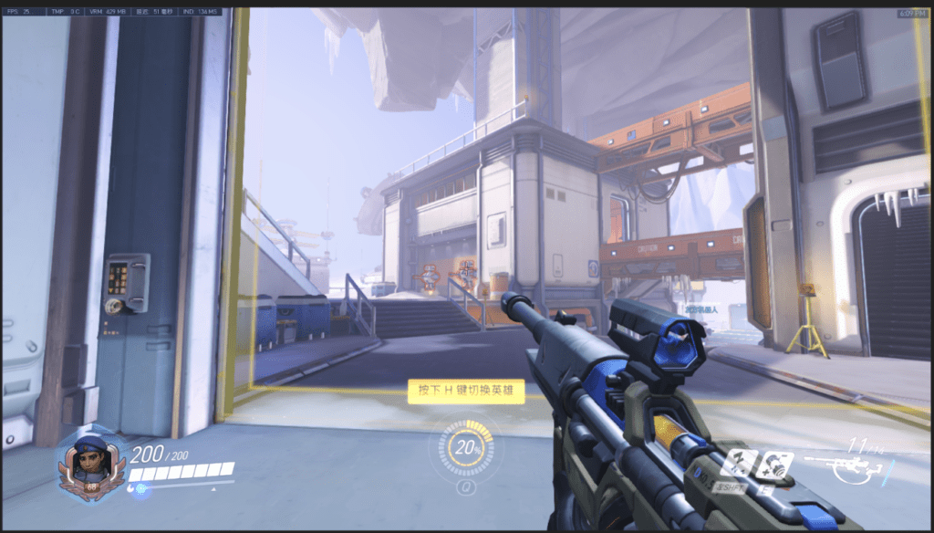
A common problem for gamers is that the information of the computer is displayed on the top left corner of the game, it’s inconvenient for them to check the tiny numbers on the top left corner and get updated of their computers’ conditions. For some gamers, they also want their favorite pictures displayed next to the computer screen, including some essential information, including time, date, weather, etc.
Inspiration:

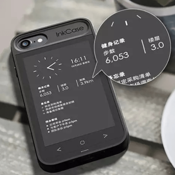
InkCase:

It’s a phone case with an ink display screen on the back of the phone. It displays all the customs information the user wants on the page.
Siri:

The AI assistant we would like to apply on our non-gaming interface, it simplifies how the user gets the information.

Our Plan:

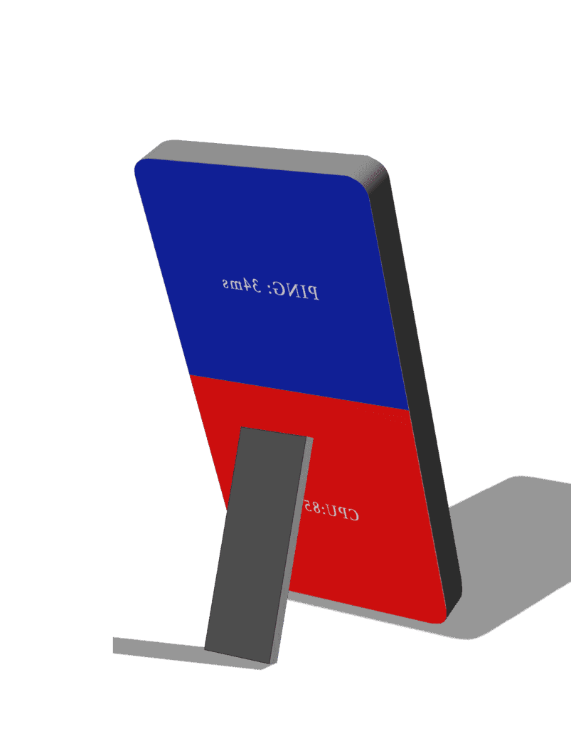
We decide to update the computer information in an abstract way of using colors to indicate the level of the figures. I build this prototype in photoshop, for this interface, the upper part is to test the PING level, and the bottom is for measuring CPU temperature. Both sections will not only indicate values with numbers in the middle but also constantly changing colors. We plan to build another interface for the user to place all the essential information he/she wants, that page can be customized and displayed when the user isn’t in gaming mode. This design is easy and direct for the user to apply beside their computers.
Process:

We think about what can be a good indicator of the level changes. Originally, we designed it to change from blue to red, the redder it gets, the laggier your network is, or the higher your CPU temperature is. However, when I applied this idea while making the changing of the light, there were two routes for this to perform: one is color changing in the RGB interface, which includes a variety of colors. From blur to red, there are so many different colors in the middle, including some greenish, pinkish or bluish colors, the user can never tell which one is closer to red, not mentioning that it can be a huge distraction for gamers. The second option seems to be better which is changing color on the HSL. I make the blue fade to white first and slowly turn red. When showing this to my partner, she told me that it is too much information for our original goal was to make the information easy for gamers to comprehend, also, if we make both the PING level and the CPU temperature indicators alter the same way, the gamer might get confused. Therefore, we decided to indicate the PING level with the color blue and the CPU temperature color red. They both start from a light color and slowly get darker as the indexes increase.
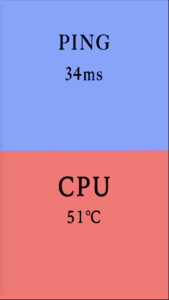
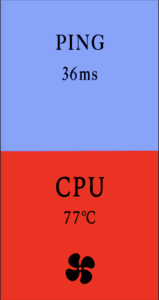
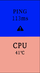
We also added two additional functions to this interface. We set a value for PING level and another value for CPU temperature, when the index reaches the value for PING, the alert sign within the area lights up as well as the alarm goes off, they both disappear as the index goes below the value. For CPU temperature, as the level goes beyond the value (75 degree Celsius in our case), the cooling fan symbol within the red area lights up, if WatchPad is connected to an external cooling fan, it can automatically switch on the fan to cool the temperature down, it then switches it off when the temperature goes below 75 degree Celsius.
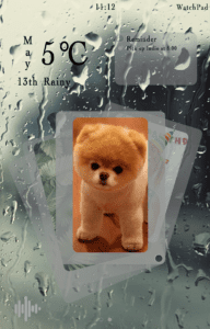
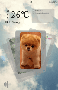
For the non-gaming interface, the user is able to design their interfaces, but the default page we design includes information on date, time, weather, reminder, photos, and also an AI assistant. The interface is clean and eye-pleasing, the background changes as the weather changes. The following are the designs I made for this interface.
Demonstration Video:

For the demonstration of our product, Echo brought her gaming laptop and the external cooling fan. We placed our WatchPad prototype next to the computer screen and launched Overwatch. We demonstrated the changing of PING and CPU temperature. With Echo quitting the game, we demonstrated the non-gaming mode’s interface and the AI function.

Future Improvement & Reflection:

We received lots of useful suggestions after presenting our project to the class. A major one is an alarm that goes off when the PING level reaches a certain value. In gaming, PING level can be reflected through game performance since the frame rate comes down when the networking is lagging, therefore it is not necessary for the user to receive an alarm on how high that level is. PING level should mainly serve as a sign that examines if there is a network error when the user finds out that the game is lagging.

Another amazing advise we received was the iteration for this project. Would it be better if we design this system into a phone app? That’d be easier for the user to use and many functions are already within the user’s phone. Also, the user can be informed only when the level reaches that certain value since he/she doesn’t need to know the exact value when it’s in the normal range.

The final improvement I think should be applied is if there’s a way to improve the network environment instead of just showing the PING level. The CPU temperature already has a solution which is switching on the external cooling fan, but so far we haven’t had a perfect solution for network speed. Echo and I thought about launching the net speed accelerator automatically, but that would increase the CPU temperature for it means launching another software on your gaming computer. We still need a better solution to this problem.

Speculative Design Practice and Reflection: Future Trends led by the Nuraphone (Peter)

Nuraphones

The nuraphone is a fascinating product that can adapt to your ears. Whenever you put it on, it can analyze your hearing by the very faint sound your ear returns, and then build a sound profile for you. (ref. https://www.nuraphone.com/pages/how-it-works). After that, it can play music in a way, perhaps by adjusting the tones, amplitude, and frequency, to make it best suitable for your hearing.

Future Implications and Scenarios

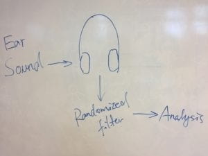
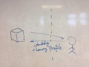
Such technology of analyzing ears is so magical, but it can compromise people’s privacy. Each person’s ear profile is unique, so it provides a potential way to identify people, or even locate people. Also, for people who have bad hearing abilities, this could also lead to discriminations. For instance, in the job market, this can be a new standard for entering certain locations. Imaging one day, we can invent a device that can analyze people’s sound profile from a larger distance, such as several meters or more (see sketch below). In this way, people can be easily identified or even located. This leads to a leak of privacy and has the potential for censorship and surveillance.

Possible Solutions

Personally, I think that the problems identified above are relatively hard to solve. Therefore might be two ways. First, for companies such as Nura, they should make sure that all the sound profiles are kept as a secret. Secondly, one potential technological way is to add a sound filter between the sound collector and the algorithm that analyzes the sound (as shown in the following sketch). In this way, each time the sound profile of the person will be slightly different (but should maintain significant characteristics for sound analyzation). The concept of this is shown in the sketch below.

Reflection

In my opinion, the development of big data and machine learning algorithms always involve the tradeoff between convenience and privacy. Currently, in China, the trend is that people tend to pursue convenience without considering much about their privacy. Personally, I think although it might be a good trend in terms of encouraging the development of AI, it could lead to serious problems one day when all our privacy are compromised by these data collecting companies and government surveillance.

Final Project Reflection – Robin Luo

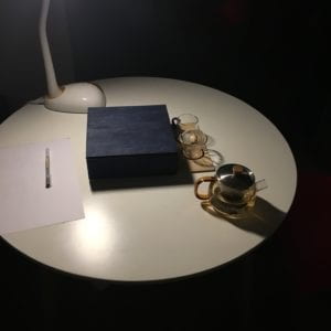
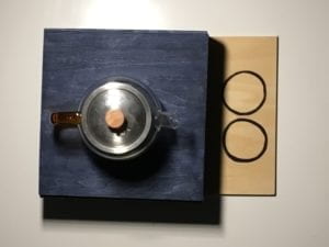
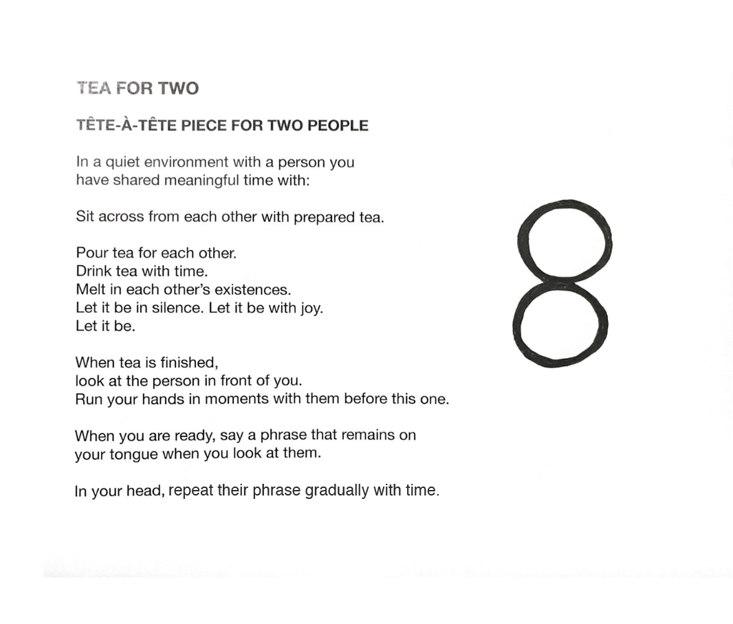
For my final project, Gabe and I designed two person performance art piece called Tea for Two which utilized a tea set and an event score.

Our intention was to allow individuals to feel power with words that deserve time to be heard with people they care about. We wanted to tackle this because words when said often pass us so briefly and instantaneously that sometimes they are not digested thoroughly. Sometimes due to this lack of time or because they can be easily said, they can be used cheaply and their power becomes dulled. I wanted to focus on verbalizing these words in person rather than through text because it lets two individuals be in a moment together and hear these words manifest naturally in the present rather than on paper or screen and see these words that were written in the past before the moment they are read. This also allows one to create time for an experience in their lives and bring people together to say a phrase that deserve time to be heard for a person they think deserves to know it. 


I really wanted to utilize this Final Project to design something experimental, and stray away from technology and design that is functional and useful for the masses and the everyday. Throughout this class, I noticed that the idea of a thing’s functionality and usefulness more often than not is attributed to it’s degree of value and worth. I do think keeping this idea in mind is good for designing with purpose — when it’s necessary. You should question why aspects of your design are there. However, I frequently find this mindset difficult to tackle with the arts — which is why I inserted in the last slide of the presentation: Why design? This question lingered in my mind throughout this entire project — why? Why this project?

Frankly, I had a lot of doubts about the value and validity of my project despite the fact my intention was clear. Why should people care? Why should I care? When looking at or creating art, writing, etc., the more the answer to this question gets muddled and faded. It makes me think about Susan Sontag’s Against Interpretation which suggests when you interpret art or find its reason for its existence (like its form or style), you begin to reduce it for what it is — you make it digestible and palatable. 

Thinking about this question, the reason why I think people should care is because I strongly believe my project — and art, design, writing, really anything that interests anyone — allows a window for an experience that enriches one’s life. With my project, I create a window for an intimate experience between two people who mean a lot to each other an opportunity where they can digest words that mean something to an individual for another individual after they share a conversation over tea. It allows individuals to hear what should be heard and it allows you to take time to appreciate that individual in your life, not over a card or a letter but in a face-to-face conversation and with a single meaningful phrase. I chose this piece as the vehicle which drives this belief.  Despite this reason, whether you believe in what I design or create isn’t a decision I make — I only persuade you and its up to you to believe in what I believe.  

In regards to the design process, Gabe and I thought creating an event score + tea ceremony was the best way to approach this project after we shared each other’s inspirations and ideas while we expressed our wishes to make a tea set. Then we thought instead of creating an interactive and tactile piece, why not incorporate our inspirations at the moment into our intention by designing an experience like Tom Sachs’s tea ceremony and Yoko Ono’s suggestive Grapefruit event scores? I think by approaching this project in this manner, we have the opportunity to touch a more intimate, sensitive experience with art and share the experience of our intention — not only do we allow two people feel power in words, but we allow two people to be present for these words meant for you. I think this approach makes the experience with this art piece more powerful.

Because of this intimate experience, I wanted to integrate this experience subtly and naturally as possible. I didn’t want to create something artificial. This consideration for the natural permeated through the entire project. As I wrote the event score, I didn’t want to have them do a specific action as Yoko Ono does in some of her pieces like to “Scream at …” or “Eat a tunafish sandwich.” Drinking and making tea seemed like already a very natural and nature-like experience, and while the event score had less specific requests, it was done on purpose. “Melt”, “Let it be,” “remains,”  and “gradually with time” were phrases I thought and felt were ones that are out of our control. I wanted words you said to the other person to emerge and settle. I wanted the individuals to appreciate the time spent together. You could say I wanted the words and experiences to be like how tea leaves are when they are sprinkled in a hot cup of water and then sink, saturating the water over time.

Final thing I want to add to this reflection is the symbol we used. Gabe incorporated the two circles just for design for our tea tray, but I found a lot of meaning we could incorporate in it. I liked how they were just touching like how we often graze by others in our every experiences, how it looked like a figure-8 or a sign of infinity like how all of our experiences are embedded in the past forever, and how it looked like two tea cups touching. I also think by drawing in the symbol, it again emphasized the natural aspect. I thought it was a nice touch! 

Ultimately, I really enjoyed this project despite my insecurities about it in the end because it made me think more about why I design, what is design, and why design at all — an approach which I tried to hold when taking this class.

Final project Reflection_Kalkidan Fikadu

Product name: R3  => REUSE REDUCE RECYCLE

Persuasive + Commercial + Performance + Enchanted Object

The product is a simple paper recycling bin with additional functionalities, compared to other recycling bins other there.

It’s visually distinguishable and is used to raise environmental awareness. The inspiration for this project came from the amount of paper

we consume each day at our school. Additional research also shows that 35% of the total tree cut around the world are used in the paper industries.

The problem statement is that paper recycling bins around campus are not visually distinguishable/distinct.

Solution: The solution I proposed for the problem statement is that we can add more functionalities to current recycling bin designs. The additional functionalities mainly aim to encourage users to perform a specific task and remind users of the impact of their actions on the environment.

The product uses two types of feedback mechanism to achieve its goal, (1) statistical information (2) images that invoke emotions

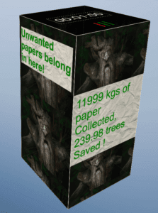
Prototype: The product is made up of a rectangular cube covered with LED screen on the surface.

Top View :

  • A timer for recording how long the collector has been in use.
  • A motion sensor for open and close functions
  • Three LEDs for estimating  the space left inside the collector

Front view:

  • Displays the number of papers that have been collected
  • Gives an approximate estimation for the number of trees that could be saved after the recycling process

Lesson learnt while designing :

Adding more functionality doesn’t equal resourcefulness. This means initially I intended to design a product with more functionality, however, while going through the design cycle I realized the additional functionality created more energy waste, which is counter to my original plan of saving energy.

Final Project Documentation and Reflection (Peter)

What and Why Design

In this project, I am designing a time management product for mainly myself, and anyone who suffers from a similar issue of procrastinating and wasting time. The reason why I am designing this product is that I keeping myself focused and concentrated while working is usually not an easy task for me, and most time management tool or timer does not solve this problem for me well.

Design Framework

  • Persuasive Design: Avoid distraction and procrastination, and encourage concentration while working
  • Enchanted Object: An enchanted timer to your laptop
  • Performance Goal: Improve and add multi-functionality to current timers

Design Process

I conducted the design process by finding out and understanding the facts about my own working style as well as the design strategy of some other products, and I am listing them as the following:

Facts about the client (i.e. me)

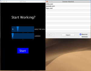
  • Easily distracted (Zhihu, Youtube, etc.)
  • Go away from the laptop (get water, daydreaming, take a nap)
  • Start working is harder than keep working

– Facts about the existing apps (e.g. tomato clocks)

  • Fixed tomato time: always 30 mins
  • False fulfillment: celebrate for you even if you took a nap. Not able to tell whether you actually spend the time working or doing nothing.
  • Is itself a distraction: the ticking noise and the constant display showing how much time is left
  • Need to set up for each task
  • Unnatural timing strategy: imposes the idea that people work by a 30 min of working + 5 min of the rest cycle

My design and the design choices

Based on all the information above, I decided to create a device that does the following:

  • Reflects the actual amount of time spent working
  • Allows a natural working style with random rests from time to time, but forces the user to make such time up.
  • Provides triggers for working and celebrates work done.
  • Blocks access to the websites that distract me the most

To achieve the goals and functions as stated above,  the following are several key design choices that I made.

  • Use a shining and unsettling red light as the trigger for start working
  • Celebrates the work done by generating a pleasant blue light
  • The device detects working by monitoring mouse movements and keyboard typing.
  • The light’s color and numbers accumulate when the user is working and decreases when the user is not being productive, thus encouraging the user to work more and idle less.
  • Calls up a third-party software that can block access to given websites
  • Designed a new timing strategy:
    • Timing according to the time I would like to work and how efficient I would like to be (i.e. laziness)
    • The speed of lights increasing or decreasing is based on the above two parameters. Therefore, it will allow me to idle by sacrificing the number of lights that I have accumulated.
    • In general, we have the following equation:
      • NumOfLights/intensity = Time working – Time idling
      • In this way, the NumOfLights/intensity only reflects the actual amount of time spent working.

Refection

Based on the feedback that I received, the project is successful in terms of making goofing around hard. However, the most significant concern about the outcome of my project is whether using lights provides enough motivation to work. On the one hand, I agree that different people can be motivated in different ways, and I also confess that I am not entirely sure whether using lights as motivation will be a long-lasting strategy for myself. Therefore, it is true that more motivation strategy should be explored to improve my project. On the other hand, personally, I believe that the lack of a strong concentration motivation can be somewhat compensated by the increased difficulty to idle.

Apart from the current design itself, it is also interesting to consider the future forms of the device. In this way, we can explore its potential of scaling up, and fit into a commercial agenda. For instance, it can be embedded into the laptop or a laptop case. Meanwhile, such a design can be extended to other digital devices, such as an Ipad of a phone. 

Demo