Week 1: Good Design – Jennifer Cheung

To me, good design encompasses good aesthetics, functionality, and usability. As a visually artistic person, I pay lots of attention to aesthetics. I’ve made visual art for most of my life, so I have an eye for what looks good and what can use improvement. Since I have the most experience in drawing, I decided to create an illustration collage inspired by my recent trip to Hong Kong. 

Hong Kong is so full of saturated colors that I knew I had to take an advantage of them in a visual creation. The perfect setting was the Choi Hung Estate, an apartment complex painted in pastel rainbow colors. I was particularly inspired by a photo taken of two of the buildings, emulating a mirror reflection of each other. I was drawn to the clean lines and complimentary colors, and decided to use it as the background for the collage.

I wanted to utilize my drawing skills by imposing a digital painting in the middle of the photo. I drew a photo of my friend who I traveled with in Photoshop, making some changes to the colors in order to emulate the same tones on the buildings. After some playing around with the background, I decided to make bold, horizontal blocks in the rainbow colors to mirror the color layout on the buildings. 
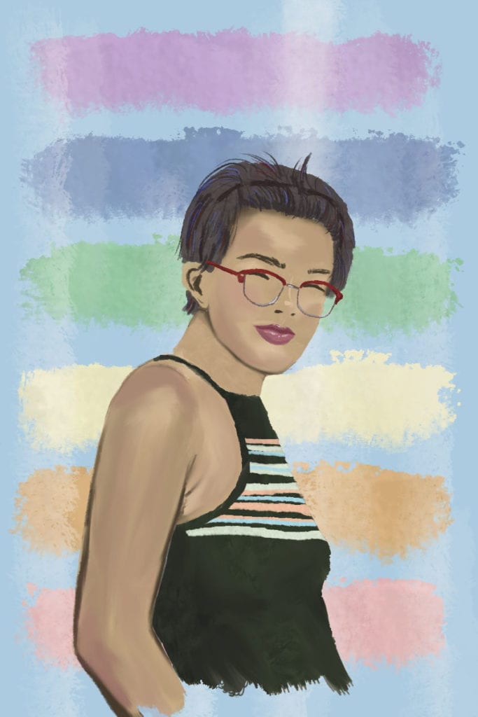
Finally, I arranged the illustration on top of the photo, adding a red border to accentuate the red accents on the apartments and adding four block elements on the sides to add to the graphic look. 
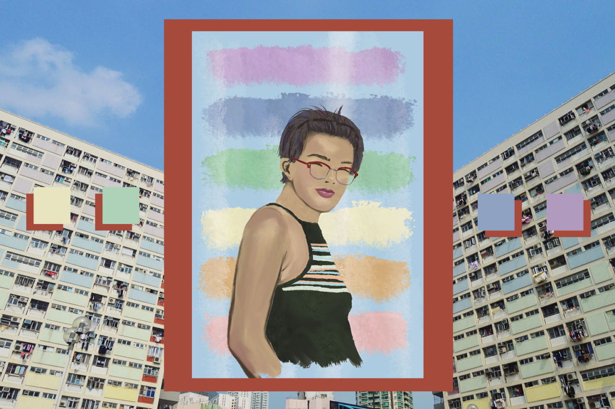
This collage represents good design to me because it is aesthetically cohesive. The lines in the buildings work very well to draw the eyes to the center of the collage, putting emphasis on the illustration in the middle. The colors all work well together without clashing or becoming too overwhelming, with none of them looking too out of place. The color theme all draws from the colors in the background photo, which makes the collage look more cohesive. Additionally, the block imagery in the apartment photo is repeated in the illustration’s background, the bold border, and the side square graphics. Because the elements of the collage all work together smoothly, this is a good design. 
Good Design Reflection – Robin Luo

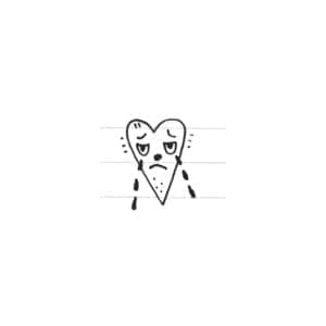
For my “good” design, I chose a small drawing in my journal of a sad, teary-eyed heart after looking at some stick-and-poke tattoos. I considered this “good” design because of its aesthetics and what it is made to represent. Although there isn’t much everyday usability to it as a design of a door or chair, it is still a form of good design and serves its purpose for its aesthetics and what it is: a drawing. Usage-wise, one could use this drawing as a tattoo design or a form of expression. Aesthetic-wise, this drawing can appeal to the eye and conveys it’s picture of a sad, teary-eyed heart.

Describing good design in terms of good aesthetics begs the question what is good art? What draws us to another work more than another? It also tackles the idea of subjectivity because for me, I’m drawn to this design, but I’m well-aware others may not be. To me, I think this is good design because the eyes and frown depicts the sadness of the drawing and the filled in tears bring some contrast and highlight the tears in the drawing. The nose, the shape of the eyes, and the small marks on and around the heart add some character to the heart as if it is animate, alive, and relatable. I also think it is good design because it is simple and not intrusive which would be a good design for a stick-and-poke.

Dirty Design Cycle Reflection – Robin Luo

With my group, we created a product for fellow Nick who was conflicted with his phone use, particularly when he is in bed, and with the battery life on his phone.


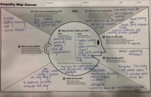
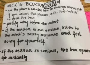
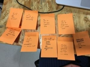
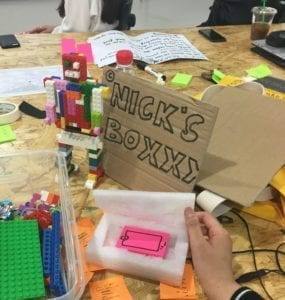
In the cycle, we first created an Empathy Map Canvas in order to understand our consumer. We then split individually to pinpoint opportunities and problems and then regrouped to find similar opportunities and problems we all had. Afterwards we brainstormed and came up with our prototype called “Nick’s Boxx” which attempted to tackle Nick’s problem. “Nick’s Boxx” is essentially an AI lie-detecting robot, inspired by his interest in hardware and robots, which talks Nick into doing what he wants to do and asks him why he wants to, that is being off his phone during unnecessary times, and keeps his phone within the designated charging box next to the robot. We decided this approach in design because we thought it would cater to his interests and be an engaging and disciplinary way to help him stay away from his phone. If it was a piece of software or a product that he had most control over, he could easily give into his temptations, but by creating a robot which inquiries his intentions, he is forced to create a valid reason why he needs to use his phone, which most of the time, there isn’t.

Doing the dirty design process was a fun experience, but ultimately it made me think about the way we approach designing products. A part of creating design is also attempting to understand the individual who will use it. For some people, one design may make more sense than another, and considering those different viewpoints in design makes the suitability of the product, to an extent, subjective. For Nick, we tried to reorient ourselves as if we were him, and crafted a product that catered to his needs and interest. The process also made me think about design that is made for the public and how we approach creating a product that makes sense to the target audience, and how this process can be used repeatedly to craft a polished product. If there is a design iterated so many times that it has become suitable for all, does that mean it’s still subjective or can it be considered objectively good?  Or is something “good” inherently subjective / not objective? 

Phone design for Tristan – Jamie (Ziying Wang)

Information:

Tristan, 23, Research fellow IMA NYUSH.

Daily routine:

Wake up—>metro (45-55min)—>in the building—>go out during lunchtime—>building working—>metro back—>sleep

Free time:

Watch shows with friends

Do gardening on weekends

Tabletop RPG games

Browse internet

Project:

Electron engineering

Improvements wanted:

Commute (metro time 50 min, 2h/day)

Goals:

Exercise more (need reminder and fixed time, keep track)

Read more (need more researching)

2 mobile phones:
Chinese school from school (iPhone): 30min/day
WeChat (communicate, payment)

Baidu map (prefer bus lines)

Apartment looking app (requires Chinese number)

Features:

Not a big fan of Apple

Standard, basic

American phone (LG gx?): 1-1.5h/day (uses the laptop more)
Slack

Browse internet

Music

Pleco

Features:
Case (needs to be customized for the phone): two parts: Basic protection (protects well); stand (very convenient)

Case restrict plugin audio cable, too thick: hard to plug in a large audio jack

Likes physical button on Android

Favorite app:
WeChat(C): utility

Baidu map(C): bus lines

Spotify

Firefox

Pleco: Chinese translation

Youtube

Calendar

Email

Notepad: take notes

Least used apps:
News apps (APNews, NPR)

Linkedin

Pinterest

Requirements:
Doesn’t require a high-quality camera

Doesn’t require good speakers: uses headphones

Doesn’t need complicated features

Likes bigger interfaces: holds comfortably

Likes the phone stand!

Problem:

Vertical placement blocks audio…

Needs bigger memory (requires external SD card)

Lock button closes the screen when the phone is placed horizontally

After quick analyzing, we decided to focus on redesigning the phone case, we wanted to design a case that can meet both his requirement of supporting the phone and not blocking the audio jack or pressing the lock button. By achieving this design, we would be having his main concerns solved.

The first case we came up with was a case that has a stand which the user can slide it inside the case when using, the stand supports the phone with a triangular supporter and the side underneath the lock button side avoids the button. However, the case remains thick as Tristan’s original case and it couldn’t ensure the completeness of the case if the phone falls to the ground. Therefore we decided to move to another design.

Inspired by slime and the slimy keyboard cleaner, we came up with a case design which Tristan can use to sculpt his case however he wants to. The slime is sculptable but isn’t too soft, and has good flexibility within it. He can sculpt the slime to avoid the button being pressed while supporting the phone at any angle he wants to. Also, the slime can be a great buffer for him if the phone drops on the floor.