NOC Final Project – Xiaonan

Project Name: Finally, they became stars

Course: Nature of Code

Professor: Moon

Project Presentation:

Introduction

There is a saying that “When people pass away, they become stars in the sky”, which I found really beautiful when I was a child. So I visualized this process based on the fact that “In average, about 1.8 people pass away every second”. So, in the project, every second about two starts will go up into the beautiful auroral night sky from ground, indicating that there are two men leaving us but heading to a new world.

Motivations

I have been hearing the saying when I was at very young age, and I really like this telling. Death is happening every second, it truly is a terrifying things, some people want to avoid it while some people are waiting for it. What’s death truly is? It’s too complicated and we will never have the answer. And that’s why this saying is so attractive and beautiful, it’s simple, peaceful, and it makes us forget about the pain.

Inspiration 

For Aurora, I looked into the real Aurora in our world and so do stars and mountains. And for souls, I found the shape of Lanterns, especially the Chinese Kongming Lantern is quite inspiring and pretty, so I decided to use this form to present souls.

Building Process

I used P5 (Java Script) to build my project, and every elements of the project is generated by code rather than any images. Here are some techniques for each element:

Aurora

Aurora is generated mainly by the function noise. The basic technique is that each particle has a Xcurr = Xpre + 1 value, and Y value is created with noise value plus a sin value so there is a wave effect, randomly but also consistently.  And for the color, I used Screen blend mode so that it would be more similar to real Aurora.

Background Sky

The sky is also generated by noise value, and you can see the change of the color from dark to light is not even, which is more natural. Basically there are thousands of 4*4 rectangles arranged in the background, and they have different color to each other, making it possible for color change.

Lantern / soul

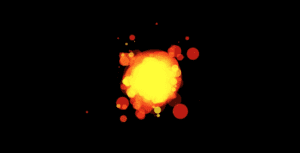
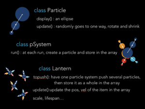
This is the soul that goes from ground to the sky. Cause it represents the human soul, I want to make it pretty and thus be respectful for lives. It is made by three nested classes, and each has its own function.

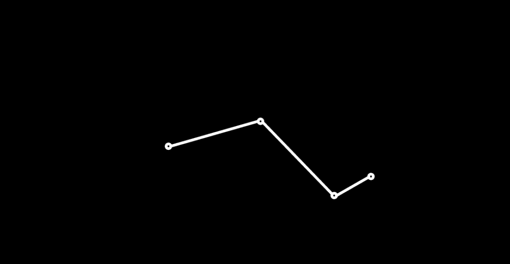
As shown in the image, class Particle is responsible for basic movement of each ellipse, and then class pSystem has an array to store all these ellipse object, and make it a whole. Then class Lantern has an array to store each particle system, make it possible to move together from ground to sky, and then finally disappear(splice). Why disappear? Because p5 is only capable for about 20 Lantern class objects exist at the same time, so I have to splice them regularly to maintain my frameCount.

I changed the color to make it fit into the background, and changed its size to very small. I wish it to be a little bit bigger but it seems to lose frameCount in this way too.

Stars

( The above image is quite unclear)

The stars are relatively simple, but it’s also quite important for the screen. Basically there is star class and each star is a particle whose transparency keeps change through Sin value. Also, the whole class is rotating around point(width/2,0), which shows a effect of time change, and makes the frame more dynamic.

Difficulties

  1. The coordinates of the star, Aurora, and the souls.
    At first, I was worried that these three things will be quite messy, cause they are all moving and they might collide with each other. So I searched a lot of the pictures of real Aurora night sky with stars and try to adjust the colors of the aurora, souls and the background, finally I found one combination could work out, although not completely satisfying, it’s not messy at least.
  2. Lose frameCount
    Because the stars, souls and aurora are moving and the same time, the frameCount is quite low and it’s not as smoothy as expected, the only solution is to use less elements with small size and low speed.

Reflection

In all, it’s quite fun making this project cause each part is very pretty thus gives me a sense of accomplishment. And I have learnt to make my code structure much cleaner this time so I could easily make adjustment to my project. As professor said, we should make things step by step, part by part, and I found that really useful especially when my projects are composed of several parts. I could make each part work and then group them together, which saves a lot of time.

NOC: Final Project —— Skye Gao

Project: Wings

Date: May 18th, 2019

Processor: JH Moon

Introduction:

My final project is about object simulation. I intend to simulate the motion of bird wing and to make some visual effect based on the anatomical movement with p5.js . The project has two versions: one shows the physical structure of bird wings, the other visualizes the appearance of wings by applying particles systems. 

Inspiration:

The inspiration of my project comes from some street arts that paints wings of human size with various art styles. One common feature for these kinds of wings art works are that, the audience are invited to become part of art pieces by posing with the wings. Also,  from my other class about 3D modeling, I learnt that wings is a common organic feature in many 3D modeling scenes and game design, which leaves the concept with much room for exploration and utilization. With p5.js, I would like explore this form of art by creating visuals of moving wings, and by utilizing tools like projection in the future, I would like to let the art piece to be immersive or even interactive. 

Related image

Ive Freya

Development:

Since my project really focuses on the object of wings, I started off with researching for and analyzing the anatomical movement of wings. 

how-to-draw-wings-ventral-dorsal-bird-2-1

how-to-draw-wings-ventral-dorsal-bird-2-2

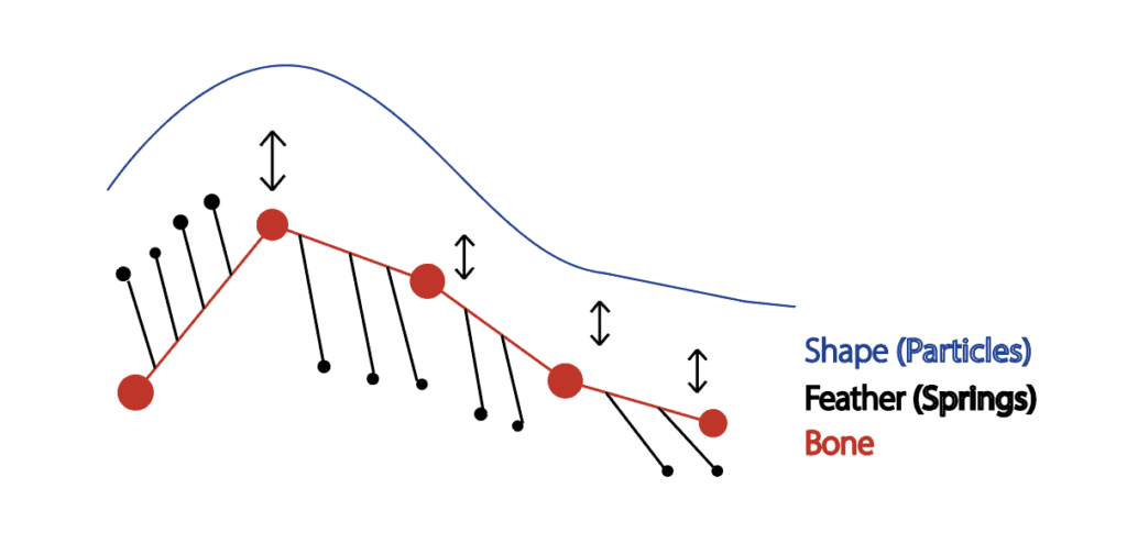
With reference to the research findings, I divided the structure into several parts: joints, bones, and feathers; and based on that, I proceed to plan my project by breaking them down into different gradations: sketch, movement, and appearance. 

As shown in the sketch, I first planed to build the bone structure and joints with the basic movement, then I would attach feather structure to the bones by using the concept of springs, and finally I would visualize the appearance of wings by applying particles to the kinetic structure. My project were basically implemented according to this plan.  

Bone structure: 

To build the bone structure, I created the movement of joints (points) first and connected them with lines (bones). However, the way to design movement was tricky. I firstly tried to change the joints position with spring concept, but the wan points moving with springs is was not very regular and they would tangle with each other. So I proceeded to manually change the positions of the joints. I used the sin() and cos() first, but in this way, the movement was too stiff and the bones were stretching.


To solve the problem, I looked up more animated movement of wings online to study the organic principles, and I realized that the problem was each joint was not moving based on the previous one. The way joints are moving should be revolving around an axis. Therefore, I changed the code to achieve the effect. 

how-to-draw-wings-flight-animation-promo

Feather structure: 

After completing the bone structure, I then proceeded to attached the feather mainly using the concept of springs. I used lerp() function to divide the distance between each two joints into ten and placed one end of the spring over there. I then positioned the other end of spring based on the first one by using sin() and noise() to build the basic curve shape of wings and connected the points with springs. 

Two wings:

After having the basic structure of one wing, I used class systems to duplicate and flip the wing to make a pair of them. The final result for the wing structure looked very organic and really met my exception. 

Link for p5 demonstration: https://editor.p5js.org/Skye/sketches/4ycJm0eZg

Particles:

With the anatomical structure of wings, I then tried present the appearance of wings by attaching particles to the structure. The outcome looked like this:

Link for p5 demonstration: https://editor.p5js.org/Skye/sketches/ZVm2FPYOo

Presentation & Future improvement:

For presentation, I showed the two versions of my wings, and got feedbacks that I should as I have two version of the wings: one is realistic simulation, the other is more about artistic representation, I may be should choose one direction to focus on and push it to the limit. 

Due to my intensive schedule during the final, I did not fully achieve the result of my project as expected, which left much room for me to further develop it. Based on the feedbacks and my reflection, I think I should have these future improvements:

  • Make the wings structure & movement more realistic and organic by experiencing with the variables;
  • Explore with the particles to create different kind of visual effects of wings (e.g.. color, shapes, lights);
  • Create some scenarios by adding some background or decorations in the canvas;

In all, it was an challenge for me at some stage but I really learnt a lot from those theories and concepts in class. I am especially thankful for all the help and support professor Moon had offered us. It was a real pleasure to be in the class!

NOC Final Project

Description:

Dreamwalker is a human-graphics interactive dance performance which aims to explore if computer graphics can replace a human in a duet. My experiences as both an IMA student and a dancer inspired her to observe the similarities between human movement and computer graphics. 
This piece applies four different interactions using three different projectors to create the illusion of someone you lost in the past coming back to you in a dream. 
The interaction between a human body and a virtual body also intends to make the audience consider: how can you tell if something is real or no?

Visuals:

For the visual part, I used the concept of nature of code to make it. It starts with dots moving around. When the wakes up, the graphics get the awareness and begin to have shapes and finally grow into a human being. 

      Non-human visuals:

      I used autonomous agents and flow field to create non-human shapes. With a Kinect, when the dancer moves to the ground, the graphics will follow her. I also used sin and cos functions to mimic the movement of legs.

      Human Shapes:

      I used motion capture to capture the movements and use noise to draw the human skeleton shapes. I also played with opacity when the visual dancer turns.

Presentation:

https://docs.google.com/presentation/d/1aEQu5dnVH2e_3doHIWDBPLQejHqynlH24GERCwZAfPE/edit?usp=sharing

Final Video Documentation:

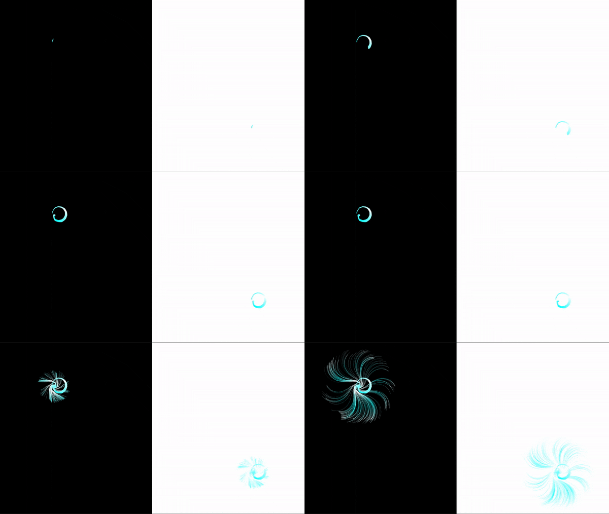
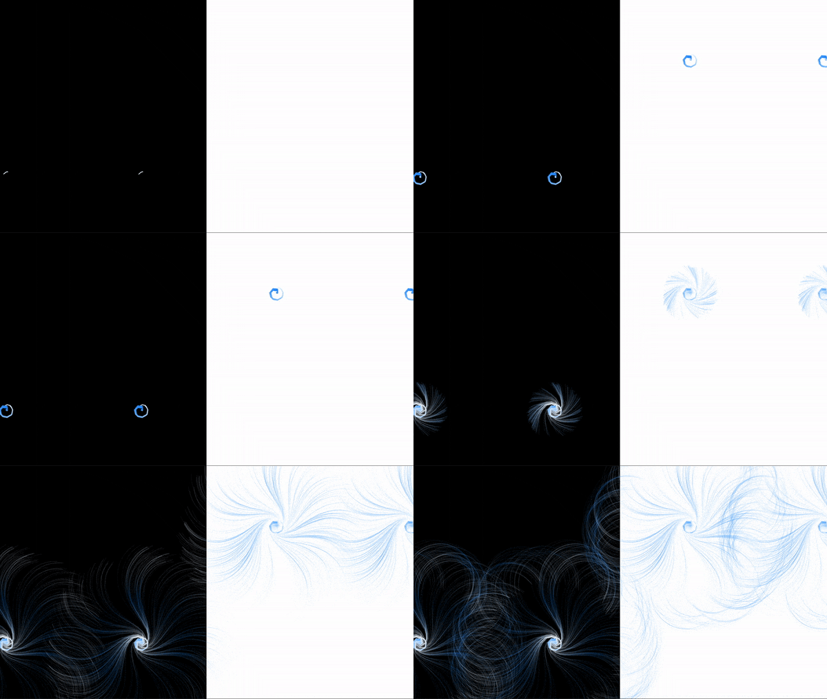
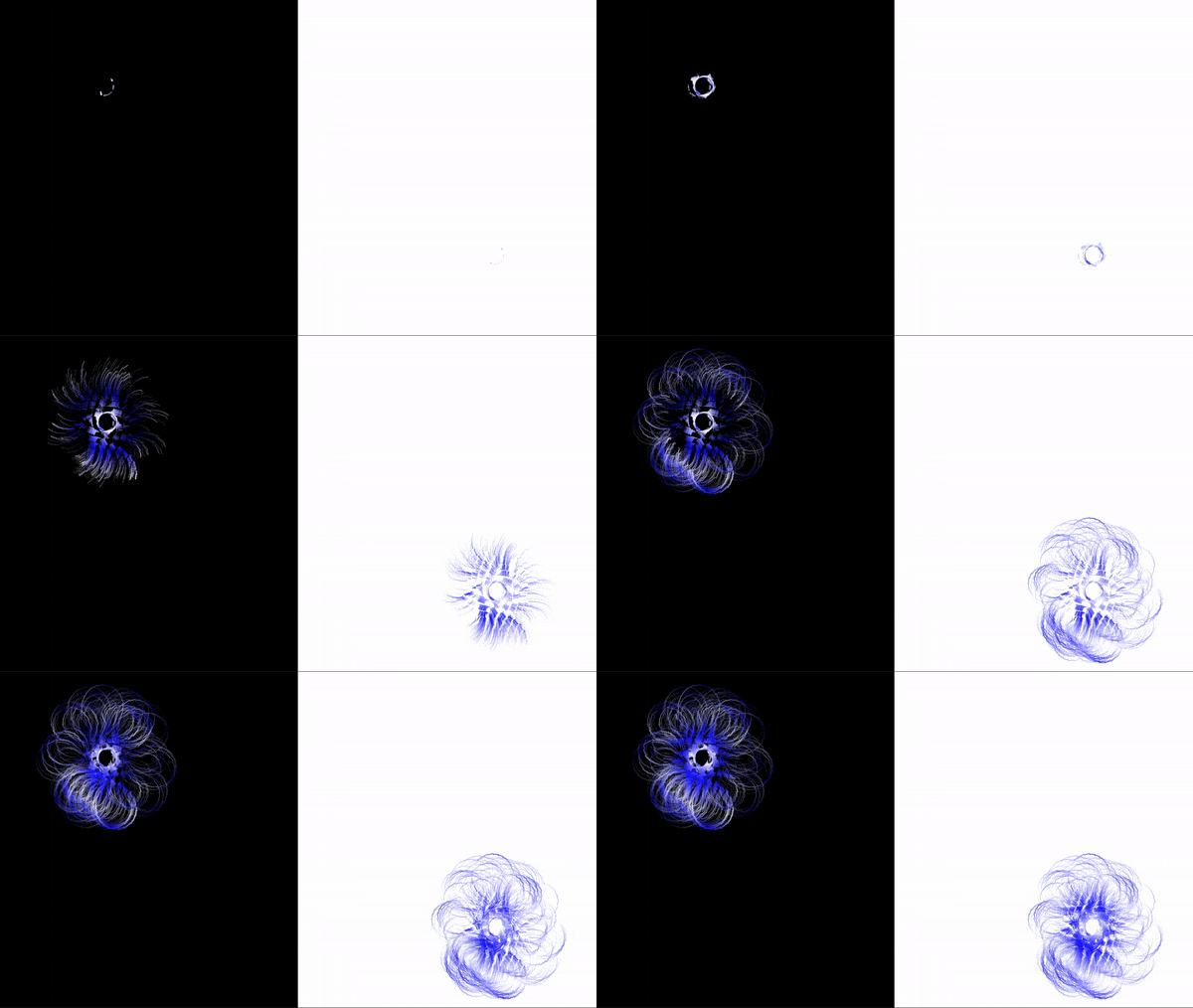
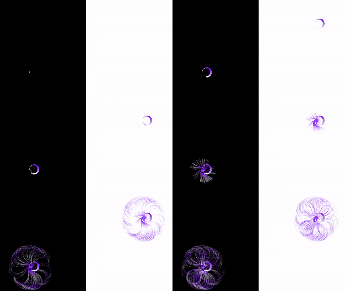
NOC – Final Project – 🌆 Day to Night 🌃 – Yang Gao

TITLE

🌆Day to Night🌃

DESCRIPTION

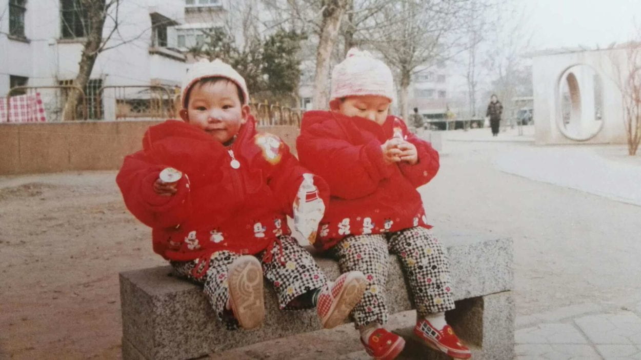
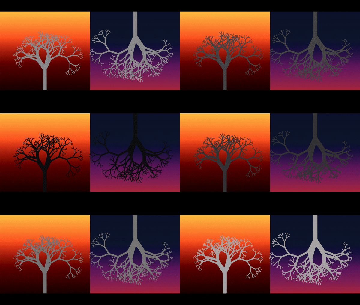
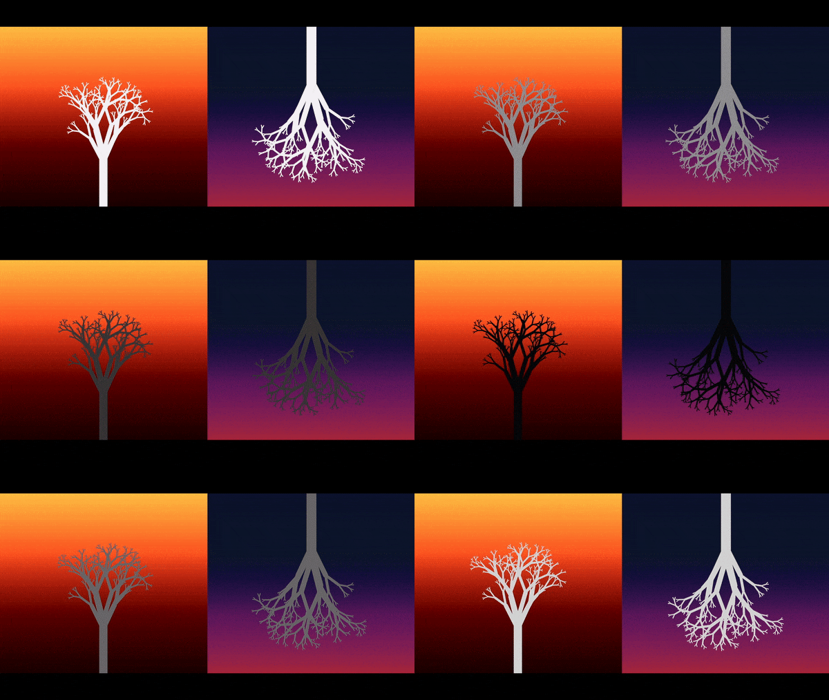
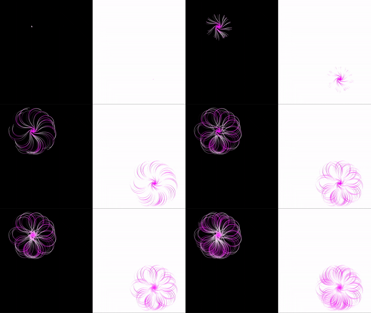
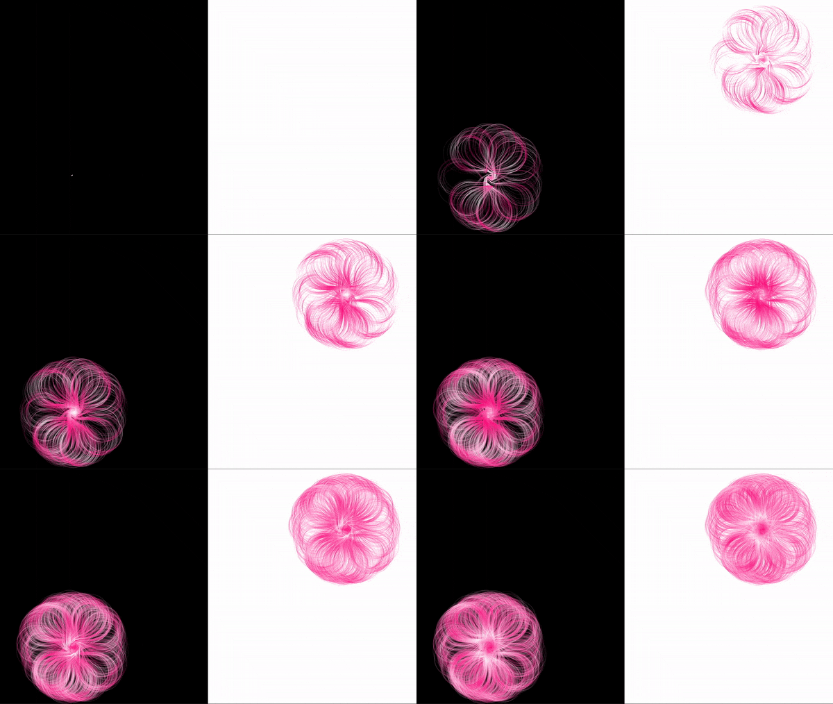
🌆Day to Night🌃 presents two similar objects growing in two different places. The two objects represent me and my twin sister at the time that I studied away in New York and my younger sister was in Beijing. 

INSPIRATION

The first time I used noise function and found out it can be a very ‘lifelike’ function. The randomness of the function is very like the randomness of human relationship. Also, we used nature of code to present many nature phenomenon like birds flying, star shining, etc, so I’m also curious about how it turns out if I use it to express the relationship between people.

So I decided to tell a story using coding. And instead of going for narrative, I tried abstract storytelling for the first time in my life.

RESEARCH& PROCESS

After researching online, browsing the Nature of Code book and talked to Moon, I decided to use the creature plant to represent me and my sister. 

Professor Moon said either go for complicated background with simple objects or go for simple background with complicated protagonist. 

1⃣️ So firstly, I went for the former and tried with simple objects. However, I found that if the background is too complicated (in terms of the color), there will be some limitation to do with the objects. I also tried using frameRate to control the background color and realized that the changing is not that organic so I then gave up working on the background and went for changing the objects.


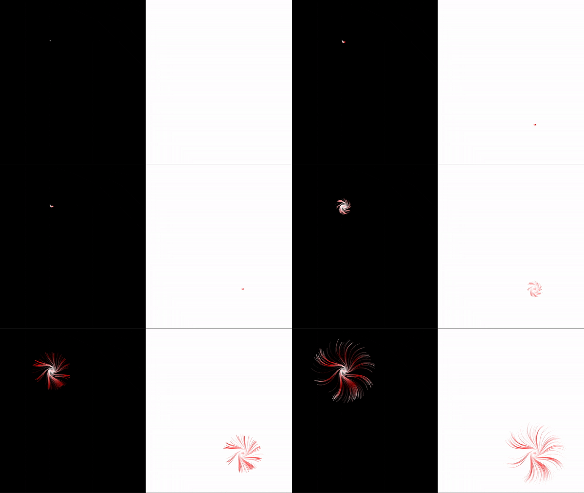
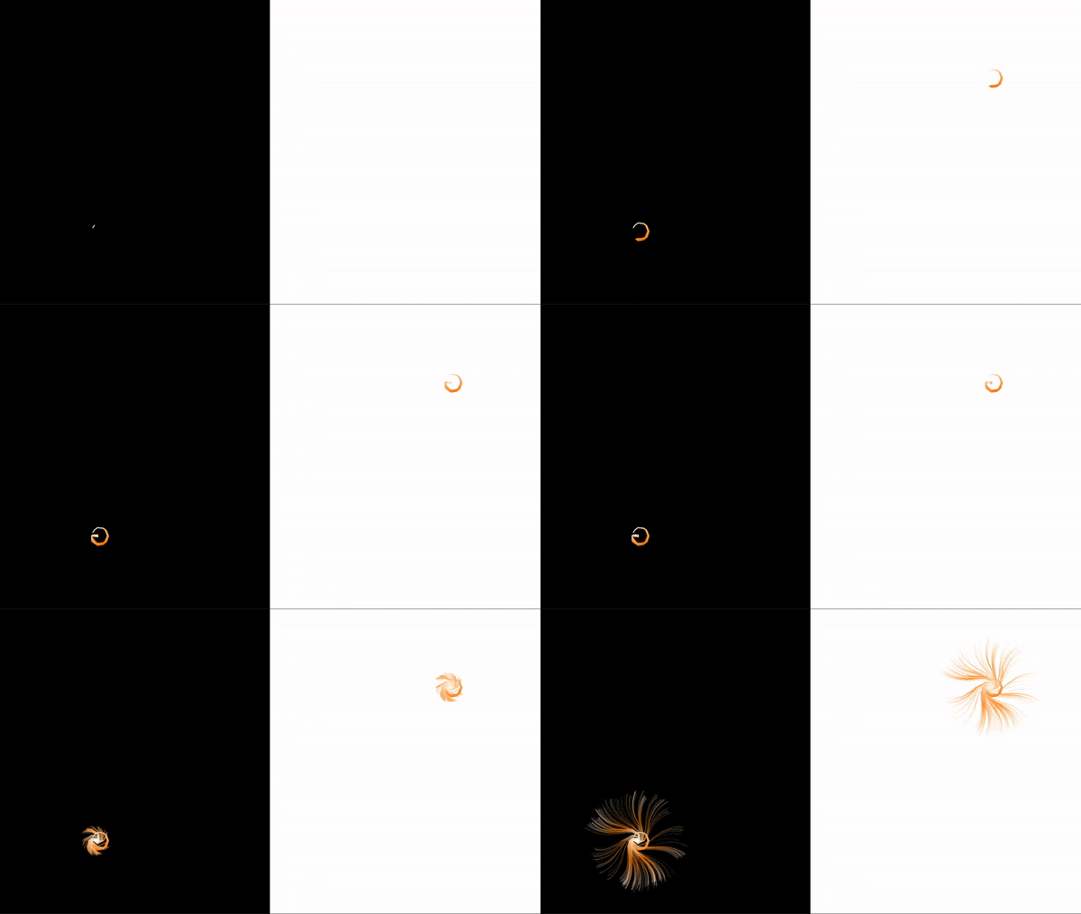
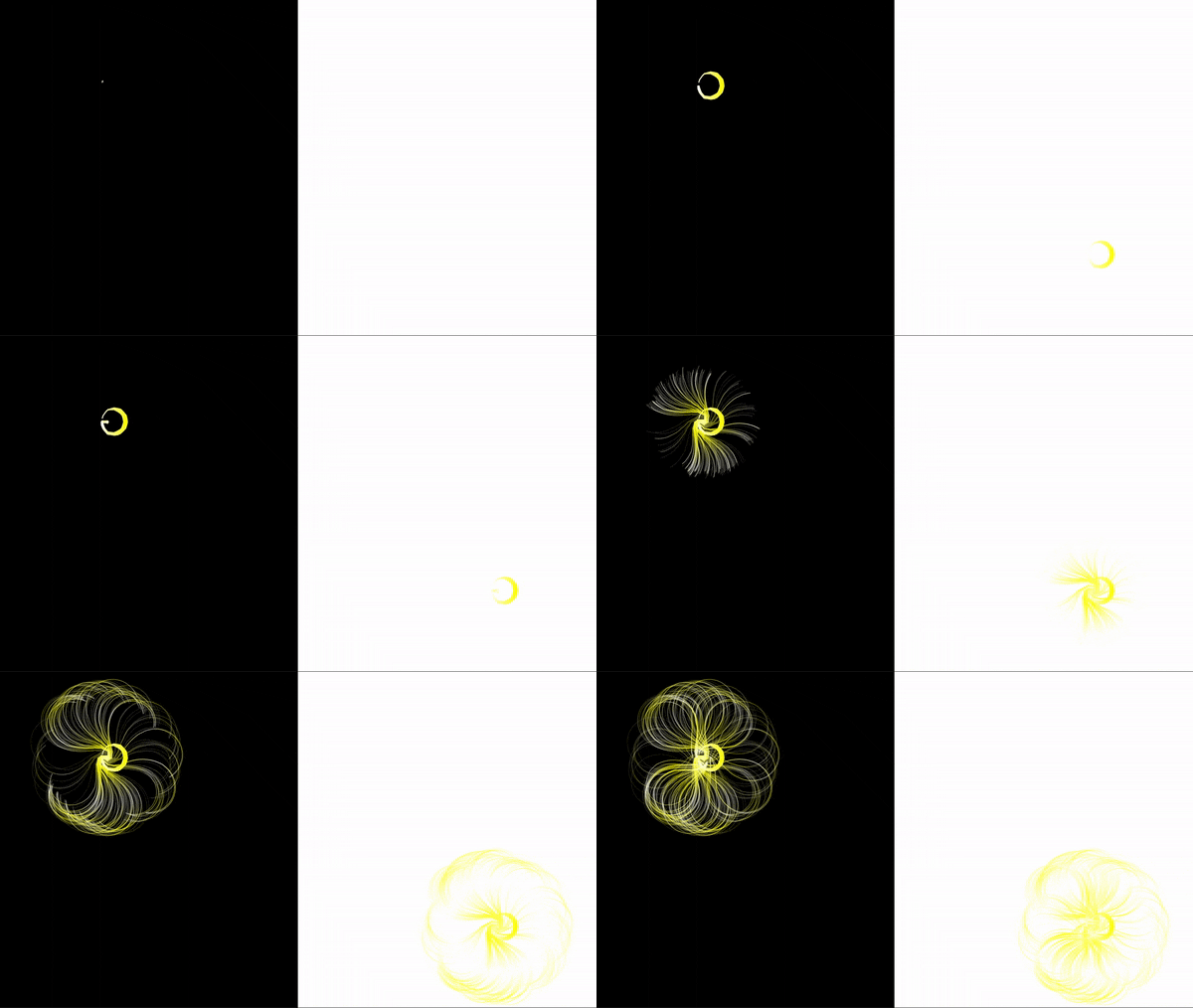
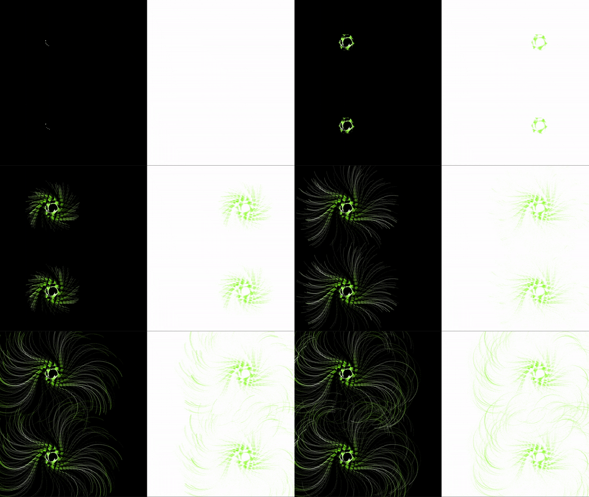
2⃣️ The I decided make the background as simple as possible (just black and white) so that I have more possibilities to work on the objects. For the objects, Moon, mentioned X-Ray flower and it looks really like flow field, which is something I want to play with. So I used the flow field to mimic twin flowers.

3⃣️ And then I played with different color and size of the flower to add more variety to it. I tried with different brightness for the flower and found out that if I want the changing of the color to be more obvious, the changing of the brightness must be very big, which turned out the petals of the flower became black at certain points. So I went for changing saturation according to the time. 
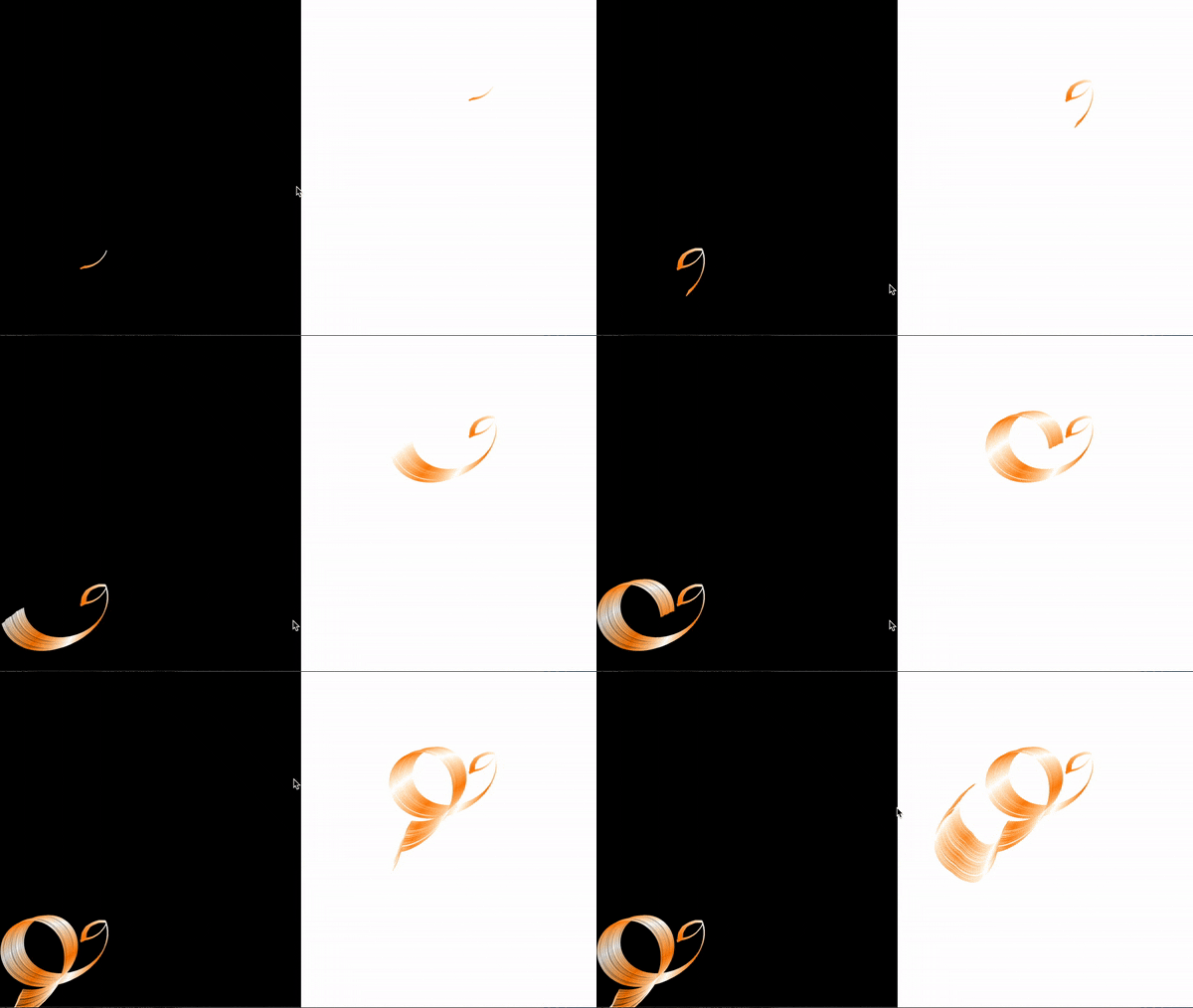
3⃣️I tried with background switch when the flower change, however, it’s not very comfortable to look at. 

4⃣️After the presentation and according to the feedback, I realized there are not much interaction between the two flowers. So I added a a mouse interaction at a certain time. Even though it destroys the flower, however, I feel like this add more changing to the objects.
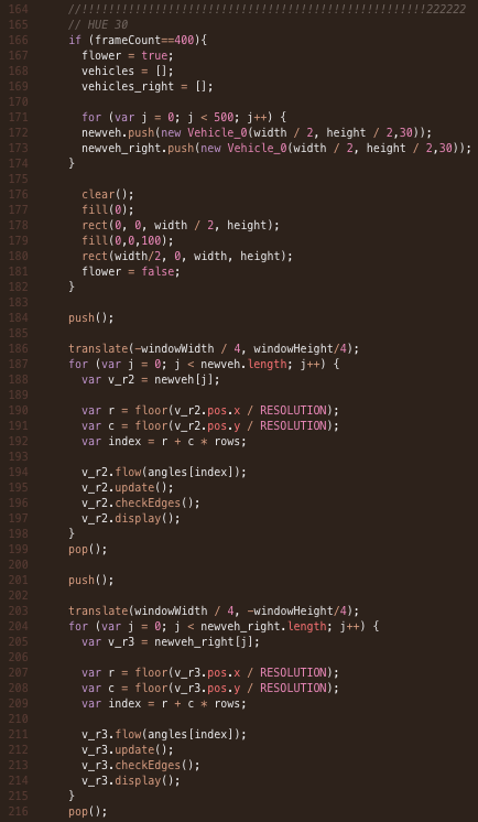
CODE

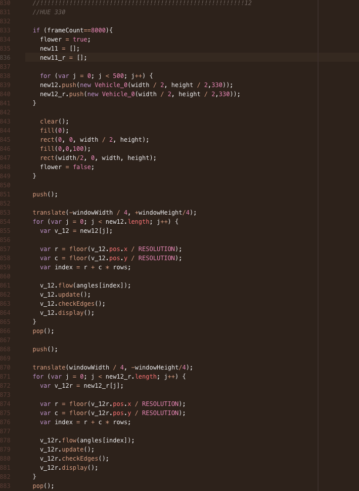
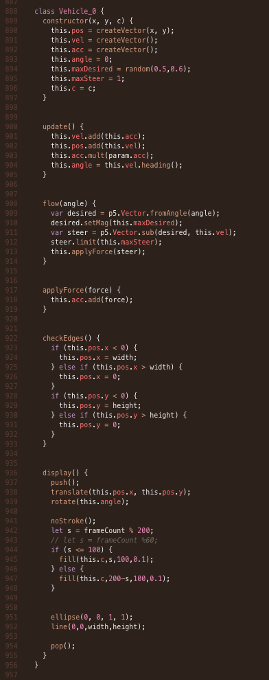
1⃣️  Control the flower using frameCount

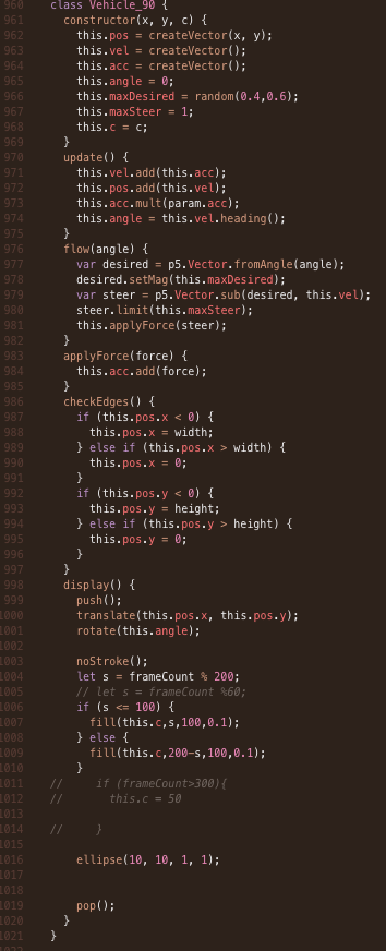
2⃣️  Two different kinds of flower

POTENTIANLS

I think I still have lots of space to improve for the project. First of all, add some interaction between two objects to make the story clearer. And also can make the two objects have slightly difference in terms of the shape and behavior, because according to CiCi: ‘your sister and you are not exactly same’. Adding a little difference can be a small surprise in terms of the design. 

(Surprisedly, since I used different background [b n w] and played with the saturation, even though the two flowers are exactly the same, the background make them looks differently)

For the presentation form, I think it can also be printed as a book, because in this way, people can see the differences between two flowers and different patterns. However, in this way, people might see the kinetic movement of the flower.

CONCLUSION

I’m satisfied with the visual part of the project, it is very satisfied to watch. However, for the storytelling part and the interaction part (two objects interaction), it can be improved a lot. Even though I went for abstract, the relationship of this two flowers can be conveyed clearer to the audience. 
Also for the presentation, I feel like it would be better if I can show the making process to the audience instead of just showing the work. I feel like showing the failure steps can also help them understand your project better. 
This is my first time use coding to tell a story and this is also my first time to do experimental storytelling. Experimental storytelling is always something I want to try and never find a chance or a story I feel like can be told through experimental storytelling. Interestingly, by using the abstractness of coding, i made my first try. Although there’s many space for me to improve the final result, it is a nice start and I develop a little confidence in experimental storytelling. 

Before this class, I haven’t touched coding for one and a half year. During learning nature of code this semester,  I start picking up my coding skills gradually and recall the programming logic. Thanks to the step by step coding in-class.

REFERENCE

Thanks to Professor JH Moon and Leon Eckert for helping me with the project.❤️

NOC – Final Project: Peach Blossom Spring (Lily)

Project Name: Peach Blossom Spring

Description

This project is originated from an ancient Chinese fable called Peach Blossom Spring, which is about the accidental discovery of an ethereal utopia where the people live an ideal and harmonious life with nature, separated from the outside world for centuries. This project is aimed to demonstrate an animated visualization of the Peach Blossom Spring in the story in the specific style of Chinese water ink painting.

Inspiration and Concept

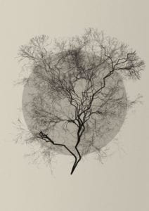
My first inspiration was from a recursion tree created by Diana Lange.

I found this tree looked a lot similar to the ones in traditional Chinese paintings, which inspired me to pursue the aesthetic style of water ink painting.

I was also inspired by the exhibit at the Chinese Pavilion during the 2010 Shanghai expo, which was an animated recreation of the famous ancient Chinese painting, Along the Riverside During Qingming Festival.

Then I decided to recreate the story of Peach Blossom Spring in the form of animated water ink painting.

Processes

At first, I imagined that there would be only two scenes. One would be an entrance drawn by the ink strokes, the other would be the main scenery of the Peach Blossom Spring, and after it rained, the ink will start to spread out and the painting would become blurry, indicating that the utopia was just a fantasy.

I started off with creating the recursion tree.

This is my first draft. But according to some feedback, it looks like a tree in a Japanese painting style instead of the Chinese ink painting style. Also, for each generation, there would be three branches, which made the sketch really slow. Therefore, I developed a second version.

The strokes were thicker, though still a bit too straight. And I took out one of the branches in order to make the sketch run smoothly. Moreover, I added an ink drop where the tree grows as well as some strokes representing the reflection of the moon.

Then I continued to work on the entrance part.

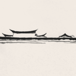
My inspiration came from this sketch that I saw online.

To imitate this blurry effect, I used ” blendMode(MULTIPLY)” to blend the strokes. The below sketch was the first version.

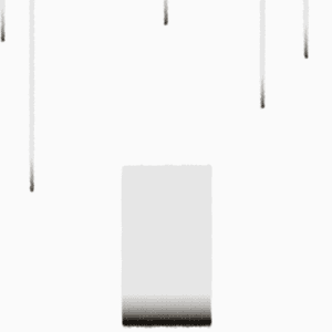
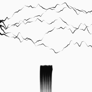
But later I realized that the gate was not intuitive enough for people did not know about my project in advance. Plus, the Spring was found through a path between the mountains, therefore, it would make more sense to add some strokes to represent the mountains. By creating the particle system that will disappear depending on its lifespan and will keep generating particles from the above, I had the second version.


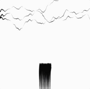
Considering the importance of blank space in water ink painting, I reduced the number of mountains. Also, thanks to Dave’s advice, I made a modification to the color of the mountains in order to create a space on a 2D canvas: if the stroke is going down, then the color will become darker, indicating that this mountain is closer to the viewer. 


I could not decide whether to make the canvas a square or the size of the screen. After receiving some feedback, I chose the former one, which resulted in that I kept the tree as a single scene.

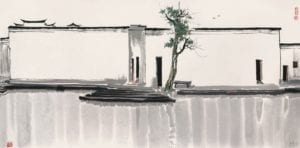
When I was considering what to put in my next sketch to give a whole scenery of the Spring, I saw this painting of Guanzhong Wu.


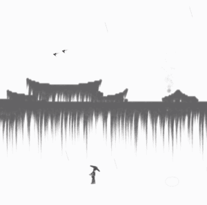
Thus, I decided to have a pair of swallows, a couple of pedestrians, smoke from the rooftop, rain, and the houses as the background.

For the swallows, I first tried with autonomous agents to make one of them follow the other, but their movement was always a bit awkward. Then I used flocking, which made the movement much more natural.

For the house, I was first suggested to look for some SVG files of houses, which would contain the x and y coordinates of the house images. In the end, I adopted the technique of pixel iteration taught by Professor Moon, which saved me much time on figuring out where to place the particles by myself.

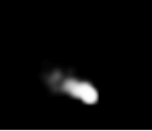
The smoke effect was inspired by the smoke particle system created by Daniel Shiffman.

The pedestrians were hand-drawn. But to prevent the sketch from being too busy, I only kept one of the pedestrians.


Here is a demonstration of my project.

Difficulties

The biggest difficulty that I had during the whole process would be how to imitate the water ink style as accurately as possible.

I played with the color of strokes, whether to use traces of particles or to have the particles spread out, different blend modes, etc.

Besides, for the final scene, the stokes for the house required that there was no background in the draw() loop, while all the other elements required there must be a background or they would leave a trace on the canvas. To solve this problem, “createGraphics()” was used to create another canvas for the house.

Further Improvement

Due to limited time, I did not get to the place where I could have the rain to blur the whole painting. But I still believe it would be cool to have this effect as an ending of the project and would make it more related to the theme of the original story.

I would also love to improve the recursion tree by adding more randomness to it, instead of making it too symmetrical.

Furthermore, I could add more colors to the sketch, or at least have different levels of darkness for the ink strokes, so that it would be more like the real ink.