benignity- Machine Learning New Interfaces- Final- Eszter Vigh

NO
No SnapChat Filters

Inspiration:

Still working off of my midterm “cancer project” I wanted to take the idea in a new and very different direction. I was HAUNTED by the suggestion that the project was a snapchat filter. I wanted to do serious work and I realized that if I wanted to covey serious topics I had to frame and present the work in a way that conveyed my intentions. 

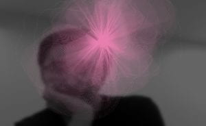
Instead of focusing on beauty and growth I wanted to reframe the project as a visualization of the dehumanization of cancer patients. I wanted to have a very delicate floral design on top of the user, covering them up completely. Somehow I wanted to show how their life was still separate from the cancer and treatments. 

The main question was… how. (I wan’t even sure when I proposed this project… so the journey to the final result was long.)

Starting with the Fun Part: p5!

The only salvageable part of my midterm was the idea of a p5 overlay of graphics. The question was, if not Henna style flowers, then how was I going to make something super delicate looking. I very randomly went to a workshop for I think another class entirely led by Konrad. It was there that we worked on intricate sin/cos drawing creation that was far more advanced than my dotted style. 

This was going to be the graphic I spring-boarded from, it would ultimately be re-colored and pixelated… but that is a later step I’ll get to a little later.

KNN- The Struggle is Real

KNN
KNN Struggles

KNN and I… we don’t get along. I think that is the simplest way to put it. I had previously done a homework based on Southern Chinese Sign Language. It didn’t “suck”, but basically I realized how limited KNN and PoseNet was. It doesn’t really detect your fingers. In my case, I realized this was once again going to be the issue if I wanted to do ALL of the cancers. There was clearly overlap if you are just taking wrist position into account. An example is colon and stomach. None the less, I selected about half of the cancer from the sample list I had in my proposal. 

I will say, just because I am so painfully awkward, I found myself saying well I have… ____ cancer, I have _______ cancer, more like trying to show that I was training a set trained on a given cancer form… not that I actually have cancer. (No seriously, I am totally fine, I just couldn’t English for a little bit… sleep deprivation is at fault I promise.)

KNN in my case was a modification of the “rock,paper,scissors” example like last time. I added about 200-ish data points for the version I presented at the IMA show, which was modified to work when the user was sitting down. (I didn’t save that particular version… I mean I did but it was on IMA Computer 20, and I didn’t think to save it until I began writing this post). I added an empty example set as well just to help in the accuracy, but once again that is something that was for the show specific version.

Pixel Manipulation – Moon is a Literal Wizard

Peter Parker
Inspiration

Now, I had this idea in my head that I wanted the user’s final image to Peter Parker out of existence. (I am including a GIF of that because that scene from Infinity War is just that good.) Just because they, the user, don’t have cancer so they don’t have to live with the consequences of having cancer. 

I had never done anything close. Basically we applied things I had learned with BodyPix, like grid size to help splice and separate the image into pixel squares. 

Then it was a matter of understanding logarithmic functions to make them move. This took… one and a half office hours to understand on my part.

What the Flower Means – Deep Thoughts 
Test 1
Tests!
Neck
Testing!
test
TEST
Testing
Tests
liver
Testing!
Kidney
Test!

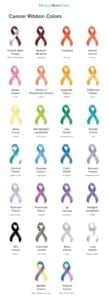
The dotted white line, represents the treatment cancer patients have to go through… so doctors appointments, checkups, hospital stays, etc. The flower is colored based on the “diagnosed cancer” and represents the life of the patient. The patient is lured out as, they as a person cease to exist as all anyone wants to talk about is the cancer. 

Bringing it All Together – Intervals and Frame Countmlnimlni

Using the FrameCount method from the midterm, I was able to effectively stop the flower from drawing more than I wanted it to. Then by adding an arbitrary number (like 250) in my case, I was able to stop the pixel manipulation sequence from going on forever. Using intervals, I was able to give a secondary threshold to the KNN, so in the case of the final it was 200 frames of a pose to cause the floral image to draw. In the case of the “normal demo” copy, it is 60 (that’s mainly because my personal laptop is just WAY slower than an IMA laptop, sorry). 

Saving the Results- Space Bar for Flower, Ending of the sequence for entire Image

I implemented two saving mechanisms. These saving mechanisms are meant to be able to allow for printing of the user’s experience so they have a lasting impression after. It’s a last touch added after the presentation on Wednesday. 
Cancer Ribbons
Cancer List

Conclusions-Next Steps

I like my project, if I had another month to just add data points to the KNN I would. Ideally the project is presented standing up, but sitting works as well just do long as the data set is modified. It would be cool if I could use the same dataset for both sitting and standing sequences.

Ideally, I want this work to be published or shown in a big setting, once I have more of the bugs worked out. The message is important. It is something that resonates with millions of families round the world. 

Special Thanks:

Professor Moon for your help, your presence in the lab during the finals crunch is much appreciated.

LA Jessica, for teaching me abut empty examples. 

My roommate Sarah, who served as the “user” during the IMA show to make the entry display always active so people had something to explore and talk about the second they entered the room.

The Code

MLNI Final Project – Alex Wang

Task:

Develop a user interface on the web or mobile platform utilizing any machine learning models covered during the class. Students are strongly encouraged to explore the diverse tracking/transferring methods and find their own ways how they effectively interact with body movement or webcam images. Successful student outcomes can be created in various forms. Projects can be anything from a visual that is manipulated by the models to bringing such visuals into augmented/virtual reality; a drawing tool; informative web application; entertaining game; virtual dance performance; or creating/playing a musical instrument on the web. More details about the final project will be discussed during class and at the concept presentations.

My Project:

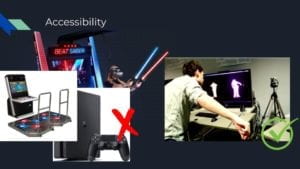
ML Dance is a web-based interactive rhythm game that is implemented in p5.js, it utilizes machine learning models to track the player’s body position. The player controls a virtual avatar in real-time simply by moving their body in front of the camera, accurate tempo syncing and real-time motion tracking allows competitive gameplay while still keeping the interaction natural and fun. Unlike other dance games on the market, the game does not require excessive hardware such as depth-sensing cameras or remote controls. By implementing machine learning models, the game is now much more accessible for all users only requiring a laptop with a normal camera.

Inspiration:

There are already many dance games and rhythm games that goes beyond the interaction of just clicking buttons, traditional games like Taiko: Drum Master creates a interactive gameplay using simple techniques by just creating a physical drum for the player to smack.

Taiko no tatsujin arcade machine.jpg

Taiko: Drum Master (2004)

while early dance games are only possible through pressure sensitive plates on the floor, which can not include the movement of the whole body since the arms and head movements can not be tracked.

Dance Dance Revolution (1998)

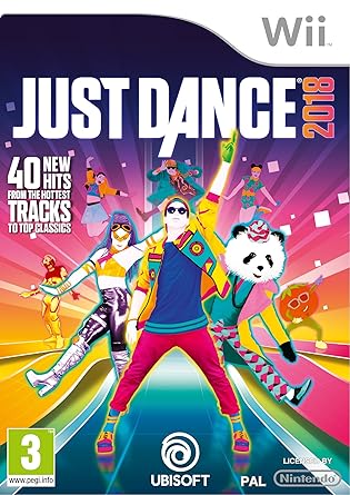
More recently dance games started to adapt body tracking techniques such as the Microsoft Kinect or Nintendo WII.

Image result for wii dance

Just Dance (2009)

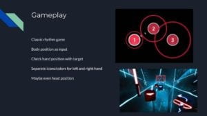
My goal is to create a interactive dance game that is more accessible to players without WII or Kinect hardware. Also adapting gameplay modes from non dance rhythm games that I thought was successful with their game design. (osu and beat saber)

osu (2007)

I would like to use a note display system similar that of osu, I believe the circle closing in is a good indicator for timing in a rhythm game where notes are not moving across the screen.

Beat Saber (2018)

Beat Saber is a VR rhythm game that have been very popular among the VR games today, due to its ability to track hand position with a controller it is able to color code the notes either blue or red. I decided that since I am able to track hand position, this will be a great feature to implement into my game.

Application of this Project/Why I chose this Topic:

The reason why I think this project makes sense is because dance games are a great way to help people get exercise. Most games today are only using mouse and keyboard, gamers sit in front of computers their whole day and this is very bad for their health. While there are already many games like Just Dance and Beat Saber that allows the gamer to get up and move, not everyone owns a VR setup or a body tracking game console. However, most gamers own a laptop with a camera, making machine learning the perfect application to make this kind of game accessible to the public.

Final Product Demo Video:

Development Process:

Setting up game system:

Posenet position update:

First I imported the Posenet model from ML5, then I use that value to control the position of a avatar for the player to know their position on the canvas. At first I used the direct value from the model output, which was glitchy. I improved this by only taking one pose value(as opposed to multiple pose detections) and also adding a filter of linear interpolation to smooth the transition.

By not jumping directly to the model value, only updating the current avatar position by a percentage of their difference can avoid the glitch effect that is caused by noises from the model outputs.

Beat Matching:

I made sure that all notes are exactly on time with the music no matter the computer processing speed. This is crucial to making a good rhythm game, even when many popular rhythm games ignore this fact. After some research I learned that the best way to synchronize the song with the game is to check the current time of the audio file being played. I did some simple math to calculate the time value of every note.

formula below:

let beat = 60/bpm;
let bar = beat*4;

and since the update speed of computers can not be controlled, the current music time might not be a whole number. So I store the value of the previous time it updated and as soon as the value surpasses the beat value, I recognize it as the next beat of the music.

if (music.currentTime()%beat < previous)

This makes sure that I can accurately get the time of any song as long as the bpm value is known

Note object:

I created a class for note objects so that they can be displayed on the screen, I pass in position and as parameters so it knows where to spawn and type value so that it knows which color it should be. I then sync it to the music by shrinking its size over the course of a bar.

I then created another class called points, it creates an animation of whether the player scored or missed, as well as how much they scored.

Collision detection:

I created a function called check() that takes both the coordinates of the user and the coordinates of the note to check whether their distance difference is small enough to be considered a score.

function check(target,px,py){
let distance = dist(target.x,target.y,px,py);
if (distance <= 70){
score += (100+floor(combo/10)*10);
combo+=1;
scorefx.play();
animations.push(new points(target.x,target.y,(100+floor(combo/10)*10) ));

}
else{
combo=0;
animations.push(new points(target.x,target.y,0));
missfx.play();
}
}

Note mapping:

I manually map all the notes just like most rhythm games do, creating a json variable that stores both the time and x y coordinates of the note, so that the note object can be created at the right time. I also created different variables for different colored notes, so that multiple notes can appear on the screen at the same time. Different sets of variables for different songs so that this game can hold infinite numbers of songs while using the same system.

UI Design:

adding a visualizer:

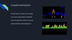
I took a visualizer code by Fabian Cober(see attributions) and modified it to fit my project, the visualizer is responsive to the audio and music being played. Adjusting the values and threshold of the visualizer I made it more visually pleasing. I also evened out the values around the spectrum so that the treble frequency does not have a huge difference with the bass frequency.

adding a breathing color:

The game title as well as the ring of the visualizer all breath with a constantly changing color. I achieved this by utilizing the frameCount variable and the sin() function to adjust rgb values.

col=color(150+sin(map(frameCount,0,500,0,2*3.14159))*100,150+cos(map(frameCount,0,500,0,2*3.14159))*100, 150+(0.75+sin(map(frameCount,0,500,0,2*3.14159)))*100,100);

High score display:

All scores larger than 0 is stored in a list of scores which is displayed using a for loop at the end of the game, the game will automatically remove the lowest score if the size exceeds 10. If the score of the game that just ended is on the list, the game will highlight the score indicating that it is the score of the current player. I avoided highlighting multiple scores by only checking for one score in the list.

Pose toggled buttons:

To avoid mouse/keyboard interaction, all commands in the game are triggered by hand position. The buttons are triggered by placing the right hand over a certain button over a period of time, and is made visible by drawing a rect over the button to show progress.

Particles:

I added a simple particle system to enhance the visual of the game, I modified the sample code from an in-class exercise to add red and blue particles to the two hands, leaving a trail when the user moves.

Interfaces:

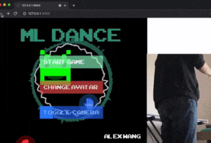
aside from the actual gameplay, there is a main menu page which gives the option to either toggle camera on and off or switch in game avatars. Then there is a song selection to select the music you want to play as well as a high score page that only displays when a song finishes playing.

Aesthetics:

I decided to go for an arcade style of visuals, the font and the avatars are all inspired by pixelated graphics.

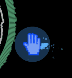
the hand sprite is my remake of the windows hand icon 

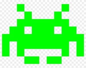
the face sprite is my remake of the sprite used in space invaders

Attribution:

background music:

(I created and produced all music/sound effects used in this game,  except for the hand clap sound file)

menu – Aqua

songs – Pixelation, Takeaway

score sound effect and miss sound effects are generated using a synthesizer

clap sound effect

Arcade font

Visualizer code is a manipulated version of Circular Audio Visualizer by by Fabian Kober

Model by Posenet (ML5)

MLNI: Mind Dump – Sebastian Lau Final Project

This project is based on my mid-term project which featured black particles coming out of my ears over a background made up of letters. My final project is what I originally envisioned what my mid-term project would be. While I said my mid-term project was meant to represent me blocking out noise with my headphones, the final project represents my forgetfulness. 

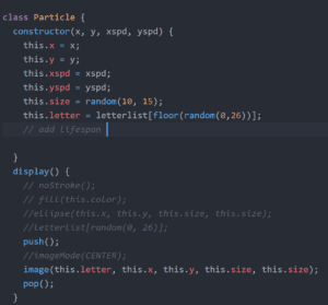
Professor Moon helped me with implementing the images, but when I tried to randomize them it would change letters every tick making it look extremely weird and disconcerting. I changed “this.color” to “this.letter”. Since I was basing the movement of letters off of the movement of the particles I used much of the same code. By switching out “this.color” to “this.letter” I was able to choose one letter I wanted and have it stay that way. 

I also changed the directions of the particles so that it would look like it was falling down as opposed to blasting out of my ears. I wanted it to look like a stream of information as if the letters were fluid and acted like water pouring out of your ears. 

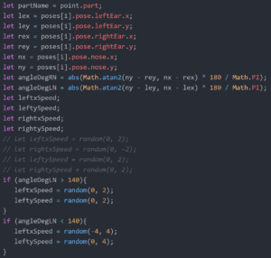
I recalled that Shenshen had tracked the distance between the nose and the ear to detect which way you were looking. After looking at how she did it, I used a similar technique to get the angle between my nose and my ears. By doing so I could detect the rotation of my head. Now that I knew how to detect head rotation, I was able to change particle movement based on it.