MLNI Final Project (Shenshen Lei)

Concept
For my final project I intended to create a immersive viewing experience.

Machine Learning Model: PoseNet

Process:
The final project is the extension of my midterm project idea. The prototype I created in the midterm project is to detect the position of the center of the triangle formed by two eyes and the nose. A big background picture will moved when the user’s face move. I received many suggestions from my classmates and instructors, so I decided to make a 3D version. So there will be two major parts in the project: the 3d model and the position detecting system.
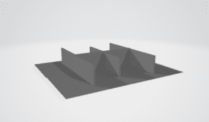
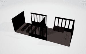
For the model part, the p5.js only accepts obj and stl file. So I made some drafts in MAYA and tried them with the loadModel() function. The room model works. I also tried some other kinds of figures such as stones and guns. I have found that the model size has the limitation: no more than 1M size. Another problem the p5.js has on loading the 3D model the render material. The surface of the model loaded on the screen could only defined by settled function in p5.js such as normalMaterial(), which means that the rendered color made in MAYA cannot be sent to the screen. In another class one of my classmate used Three.js to created a interactive model online, which can render the model with surface material and colors. I am considering of using another machine model in the future.
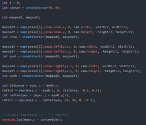
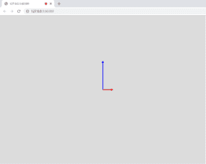
About the direction controlling part, instructor suggest me to use the vector. I searched the createVector() function and learned some traits of vectors online. We used the ratio of the x number of two eyes and the center point, and the vertical movement is controlled by the distance between the center point of eyes and the nose. The poseNet is sensitive and blinks when detecting the figures. Thus it is important to smooth the changing process. I utilized lerp() function that send analogy data to the screen. I tried few times and finally decided the number 0.1, the unit that best smooth the project but also ensure the accuracy and rotate speed.
Initially I used a model of a room to display, but the problem is that the screen is limited. In this case when the user is moving the focus to change the direction of the model, he or she cannot viewing the full screen. Also, when the model rotate same direction with the face, the viewing experience is not that immersive.
To make the pointing direction more clear. I changed the model to the gun. So the user can control it to point to any directions.

Output:
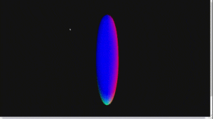
Reflection:
Since my project is very experimental, it is not easy to display. But doing this project makes me thinking about the design of user directed interface and how could it be in used in other areas. I have many ideas of improving my project or make it in use such as games. I hope to keep on working on this project.
Thanks to all the friends who helped me with the project and those who gave great suggestions. I have learned a lot this semester.

MLNI Final Project Documentation–Crystal Liu

Background 

My final project is a further development of my midterm project. My midterm project was inspired by a movie called Nezha and it was an interactive painting. The users can trigger the motion of the still object by getting close to it. They can also hear the sound of animals or water by the same method. However, there were some features that didn’t work very well. For example, my thought was to let the users trigger the cloud by raising their hands. However, since I didn’t add any hint to inform them, the outcome was lower than my expectations. Besides, my interaction part was not that smooth and natural. The reason might be that I didn’t think about the logic of my project, I just added what I wanted to my project. I also received many excellent suggestions from my professor and other guests, and they really inspired me a lot on my final project.

Inspiration

One of the inspiration of my final project is Shenshen’s midterm project. I was surprised at how her project could let the user move the image through their eyes to see the whole picture. It looked like the user was actually walking through the gallery but not just seeing it. I also wanted to make my painting much larger than the canvas size so that it could be more immersive for the users. What’s more, I wanted my project to tell a story or to have logic but not just a pile of random elements. Since Christmas was around the corner, I chose this festival as the theme of my project and the story line was how Santa prepared and deliver presents.

My Projects

My final project is an interactive painting whose theme is Christmas. It has four different scenes. In the first scene, the user is a red glove and the position is determined by the position of user’s eyes. There is a closed book with an arrow pointing to it. The role of this arrow is to give hint to the user to get close to it. Once the user get close enough to the book, it will open and show a Christmas tree, which is the second scene. Then the user will notice the gingerbread since I add this GIF to emphasize it. 

Once the user approaches to it, the glove will change into the gingerbread which means that the role of user in this painting is it. Then there will be a right arrow telling the user move to the right edge to go to the next part.

The next scene is a postcard in Christmas style I made by Photoshop to tell the user how to play this interactive painting. Then the user can go to the last scene by the same method. And the last one is an image as the follow:

This is the original image I found online and I also added some other images and GIFs to make it interactive, just like my midterm project. Besides, I found some sound files such as Jingle bells in elf tune and the sound of clock. If the user approaches to the right edge, he or she will see an arrow pointing to the right. And if the user goes further, the image will move to the left so that the user can see the rest part of the painting. They can also choose to go back to the left part by move to the left edge, just like pressing the arrow key on the game console.

Methodology & Difficulties

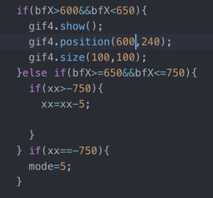
One of the most difficult part of my project is the coordinates. At first, I accepted Jamie’s method to let users move the image based on the position of their wrist. However, after several trials I found it was so tiring and the wrist  usually blocked the eyes so it would influence the position of the gingerbread. Then I decide to use the coordinates of eyes to move the image. The solution is that I defined a value called xx, whose original value is 0, and let it be the x-coordinate of the image. Then I set some conditions to achieve my expected result. The reason to set two areas is to make the interaction in a gradual way, which is inspired by Tristan’s suggestion.

Here came another issue. The image I added to the large one couldn’t move with the main scene and the area I set as the condition couldn’t change with the image either. So I just applied the same logic to these still images and it worked.


The next one is taking control of the GIF. 


My initial idea is that if the user touches the book, there will be a GIF displaying the opening process of the book. However, I couldn’t make the GIF play for only one time then stop. Thanks to Professor Mood, he sent me a sample code to solve this problem. Unfortunately, when I applied the method to my project, I got hundreds of errors, so I had to give it up. Now I know the reason is that the library for GIF was so advanced and I didn’t update my Atom so it couldn’t recognize the code.

The last one was not a problem but an essential method which is switch function recommended by Professor Moon. This function is so important for me because I have so many scenes, and they all require the position of the eyes. However, I cannot set different variables for each scene which is too much for me. This function solved the problem. I can set a condition to decide which mode I want to display and there is a break between each mode. I learned the importance of break from my extremely embarrassing final presentation. I didn’t add break between mode 3 and mode 4 so that my function didn’t work and I couldn’t see the images I added on my project. After seeking Professor Moon for help, I learned the reason and also the significance of break in switch function.

Further Development 

For the further development, I want to focus on the transition part of my project. I really like Jessica’s project because she made some transitions in changing the original  image to another one. I also want to apply fade away effect to the change of scenes in my project. Also, I can use fade function for the sound part to make smoother interaction. Last, I want to add some text bubbles around the characters in the painting such as Santa and elf. The content is about the background information about them and Christmas. In this way I can make my project more educational.

I sincerely appreciate everyone who help me with my project and who like my project. Especially Professor Moon, he really helped me a lot and made me realize that I can use knowledge related to machine learning to achieve some creative and artistic ideas. And I will definitely apply what I have learned from this course to the rest of my academic life in NYUSH and even after I graduate in the future.

Related image

Final project documentation

My final project is a continuation of the midterm project. With a goal in mind, I wanted to improve on the midterm based on the feedback I received from the judges.

First, stylistically I should pin down if I should do 3D or 2D visuals. I found that it is hard to create a lot of change visually with 3d visuals because of limiting 3d capacities in p5.js. So I decided to create a 2D graphic as the main visual. Right about this time is also when I was creating designs for my Programming design systems class, I really enjoyed the idea of having a system of design that can output different products that visually represent the same distinct style. So I decided to directly implement some of my designs to the audio visualization project.  

Second, I was also instructed to look into more inspiration from other audio visualizers.  I recognized that there most of the graphics that I really liked have motion in the 3d background that makes the graphics look more impressive. So I added a 3D background that complements the main 2D visual.

Third, I also received feedback on the style of the graphic only fitting EDM music and hip-hop and not love songs and ballads. So I made a much softer floral design that complements softer songs. 

My last and most important suggestion was that my midterms graphics were too centered around the waveforms and spectrum of the audio itself and lacked complexity in utilizing the data from the audio file. To address this issue, I was instructed to take a deeper look into how the spectrum interacts with the music. What part of the sound wave is triggered by bass and what part is triggered by snares and what part by vocals?  After observation, It took some time to calibrate and find the right range of data to select and use. After that, we added further data manipulation to map the value into a usable range for the most effective visualization needs.  

Also, I gave the project a name. I called it META. Because I want it to always change.  

To sum it up, I am so glad to have been able to take MLNI with Moon. Looking back, I am so surprised that I can take part in creating something like this, both visually pleasing and technically complex.  I loved the fact that we presented our ideas at the beginning of our semester as pitch after learning a little about what ML technology can do. It was just enough information for us to recognize the power of the technology and be creative with imagining its capacities.  After that, I was excited to see what kind of prototype I can make to test my idea. In order to create something I enjoy, I was more motivated to work than any of my other previous IMA classes. Big big thanks to Moon for being so patient with me and helping me so much both creatively and technically. 


MLNI: Final Project Kevin Xu

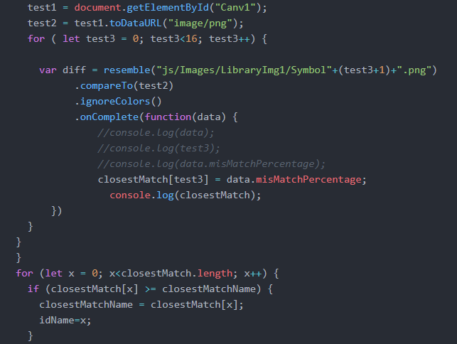
For my final project I wanted to continue advancing the work I did for the midterm, but go a step further in smoothing the process, as well as creating a better visual presentation of the material. I ambitiously wanted to create a neural network to recognize handwriting myself, but amongst other assignments failed to give myself enough time to do so, so I defaulted back to using resemble.js as I had in the midterm in order to compare the canvas to an image. With help from Professor Moon, I realized that I could actually refer to the p5 canvas as an html element, which drastically improved the smoothness of the project since I didn’t have to worry about the conflict between saveCanvas() running on a live server. (which normally reloads the live server, not allowing anything to be done after the canvas is saved to the machine.) I still ran into other problems with resemble.js that I did not expect. A problem that had deterred my progress for several hours was in the recording of the comparison data fed by resemble.js.  Since I was trying to make a video game, in which you need to copy the given glyphs in the same order as presented, I wanted to store the ID of each glyph within an array. Then, when the player repeated the gylphs, it would be stored in a separate array then compared to the original. In order to do this, I put the resemble.js command inside a for loop, but it would turn an array specifically limited to 24 values into a length of 25, and only feed data into the 25th item in the array. I tried many ways to amend this problem, one being the addition of a setTimeout() into an empty function to delay the speed of each loop, amongst other attempts to change names and order of which it would call each function. After spending about 3 hours on this single problem, I found that the solution was simple changing the (var i = 0; i<24; i++) to (let i=0; i<24;i++).

Another problem in the same area of code was in the calling of the images themselves. In my last project I preloaded images and was able to refer them in the find difference command of resemble.js. This time, I kept getting an error asking me to import the images as blobs, and even after making sure that the information being referred to was specfically the data image, the problem turned out to be with the physical library as opposed to the canvas image.

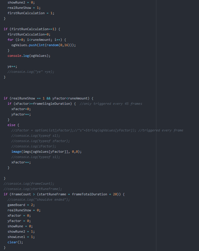
In the image above, I had originally simply referred to the image library with imgs[test3] instead of the full directory reference (“js/Images/LibraryImg1/Symbol”+(test3+1)+”.png”).

It was little problems like these that hindered me the most, in hindsight resemble.js was not only a rather impractical way of attempting to recognize handwriting, but was also filled with inconsistencies as such.

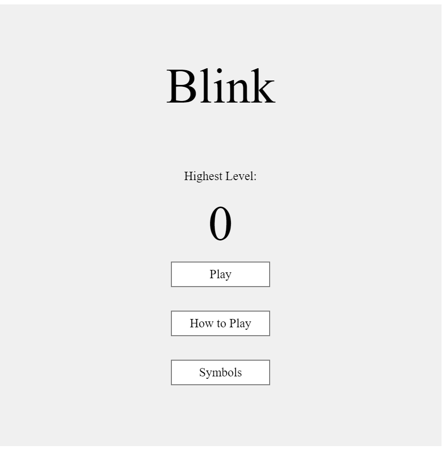
In the areas of code not pertaining to resemble.js itself, things went much more smoothly. Since I wanted the visual presentation and interactivity of the project to improve, I spent a fair amount of time trying to develop the game aspect of the project.

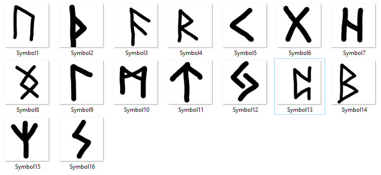
A part of the inspiration for the game actually came from the game “osu,” a rhythm game, where you need to hit circles as they pop up on the screen. There is a mod in the game that makes it so that instead of staying on the screen until the note is passed, it simply flashes for a fraction of a second and you simply need to remember where it was. This brought me to the idea of creating a type of game where you needed to rely on this extreme short-term memory in order to pass. About 2 months ago I had also gotten around to playing God of War 4, which included several puzzles involving Nordic runes.  I liked the idea of basing the images off of those symbols, as completely random/made-up glyphs may have been hard to follow, and regular letters or Chinese characters might’ve been too easy and boring. 

I originally tried supporting 24 different runes, and by manually training (appending more and more images to simulate different “handwritings” of the different glyphs) I quickly realized that resemble was not suited for heavy duty work. Even with the base of 24 images, in order to compare each one to the canvas took around 30-40 seconds for just one rune; and the starting level would already have 3. In order to cut down this time, I cut the number down to 16 but the idea of trying to make model more accurate failed as more pictures added significantly more time. 

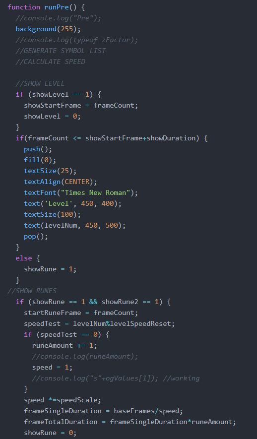
I also wanted the game to be able to go on forever like an arcade game, and the objective was simply trying to retain the highest score. In order to up the difficulty over time, I made it so with each level the speed at which the runes flashed became faster, resetting every 5 level along with the addition of an extra rune (3 runes lvl 1-4, 4 runes 5-9, etc). I made sure to specifically code everything to keep scaling larger with these numbers as well. 

This was best exemplified in the gamescreen “Pre-game,” where I did all the calculations for how many runes to show, tracing what level you were on, and the speed at which the runes were shown. Overall, my disappointment mostly lied in my choice of using resemble.js instead of putting in time to truly develop a neural network capable of more accurately understanding what the user input.  While I certainly had an unfortunately timed semester, with midterms dragged out right to the start of finals, I certainly could’ve and should’ve made sure to get an earlier start on this project in order to build a strong basis and make sure that the little problems I faced could be avoided.

MLNI – Final Project (Billy Zou)

Adventure of Sound

This project is open source. Source code can be found on https://github.com/DaKoala/adventure-of-sound. You can also try this project on your machine by following the guide in the readme file of this repository.

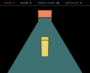
This project is an interactive sound game. Users need to control the size of a box in the center of the screen. There will be obstacles appearing in the front and there are holes of different shapes on the obstacles. The goal is to make the box fit the size of the hole. The better it fits the hole, the higher score the user will get. There are multiple stages and each stage has a target score. Failing to meet the target score or bumping into an obstacle will lead the game end.

Architecture

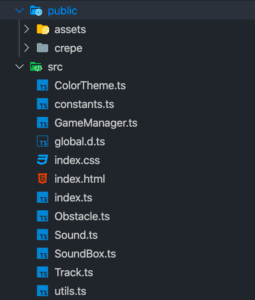
Typically a HTML file + a CSS file + a JS file is a pattern adopted by most p5 projects. As for me, to make my code well split, I used a bundler, which is Parcel, to bundle my code. Therefore, I can separate my code into different files but in the end only a single JS file will be generated.

I also utilized TypeScript, which is a superset of JavaScript. It was only effective when I wrote my code. TypeScript provides some features that JavaScript does not have, like static type check, which is the feature I love the most. Final output is always vanilla JavaScript.

Inspiration

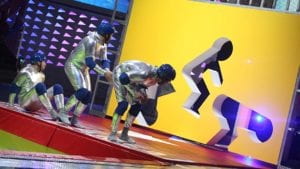
The game is inspired by a TV program Hole In The Wall, in which competitors are required to pass through walls with different postures.

The basic idea of the game is the same as the TV program. There are holes on the wall and players are required to shape the box.

Sound Processing

Implementation: https://github.com/DaKoala/adventure-of-sound/blob/master/src/sound.ts

Sound is the only way that users interact with the box. Width of the box is related to the volume and height of the box is related to the pitch. I used p5 sound library to get the volume, which is the AudioIn.getVolume method. For the pitch detection, I used ml5 Pitch Detection. It is worth pointing out that the pitch detection function is asynchronous, so what I did was executing this function recursively and storing the value on the instance.

Drawing Objects 

Box: https://github.com/DaKoala/adventure-of-sound/blob/master/src/SoundBox.ts

Obstacle: https://github.com/DaKoala/adventure-of-sound/blob/master/src/Obstacle.ts

Track: https://github.com/DaKoala/adventure-of-sound/blob/master/src/Track.ts

This game is 3D, which was a challenge for me because I rarely develop 3D projects.

This first challenge I faced was changing the perspective, which was implemented by calling the camera function in p5. It took me some time to figure out the usage of different parameters. The value I finally set was the result of testing several times and finding the most comfortable value for me.

It was also challenging for me to draw objects. The way to draw objects in 3D environment is different from the one in 2D environment. What I did was using the translate function to translate the origin and drawing objects.

To save code, I designed a function called tempTranslate, standing for Translate Temporarily.

const tempTranslate = (func: () => void, x: number, y: number, z?: number) => {
  translate(x, y, z);
  func();
  translate(-x, -y, -z);
}

 This function is useful for drawing 3D shapes.

Game Design

Game play is an important part of a game. For a game with simple logic like this, it should not take beginners too much time to figure out the interaction. Also, incentive that attracts players is another part need to be take into consideration.

To help users understand the interaction better, the box has a minimum size so even if there is no sound, the box is visible. However, there is a problem that players can score with no sound input.

I got some helpful feedback during presentation and did some modification after that. When the box size is too small, no score will be added.

Difficulties

I think the largest difficulty in the development of this project is handling 3D objects. I am a newbie this field and still learning. Therefore, the shapes in the game seems a little awkward.

I am still not familiar with some concepts in 3D development such as light and camera. I think these things are meaningful to learn and this project for me is an introduction.

Words in the End

This course is the last IMA course I take in my college (apart from the Capstone). I really enjoy the happiness brought my IMA courses and wonderful IMA instructors.