CPD | Dear Data: Songs Stuck In My Head | Ashley Friedland

For this week’s project, I mapped out the songs that got stuck in my head. 

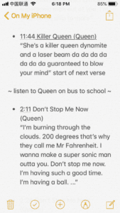
I kept a list on my phone’s Note app. I noted the time, the song, the artist, and sometimes the repeated phrases. I realized through this project that when I have a song stuck in my head, I don’t sing the entire song, I sing a section (usually the chorus). Sometimes I would have the chorus running in my head over and over for about an hour. 

Some of my notes:
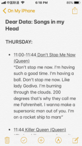
For my visualization, I made circles for each song. The size corresponds to how many times it entered my head. I accidentally made my circle for 2 times just as big as the circle for 5 times. Each song is color-coded and has an arrow going to the next song that popped up. The starting line has the day of the week. There are also time stamps. There is a little headphone icon that is placed in certain areas, noting that I listened to music in between the songs stuck in my head. For example, I had “Don’t Stop Me Now” stuck in my head, then I got on the bus, listened to music, got to school, stopped my music, then “Killer Queen” was stuck in my head. 

Map

One issue I ran into was whenever I went to log my song, I would see the ones I’ve logged before, then start singing them. I would then try to do an activity that would get it out of my head to get back to an “organic” manifestation of a song getting stuck in my head. I also noticed that sometimes my lyrics weren’t right, so it forced me to really think about that. In one instance, I was meshing two songs together so that was something interesting to note.
CPD Week 2: Data Visualization

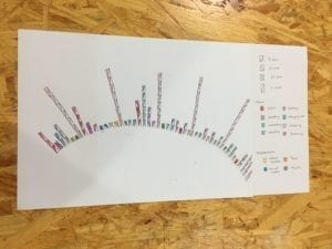
I wanted to keep track of how I spent my time in a given week. Most of the time we are bombarded by distractions, so other than the major events where I spent blocks of time, I also logged how often I was distracted by activities such as social networking and video watching.

I visualized each time segment by using boxes with different slashes to indicate increments of time from 5 minutes, 15 minutes, 30 minutes, and 1 hour. The individual colors represent each activity.

CPD Data Visualization – Sabrina Goodman

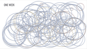
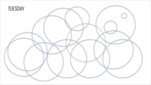
I realized that I did not read the assignment carefully and created a digitally drawn map rather than a hand drawn map but I guess it still works. This week I tracked my time spent with people. I tracked this data based on three variables: personal (time alone), private (time with family/friends), and public (time with greater Shanghai). I visualized this data through bubbles – not sure why, I just felt that the size and color of the bubbles would be a visually appealing and engaging way to understand with whom I spend my time. I used yellow for personal time because I am quite happy when I spend time alone. I used blue for private time because I feel at ease spending time with friends and family in Shanghai. I used red for public time because I am often aggravated when I spend time out and about on the metro and in public places in Shanghai. Below are screenshots of a daily map of my time spent as well as a weekly visual of overlapping circles detailing my time spent with whom this entire week.

Link to slides:

https://docs.google.com/presentation/d/1tc3TucSw2jKgHdzTEGzPqrsV9Z1ezYwosgXMQSvFYsg/edit?usp=sharing

Dear Data Shanghai–Ann(Candy)

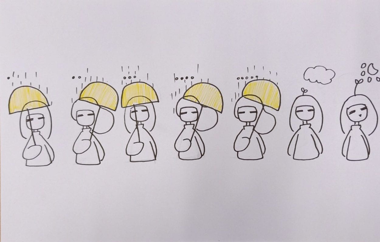
This is a map that I made to note down my feelings in different weather in Shanghai during the last week. It provided information of how strong the wind is and how is the weather and also my feelings. My inspiration comes from the complaints about the rainy days I heard in the past week(It really rains a lot).

To directly present myself, I drew 7 little characters, representing myself in the seven days. They all have similar outfit for this is not my focus. The weather is straight forward: with five days raining , one day with clouds and one day in the sun. The wind on the other hand is shown through the character’s hair and the angle of the umbrella she is holding. I made the umbrella yellow so that the map looks better. It seldom keeps rainy for so long time in Februry in Shanghai. For me I do not feel so comfortable when it rains since my shoes would get wet and it would be sultry even indoor. I drew some black dots ahead of the 5 characters in the rain to express my resigned feelings, and of course the dots keeping accumulating. On the last two days on my map which sun starts to come out. There grows a little plant on the head of the girl to represent her happiness. It feel like a cute and efficient way to map my feeling in this way.

(AnnChen)week2: Mapping_Xiaonan Li

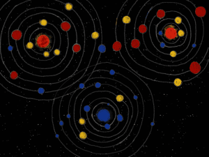
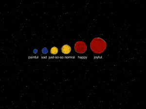
This is a map of feelings. It is represented in the form of stars and systems in the space, and each of the system records the feelings of one week. For each system, there is a fixed star in the middle, and its color represents the overall feelings and mood of the week. It is surrounded by 14 planets on 7 tracks, where each of the track represents one weekday, and two feeling records for each day. And the color and the size co-present the mood as follows: bigger one stands for more delightful, and red for happy, yellow for normal, and blue for sad. And the position of each planet marks when I record my feelings, which means the circle is divided in 24 parts for each hour in a day.

The reason why I chose to record feelings and use such forms is that, for some mental issues, it’s important for me to keep a record for my emotions. The data I used is the record  for last 3 weeks, and it can be seen some of them are joyful and the others are not. And the enormous space with its marvelous galaxy have always fascinated me, so if I keep recording and drawing, there will be more systems with different color composition, and there will be a special galaxy for “emotions”.