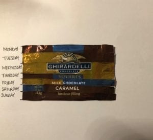
For this assignment, I chose to create a data visualization of the amount of chocolate I ate last week. Instead of drawing it out, I collected the wrappers of the chocolate I ate and put them together. Since the chocolate I had were all from the same bag and had the same wrapper design, I cut them into pieces and put them together to make one wrapper. I cut each wrapper into seven, horizontal strips to represent the seven days I observed starting from Monday to Sunday. Each strip would them be split into however many sections that represented the number of chocolate I ate and the sections would be from those wrappers. Then I taped all the sections together to put them together as one wrapper. Representing the data this way, I can see what kind of chocolate I ate the most in that week at a glance.
CPD Week 2: Carlo G Professor Ann Chen
Professor Ann Chen
Carlo G
Feb, 25th 2019
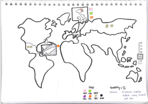
For the week-2 assignment, I created a data visualization of my weekly drink units. In making the data presentation more attractive, I decided to hand draw a world map that shows the origins of drinks I had this week. For a head up, this world map was hand drawn poorly, so I’m sorry if some regions aren’t on this map.
Furthermore, I use different colors to show which day I had which drinks. For example, pink represents Monday, green represents Tuesday, yellow is Wednesday, purple is Thursday, Friday is orange, gold represents Saturday and black represents Sunday. To show the number of drinks I had, I incorporate a geometrical shape that is square. One square represents one drink.
What I wish I could have done better for this assignment is the accuracy of my world map. I am aware that a lot of details are missing on this map and that many places may appear smaller/bigger than it actually is.
Week 2: Mapping – Sebastian Lau (Chen)
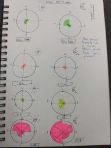
My map charts how frequently I think of people who are currently in certain places. The places I picked were New York, Hong Kong, the UK and Shanghai. I picked Hong Kong because that’s where my family and some of my friends are. I also have family and friends in New York. I know some people in the UK and Shanghai since I’m currently here.
Originally I wanted to use a world map and have bigger circles to represent how often I thought of people from different places. However, I thought it would be difficult to represent the times that I was thinking of people on the map so I decided to go with those world clocks that are quite common. I split it into AM and PM as normal clocks on show 12 hours on them. I think I could have been a bit more creative, perhaps using different colors to show different emotions perhaps when I thought of people from different places?
Overall the map was quite simple and I think to improve it next time I could try seeing how much information I can really fit into these clocks without overcrowding it.
Week 3: Mapping – Jingyi Zhu
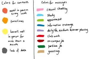
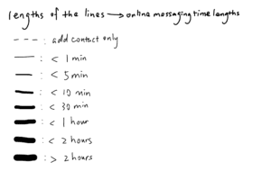
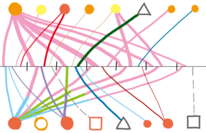
The map I created is a map of my last week’s online messaging. It maps what I used online message for, relative lengths of time I spent on messaging every day, the dates when I messaged each contact and the frequencies of previous online and offline contacts with these people. The representations can be read according to the explanation below.
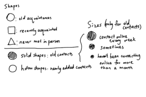
The data is visualized in this linear way to represent the length of a week. The black line represents the week with seven sections representing each day. Size and width are intuitive in representing time lengths and frequencies. Colors can separate different types of messaging clearly. The density of the ending points of the lines in each day shows the time spent on online messaging in that day. The map shows not only how I use online messaging as a device of communication, but also various kinds of relationships between me and my contacts.
One set of data shown by the lines is about online messaging in the last week. The icons of contacts are placed in the order of their first message exchange with me during last week. This map shows that I used online messaging more on weekdays than on weekends, but more casual chatting towards weekends. Also, the map show that my need for online messaging is mainly based on chatting with friends, keeping track of my work, making appointments and study.
I included another set of data about the frequencies of previous online and offline contacts of these people to find out interesting facts about different online and offline connection patterns with different people. It is intriguing to see that some people who I meet in person frequently do not often communicate with me online. Online messages exchanged with these people are mostly about work and study. Other people that I often chat with but meet in person less frequently have a more personal connection with me in spite of geographical distance.
Week 3: Mapping
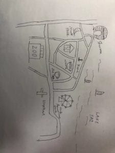
The map I created was a guide around my home. In the map, I highlighted several places where I would go to very often and landmarks that I think are recognisable. On the map, I marked out my favorite noodle place and café as well as the ring-shaped Sheraton hotel, which I believe is one of the landmarks in the city. I first drew out the main roads and than marked the places with different icons. The icons I used to represent different places are very straightforward, for example, I used a bowl of noodles for my favorite noodle place. The map is certainly not complete since I only drew out places that I am personally familiar with and left out some other places. But I think this would be a useful guide if I am going to introduce the surroundings of my home to someone who has never been there before.