Midterm Documentation (Cassie)

Social Impact

The technical simplicity of this project shows that AI doesn’t have to be scary or complex in order to use it: it can be a simple tool for artists looking to explore new digital mediums to create something visually interesting.

There is also a lot of discussion surrounding AI art in terms of who the artist is: is it the neural network, or is it the person who programmed the work? A lot of people seem to view this debate as very black and white in terms of believing that the artist is solely the neural network or the artist is solely the programmer. Regardless of what your opinion may be surrounding this debate, I think this project is an example of AI art where I would argue that both the programmer and the AI components equally work together to create the outcome. It doesn’t have to be an all-or-nothing scenario: the point of AI is to help us achieve certain outcomes more easily, so why not use it to work together rather than treating it as something that is taking away human creativity?

Further Development

I can see this project taking two different routes if I were to further develop it. The first route is to make it more user-friendly in order to make this kind of art more accessible to other people. In this case, a better interface would absolutely be necessary. The whole hover-to-start setup worked fine for me, but it might not be so intuitive or useful for others. Some kind of countdown before the drawing process starts, as well as an option to save the completed piece or automatically record it rather than having to manually take a screen capture video would make more sense. Additionally, making the artwork customizable from the interface side would be good to add such as being able to change the colors, size of the ellipses, or even change the shape entirely, rather than having to go into the style.js code to change these aspects.

The second route would be to further explore the concept as a personal artistic exploration. This option is definitely more open-ended. I could try and apply more machine learning skills; for example, I still really like the idea of AI generative art, so what if a GAN or DCGAN could make its own similar pieces based on these body movement pieces? This is conceptually interesting to me because it’s like giving a neural network its own set of eyes. It’s like some machine is watching you and can predict your movements, converting the artwork into a statement on privacy in today’s digital world rather than just an exploration of body movement over time.

Full documentation

(with updated background + motivation for new concept): https://docs.google.com/document/d/1DGs7plWL98vslkEo1t7phG4EcR2uOVikXQ4AFmjzsZI/edit?usp=sharing 

Midterm Project Documentation

Is it possible to teach an AI design? This is a problem at the forefront of Machine Learning exploration and a fascinating topic that could change how designers work and how companies operate. For my midterm project, I wanted to examine ways to create an algorithm that could design posters based on a specific style and user inputs. In the end, I believe that my proposed idea is  likely possible, but would require time, extensive data and skills beyond my range.

Background:

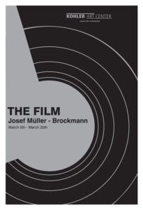
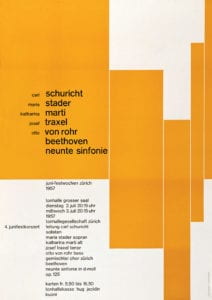
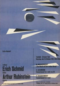
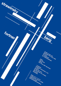
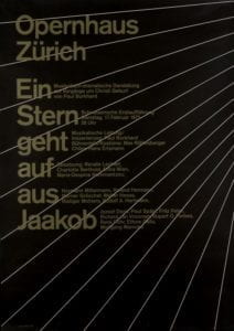
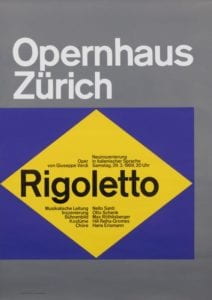
I wanted to do this project because of my interest in design, as well as the Swiss Minimalist style, which I chose to focus on. Swiss minimalism, particularly the poster style I chose to focus on, was developed in Switzerland during WWII and made famous by designer and author Josef Muller-Brockmann, editor of magazine Neue Grafik. Brockmann’s posters used bold colors, a grid layout and simple, clean typography to create aesthetic posters. Brockmann’s style changed graphic design, ushering in an appreciation for layout and typography. His style is time-tested and still favored today by artists and institutions.

Posters designed by Josef Muller-Brockman that show the fundamentals of Swiss Minimalist Design. Note the use of color, shapes and different headings.
Another source of inspiration is the class Programming Design Systems, which I’m taking this semester with Cici Liu. Before this class, I mostly used Adobe Illustrator, Photoshop and InDesign to create designs, which often involves a lot of manual work, i.e. physically moving things around the canvas and placing them myself to see what looks good. I love making posters, whether it’s for a party I’m throwing, part of my freelance work or just for fun, but I often find myself saving countless versions of the same poster with slightly different positioning and elements. Through the class, particularly the poster-designing assignment, I found it fascinating to see how code could be used to simplify the design process, and how an aesthetic poster could be broken down into coding data. We work in P5, which can also be used to randomize posters by setting limits and creating arrays with sets of data to allow the code itself to generate many different versions of posters within set ranges.

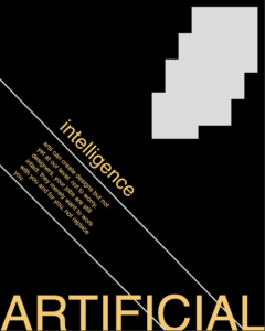
I used P5 to recreate a few Brockmann posters and realized the Swiss Minimalist style poster could be entirely recreated with P5, as the posters usually involve a few headings of text (sometimes rotated or overlapping), use of simple shapes, curves and lines and a grid layout, all elements that can be translated into code to reproduce the posters.

Here’s an example minimalist poster coded in P5:
Inspiration:

As mentioned in my project proposal, I was inspired by Alibaba’s LuBan AI software, which is used to generate banners and ads for products on Taobao and Tmall. Most of the pop-up ads in the app are now generated by the software, which can generate 8,000 banners per second. This AI was trained with a more complex process involving teaching it design elements separately, and then having teams of designers use reinforcement training to steer the AI towards “good” designs. The AI was trained on copy, product shot, background, logo and decorating artifacts, all the elements needed in a simple ad, from a huge dataset of these individual features. This project took years and likely thousands of programmers and designers, but it shows that a Machine Learning algorithm can be taught design elements and produce designs indistinguishable with those from a designer.

Process:

After bringing Aven my idea of teaching a Machine Learning algorithm poster design, we brainstormed possible ways of doing the project. Inspired by the Programming Design Systems class, I was interested in using P5 as the way the algorithm could “design” the posters as that way the posters would be represented as data. This means that I could use P5 “data” to teach the program, and it could create an algorithm based on the data to design original posters with Swiss Minimalist design principles. My goal by then for the midterm was to find an effective way of creating and gathering this data.

My original plan for the project from midterm to final:
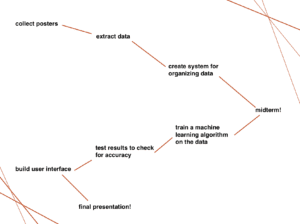
Aven said I would need at least 1,000 posters, so I started my research, saving posters that could be turned into data (eliminating those with images and design elements that couldn’t easily be recreated with code) and saved several hundred minimalist posters.

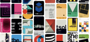
Some of the posters I saved to gather data from:

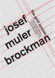
I began to notice that many of the posters had 3 main types of text, which I began to call Heading1, Heading2 and Heading3. Heading1 was usually bold and almost decorative, often very large and distinctive on the poster. Heading2 and 3 usually had smaller font and creative placement, containing the actual information for the poster. The posters often used one or two types of shapes, repeated and in various colors. After observing these posters, I created an Excel spreadsheet for the data I wanted to gather and broke it down into a few different categories that I thought could represent most of the posters:

Heading1 text placement (location on the canvas, text size, text color, text rotation, and the same data points for Heading2 and Heading3, then Shape1 placement, size, fill, rotation and stroke, continued for the rest of the shapes present on the poster, and background fill. I was planning to input the data as P5 code.

A clear example of the 3 headings style I wanted to teach the algorithm:
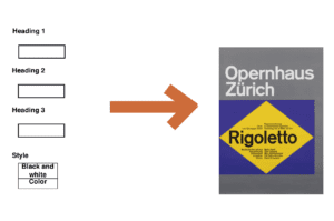
I then brainstormed the user interface, which I wanted to be simple but allow users to create their own personalized posters. While my original idea involved different “styles,” I decided to simplify that to “black and white” or “color.” I wanted to allow users to input the three headings themselves, perhaps with a guideline indicating that Heading1 should involve little text and Heading3 should contain the main data for the poster.

User interface layout:
Potential solutions and challenges:

The first major challenge I encountered was gathering the data. While I knew what data I wanted to pull from the posters and I had the posters to use for this, I quickly realized that placement, rotation and fill weren’t that intuitive. In order to get this data, I would have to “redesign” each poster in P5. Some of the posters didn’t share the same dimensions, so I would have to reformat the posters to one dimension to create consistent data. I would also have to use color pickers online to find the colors inside the posters, and then pick a consistent color system, such as HSB in P5, to represent the colors. Rotation also presented a challenge as it would take time to find the rotation and placement, which I would have to do by essentially “eyeballing” the poster and trying to match the coded version to the real one. Also, recreating curved lines with Bezier curves would prove a major challenge, as well as any irregular shapes that would involve more coded data than I could easily input. I quickly realized that turning 1,000 posters into P5 data was a huge task that would take many hours and could produce imperfect results.

The second major challenge was how to input this data into the Machine Learning algorithm. I met with Aven again to discuss this challenge, and he suggested JSON, as I would be able to upload my Excel spreadsheet of data into the platform and then import JSON into the model to train it.

Also, since I wouldn’t be using a simple pre-trained model, I would need to find a program that could read and learn Swiss Minimalist principles from the data, and then be able to generate new P5 data and create a sketch for a new poster. This seemed very challenging as we discussed how we didn’t know whether such a program already existed, so I may get through all the steps of data gathering to realize that I wouldn’t be able to train it at all.

In order to create the user interface, I would also have to find a way to input the user’s headings into the P5 sketch while allowing the algorithm to generate the rest of the design based on the data, and then display that sketch. This also posed a challenge as while I have experience in P5, linking all the systems together to create the project I wanted would involve many steps I wasn’t familiar with.

After reaching the conclusion that turning thousands of posters into data would be beyond my ability this semester, I started looking into other ways of finishing the project, such as human in the loop. I knew from my experience with P5 that I could use several different sketches to produce infinite posters in the Swiss Minimalist style by randomizing certain elements within ranges. With this in mind, I was curious whether I could have feed an algorithm these sketches and have it produce its own random designs, which I could then evaluate in order to essentially teach it to produce more of the “good” designs. This is very similar to LuBan’s reinforcement process, where teams of designers evaluated the AI’s designs in order to teach it the finer points of design. While Swiss Minimalism famously uses grid systems, which generally follow “rules,” many of the posters also “break” these grid system rules in order to create interesting and unexpected designs. This would be one aspect I could teach the algorithm through human in the loop: when to “break” these rules and when to follow them in a design to create aesthetic results. One challenge however is that most of the resources on human in the loop that I came across start with a high quality training dataset, and I couldn’t find references on whether I could have the algorithm randomize posters from different ranges of data and elements to create its own dataset. I briefly considered somehow gathering the data from different iterations of P5 sketches to create a database, but if all the sketches use the same code to create different posters, this would also prove to be a huge challenge.

With this is mind, I conclude that while this project may be possible if a team can turn thousands of Swiss Minimalist posters into P5 data and then teach an algorithm to use that data to generate its own posters in P5, it would take time, resources and knowledge out of my reach in order to do so. Also, at any step of the way if something went wrong or if the actual algorithm needed doesn’t exist, this could easily fail to produce the results I was looking for. This project was a fascinating exploration for me into the world of building databases and training models, and while in the end I’m not able to create the project I wanted to, I have a much better grasp on the realistic challenges of data, training and algorithms, which I can take with me for my next, more achievable, project.

Sources:

https://www.figure-eight.com/resources/human-in-the-loop/

https://vanseodesign.com/web-design/swiss-design/

https://medium.com/@rexrothX/ai-visual-design-is-already-here-and-it-wont-hesitate-to-take-over-your-petty-design-job-934d756db82e

https://medium.com/@deepsystems/human-in-the-loop-for-object-detection-with-supervisely-and-yolo-v3-fa205ff07c1f

Week 7: Midterm documentation(EB)

GitHub: https://github.com/luunamjil/AI-ARTS-midterm

For the midterm, I decided to create an interactive sound visualization experiment using posenet.  I downloaded and used a library called “Simple Tones” containing multiple different sounds of various pitches. The user will use their left wrist to choose what sound they want to play by placing their wrist along the x-axis.  This project was inspired by programs such as Reason and FL Studio as I like to create music in my spare time.

Although I originally planned to create a framework for webVR on A-Frame using posenet, the process turned out to be too difficult and beyond my capabilities and understanding of coding. Although the idea itself is relatively doable compared to my initial proposal, I still needed more time to understand how A-Frame works and the specific coding that goes into the 3D environment. 

Methodology

I used the professor’s week 3 posenet example 1 as a basis for my project. It already had the code which allows the user to paint circles with their nose. I wanted to incorporate music into the project, so I looked online and came across an open-source library with different simple sounds called “Simple Tones”.  

I wanted the position of my hand in the posenet framework to play sounds. Therefore I decided that the x-axis of my left wrist would be used to determine the pitch.

if (partname == “leftWrist”) {
if (score > 0.8) {
playSound(square, x*3, 0.5);
let randomX = Math.floor(randomNumber(0,windowWidth));
let randomY = Math.floor(randomNumber(0,windowHeight));
console.log(‘x’ + randomX);
console.log(‘y’ + randomY);
graphic.noStroke();
graphic.fill(180, 120, 10);
graphic.ellipse(randomX, randomY, x/7, x/7);

the “playSound” command and its attributes relate to the library that I have in place. Because the x-axis might not have high enough numbers to play certain pitches and sounds, I decided to multiply the number by 3. Left is  high-pitch, while the right is low-pitch.

I ran it by itself and it seemed to work perfectly.

After some experimentation, I also wanted some sort of visual feedback that would represent what is being heard. I altered the graphic.ellipse to follow the x-axis coordinate of the left wrist. The higher the pitch (the more left it was on the axis) – the bigger the circle.

The end result is something like this. The color and sounds that it produces give off the impression of an old movie. 

Experience and difficulties

I really wanted to add a fading effect on the circles, but for some reason, it would always crash when I write a “for” loop. I looked into different ways to produce the fading effect, but I wasn’t able to include it in the code. 

I would also try to work on my visual appearance for the UI. It does seem basic and could use further adjustment. However, currently, this is as much as my coding skills can provide.

This idea and concept did seem to be a very doable task at first, but it required a lot more skill than I expected. However, I did enjoy the process, especially the breakthrough moment when I could hear the sounds reacting to my movement. 

Overall, I have now learned how to use the positioning of a bodypart to do something. Going further, I do want to work on the webVR project and this experience can help in the understanding and implementation.

Social Impact:

In the process of my midterm, I worked on two different projects. The first project was pairing WebVR with posenet in order to develop a means to control the VR experience with the use of the equipment required. The second project was the one I presented in class – Theremin-inspired posenet project. Although I only managed to complete one posenet project, I believe that both projects have a lot of potential for social impact.

First, let’s talk about the WebVR project. The initial idea behind the project was to make VR more inclusive by allowing people without the funds to buy the equipment to experience VR. HTC Vive and other famous brands all cost over 3000RMB to purchase. By allowing posenet to be used inside WebVR, we can allow anyone with an internet connection to experience VR. Obviously, the experience won’t exactly be the same, but it should give a similar enough experience

Secondly, the Theremin-inspired project. I found out about the instrument a while back and thought to myself “What an interesting instrument?”. While the social impact of this project isn’t as important or serious as the previous one,  I can see people using this project to get a feel or understand of the instrument. The theremin differs from traditional instruments in that it is more approachable for children, or anyone for that matter. It is easy to create sounds with the theremin but it has a very steep learning curve. By allowing this kind of project to exist, people of any background can experience music and sound without buying the instrument.

Future Development:

For the first project, I can see the project developing into an add-on that works for every WebVR project. For this to be real, one has to have an extensive understanding of the framework A-Frame. By understanding the framework, one can possibly use it to develop the necessary tools for the external machine learning program to be integrated. The machine learning algorithm also needs to be more accurate in order to allow as many functions to be used as possible. 

For the second project, I can see music classes using this project to explain the concept of frequencies and velocities to younger children or those with beginner knowledge in music production. It allows a visual and interactive experience for these people. For the future, it can be possible to add the velocity and volume of each point on the x and y-axis to make the sounds more quantifiable for the person who is using it. The types of sounds that can be played can also be placed on the sidebar for the user to pick and choose. 

Week 7: Midterm Methodology + Experiments (Cassie)

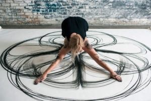
My project concept went through a few changes, so first a short introduction to the most recent concept: I was inspired by the artist Heather Hanson and her series of performance art pieces where she uses her body to create giant symmetrical charcoal drawings:

I like the concept of capturing body movements in an artwork, and wanted to see if I could use Posenet to create a tool to help me create interesting pieces, like a new medium of art.

Methodology

Code: https://drive.google.com/open?id=1gQd5Y2zuFOc1hy0bvWIUCVA3vMfjIuMy

I used the week03-5-PosenetExamples-1 code as a base to build on top of. I then searched in ml5.min.js to see the possible body parts to use, and integrated the nose, eyes, ears, shoulders, elbows, wrists, hips, knees and ankles. I actually forgot to include the elbows at the beginning of my experimentation, but added them in later. I also alternated between using and not using the nose and ears while experimenting with different aesthetics.

The next step was figuring out an interface that would be the most conducive in easily creating a work that could be recorded in a visually appealing way. I first created a green ellipse that serves as a “start” button when the user hovers their mouse over it. It also serves as a restart button so that if you would like to start over, you simply hover your mouse elsewhere and then hover back over the green ellipse to start the drawing process again.

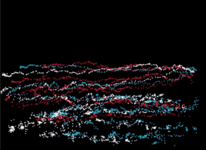
When the user first sees the screen, the web camera is on so they can see themselves. I decided to have this kind of interface because it is important to first see your body’s placement on the screen so you understand where exactly your different parts are before you start creating the artwork. When they hover their mouse over the green ellipse, however, the screen turns black and the drawing starts so that the user can no longer see themselves, but the art they are creating instead. This way, they have a clear view of what the piece looks like. One of my friends who user-tested backed this up, saying she liked being able to see the art forming as she moved around. I found that this way is also fun if you screen-record the process, so that you have what looks like an animation as an end result rather than just a final still image piece. This was my friend’s user-test/piece which she calls the “interpretive mountain dance.”:

Her piece had a cool result because it almost looks like a human figure with mountains in the background, hence the name.

Experiments

Most of the experimenting came from tweaking different components to see what was the most visually appealing. As mentioned earlier, for example, I played around with different combinations of keypoints.

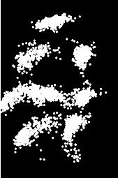
Playing around with different movements was interesting to experiment with. Some were still, some were fast and some were slow. Here’s a rather still movement of my friend sitting on the couch, for example:

Here’s another example of a movement experimentation, which turned out to be a bit of an abs workout:

I still wasn’t super satisfied with the visuals until I experimented with the color. I found that a combination of different colors, along with a combination of still and slow movements, seemed to produce the most interesting visual effects. Here are some of my favorite pieces produced (recommended to watch at a faster playback speed)…the title of the videos describe the kind of movement that was used:

I thought it was interesting how, even if I wasn’t trying to make anything in particular and was only testing out different movements, my brain would try and find patterns or different images in each piece. These all sort of look like abstract aliens or robots to me, which is kind of ironic considering AI is very “futuristic” in the eyes of the media, as are aliens or robots.

Week 07: Constructing Humans – Midterm Progress – Katie

Background

The direction of my project changed from the original concept I had in mind. Originally I wanted to do a project juxtaposing the lifespans of the user (human) and surrounding objects. Upon going through the ImageNet labels though, I realized that there was nothing to describe humans, and that the model had not been trained with human images. There were a few human-related labels (scuba diver, bridegroom/groom, baseball player/ball player, nipple, harvester/reaper), but these rarely show up through the ml5.js Image Classification, even if provided a human image.  Because of this, it would be impossible to proceed with my original idea without drastically restructuring my plan.

I had seen another project called I Will Not Forget (https://aitold.me/portfolio/i-will-not-forget/) that shows first a neural network’s imagining a person, then what happens when neurons are turned off one by one. I’m not sure exactly how this works, but I like the idea of utilizing what is already happening in the neural network to make an art piece, not manipulating it too heavily. In combination with my ImageNet issue, this started to make me wonder what a machine (specifically through ImageNet and ml5.js models) thinks a human is then. If it could deconstruct and reconstruct a human body, how would it do it? What would that look like? For my new project, which I would like to continue to work on for my final as well, I want to images of humans based on how different body parts are classified with ImageNet. 

New Steps
  1. Use BodyPix with Image Classifier live to isolate the entire body from the background, classify (done)
  2. Use BodyPix live to segment human body into different parts (done)
  3. Use BodyPix with Image Classifier live to then isolate those segmented parts, classify (in progress)
  4. Conduct testing, collect this from more people to get a larger pool of classified data for each body part. (to do)
  5. Use this data to create images of reconstructed “humans” (still vague, still looking into methods of doing this) (to do)
Research

I first was trying to mess around to figure out how to get a more certain idea of what I as a human was being classified as.

Here I use my phone as well to show that the regular webcam/live feed image classifier is unfocused and uncertain. Not only was it recognizing images in the entire frame, but also its certainty was relatively low (19% or 24%). 

In the ml5.js reference page I found BodyPix and decided to try that to isolate the human body from the image.

bodypiximageclassifier

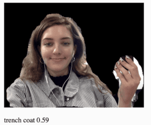
This worked to not only isolate the body, but also more than doubled the certainty.  To be able to get more certain classifications for these body parts, I think it would be necessary to at least separate from the background. 

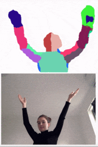
With BodyPix, you can also segment the body into 24 parts. This also works with live feed, though there’s a bit of a lag.

bodypix_partsegmentation

Again, in order to get readings for specific parts while simultaneously cutting out background noise, BodyPix part segmentation would need to be used. The next step for this would be to be able to only show one or two segments of the body at a time while blacking out the rest of the frame. This leads into my difficulties.

Difficulties

I’ve been stuck on the same problem/trying to figure out the code in different ways for a few days now. I was getting some help from Tristan last week to try to figure it out, and since we have differing knowledges (he understands it at a lower level than I do) it was very helpful. It was still this issue of isolating one or two parts and blacking out the rest that we couldn’t fully figure out though. For now we know that the image is broken down into an array of pixels, which are assigned numbers that correlate to the specific body part (0-23):

Conclusion

I have a lot more work to do on this project, but I like this idea and am excited to see the results that come from it. I don’t have concrete expectations for what it will look like, but I think it will ultimately depend on what I use to create the final constructed images.