http://imanas.shanghai.nyu.edu/~zz1224/comlab/week2/My-portfolio.html
Final Project “My Protest” (Vivian Zhu)
Title: My Protest (initial name: Social Media’s Rebellion)
Link: http://imanas.shanghai.nyu.edu/~zc1151/commLab/finalProject/index.html
Partner: Cecilia Cai
Design:
Our project is built upon the idea that everyone wants to meet up with ‘a perfect life’ standard on social media. We want to criticize the fake posts with shallow contents online, along with the sarcasm towards people’s indulgence into the virtual world. Inspired by Victoria Siemer Human Error, 2014, the whole project stands from the perspective of social media (treat it as if it is alive). The social media comments on and criticizes the posts and ultimately itself breaks down because it protests the fake and superficial part of itself.
Process:
Because Cecilia and I initially wanted to design a project that could take advantage of our assets in coding (Cecilia’s) and photoshop and video&audio editing (mine), we went through a little bit tough process of coming up with feasible ideas. We both wanted to critique the social media (in terms of the spread of untrue information, the brand-followers, etc.), but it’s a multi-layer topic and the way of presenting them was always vague. During which we even thought about doing spatial arts instead. Almost right before the final proposal due, we eventually got inspired by our anxieties and feelings of nothing is right: what if nothing on the social media platform is right? What if the social media itself breaks down? Further inspired by error arts, we designed a social media platform that is broken down and filled with three untrue, exaggerated posts.
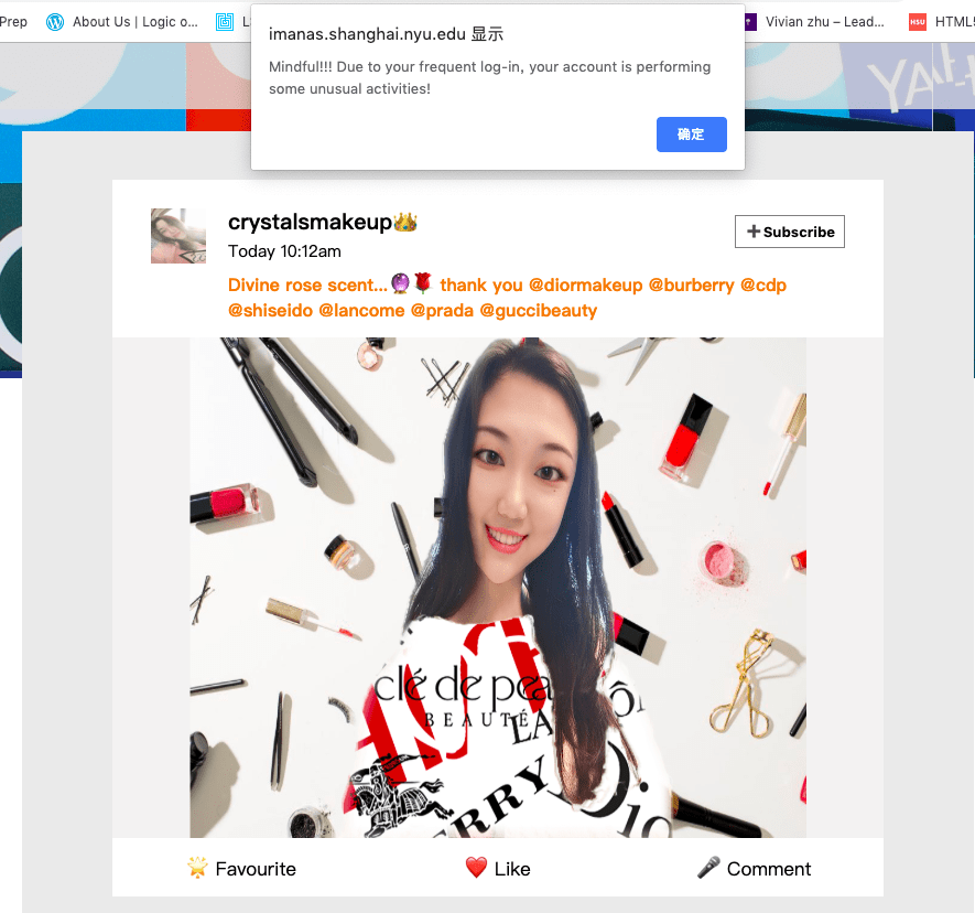
The first post reflects a Chinese cosmetics beauty opinion leader (KOL) showing off her new facial style (unreal make-up completed from App Meitu) and luxury goods. To make it more sarcastic, I intendedly designed an Asian-baby-girl name Crystal. The post is her overly photoshopped selfie meeting up towards Chinese customers’ standard of beauty. To reveal the essence of her luxurious life, I substituted her clothes with the pure collage of luxury brands.
I was told the brand-collaged clothes Crystal is wearing looks good. But I think it could be better if I make the brand names move on the clothes, in order to make it more interactive and sarcastic.
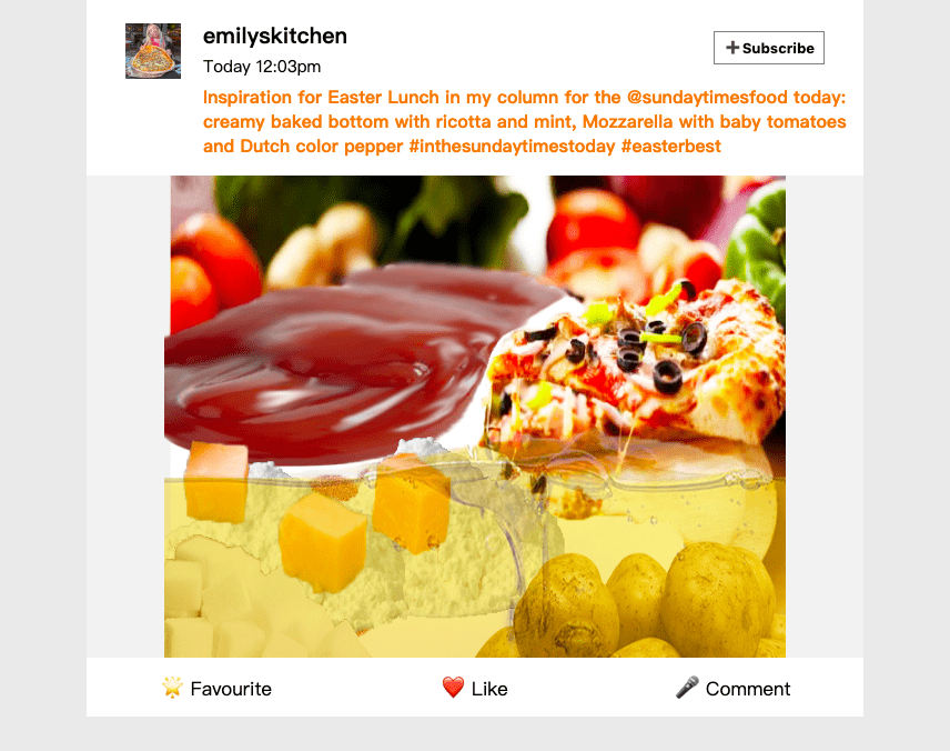
 The second post is from a western food KOL showing off her self-made pizza, with a sophisticated description of the recipe. The post intends to criticize that though KOLs are using their wits end to express how complicated the food is made—and thus how dedicate their lives are, the main ingredients of making these foods are actually monotone. I like the innovative way of showing the core idea: the oil is the sea, tomato the rocks, flour the sand under the sea, cheese cubes float on the sea, ketchup is the beach. But it still looks unnatural. If I had the chance to do it all over again, I would make the picture look as if an artwork rather than a rough draft on photoshop.
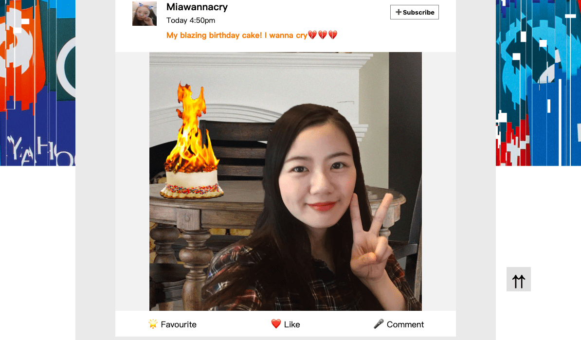
The third post is from a drama queen Mia, whose make-up and facial features are also fictitious and overly photoshopped. She is celebrating her birthday and the cake is on fire. But her first intention is not putting out a fire, but posting her selfie with the blasting cake online, with the intention to earn sympathy and attention from others. This post criticizes the phenomenon that people are addicted to crazy ideas and fascinated by sharing them online, even if the ideas are dangerous and inappropriate.
I successfully figured out how to make the cake as if it is blazing using “stamp” and “burnout” function in the Ps. But it’s really a pity failing to address the issue of the source of light. Because this post is made from four different pictures, the perspectives to shoot them are different and as a result, the whole photo doesn’t look that real. If I had more time, I would shoot the picture in the real situation to add a sense of realness.
 Actually, we initially wanted to make the third post about a fanatic fan for Ariana Grande, who is asking his friends to buy the new album for his idol (Ariana). The song is made into the melody of Beethoven Virus, and it is a combination of system error sounds. But because we thought it’s better to use the creepy song as the background music of the end page, we changed the third post then. Though as a song it works well, it is not that intentional and we received confusion like “Why you are using this song?”
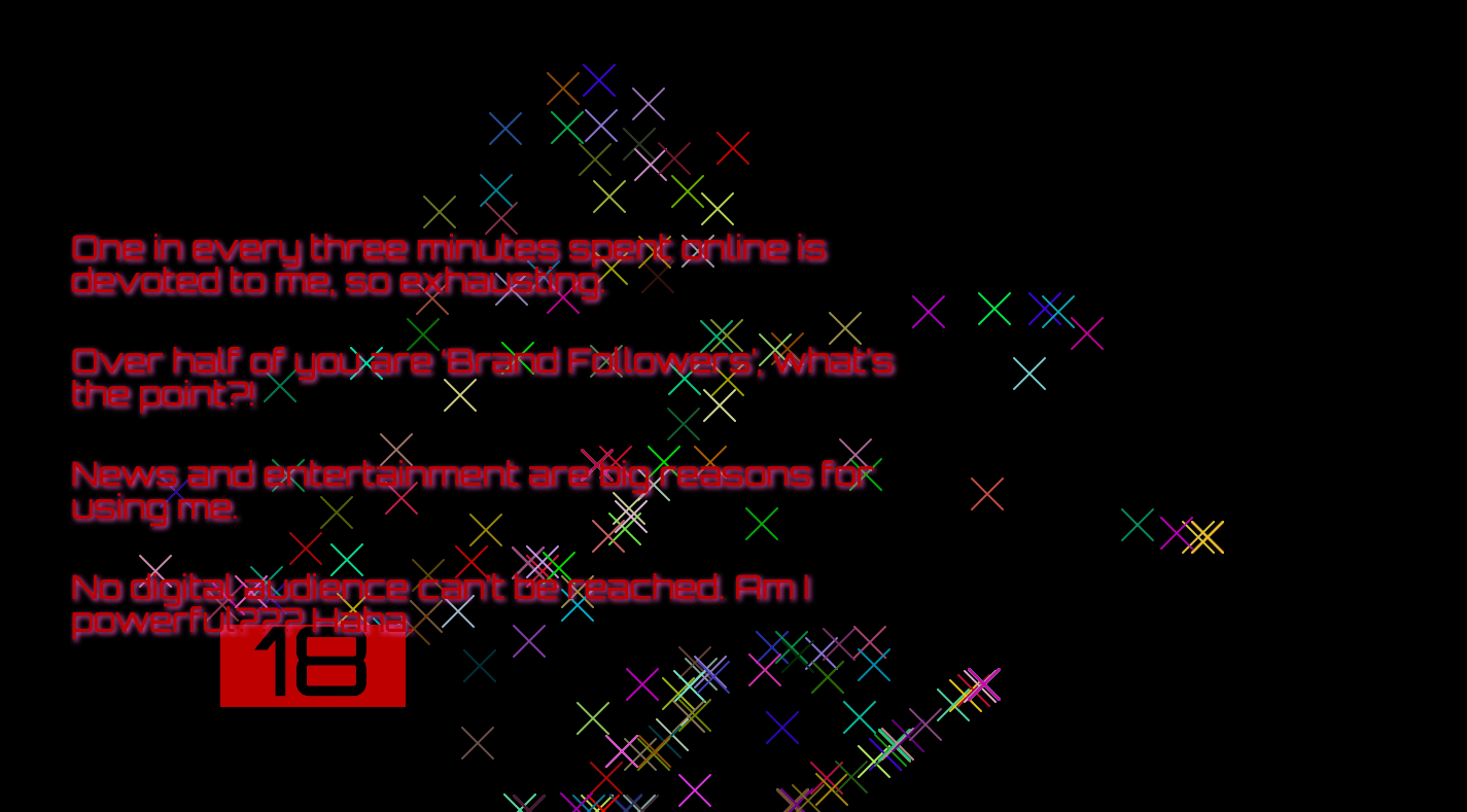
For the ending part, I researched data for the average time that people spend on social media every day, and the most searched topics, etc. I wrote four sentences from the perspective of social media (because it’s social media’s rebellion), mocking and making people reflect when they are on the social media platforms, what they are actually looking at and sharing. The last page looks more of being hacked rather than the website’s broken down. It would be better if we could make it more real.
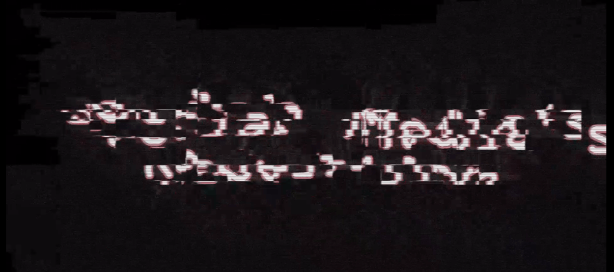
I initially used After Effect to create the beginning of our project, making the title “Social Media’s Rebellion” look as if an unknown signal interferes. It works well in terms of effect, but its style is not harmonious with the second and third pages, and the name could be confusing, we decided to delete it eventually.

Reflection
After the presentation, I realized there are still some defects underlying our project, especially the idea transmission. According to the feedbacks, many audiences found it difficult to understand the meaning of combining the shallow posts and the glitchiness. And many of them found the title “social media’s rebellion” confusing. It is surprising as we thought to have made everything clear. But their feedbacks actually inspired me that art project is not just an instrument utilized to convey the message, but also a cultural thing. For example, the title which is criticized was actually cautiously named and has been approved by many of our Chinese friends. However, the word “rebellion” seems to be used in a different way than we thought it to be, therefore causing lots of confusion. Besides, the whole project stands in the shoes of social media. Social media aggregates posts with cheap styling and shallow contents, and comments on them, with the intention to criticize that people who indulge in social media, are actually get impacted by social media itself. The effect of glitches and break-down are not only unique ways of expression but also expressing social media’s criticism and satire towards people’s absorption into a virtual world.
After we realized the difficulty of sending the message successfully, we made further adaptations towards our project based on reflections. Firstly, we changed the title into “my protest” to avoid confusion to a heavy word “rebellion”. Secondly, we made the background picture less broken-down, in order to have a better contrast between the first scene (three posts) and the second (social media breaks down).
Future:
Criticizing social media intentionally is not an easy thing as it has multi-layer messages, and most messages can be regarded as neutral. The project could be better if the project could focus on merely one or two aspects of social media. I personally really love the possibilities of combining error art style with the topic of social media—-and only on the web can I realize this combination. Just like Lauren points out: the web is what we make it.
Final Project Proposal (Cecilia Cai and Vivian Zhu)
Taking into account of feedbacks from peer-editing yesterday, we adjusted our idea and decided to take another approach to present the theme.
1. Concept
Is social media a sincere outlet to express oneself and link among friends, or a veritable battleground boasting and gloating to get appreciation from others? While the answer could be subtle, it is undeniable that people are increasingly fascinated by the idea of “a perfect life” portrayed by Kim-Kardashian-like KOLs through social media posts. At the same time, people also indulge in hopping onto social media platforms like Facebook and Instagram every day, reading posts, checking notifications, and sharing interesting stuff etc. A report by GWI reports internet users are now spending an average of 2 hours and 22 minutes per day on social networking and messaging platforms. We cannot live without social media.
Therefore, a critical examination among relationships of social media, branding and the definition to a “good life” is a timely topic. What constitutes a perfect life at present? When you’re choosing brands online, what you are actually choosing?… And, what if all the crafting perfect lives are destroyed? By adopting a critical, sarcastic perspective, we hope our project not just reflects a layer of the phenomena happening in virtual world, but also leads the audience to have deeper thoughts upon how humans get interconnected, and impacted by social media.
2. Sources
Amalia Ulman, Excellences & Perfections 2014-2015
Amalia used her social media profiles to stage a five-month scripted performance inspired by extreme makeover culture. She established herself to be a encouraging role through Instagram, profiling herself as what social media seemingly demands her to be. After repeating a lie for three months, she created a truth that she was unable to dismantle. We found this artist inspires us as she “boycotts” her online persona and criticizes the impact of social media. Our project is also about criticizing. However, instead of constructing perfect figure, we take a sarcastic perspective by making everything imperfect and ugly on social media, reflecting the topic from another extreme angle.
Victoria Siemer “Human Error,” 2014
Victoria is a graphic designer who imagines a world where everyday actions and scenes get a computer error message. She updates the photos of this series on her blog Witchoria every week. The photos look like Polaroid pictures, ranging from flowers to people to abstract nature scenes. On top of the scene is a modified error message. We get inspired in terms of the art of error conveying via her work. We had a difficult time thinking how to express the theme of our project, and we found exaggerations and sarcasm would be effective ways to present, and error art helps our project stand out.
3. Production
We will construct a “fake” social media webpage, mimicking the style of Weibo. When the users open the page, all the posts appear to be normal, with beautifully edited contents (such as pictures, texts, and videos). However, when users interact with the page, the contents will gradually break and become disordered. For example, when clicking on the pictures to enlarge them, a window will pop up showing the pictures, which, instead of applied with pretty filters, are intentionally made uglier. As for the videos, they would appear as a pretty frame, but on playing, their contents are actually messed up. As more interactions are generated, the webpage itself becomes disordered, with texts displaying randomly and contents not showing orderly. If the user tries to exit the page, an alert will be generated and the users would be unable to quit.
The production of our project will make use of pictures, videos and audios. The coding part will mainly be based on javaScript, HTML, and CSS, and we will also use P5 for some part of the web page.
Week 10: Response of “A History of Internet Art” by Rachel Greene (Vivian)
Response to Week10: StarryNight (Vivian)
