-
CONTEXT AND SIGNIFICANCE
My previous Group Project was Heal-O-Metic 5000. It’s a machine that can give you the proper medicine by testing your body condition. But instead of being an interactive project, it’s more likely to be a responsive project. Since my definition of interaction is that it’s a cyclic process requiring at least two objects that have effects on each other, the group project seems hard to motivate the continuity of the interaction. Thus, I wanted to make a more interactive project for my midterm project. We decided to use the fans and the IR remote in our Arduino kit to make a remote control electric fan at first. However, we were impeded by physics because if the current in the circuit was too big, the IR remote couldn’t work properly. And our project seemed a little boring at that time because all the interaction parts were depending on the remote. And the user just needed to click the button on the remote.
Hence, we started to think of another idea. Professor gave us the suggestion that we should focus more on the user’s experience. So we searched for some interactive projects on the Internet to find some inspiration. I found that some of the projects are actually pretty simple, but their designs for user experience are interesting, which can attract the users to continuously use it. And I think it’s also a way to motivate people to interact with the project. Finally, we decided to focus on the user experience. As a result, even though our project seems a little simple, but the users can have different experiences depending on their interaction with our device instead of having the same output every time. I came up with this idea because I recalled a Japanese animation called Dragon Ball. Kamehameha is the way that the main character to use to attack others. I just imagined if I can experience it even once, that’ll be one of the unforgettable experiences that I’ve ever had. So we finally created a Kamehameha simulator. We still use two fans in our project. But this time, we were not limited by the form of a normal electronic fan. The whole project intended to be a project with entertaining purpose and interesting user experience. In my opinion, the targeted audience and user should be the fans of the animation Dragon Ball. They probably want to experience Kamehameha as well. Thus, our project can be a good chance for them.
-
CONCEPTION AND DESIGN
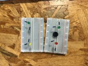
First of all, we decided to make the speed of the fans as the output of our project. And we used a distance sensor to test the speed of how fast you can push your hands in front of the sensor. Then how fast the fans would rotate depends on the speed you push your hands. In the animation, Kamehameha is a very certain action. But we cannot ask the users to act as exactly the same as the character does in the animation. Besides, we don’t have a machine or method to test whether your move is standard or not. At the same time, if we asked the users to do the same move every time, it won’t be user-friendly for those who never watch this animation. Thus, we decided to use a distance sensor. We first set a fixed time which is 1.3 seconds. And the sensor would test the distance once at the beginning of 1.3 seconds and test again at the end. Since the sensor could get the distance difference during 1.3 seconds, then we can calculate the speed of your hands and map it to the speed of the fans. And the device would work as long as it can test a distance difference. Thus, no matter what kind of move you pose, you can experience this device. In this sense, the device is not limited by the certain move of Kamehameha. Moreover, if we only had two fans to show the output, it won’t be intuitive. Thus, I decided to put a tower of paper cup in front of two fans. In this way, if you can push your hands fast enough, the fans would blow down the tower. Otherwise, this tower would only move a little but not be blown down. After adding the tower of the paper cup, the whole project became more interesting as well.
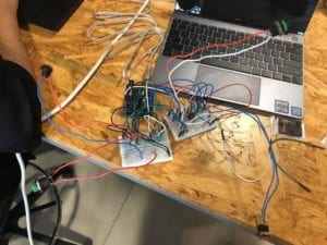
In terms of the outlook of the device, we chose to use the cardboard to make the main body of the device, because there is enough space for us to put the Arduino board and the breadboard inside the cardboard box and it’s easy for us to cut it and adjust the shape. We cut two holes at the box to put the fans at first. But we found that if we put the fans without enough distance between the box, the wind would be too weak to blow down the tower of the paper cup. Therefore, we decided to use the 3D printer to print two pipelines to put the fans. In this case, we can place the wires inside the pipeline to make the outlook better and make the fans function properly. We could also laser cut one box. But we rejected it because if we didn’t measure the size of the fan correctly, it’s hard to adjust or cut by ourselves.
-
FABRICATION AND PRODUCTION
The most significant step in our production process was to print two pipelines. We met with a lot of difficulties when we print the pipelines. I first measured the size of the DC motor, such as the height, the width. And I used the Tinkercad to make the 3D model of the pipeline depending on the size of the motor. However, even though the size fitted the motor well on the computer, the real products were not suitable for the motor after we printed it because of the error. Then I had to make the model larger. At that time, in order to save some time, I printed endways. So the printer needed to print so many layers and it’s easy to mess up. Beyond what I expected, the printer got wrong before I was about to finish. The material was printed in the wrong position. So we must stop the printer and do it again.
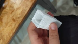
This time we tried to print sideways with support. Although it took a longer time than printing endways, the printer functioned properly. In some sense, it also saved our time.
During the user testing session, one feedback that we received most was that the instruction was not clear. The users felt confused when they first saw the device and didn’t know how to interact with it unless I told them what they could do. At that time, our instruction said that “Start button, 1,2,3…., Push!” So it gave the user a sense that they needed to push the button after 3 seconds but not push their hands. There are only a few times some people using the device correctly because they watched the animation before. Therefore, we tried to make clearer instructions after the user testing session. We write more instructions to inform the user about what they could do. Furthermore, we printed some pictures of Kamehameha and stuck them on the surface of the device to directly show the move. We even had a picture which is the images of every step of Kamehameha. However, when presenting our project, the instructions still seemed a little confusing. And the picture of the steps was not distinctive so that the user might overlook it. Maybe next time, we would make a board with instructions and put it beside the device to directly show the instructions instead of writing the instructions on the device.
-
CONCLUSIONS
In conclusion, the goal of our project is to give the fans of the animation Dragon Ball a chance to experience Kamehameha. Basically, our goal is to make an entertaining project which is simple but interesting. Our project is pretty interesting and the user can have a good experience of using it. But the whole process of interacting with it is not cyclic. My definition of interaction is that it’s a cyclic way requiring two objects which have effects on each other. Our project requires one person to interact with it and give the person a direct output. It aligns that two objects have effects on each other. However, it doesn’t motivate people to interact with it continuously, which means that it doesn’t motivate the loop of interacting. A person may feel interested in our project when he first saw it. But after playing it several times, he would probably get bored with it. All the people who have interacted with our project give me a sense that they are interested in it. But they don’t give me the sense that they want to play it for one hour. It’s really different. People would get bored quickly. Thus, if I had more time, I would improve the interactive part more. For instance, I would make it a competing game that requires two players. And the output wouldn’t be as simple as what we have now. In this sense, it can not only involve more people to interact with it but also be more interesting so that people can interact with it for a long time. Moreover, I also learned from the setbacks that user experience is worth being taken into consideration when making a project. We should not only consider what can be interacted with but also consider how can others interact. From my perspective, only when we consider both of what the interactive parts are and how people would interact can we indeed make a good interactive project.
