Reflection to On the Rights of Molotov Man – Jamie (Ziying Wang)

This essay discusses the appropriation of artworks. The photo which was originally taken by Susan reveals the important moment in the history of Nicaragua but was later adopted by artist Garnett to express another artistic feeling without citing the sources. Therefore Susan sued Garnett for his “stealing” of her work and claimed that although everyone can have their own comprehension of artworks, people need to have the awareness of ownership.

Personally, I strongly consider ownership as a critical issue. Indeed, an artwork can have different dimensions of meanings and can be expressed through multiple ways, lots of artists may argue that if the ownership of artwork is over-regarded, it might limit the recreation of this artwork and therefore limit the creativity of various artists. However, in my opinion, the recreation of previously-existed artworks actually limits the creations in total. As Oswald once said: “Although people, in general, are making more noise than ever before, fewer people are making more of the total noise.” This sentence is referring to the “plagiarism” in music, especially recordings where musicians take the original music and make a few adjustments and label it as a new track. Oswald explains that we need to increase the amount of music in total, not creating new music by changing the old ones. Art is the same, I think that by protecting the ownership of original works, we can also inspire new artworks.

Responding to Homecoming—Jamie (Ziying Wang)

This is the first time I’ve listened to a podcast that tells a story in the way films display their stories. I’m intrigued by the layout of this story. Instead of telling the story in time order, it divides the story into 6 scenes (not including the intro and the outro) and allows the listener to deduct the storyline through listening to real life conversation simulation. 

The podcast starts with deep and dark classical music, it creates the overall atmosphere for the story, letting the listeners know that the story is a little bit heavy.

Then the first screen starts with a siren, and the protagonist, the woman starts her recording. The podcast was unlike other recordings which present their listeners with clear voices, instead, it tries to return to the original scene by adding noises simulating real-life noises into the audio.

Similar techniques are also used in the second scene where the woman was interviewed by an official from the Department of Defense in a restaurant. We didn’t know directly that the woman works there but we can deduct her current occupation when a waiter tells her that her break time is over. Also in the fourth scene when the woman called her boss the signal was poor and the voice kept breaking and blurring. The language used by her boss was rude but can reflect his haste.

I’m attracted by the sudden stop in the audio when switching between scenes. It indicates clearly that this scene is finished and pulls the minds of the listeners’ back if they slipped away.

The sixth scene was the conversation the woman had with the official, she was asked if she remembered a former soldier, Walter Cruise. In previous scenes, Walter appeared multiple times as part of the woman’s memory, but here, the woman kept silent for a while and finally denied their acquaintance. This leaves suspense for the audience whether the woman actually forgot about Walter or if she’s hiding it from the official. The pause before her denial is something that is left as a blank for the audience to fill in.

Overall, it’s a great entertainment way and the audio settings present this story amazingly.

Comic Project (26 htmls)—Jamie (Ziying Wang) & Madison

link: http://imanas.shanghai.nyu.edu/~zw1745/26htmls/index1.html

This is a screenshot of all our html,  css and js pages as well as images and music sources. 

The name (26 htmls):

The comic project is named after the number of html pages we’ve created for it. For in each html page we have different animations and conversations, it is hard to keep everything within one page and just switch the pictures. 

Also. the 26 htmls is also a must if the player wants to go through every plot in this story. 

Sketching stage:

Madi and I are both crazy for the Netflix series Black Mirror, its latest work Bandersnatch which allows the players to choose their own plots deeply inspired us. We immediately decided to design our comic into an interactive comic, allowing our players to encounter different plots by exploring the map themselves. Also influenced by Black Mirror, the theme of the comic is pretty dark, originally we planned to make the comic reveal the darkness of humanity through making hard choices between dilemmas, however, we soon discovered that our skills  are limited in writing the lines and what we’ve written can’t fully express our ideas, nevertheless, we compromised to the best we can do. We sketched out a thorough plan of our plot, it’s a tree shaped chart which leads to 8 different endings.
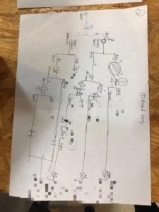
 (Blurring out the endings to avoid spoilers)

Coding:

We distributed our work well, Madi was mainly in charge of drawing and css layout while I focus on coding in index and javascript. Within two days we sketched out our protagonists and got ready for building index pages. We started with a cool torchlight effect which we got our source code online, I studied the code and changed the original background to what we photoshoped, and turned it into the beginning page we can see now. Then we drew our buttons on photoshop to create a more story feeling instead of using the stiff default buttons in html. 

The word changing effect in this comic is achieved by switching png pictures instead of directly showing the words. We didn’t use innerHTML function for we want the texts to appear after the player clicks on a speechbubble. But now looking back, I think I can use “display: none” in html and “display: block” in js to present the conversations and keep them in a stable position. 

The only animation we have in the comic is the boy, I used a simple moving code to make him move a little in some pages, we also have footsteps and chewing sound effect inserted within the code and the players will encounter them when coming to certain scenes.

The coding process was very confusing, since we have so many pages and the choices the player chose before will affect how the boy appears in later scenes so we had to create multiple pages with tiny differences for a same scene. The background color changes in some scenes, it is a return to our concept “finding humanity”, lighter backgrounds indicate that you’ve made choices closer to your humanity while darker ones mean you’ve done dark things.

User testing, Conclusion and Reflection:

To conclude, we finished 80% what we had planned originally, we didn’t abandon any originally made plots and completed the 8 endings. However, during user testing, we find that it’s hard for our users to compromise to the unclear instructions in the game. For example, every input the user enters must strictly follow the two choices presented within the question, and the user didn’t know they should click the boy for animation before clicking onto the speechbubble. If I were to do a revision, I would fix the first problem by adding more “or”s to the if conditions, and make the boy move automatically without the user having to click on it.

Overall it’s a fun experience of creating artworks and building interactive website. Though my creation is limited due to my ability in coding, I would try to compensate that by learning more coding tricks in the future, especially those that can help with simplifying my codes.

Walking Recitation Exercise-Jamie

http://imanas.shanghai.nyu.edu/~zw1745/Week4/index.html

I was stuck at adjusting the position first, then I realized my css file wasn’t even connected to the html file because it was within another file. Then my “opacity” function wasn’t working even though I inserted it correctly, with a few refresh on the webpage it somehow worked.

I used count clicks and if function, with else ifs like “click%3==1” to arrange the opacity of the pictures.

Comic Project: In Progress – Madi Eberhardt & Jamie

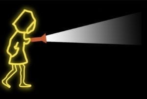
So far Madi and I have sketched out our protagonist, the yellowish boy with his torchlight, the ghosts and the cat, we are adding more characters once we plan out every detail of the comic on Friday.

I used photoshop and drawing pad to create the figure of the boy and use filter: Gaussian Blur to create the glowy shadow around the figure. We chose yellow as the color for the boy so that he can be spotted easily under the changing backgrounds. In making the beam for the flashlight I use the gradient to adjust the opacity of the beam and make it more like a real beam.

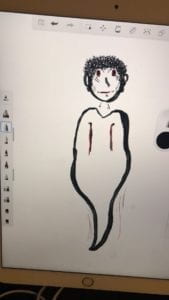
Madi draws on the iPad and created the ghosts and the cat which will be significant for our plot in the comic. We are still designing the interactions that can fit into the comic better without sudden disturbance and get the audience more involved in the plot

.