Phone design for Tristan – Jamie (Ziying Wang)

Information:

Tristan, 23, Research fellow IMA NYUSH.

Daily routine:

Wake up—>metro (45-55min)—>in the building—>go out during lunchtime—>building working—>metro back—>sleep

Free time:

Watch shows with friends

Do gardening on weekends

Tabletop RPG games

Browse internet

Project:

Electron engineering

Improvements wanted:

Commute (metro time 50 min, 2h/day)

Goals:

Exercise more (need reminder and fixed time, keep track)

Read more (need more researching)

2 mobile phones:
Chinese school from school (iPhone): 30min/day
WeChat (communicate, payment)

Baidu map (prefer bus lines)

Apartment looking app (requires Chinese number)

Features:

Not a big fan of Apple

Standard, basic

American phone (LG gx?): 1-1.5h/day (uses the laptop more)
Slack

Browse internet

Music

Pleco

Features:
Case (needs to be customized for the phone): two parts: Basic protection (protects well); stand (very convenient)

Case restrict plugin audio cable, too thick: hard to plug in a large audio jack

Likes physical button on Android

Favorite app:
WeChat(C): utility

Baidu map(C): bus lines

Spotify

Firefox

Pleco: Chinese translation

Youtube

Calendar

Email

Notepad: take notes

Least used apps:
News apps (APNews, NPR)

Linkedin

Pinterest

Requirements:
Doesn’t require a high-quality camera

Doesn’t require good speakers: uses headphones

Doesn’t need complicated features

Likes bigger interfaces: holds comfortably

Likes the phone stand!

Problem:

Vertical placement blocks audio…

Needs bigger memory (requires external SD card)

Lock button closes the screen when the phone is placed horizontally

After quick analyzing, we decided to focus on redesigning the phone case, we wanted to design a case that can meet both his requirement of supporting the phone and not blocking the audio jack or pressing the lock button. By achieving this design, we would be having his main concerns solved.

The first case we came up with was a case that has a stand which the user can slide it inside the case when using, the stand supports the phone with a triangular supporter and the side underneath the lock button side avoids the button. However, the case remains thick as Tristan’s original case and it couldn’t ensure the completeness of the case if the phone falls to the ground. Therefore we decided to move to another design.

Inspired by slime and the slimy keyboard cleaner, we came up with a case design which Tristan can use to sculpt his case however he wants to. The slime is sculptable but isn’t too soft, and has good flexibility within it. He can sculpt the slime to avoid the button being pressed while supporting the phone at any angle he wants to. Also, the slime can be a great buffer for him if the phone drops on the floor.
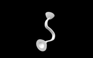
Good design: Good news for zombie babies – Jamie (Ziying Wang)

Recently I read an article on “zombie babies”, which are mostly babies of 1-3 years old who lies in baby carriages pushed around by their parents. They are called zombie babies because they are too young to walk around, so they just lie inside carts instead, and while they are inside the cart, the babies are isolated from the outside world: their parents don’t talk to them, nor do they interact with passerby. For zombie babies, their only activated sense is visual through which they see moving images flashing in and passing their sights. We are only considering the conveniences of baby carriages but forgetting the babies’ feelings.

I think that the key to not ignoring the babies is to activate more of their senses, especially the ones they are most familiar with, the signal from their families. Therefore, I modeled an item which conveys the sound of the troller-pusher to the baby inside the cart, it uses solid media to convey sound through the “cups” on both sides and the rubber band connecting the cups. One of the cups is placed next to the pusher’s mouth and the other next to the baby’s ear. This way the baby inside the cart wouldn’t be ignored as before as their audio sense would be activated and would get more comfortable when inside the carriage.

I consider it a good design for 1, it aims for a particular group of customers who were ignored before. Newborn parents are always looking for ways to better raise their babies and this can be a good product for them to shape their babies’ personality. 2, it is considerate for the babies’ health. I am using the most traditional way of sound transmitting instead of phones which require signals, signals can be hazardous to the babies’ brains. 3, it is safe for babies. I am using thick rubber bands in the middle instead of thin strings which might strangle the babies. Rubber bands are more sustainable and safer for young children,

Audio Project – Jamie (Ziying Wang)

Link:

http://imanas.shanghai.nyu.edu/~tlb394/audio/index.html

Sketching Stage:

The original idea for this project was the three of us each make a track that represents a genre and combines them with a radio which the user can switch channels on. But this idea wasn’t suitable for a group project, so we decided to create a scenario where two friends are chatting through the phone, one of them is not in Shanghai but would like to know how the dorms are like, the other friend tells her that she can see it for herself, and the webpage combines all the sounds of the essential elements in the dorms, when the user clicks on it, they can hear the sound.

Design:
The page is divided into two parts, one is the phone call and the other part the simulation of the dorm scene. For the phone part, I photoshopped a telephone gif, when the user clicks onto the telephone, the conversation between two friends will play. Taylah and I recorded the conversation, with me being the one away from the dorm and Taylah intruding the dorm scene. We intentionally add the editsound effect to create a distant feeling when it’s my sentence to make it sounds distant, Taylah teditsthe audio together in one piece. I coded to make the telephone gif automatically changes into a play button gif when the audio is done playing.

For the second part , I set the background as a gif of Van Gogh’s starry night. It represents a nostalgic feeling which is related to our theme. Then I photoshopped the elements, including the doors, the laundry machines, the fridge, the kitchen cabinets, the sofa, the floors and the cat. When the user clicks on the element, it will play the sound of that element, the five dorm doors represent different in-dorm scenarios.

I used toggle function in coding so that with clicking on the same element once more the sound effect would pause, click it again and it will continue playing. Almost all the elements have this toggle function except for the at in the middle, once it is clicked it’ll play the background music non-stop. I coded it on purpose to make sure there’s no sudden stop in background music. Also, I made the cursor change when it moves to the objects, so the user would realize that they are clickable. I made the cursor “grabbing hand” on almost every element (except for the cat again) to make it looks like it is touching the element, and the cursor on cthe at is a pointer.

Difficulties:

I came across some problems when doing thee css part, the elements wouldn’t line up as I want on the screen, then I knew the specific use of position function in css, learnt how “relative” and “absolute” work.

If I had more time, I would add more interactive features on the webpage, this webpage is currently just for enjoying the scenario by simply listen to the audio. But I’m not sure about further improvement, it’s not an excuse for not making more pages (ex. When the user clicks on the door, he sees the inside), instead, I want this experience based on sound, not the traditional way of perceiving information through vision. So I’d still want to figure out what improvements I can make to deepen our meanings.

Theft And Artistry – Jamie (Ziying Wang)

Theft and Artistry introduces conflicts on cultural appropriation within music. It takes examples of popular tracks and discusses the cultural conflict its involved in. Personally, as a music lover, I am aware of how different music genres are originated from different cultures, but I never consider a piece of music has to carry a certain label. A genre may be addressed as originated from culture because people from that culture first discover, or simply because its people are mostly making music in that genre. Artistic works always need inspiration, when an artist is inspired, that inspiring thing is no longer the object of the artist’s creation, but the creation itself is representing the artist’s idea. Even when two creations look similar, the creators of either creation hold different beliefs when creating their works, and that shouldn’t be considered stealing or plagiarizing. Everything is, in a way, borrowed or stolen. No one is the owner of the language, or the owner of music, or color, every creation is a rearrangement of already-existing elements. When the critics in the text argue that Bieber’s song is absenting the full presence of Black and Brown woman and Hymn For The Weekend is a stereotype of Indian’s culture, I think the critics are holding their stereotypes of nowadays music. Regardless of the artists are actually doing this or not, we don’t and will never know their initial intentions and ideas, isn’t the behavior of labeling others’ works without knowing all aspects of them not very “sciency”?

Some people today are over interpreting, and maliciously interpreting artworks, trying to find every possible detail and maximize to vilify either the artist or the artwork. As an outsider of the artist’s mind, we should not suppose what the artist means and just express those guesses as of our personal interpretations.

Reflection to Ecstasy of Influence – Jamie (Ziying Wang)

This essay inspires me to think about the differences between “plagiarism” and “inspiration”. We support good artworks but when it comes to renovated pieces, we categorize them as plagiarized pieces and they should be disgusted. But judging the masterpieces in the history, Shakespeare for example, his Romeo and Juliet’s plot is similar to an ancient Babylonian story yet people still respect Shakespeare for his composing.

In this case, we should question ourselves, are divine authors being spared from the crime of plagiarism while the ordinary others are the main targets being watched? The renovation we make is inspired by original works but hardly not considered as “stealing” others’ ideas. The line between inspiration and plagiarism is murky and there isn’t a clear definition for either term. In my opinion, we should embrace all recreation works instead of judging them, even when the recreated version is similar to the original one, we should refer it as a better change, or a failed change of the original piece.