Week03 Assignment: ml5.js Project —Ziying Wang

The following clip is a demonstration of my project: Nose & Notes

The user can strike notes by moving the position of the nose, the colored rectangles will appear on the screen to illustrate which area is being stroked. 

Nose & Notes is based on the PoseNet machine learning model that locates the user’s body parts and generates live coordinates for different body parts. My project uses the coordinates for the nose and dissects the canvas into nine sections, with eight sections each representing one note from the scale and the ninth playing note A in chorus. The user can then plays pieces of music by moving his head and getting his nose within different sections. It is also possible for multiple players to strike notes together. 

The initial plan was to have different body parts all able to play notes within the screen, so it can enable a single player to play chords. However, after testing “rightWrist” and “leftWrist”, these two body parts are often wrongly recognized by PoseNet and I would constantly strike on notes that I don’t want to strike. Even though the recognition conditions for those body parts have set to be more than 0.8, it would still wrongly recognize and eventually gets stuck. 

I ran into a few problems in programming. One major problem is that I’ve been using Atom to program and run my code and the sounds I store in my folder wouldn’t start preload in the page. Then I was advised that I should run my code on the local server to preload the sounds. I then downloaded the atom-live-server and successfully launched a trial live server to run the program. However, when I use Terminal to run my code, it wouldn’t run properly and the console reads as follows:

Another issue that affected my original plan was that since the sounds are programmed to play every time a section detects the nose, it will constantly start the mySound.play() function as long as the user’s nose is within the area, which is not very pleasant to listen to. Originally, I wanted to make it into 9 sections saying phrases or sentences when the nose is in those areas, however, if the code plays the beginning of each audio continuously, it wouldn’t sound like a complete word, just a syllable instead. Therefore, I used notes to make compensation for this drawback. It still sounds a bit ragged since the sound files themselves have background noises, but are definitely smoother than inserting other audios instead.

If more time is provided, I would turn it into a game which requires the user to use nose, right wrist and left wrist to participate. Three color blocks will randomly appear on the screen and the user will need to use the three body parts to fill in those three blocks, a countdown will also appear on the screen, the user gets one point if he/she finishes the goal within the few seconds.

The following is the link to the code:

https://drive.google.com/open?id=1pfMnVntYXmOIVGkaGhn_F9QUpq7Xrds_
Week 02 Assignment: ml5.js Experiment – Ziying Wang

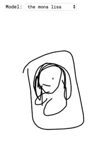
I played with the ml5.js together with p5.js model called “sketch-rnn”. Its idea is drawing with artificial intelligence. The trained model in sketch-rnn would allow the user to pick a category and let the user start drawing first. After the user stops drawing (release the left-click on the mouse), sketch-rnn will automatically complete the rest of the drawing based on the stroke the user made previously and turn it into the shape of the chosen category. It’ll then automatically continuously generate similar artworks until the user presses the “clear” button. The model aims at suggesting humans collaborate with artificial intelligence on art. Currently, due to the limited models in its database, the drawings are rather ragged, but with the collection of more paintings, sketch-rnn can probably create aesthetically-valued works with the human in the future.

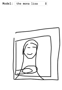
The following is what happened after I chose Mona Lisa in the category and draw a circle to start.

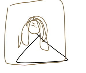
I then try to draw something completely not connected to any elements in the category I choose, I want to see if the AI can cleverly reshape the default pictures in its database. For example, I choose Mona Lisa as my category again and draw a triangle first.

The first drawing turned out good, ai cleverly used my triangle as the body of Mona Lisa. But then I found out that the triangle was no more than some lucky original resources hidden in the database. 

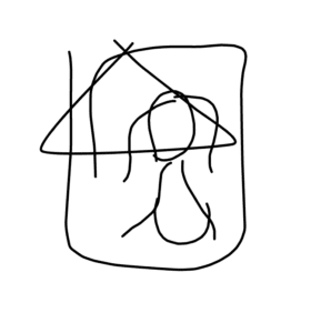
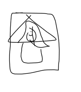
The following drawings didn’t go well, sketch-rnn simply covers my triangle with “Mona Lisa” resources in its database, which make me assume that if this ai can’t find any element in its database similar to the user’s drawings, it would just draw a completely new drawing to cover the original stroke.

It turns out that my assumption is not entirely right. Even though in the Mona Lisa example it is covering and redrawing, in many other trials I conducted later,  it still tries to recognize the basic outline of your drawing and is trying to complete the work with a few more strokes. Sometimes, however, it’s hard to recognize what it’s drawing when I draw a huge mess first and it finishes it by adding on some simple strokes.

I’ve never had experiences in training models before but I tried to read its sample code.

Link: https://github.com/tensorflow/magenta-js/tree/master/sketch

It first implements a set of models for every category, in the sample code, it’s using the cat model as an example. The user’s pen is tracked to see if it has started drawing & finished drawing, previous and after coordinates of the stroke are stored and the model is set to the initial state. After the pen state is stored, it is transferred into the model’s state. The parameters of the model state are traced. The model then samples the coordinates and reset the pen status to the coordinate it collects and finish the drawing according to the cat model resources. 

There are certain terms I don’t understand in this code, for example, I don’t understand how the amount of certainty functions here.

Additionally, I can’t locate the code where the model compares the shape of the user’s drawing to the ones in the database, or is it just using the ratio calculated from the coordinates to match with the models.

Week 01 Assignment: Case Study Presentation —Ziying Wang

Presentation link: https://docs.google.com/presentation/d/1tdoZ9_-9mCf3V7KWDZEWeO5lKrDrtxaBLxm0OM5qo-g/edit?usp=sharing

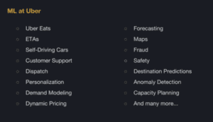
For a work related to artificial intelligence or machine learning, I looked into Uber’s artificial intelligence and machine learning system: Michelangelo.

Uber is a company that supports 75 million riders and 3 million drivers, that has completed 4 billion trips by the end of 2017, which is about 15 million trips per day on average. Without a complete machine learning system, Uber’s server cannot offer us sufficient services as they are providing now.

Michelangelo has been employed to various fields in Uber, including ETA (estimated time of arrival), Uber Eats, forecasting the supplies and demands in markets, Uber Maps, One-Click chat which predicts the conversation the driver is going to make with the riders and many more. It manages data, train and employs models and make predictions. Michelangelo enables scientists to easily deploy machine learning solutions and therefore increases productivity.

I’d like to further illustrate the use of Michelangelo in UberEATS.

Its ability In machine learning is mainly put in use on calculating the delivery time. Time calculation isn’t a simple task. When the user places an order on UberEATS, the restaurant needs to take the order first and then starts to prepare, meanwhile, an estimated time is calculated to locate and inform the most suitable delivery-partner to head over the restaurant, find parking, walk inside to get food, get back to the car and deliver the meal to the customer. Machine learning is supposed to estimate the total time for this multi-stage process as well as continually performing recalculation as the stages are being completed. Features for the model here includes the information of the order, including the time of the day, location… and the restaurant’s recent preparation time (usually recent two weeks). Through deploying these figures into models, Michelangelo is able to predict the delivery time for thousands of customers within a short time.

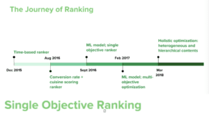
Apart from the ETD (estimated time of delivery) in UberEATS, the ranking system inside this app is also supported by large amounts of data and the artificial intelligence that utilizes these data for MOO (Multi-Objective Optimization). In the past, the ranking is only based on the eater, for example, what categories he/she usually looks into and frequently orders from. Today, the new model takes the restaurant into consideration as well. If a customer is more likely to order from some restaurants than others, the conversion rate (how likely the eater is going to order) increases but the marketplace fairness decreases, since most new restaurants are not likely to pop-up on the recommendation page. Similarly, if we ensure the fairness for each restaurant, the customers’ conversion rates would fall.

Another trade-off is between the relevance and diversion, continually recommending the user with only the restaurants containing his/her favorite food may prevent the eater from trying out new options and it can be hard for them to find a great restaurant when they want something new. Balancing the two trade-offs aforementioned is the goal of the AI system in UberEATS, it aims to build a unified framework that ranks within and then across the carousels, and therefore build a triplet model for eater, store and the sources which are the categories including “popular”, “near you”, “new”, etc.

This video demonstrates how Uber Eats help to grow the restaurants’ business.

Final Project Reflection: The Wanted by Jamie & Clover – Jamie (Ziying Wang)

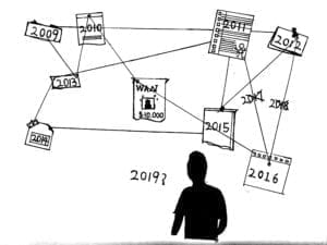
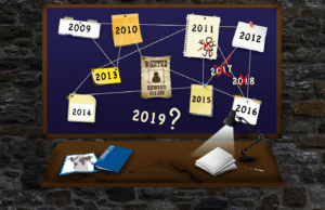
Our internet art project: The Wanted is a fictional detective game based on a catastrophe happened in real life. The user is a detective who has been after a criminal for almost ten years, through analyzing past crimes, she suspected that the criminal is going to commit something big soon, despite the police department plans to officially close the case in three days due to the large amount of money and effort wasted on this criminal over the past 10 years, the detective decides to look into the case for one last time and try to take the criminal into custody. The user, as the detective, will submit an information form with the information of the upcoming possible crime he/she deduced from the previous profiles, the results will decide whether the user has performed the right deduction.

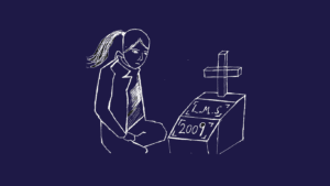
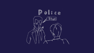
Clover and I went through lots of iterations when constructing this project. We started off with Clover drawing four images for background story and I making an image for the timeline page with photoshop. We designed the timeline according to the vague schedule we listed before starting, which includes 10 years (2009-2018) and two of which don’t have crimes, the rest is a crime per year.

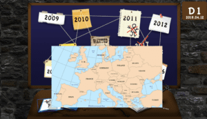
Then as we design our cases, a hint we wanted to offer is that the crimes happen in geographic order on the European map, therefore I appended clickable map of Europe on the timeline page.

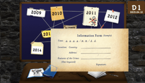
As the user is required to fill out a form as the final evaluation for the performance, we designed clickable items on the timeline page, one of which leads to the submission page and the other is a screenshot of the sample form.

Originally, the user clicks open different documents and goes back to the timeline to check out others, then we realized that the limitation doesn’t work when the user can click open all windows and has unlimited deduction time. Therefore, I coded the page open time as 20 seconds, when the time is up, the window closes itself. After every eight profiles the user checks, there is audio informing it’s the sleeping hour comes out, indicating that a day has passed. After 24 times checking the profiles, the timeline page will automatically direct the user to the submission form page, where the user has to fill in their deduction result for the upcoming crime.

The evaluation of the results leads to three endings, one of them is the good ending, where the user successfully stopped the crime from happening and took the criminal into custody. The rests are both bad endings, one is the case that the user gets the right time but the wrong location, the ending is that the user arrives at the place in search of the criminal but instead sees the news of the catastrophe happening in another place; if the user gets the time wrong, the ending is only the news on the catastrophe.

Given more time, there would definitely be things I want to improve. One of which is the submission page. Theoretically, according to my current code, the user can open multiple submission pages and try unlimited times, I haven’t come up with a better solution for this because I want to give the user time to think and not set time limit for their submission. Another is that the crimes should be perfected, right now they are too deliberate, and look like something purposely designed so that the user can figure out the hints. The storyline is something I definitely want to put more effort into. After presenting it to the class, we learned that we should have changed our cursor into a pointer when it hovers onto clickable elements so that the user will be clearer about what to click on.

Final Project Reflection: WatchPad by Jamie & Echo – Jamie (Ziying Wang)

Product Name: WatchPad

Demonstration Video:

Presentation Slides: https://docs.google.com/presentation/d/1SdHM9oRaqpP0Qe8VAAGJVoBxrjfKM1sHXzY199ruakk/edit?usp=sharing

Agenda: Responsible Design Agenda

Goal: Problem Solving

Background:

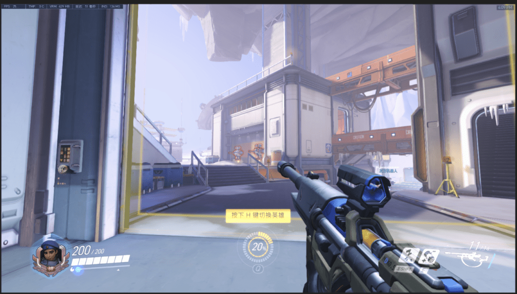
A common problem for gamers is that the information of the computer is displayed on the top left corner of the game, it’s inconvenient for them to check the tiny numbers on the top left corner and get updated of their computers’ conditions. For some gamers, they also want their favorite pictures displayed next to the computer screen, including some essential information, including time, date, weather, etc.

Inspiration:

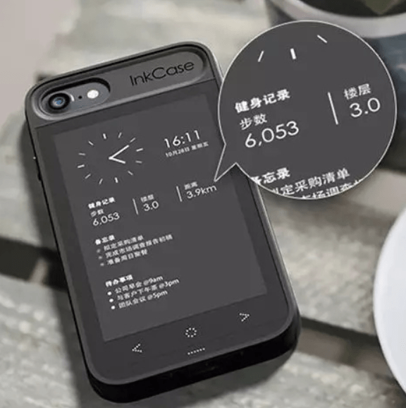
InkCase:

It’s a phone case with an ink display screen on the back of the phone. It displays all the customs information the user wants on the page.

Siri:

The AI assistant we would like to apply on our non-gaming interface, it simplifies how the user gets the information.

Our Plan:

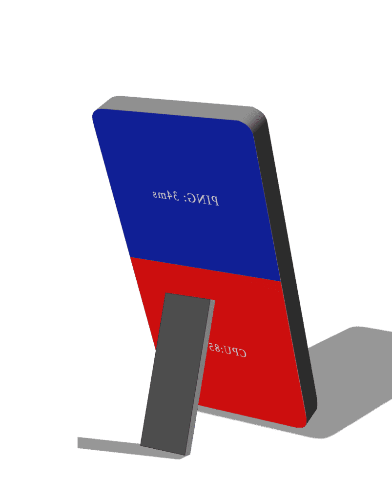
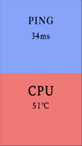
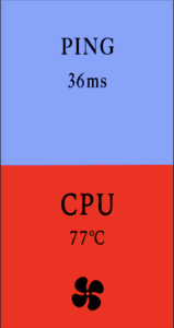
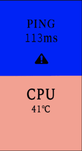
We decide to update the computer information in an abstract way of using colors to indicate the level of the figures. I build this prototype in photoshop, for this interface, the upper part is to test the PING level, and the bottom is for measuring CPU temperature. Both sections will not only indicate values with numbers in the middle but also constantly changing colors. We plan to build another interface for the user to place all the essential information he/she wants, that page can be customized and displayed when the user isn’t in gaming mode. This design is easy and direct for the user to apply beside their computers.

Process:

We think about what can be a good indicator of the level changes. Originally, we designed it to change from blue to red, the redder it gets, the laggier your network is, or the higher your CPU temperature is. However, when I applied this idea while making the changing of the light, there were two routes for this to perform: one is color changing in the RGB interface, which includes a variety of colors. From blur to red, there are so many different colors in the middle, including some greenish, pinkish or bluish colors, the user can never tell which one is closer to red, not mentioning that it can be a huge distraction for gamers. The second option seems to be better which is changing color on the HSL. I make the blue fade to white first and slowly turn red. When showing this to my partner, she told me that it is too much information for our original goal was to make the information easy for gamers to comprehend, also, if we make both the PING level and the CPU temperature indicators alter the same way, the gamer might get confused. Therefore, we decided to indicate the PING level with the color blue and the CPU temperature color red. They both start from a light color and slowly get darker as the indexes increase.

We also added two additional functions to this interface. We set a value for PING level and another value for CPU temperature, when the index reaches the value for PING, the alert sign within the area lights up as well as the alarm goes off, they both disappear as the index goes below the value. For CPU temperature, as the level goes beyond the value (75 degree Celsius in our case), the cooling fan symbol within the red area lights up, if WatchPad is connected to an external cooling fan, it can automatically switch on the fan to cool the temperature down, it then switches it off when the temperature goes below 75 degree Celsius.

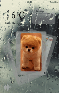
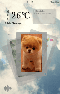
For the non-gaming interface, the user is able to design their interfaces, but the default page we design includes information on date, time, weather, reminder, photos, and also an AI assistant. The interface is clean and eye-pleasing, the background changes as the weather changes. The following are the designs I made for this interface.

Demonstration Video:

For the demonstration of our product, Echo brought her gaming laptop and the external cooling fan. We placed our WatchPad prototype next to the computer screen and launched Overwatch. We demonstrated the changing of PING and CPU temperature. With Echo quitting the game, we demonstrated the non-gaming mode’s interface and the AI function.

Future Improvement & Reflection:

We received lots of useful suggestions after presenting our project to the class. A major one is an alarm that goes off when the PING level reaches a certain value. In gaming, PING level can be reflected through game performance since the frame rate comes down when the networking is lagging, therefore it is not necessary for the user to receive an alarm on how high that level is. PING level should mainly serve as a sign that examines if there is a network error when the user finds out that the game is lagging.

Another amazing advise we received was the iteration for this project. Would it be better if we design this system into a phone app? That’d be easier for the user to use and many functions are already within the user’s phone. Also, the user can be informed only when the level reaches that certain value since he/she doesn’t need to know the exact value when it’s in the normal range.

The final improvement I think should be applied is if there’s a way to improve the network environment instead of just showing the PING level. The CPU temperature already has a solution which is switching on the external cooling fan, but so far we haven’t had a perfect solution for network speed. Echo and I thought about launching the net speed accelerator automatically, but that would increase the CPU temperature for it means launching another software on your gaming computer. We still need a better solution to this problem.