Six Hats Workshop Reflection – Zeyao Li

This work is about persuasive design. Our target user is Eric, one of the IMA professor. His problem is that he couldn’t find a certain time to do meditation yet he knew meditation would be helpful for him. Leon assigned the whole class 5 groups. Each group represents one color of hats. In my opinion, it stands for different responsibilities for solving the design problem. The group that I had was a green hat, which requires our creative mind to do ideation. My work was to think about as many ideas as possible in a short amount of time. It was quite fun to just randomly come up with ideas. However, in Eric’s case, it was really hard to help him with that. Based on the chart that we talked about in class, finding a time to do meditation has a high ability and a high motivation since he wanted to do that. So what we needed to do was to find the trigger for him to execute the work. I proposed that he needed to find professional help for that. If he goes to see a therapist, it may force him to do meditation. 

I think the workshop would be better if we had more times. Because there are color groups who have to summarize our ideas and pick one of the best while we are brainstorming. So it looked a little bit rush 🙂
Final Project Proposal – Zeyao Li – Unconventional Design

Final Project Proposal:

 Framework: Speculative Design

Agenda: The Discursive Agenda

Goals: Communication

For my final project, I am designing a future Tinder/Grindr Chatbot to find you a perfect lover or a perfect hookup.  The way we find our partner or other intimate relationship has been changed in the past 5 years. I am wondering how will the rise of AI and voice technology change the way we see the modern relationship? The TinderBot will be a speculative design. It happens in 20 years when people are used to talking to AI bot and letting it handle things in daily life. People are tired of swiping, an old interaction to find their matches. They are even tired of looking at their phone screen. Thus, Tinder and Grindr published their new product, tinderbot/grindrbot. They can help you find your perfect one based on your conversation with them. How do you want them to look like? What is the size? Where does he/she live at? Everything that you have is exposed to the Internet and used by the bot. Does it boost the efficiency of finding your boo or does it make the modern love worse? 

Inspired by:  http://nicole.pizza/true-love-tinder-robot 

Tiny Habit – Zeyao Li

Tiny Habit:

From my observation that I had in the past few days, I realized that I always woke up around 7 something then I played my phone and fell back to sleep until 9-ish, which is not a healthy habit. I keep wondering why can’t I just get off my bed straightforwardly after the first time I wake up. 

Design System:

I first analyzed my tiny habit by using the chart that is provided in class. In terms of hard to get off my bed, I think it belongs to high ability and mid-motivation. Because the floor is right next to me, and the indoor temperature now is not bad, since it’s almost summer. Thus, theoretically, there should not be a problem for me to just get off. So, my design system is to help me increase my motivation for waking up. 

  1. Buy a good breakfast the night before
    Who doesn’t like some good food right after waking up from a nice sleep. A decent breakfast will help me increase my motivation. Because I know there will be food that is reachable. 
  2. Make a detail to-do list
    The second thing is to have a detailed to-do list before I go to bed. Making a to-do list can help me sort out the thing that I need to do the next day, and make me become clear about my schedule when I wake up. In this case, I will be more willing to wake up.
  3. Always leave a little bit of work for the morning
    The third one that I developed was to leave a bit of work for the next day to do. If I have the work that I need to submit on the next day, I will have the force to wake up and do it. Also it can help me sleep early since there will be less work.

Reading Response 2 – Zeyao Li

Since we already talked about thoughtless acts, affordance, and constraints in class, the reading enhanced my understanding of these things in design thinking. In terms of “Thoughtless Acts”, firstly I like how she defines thoughtless acts — actions, prompted by our relationship with the world, that seem automatic or intuitive. It points out the core of the term. So when I did my assignment, I looked for the similar activities that the author described. What I also learned from this article is that thoughtless acts do not just limit to actions but also contains feelings. When people react to something unconsciously, the feeling is also a thoughtless act. The author also mentions something quite interesting is that she keeps a diary of things she is doing, such as using a washing machine. I think it is a good way to capture the thoughtless acts when people start paying attention to it. She at the end talks about the differences between a scientist and a designer, which I totally agree with. As a designer, we need to have empathy for things. When we design things, especially for human-centered things, we can’t be objective and totally logical about everything. What we have to do is to feel about the user and put ourselves in their shoes. 

When we talk about affordances and constraints, we usually link it to us- human beings and our relationship to the rest of the world. In the reading, the author distinguishes the differences of perceived affordances between the physical world and screen-based world. This is something novel to me. People only have perceived affordances on their screen-based devices. That makes me realize the importance of UX design. UX designer has to anticipate users’ perceived affordances when they open the app. It becomes the user flow and the user journey that people usually talk about. From my perspective, the logical constraints are more like the guideline for the ux design. It helps the user to navigate the app or websites in their natural way. 

Unconventional Design – Thoughtless Act – Zeyao Li

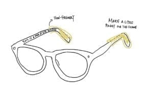
  1. I took this picture when I was on the train back to Beijing. The guy who sat next to me took a nap on the train, and he did this with his eyeglasses. Why did he naturally put his eyeglasses on his collar? Do eyeglasses design for this, or this is the user’s thoughtless act?  When I take down the glasses, I also put my frame on the collar. I think the way that frame looks like make people do this. It looks like something that can stick into somewhere, and the closest place where I can put my frame will be the collar (also not easy to break it). While this is a good thoughtless act, sometimes I think the glasses make my skin slightly uncomfortable. My solution to this will be to have a skin-friendly protector/pocket for the end of the frame. Thus when people put their glasses on the collar, it will make our skin feel better.
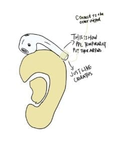
  2. The second thoughtless act was also found on the train. Similar to the first one, this one is also about how people place stuff temporarily. I noticed that an AirPods user took one side’s earbud off and put it on his ear, just like a cigarette. Since the original AirPods design force people to put the earbud into the charging case after using it, it does not feel convenient if someone wants to just take it off for a minute and put it back. Thus, people come up with a thoughtless act which puts the earbud on their ears. However, the earbud might fall on the ground. So I come up with a rubber connector that the user can put it at the end of the earbud and connect to the other side. It can prevent the earbud from falling. 
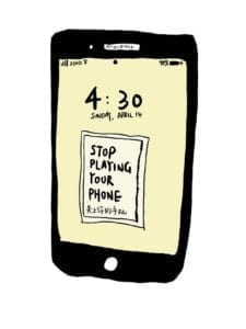
  3. Check my phone for no reason. The last thoughtless act is from me. I realized that I always press the home button and just open it without any intention. It became a thoughtless act since I switched my phone to iPhone around 8 years ago. I know it is kind of a bad habit but I sometimes just can’t control myself from doing this. What I think of to design a solution for this is that I can change my background wallpaper to something alarming. Once I opened my phone, the wallpaper will remind me of not using it and putting it back.