Week6: Response to “Homecoming, Season One: Episode 1” (Cecilia Cai)

It was not until I listened to this episode for the second time was I able to understand the outline of the story clearly. I find it interesting to pay special attention to the characters’ tones and intonation, which gives out the emotion states as well as the personalities of the characters. I especially enjoy listening to the “after show” interview with the CEO of the company, from which I gained many valuable insights. 

The episode begins with a women, named Heidi, serving food in a canteen or restaurant. Then at some point when interrupted by a man, and it switches to another scene. There, she was having a conversation with another man, named Walter, introducing to him the program schedules and arrangements, and asking him about his settlement. I learn that the woman was a key researcher at Homecoming, supervising and conducting the program. And the man she had the conversation with was a homecoming soldier who just got out of the military and newly attended the program.

Without any context, I can tell immediately that the first conversation happens in a restaurant/canteen, while the second takes place in an office, since besides the talking, the background noises serves as key element in creating the settings. During the second conversation, the background sounds are opening the doors, turning the papers, getting and putting stuffs, and etc., which are all common noises surrounding us when we are working or studying in front of a desk. It is interesting that, we are so familiar with these sounds that we hardly pay any attention to them in our real life. When listen to stories in the form of podcast, however, we can easily recognize these sounds and relate to the scenes in our daily life. These background voices also have the effect of rendering the atmosphere. As in a later piece of the conversation, where Heidi is meeting Walter for the second time and learning about his recent life, they were interrupted by the sounds of some animals outside. This adds to my feeling that both of the characters are quite embarrassed and uncomfortable during the conversation, having different worries and hiding parts of themselves from each other.

The voices of the characters shows not only emotions, but also the personalities and social status of the characters. For instance, from Heidi’s conversation with Walter, I sense that she is very nice, patient, and caring, while Walter is a little bit nervous, trying to comfort himself, but still holds many concerns and uneasiness. I remember when Heidi asks about how’s things going, Walter answers “everything’s … fine”, but with a long pause and a dragging voices, which shows that he was hesitating to give out the answer. Heidi also senses this minor emotion changes and thus goes on asking about the problems he faces. The relationships between the characters are also vividly shown in their way of talking. As pointed out in the after-show interview, at the beginning of the scene where Heidi is having the phone call with her boss, and he was on his way to catch his flight. His voice keeps dropping in and out of the conversation, making Heidi hesitating on whether to speak. Reflecting back on our real-life experiences, when we are on the phone with someone, usually of a higher social status, and they are clearly onto some other things, talking to you on the phone while occasionally speaking to others in his surroundings, making you confused about his actual audiences when he speaks. You will normally feel nervous at such setting, especially when the other person is your boss, for fear that your call interrupts his business. This relationship is further confirmed in the audio drama, where Heidi is being very patience and cautious when talking to her boss, and even if she is interrupted and censured a couple of times during the conversation, she still shows high respect to the man’s words. And even though her proposal was denied, all I can sense from her intonation was a feeling of helplessness and disappointment. Such effect of showing interpersonal relationships is actually being exaggerated when removing all other mediums except for the audio. I find myself more focused and more sensitive to the change of emotions in people’s words when listening to the podcast.

Moving on to the audio medium, it is interesting to consider how it creates and presents a multi-dimensional scene, fitting into the real-life setting. It is able to deliver the message and contents clearly, and even without seeing it happening, we can tell the changes of the settings and characters. Audio is actually familiar to most of us. Although audio is not as popular a medium for entertainment as video such as TV series or movies, or texts such as books, or even image such as photos and comics, it is taking up an important part of our life. Making phone calls, for example, is somehow similar to listening to a podcast, for you are essentially getting others’ stories only through their voices during calls. It is quite inspiring to listen to a podcast and reflect on the message of the audio medium.

Comic Project Documentation (Cecilia Cai)

http://imanas.shanghai.nyu.edu/~zc1151/commLab/ComicProject/view.html

The above is the link to our interactive comic — Views of Shanghai.

For this project, I worked with Alina. She is a good drawer while I’m better at coding, so I mainly take charge of the coding part while she did for most of the drawings. We did both challenge our weaknesses, I gathered the materials for the drawings, and tried some editing on the images, while Alina did some explorations on coding.

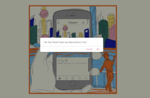
We had the idea of depicting a guy going on sightseeing in Shanghai, but was on his phone checking social media (instagram) all the time, without paying attention to the views. It was not until he was interrupted by his accompanying friend at the bund who asked him to help take a photo did he realize that the view was pretty nice. He then decided to travel back to the sites he went earlier, and this time, he put his phone away so that he can enjoy the views more. 

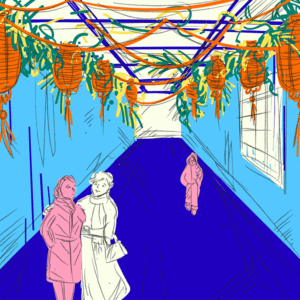
For the comics, we chose three typical sites at Shanghai, respectively the bund, the Yu Garden, and the Tianzi Fang.  After we gathered the images of those sites, Alina drew the them into a comic style. We also have our original drawings of the instagram contents, the phone frame,  and the scene of the man asking for photos. 

Here are the images we have for the views of the sites:

For the interactivity, we originally thought about having two arrows to click through the pages. However, as we have the part of the character browsing through the instagram posts on his phone, we want to explore if we can implement the scrolling feature. I mainly worked on the coding part. To get the screen scrolling, I separated the layers for the phone frame, the phone screen, and the contents to display on then screen, and then set the overflow for the phoneScreen div to be scroll. However, I could not figure out the way to track the scrolling position. I went to Cindy for help, who introduced me the scrollTop argument. I was then able to use this inside the function to track the scrolling position, and change the background images (of the different sites the character went) according to the current scrolling position. The scrolling is for the first half part of our comic, and for the second part, we realized the interactive effect with clicking. 

The second part of our comic was the character visiting back. I introduced a function for that part to remove the phone frame and screen, and display only the background image. We decided to use arrow for this part, allowing users to click through the images. For the functions for clicking interactions, I created an array of image url and a variable indicating the index. Each time the left/right arrow is clicked, it decreases or add the index variable by one, calling into the array with the corresponding url, and presenting the image of the view.

As for connecting the two parts, we make use of the confirm function and use a pop-up message to indicate the dialogue.

Another thing I worked on is the initial state of the comic. We designed a title page, adding a button to the phone screen with javascript. Once the button is clicked, it prompts an input alert, asking for the user’s name. We created this feature because we want to create a sense of individuality for the user. Later in the comic, when it reaches the point where the character is asked by his friend for a photo, the confirm message will call the user by the name inputted before. Following the input prompt, an alert message bumps up, informing the user to scroll the screen for more contents. At the same time, the function in javascript creates a phone content element and adds the social media (instagram) page to the phone screen, and initializes relevant functions.

A major problem we ran into when working on the javascript is the control of time of changing an image or popping up an element using setTimeOut function, especially when  I use it for changing pages. I found the measure of time varies among different browsers, and it is hard to predict how long a user would spend on the current page. I did several tests and modify the time period for numbers of times, and did manage to lower the influence of the time on the interactive effect to minimum. I also tried combine the use of setTimeOut with conditions, so that it won’t be too vulnerable, and the page won’t crash even if a user scroll/click through too fast or too slow. 

Personally, I explored many functions and features of JavaScript during the working process. I have never worked on styling and tracking a scrolling, setting time period, or adding/removing element to the HTML using JavaScript. I also gained a deeper understanding on interactivity, thinking more about how those interactions can be added to our original design so that they make sense. In addition, I learned more about comic as a medium itself. I gained many insights on how static comics interact with their audiences, how they indicate the flow of time and present motions.

Week4: JavaScript conditional exercise (Cecilia Cai)

http://imanas.shanghai.nyu.edu/~zc1151/commLab/jsconditional/index.html

The above link is what I made for the javaScript exercise on conditional statement. To build this animation, I first organize the HTML page, arranging the layout of the button and the three pictures. The trick is the opacity of each picture. I set the initial state to be the first picture with no transparency by setting its opacity to be 1, and the other two with high transparency by setting their opacity to be 0.1. I then established two functions in the javaScript document, one is for changing opacity from 0.1 to 1 (called “incOpt()”), the other is to change from 1 to 0.1 (called “decOpt()”). To make the code cleaner, I made these two functions to accept an Id parameter, so I can call them multiple times in my later codes without rewriting the functions. I then set up a variable called stated to keep track of the current state of the image, and set its initial value to be 0, indicating that now it’s the first image with the opacity of 1. Each time the button is clicked, another function called “changeOpc()” is called, which include several conditional judgements. If the state is 0, it calls the function “decOpt()” and pass the Id “walking0” to it, then it calls “incOpt()” and pass the Id “walking1” to it. After these two statement, it adds one to the state so that the current position is updated to the second image. The same is done for other states. To make it a loop, when the state reach 2, I set the state back to 0 instead of adding 1 to it. 

Week3: Cat JavaScript Exercise (Cecilia Cai)

http://imanas.shanghai.nyu.edu/~zc1151/commLab/week3/index.html

Here is the link to the page I made with the two pictures of the cat. I found an additional picture of cat on Google and set it as the default picture. At the top, I set three buttons, with respective functions of: turning left, turning right, and changing captions. At the bottom is a text box where the captions will be shown.

To implement the function of turning left or right, I firstly assigned an id to the image tag. In the javascript document, I call the document.getDocumentById function and change its binding url to be the image of cat facing left or right. I also change the caption that is bind with the image, so that when you click on the “Boobie left” or “Boobie right” button, not only does the image change to the cat facing left or right, but the caption below change to different ones.

For the third button, changing caption, I find it interesting if I can randomly change the captions by clicking the button for several times. In the JavaScript document, I created a list with several phrases, and using a scaled Math.random() function to decide which one of the phrase to present on the screen. I learned about the Math.random function and the Math.floor function from google. When clicking on the changing caption button, the random function will bump a random choice from the number range and check the list of phrases for the one with corresponding index, and assign it to be the content of HTML through the document.getDocumentById.innerHTML function. 

Lastly, I added some CSS to format the web page and styled the buttons and text box.

During the process, I ran into problems with setting font-weights and aligning items. With Professor Ann’s help, I was able to figure out that the alignment of the item might be influenced by the length of the containing text. If the text is too long and the size of the item is not big enough, the specific item might appear unaligned with others. For the Font-size problem, Professor Ann suggested that it might be the problem of using an unidentified font-family, and directed me to the site of Google Font-family.

Week3: Comic Idea presentation (Cecilia and Alina)

Name for our Comic:  â€śA Day Without the Phone”

Story-line:

  • The character is going on a sightseeing tour, but he is on his phone checking social media posts all the time without paying attention to the scenery. When he decided to come back and open the Didi app, preparing to call a taxi, someone else asked him if he could help them take a picture. He agreed and put down his phone, and not until then did he realize how nice the view was. It happened to be at dusk and so he decided to walk back and revisit the sites.

Comic features:

  • Single panel, first person point of view images, user clicks through
  • Panel images will originally feature views of social media and the phone with bits of nature and scenery on the outer edges behind the phone, as if the phone screen is blocking them from seeing most of the world around them
  • Time on the phone indicates the elapse of time
  • Character revisits same spots without phone blocking their view, the images should shows the scenery, but of views at dusk
  • After the character puts down their phone, utilize color to emphasize contrast and make the sunset/dusk extremely beautiful

Interactivity:

  • Perhaps try to utilize a feature that emulates a “like” button or comments on social media that the use has to click in order to proceed to the next panel to make it seem like they are participating  [onClick function]
  • User can scroll through the screen to read the social media posts, and click on the button to jump to the next page