Week 3 – Basic HTML/CSS website – Anica Yao

Here’s my link: 
http://imanas.shanghai.nyu.edu/~yy2552/Project1/index.html

Process:
Basically, I made some adjustments to my portfolio page. The style of my webpage Id like to present here is a feeling of fresh air, with blue and light red as main colors. I wrote, welcome to my stylish webpage as my title and Anicas Debut the subtitle. 

Issues occurred:

  • Float doesnt work as expected. Sometimes it’s just a mess on my page. I may have to reset everything.
  • Clear is interesting but I’m not quite sure how to use it. So I decided to drop it at last.
  • Easy to mix up Span and h1 div when changing the background color of the words.
  • Easy to mix up flex properties like justify-content: center;  align-content: center;
  • The properties of the flex cannot be used without Display: flex;
  • Still, I have no idea how to add texts on the top of the picture, so later I decided to use the hyperlink to introduce myself
  • still, I’m used to using center and background-image  in HTML pages and not sure whether they work better in the style.css page.

New things Ive learned:
– many kinds of border-style: double and dotted
– the use of opacity of image (only) in the CSS page
#idname img{}, for example, is specially targeted at some image in that id.

Conclusion:

Since Im used to focusing on designing, I should pay more attention to the codes themselves, that is, how i can make them operate properly. I need to clearly figure out how they operate and what are the exact functions of them.

Week 2 – CSS Exercise – Anica Yao

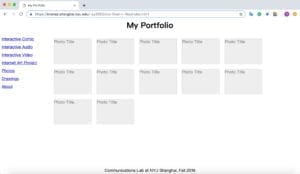
Here is the link to my portfolio page:

https://imanas.shanghai.nyu.edu/~yy2552/css-float-n-flex/index.html

The final version of the portfolio page:

Conclusion:

For me, the most difficult part is to combine the content and the navigation into one div. Before that, the content just wouldn’t go up to the top. Also, I’m still not that familiar to the functions like the margin, display, and padding. I’m going to practice them more. 

Week 2 – Response to “Understanding Comics” by McCloud – Anica Yao

I’m highly interested in the novel comic style presented by McCloud, where his words and the pictures are combined together vividly to get across to the readers what he is talking about. For instance, when he is trying to explain the function of the space in between, he compares it to the situation shown below:

What is the comic? When touched on, the comic will be a sequence of several humorous but low-class pictures. I remember that it’s been considered as indecent compared to those educational books since a very young age. But according to McCloud, content is not everything. The comic is only an abstract concept, situated between the words and the paintings. Continuity is essential to reading the comic. But the future of the comic is yet to be explored all the time.

The comic is magical. The abstraction of the object is exactly the concrete of intention. The cartoon absorbs the identity of the character. We humans can also unconsciously connect the separated comics to a whole body.

The title is called “understanding the comics”, but I feel like we are being understood by the comics. The author explains that the comics are, but much more emphases are put on why we understand the comics in a specific way.

Week 2 – Photoshop – Anica Yao

Final product:

“Hidden behind the iceberg and pouring the water”, and this is what “I” am doing right now. I put five images together.  I transformed and polished the bottom of the “glass” with the brush tool because the original picture was not complete. Also,  I put a city in it.  Splash effect was added too. Then, I used the clone stamp tool between “me” and the iceberg so that it seems like “I” am really standing behind it.  Finally, I made the glass darker by adjusting the level so that it won’t be so strange as a whole 😀

My components:

Week 2 – Response to “The Medium is the Message” by Mcluhan – Anica (Yue Yao)

The article is written in terms of communication, where it is the medium rather than the content that really counts in society. Just as stated by the author, “…the latest approach to media study considers not only the ‘content’ but the medium and the cultural metric within which the particular medium operates”(McLuhan, 153). The phrase, “The Medium is the Message”, reveals that sometimes the way we interpret the message is largely influenced by the medium, through which the message can be conveyed to us. There are lots of different ideas about this phrase. Some may think it is just the content that really counts, and others think the use of content can exert influence on the content itself. Therefore, Although some parts touching on philosophy or something got me confused a little bit, I still found McLuhan’s idea quite novel.