Week 1: Electronics & Soldering Recitation + Readings – Anica Yao

Electronics & Soldering

In the first recitation class, my partner Cathy and I learned how to solder the metal wire and build the circuits.  As a beginner, I found soldering quite fun, especially when I saw the solid solder shining a silver light. I took comm lab last semester where I became familiar with webpage design, which is also a kind of interaction between human and computer. Therefore, physical interaction using diagrams, circuits, and Arduino opens up a novel world to me, still, even though I majored in physics in my high school. After finishing soldering with the help of Prof. Godoy, we began to build the circuits. I admit it was tough for us from the very first beginning. 

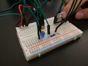
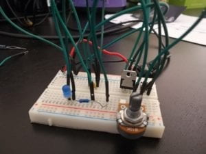
The components we used with their functions are listed below:

  • 1 * Breadboard (a device to connect electronics and to test circuit designs)
  • 1 * LM7805 Voltage Regulator ( to maintain a constant voltage level)
  • 1 * Buzzer ( like a speaker, sending the audio signal. it will beep when we successfully build the circuit)
  • 1 * Push-Button Switch (connect/disconnect the circuit)
  • 1 * Arcade Button ( well, a switch with a bigger button )
  • 1 * 220-ohm Resistor ( electrical resistance )
  • 1 * 10K ohm Resistor ( electrical resistance )
  • 1 * 10K ohm Variable Resistor (Potentiometer) ( electrical resistance with a changeable value)
  • 1 * LED ( a light that only allows current from one direction)
  • 1 * 100 nF (0.1uF) Capacitor  ( to store the electric charge, but not sure what’s the function in these circuits)
  • 1 * 12-volt power supply (supply the power)
  • 1 * Barrel Jack ( in class we use it to connect the power line and breadboard)
  • 1 * Multimeter ( It can examine the value of the current, the voltage or the resistance. in class we use it to test the value of resistance )
  • Several Jumper Cables (Hook-up Wires)
  • Circuit 1: Doorbell
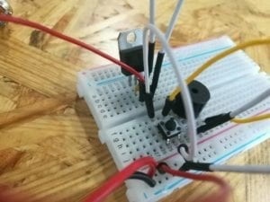
    We spent a lot of time figuring out how the breadboard works. (Yes we learned hard in class but still got stuck there in practice) We were not even used to connecting the electronics with tons of wires. With the help of one of the fellows, we made it after all. Then, we got a little bit confused about how the switch works, and how the voltage regulator works. Especially for the voltage regulator, since it has three legs, it’s difficult to separate each line of them. For the capacity, I know its function but I’m not sure why it appears in these circuits. After we read the instructions over and over again we finally got to know that the switch will connect the circuit only when it’s pressed. 
  • Circuit 2: Lamp
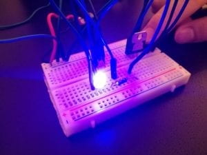
    I made up building this circuit with my partner Shawn today, for I didn’t have enough time to do it in class. The circuit is actually built on the first one and all we need to is to change the buzzer into a resistor and a LED light. it went smoothly except that we got wrong the direction of the LED light.  
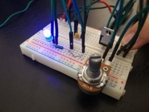
  • Circuit 3: Dimmable Lamp
    For this one, we simply added a variable resistor into the circuit. 
Reading & Video

  • Question1:
    After reading The Art of Interactive Design, in what way do you think that the circuits you built today include interactivity?

By definition, the interaction is to put two actors into the conversation where they can listen, consider and respond to each other. It seems like there’s an internal hierarchy in regard to interactions, for we, one of the actors, have various interpretations towards the interaction. 
In the circuits, the way we connect all the electronics, firstly, is to put them into conversation with each other. For example, when we press the switch button, it sends a “signal” to all the electronics. Then all the electronics are activated and began to work.  On the other hand, if we see all the electronics as a whole, we put ourselves into the conversation with the whole circuit. We give the instructions to the circuit ( like turning the variable resistor or pushing the switch button ) so that the circuit can work well. 

  • Question2: How can Interaction Design and Physical Computing be used to create Interactive Art?

In the video presented by Zach Lieberman, we are introduced to a device in which the interactive arts and high-end technology are involved. Apparently, it brings so much convenience to the disabled to convey information to the outside worlds. Usually, we know people can be engaged in a conversation through facial expression, gestures, posture, etc. But in this case, the testing user only needs to roll his eyes! It seems that Lieberman is devoted to studying the motion and how it can trigger an emotional response. In an interview with Lieberman, he argues that  â€œ… for interactive work you always want to make things that are immediately understandable and that have depth.” That’s probably his philosophy of creating the interactive arts. It can be complex itself but it should be easily understood. It’s worth exploring but it should be available to all human beings( or other things). However, Without either Interaction Design or Physical Computing we cannot successfully create interactive arts. Both ideas and technics are important. 

Big thanks to Prof. Godoy, my partner(s) and the nice fellows :)))
Week 14: Final Project Reflection – Anica Yao

Project: Tokio
Partner: Ruby  Instructor: Moon


Design:
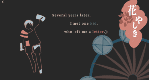
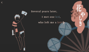
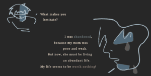
This is a story-based net art adapted from a novel ‘Tokio’ by Higashino Keigo. It tells a story that Tokio, Takumi’s son, goes on a temporal journey back to 20 years ago and helps his father uncover the truth about his family background. We want to simplify the text but amplify the art (both visual art and animation programming) so we carefully picked out 14 important scenes with its original meaning retained. It is delivered from the first-person perspective — Takumi, Tokio’s father. Every page is presented with a combination of the quote(s) and the image(s).
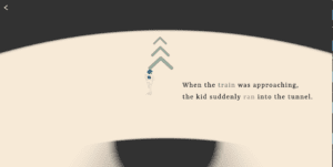
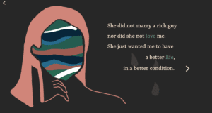
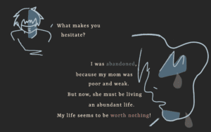
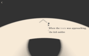
Below are the screenshots for several pages of the project:


Process:

1. Determine the topic and form: 

We worked together on the topic and the form. I always have imagined pictures in my mind when I’m reading a book. ‘Tokio’ is one of my favorite novels. Inspired by both the themes ( time travel, redemption, and circulation) we decided to take the form of storytelling. Since we didn’t really want to make it a comic style. The main idea we finally applied was “abstraction” after we asked Moon for advice. As for the story, we retained the original meanings with minimal details; As for the visual arts, we replaced the concrete objects with abstract sketching.

2. Visual arts:

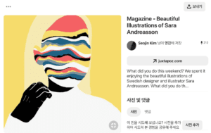
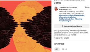
I was in charge of the visual arts. I made them with my digital panel and Adobe Photoshop. My sketching style was inspired by a series of illustrations we found in ‘Pinterest’. Inspired by Dave, we used color palettes selected from “color-hex”.
Here are 2 examples of abstract Illustrations we found on ‘Pinterest’:


Some of my ideas:
1)The conversation box: I used the irregular shape, the coarse margin and ink marks to make it more like a letter.
2)The amusement park: By organizing the layout and putting the rotating Ferris wheel I would like to enrich the audience’s visual experience.
3)Dialogue: The comparison of the size and angle of their portraits indicated the tone and mood when they walk.

3. Interaction: 

Initially, we planned to use interactions other than clicking the mouse to turn the page. But for some reason, we couldn’t direct to another page by scrolling. If I had to do it all over again I may try a whole HTML page so that scrolling can work. In this case, the potential problem may be how to scroll in a div box considering we have lots of scenes contained.
Some of my ideas behind interactions on every single page:
1) Hover over the envelope: To create a sense of mystery and let the user explore by themselves.
2) Shift between Mom and Dad: By following the mouse position the user can shift the scene anytime.

4. Coding:
We both worked on coding in this project and my charge was p5 animation. With my partner’s help, I also had a better understanding of keyframe function in CSS and addEventListener in Javascript. With Moon’s help, I also learned how to build the local server with the terminal so that I could upload the image to canvas.
Here are some of my ideas behind the animation:
1) Train and running boy: These two pages can echo with each other through two circles: One is shrinking and the other is expanding. By keeping still the main objects but moving the surroundings the scene could be more dynamic.
2) The falling newspaper: I was going to create the floating or bouncing effect but I didn’t make it due to the time limit. But it’s worth a try next time.

5. Other problems:
There are some other problems we came across during the process. For example, it seems difficult to playback the audio throughout all the pages. Also, we found some interactions are not obvious enough during the user testing.

6. Discoveries:
But along the way from proposal to the presentation, I’ve learned three important things about creating a net art:
1) It’s better to perceive the capacity or feasibility before really doing it
2) Always care about users’ experience. Any detail can make a huge difference to users’ experience.
3) Art can be achieved by abstraction/conceptualization.


Future:
Taking the criticisms I received into account, I want to make further explorations about better interactions. I want to improve my skills in javascript which I’m not much familiar with yet. I will also try to figure out how to make the audio work. I really appreciate my experience working with my partner and getting inspiration from Moon and Dave. BIG THANKS to them as well as the whole class.

W14: Final Project – Ruby & Anica

Link:
http://imanas.shanghai.nyu.edu/~sk7383/netArtProject/coding/index.html

Main Idea:
This project is based on a story adapted from ‘Tokio’ by Higashino Keigo, in which we are inspired by the theme — time travel, redemption, and circulation. Tokio, son of Takumi, goes on a temporal journey back to 20 years ago and helps his father uncover the truth about his family background. The story is told from the first-person perspective. Since it’s impossible to show all the details, we decided to select some key plots for the audience to navigate it.

Process:
As for the teamwork I’m in charge of all the visual arts and together we did the storyboard and coding. 
The basic layout in a single page contains quotes and pictures. We don’t really want it to be a series of comic pictures but something artistic. We got the inspiration from Moon and Dave that we can extract the abstract elements to show the concrete things. That’s why I choose to sketch the abstract lines and panels. The colors are also carefully selected to create a gloomy and sorrowful atmosphere. I drew all of them in Photoshop with my digital pad.
For the coding part,  I  was in charge of the p5 java mainly. For example, by shrinking the circle little by little with the train remaining still I want to create a dynamic environment where the train is coming from a tunnel. And the next page actually acts in cooperation with the last one. The circle spreads out, showing the boy is running towards. 

Post Mortem:
Somehow we haven’t figured out how to add the background music throughout all the pages. And the audio seemingly works only when there’s some interaction. If time permits, we also want to add more effects like dragging, (auto) scrolling and bouncing rather than just clicking to turn to another page. Through this project, I realize the significance of the overall style of an artwork and the word “conceptualization”, which leads us to think deeply about the way to present the art.

Big thanks to my partner Ruby, my professor Moon, and Dave 🙂

Week 13 – Final Project Proposal – Anica Yao

Final project proposal
Ruby & Anica

Concept

The idea of this project stems from a novel ‘Tokio’ by Higashino Keigo, which we are inspired by the theme–time travel, circulation, and redemption. The overall story will be based on the original plot, but it will going to be delivered by the selected quotes from the first-person perspective of Takumi. Tokio, son of Takumi, goes on a temporal journey back to 20 years ago and helps his father uncover the truth about his family background. In our life, parents are always thought to be stronger, both physically and mentally, than the child while in fact, they can be helpless as well. This storytelling witnesses a reversed role– Tokio changed the life of his father and helped him become a better human being. Although Tokio, unfortunately, died at a young age, he still appreciated what he had had in the world. Thus, besides our personal motivation, we seek the project to be as an educational fiction for both children and parents, which can also break the conventional hierarchy between children and parents. Therefore, the project will tell young people to be grateful for what they have given by the parents even if their living condition does not satisfy their wants. Similarly, our work will let parents remind the importance of self-improvement and warm attention to their child.

Sources

Two sources significant to the project are both from a Front-end Developer ‘302chanwoo’. In his work ‘Going Home’, he constructs a story of a robot who embarks on a journey way back home. Unlike typical stories, ‘Going Home’ does not have a detailed plot, but has abstract scenes that more trigger users to anticipate the future scenes. Likewise, our project also aims to establish the plot with minimal details of the story, but with diverse visual and audio effects that can function as much as texts do. Furthermore, the main medium for transmitting the story will be two-dimensional illustration and animation. This idea is originally drawn from a three-dimensional animation, which is prominently used in his other project ‘꽃, | flower’. From the work, we learned that how simple and organic form can effectively convey the emotion of each character. While those sources gave us a lot of insights, we thought the effects would be maximized if there were supporting audio elements. Therefore, our project will further attempt to adopt audios that could particularly contribute to expressing the emotions of the characters.

Production

The webpage will include quote(s) of Takumi on one side, and on the other side, illustrations or animations that match the plot will appear. The positioning of quotes and visual elements may differ from each scene so that we can maximize the legibility of users. Regarding the techniques, we will combine two-dimensional visual elements with programming. For example, first, by coding, we may create several organic forms such as ellipse and rectangles, and place the illustrations or animations, drawn either by photoshop or coding, on top of those organic shapes. In addition, we may let the user press the button for a certain amount of time, which can be used for the transition between the scenes. Once they take their hand off, the picture will zoom in, indicating the character traveling back to the past. The project will also include a few audio elements like background music during the monologue of Takumi and conversation between the characters.

Week 11 – Response to “a history of net art” – Anica

From the barely recognized “net.art”, the artist Vuk Cosic began to talk about online art and communications. With the immateriality and instantaneity of the internet, the construction of internet art is to create a community where the artists can discuss their ideas equally regardless of the countries they are in.  This community reminded me of the field trip to How museum, where I saw a quote by Joseph Beuys: “Every individual can be the artist in his or her own field”. For such a long time there are no artists involved in the internet, there came the renascence of internet art.

I didn’t really have an idea of what’s internet art even after I looked up some examples. However, this article sets me thinking about how the internet art stands out from other traditional forms of arts. Firstly, it’s web-based. It’s digital, rather than on paper. This can also be related to my EAP topic “intercultural communication”, since by creating the internet art we are actually communicating with others through science and technology. Secondly, As mentioned in the article, “it was artists, enthusiasts, and technoculture critiques trading ideas, sustaining one another’s interest through ongoing dialogue” (126), it focuses on interaction mainly constructed by HTML and javascript. That’s how it always looks so dynamic.