Midterm Project – KAMEHAMEHA!
1. Preparation Stage: Ideas, Early Attempts and Failures
The most important point that the group project enlightens is the distinction between interactive and responsive. In my group project, the “Paint Your Day” machine is more like a responsive product. It is interactive only in the sense that the machine is making different choices according to different data that the sensor gives. The user only sees the output, which means that the user cannot directly feel the process of interactivity. The level of interactivity is not high enough. And we have analyzed several projects on the Internet, basically, those projects which we consider interesting involves human interaction strongly. For example, we looked at a mini arcade game machine.
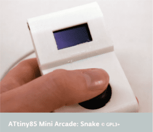
One example game on it is the retro snake. The interactivity lies in the point that once the user moves the joystick, there is an immediate change on the direction the snake is going. By doing this, the user has a strong sense that I am controlling it, and it interacts with the user.
So the most important point that my partner and I would like to address is to create something that the user can be easily and strongly involved in. By that time, the class has just finished the content about controlling a motor fan, and we consider the motor fan might be a good point to start off since the output can be directly seen and heard.
We started from the simplest point, trying to reproduce a remote control fan, and then add some extra features in it. We thought about putting an auto-mode in it, which is to adjust the fan speed according to the surrounding temperature. But we had never thought that this simple idea is such difficult to implement. We spent a whole night trying to figure out the difference between a TIP 122 and TIP 127 transistor since there wasn’t any TIP 122 transistor in stock and spent another afternoon trying to make the IR Receiver working properly. But the plan ended up because the IR Receiver keeps transmitting wrong data due to electronic noises that we cannot cancel even if we applied RC filter.
Besides the mechanical problem, we still do consider this product is too boring. So we ditched the whole plan and started to do more research. In the next stage of research, we looked at more interesting projects and reflected on the in-class projects. We reflected the mini arcade machine and the speed competition game in class and discovered that the most interesting and interactive way to create a project is to gamify it.
At this point, Joseph came up with an idea of another speed game. It uses a distance sensor and a motor fan. The machine detects hand moving speed using a distance sensor, and the faster you move your hand, the stronger the wind will be. We then tried to gamify the project by setting up barriers and rewards. We consider that the speed of the fan is not direct, or visual enough. Thus we decided we make the fan to blow away something. The easiest way is by setting a paper cup wall. In this way, we have a complete gamified interaction. We have the user providing input data, Arduino mapping the moving speed to the rotation speed of the fan and the fan blows away cups as a gamified result.
This is a product that can be played by anyone, and the result is straightforward. The intention of this project is to make the user feel that they are applying a magical, invisible power to those cups. The users can feel a strong sense of achievement through the process of destroying the cup wall. This interaction involves the user in strongly. Besides, we consider this sequence of movements is similar to the “KAMEKAMEHA” action in animation Dragonball. We therefore decided to theme this project as Dragonball cause we believe this will make our project easier to be comprehended and much more interesting for those who watched the animation before. With the idea set, we started to design and produce this product.
2. Designing
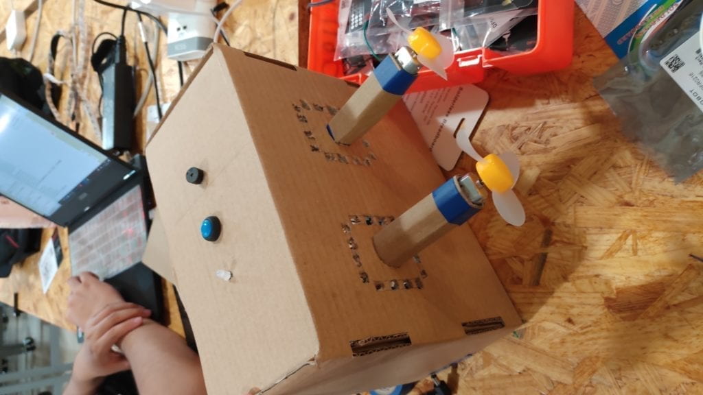
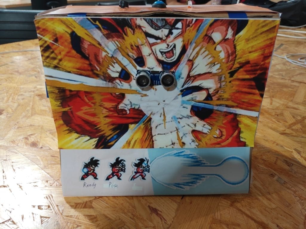
To maximize the user experience, we would like the machine to be placed in the middle of the user and the cup wall. The user pushes towards the machine, and the machine blows the cup away. This way, the user can feel that their energy is transformed in the air to the cup wall. We find a big cardboard box and decided the position of the distance sensor. (The reason we use a cardboard box is that it is easy to be modified, in case we improvise some features or some of the parts does not fit in properly. We do not need to laser cut a new one. It takes a long time and requires a small residual. )In our case, we put the sensor in the up-of-centre position, so that most of the users don’t have to bend down or reach up when doing the “KAMEHAMEHA” action. On the panel opposite, we would like to cut two slots to fit two motor fans. Using two fans can blow away more cups thus lead to a better visual effect.
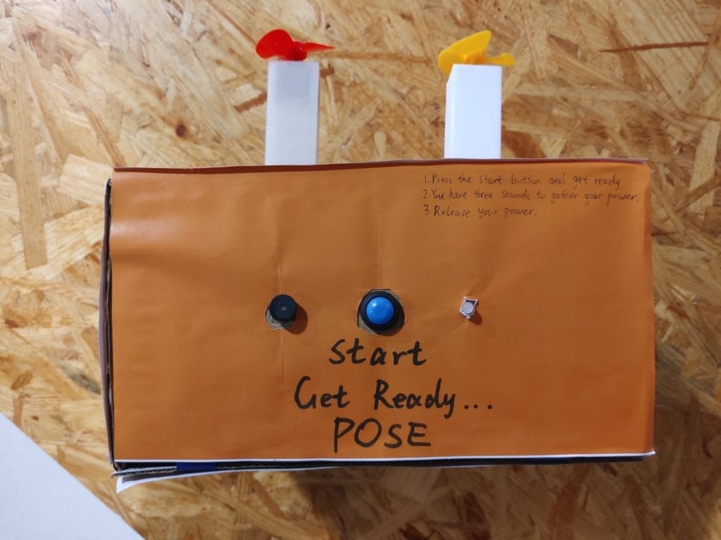
Besides, since our output is a one-time output, we need to give the user a clear instruction on when to start. So we added a start button, a led and a buzzer to indicate the countdown and start command when playing.
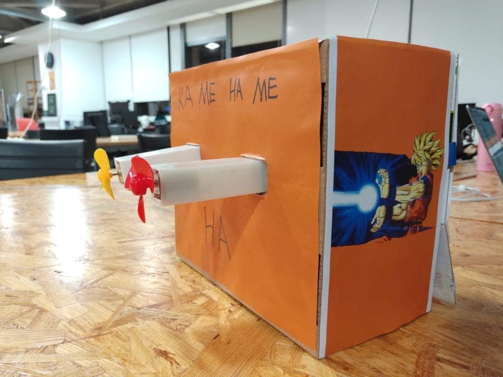
Also, we would like to decorate our project with the Dragonball themed elements. On the surface which we put sensors on, we used this picture and tried to make the sensor at the centre of Son-Goku’s energy ball. We would also want this picture as an implication of how the machine works. And on the two sides, we made two energy beam so that it looks the energy is sent from the user to the paper cups.


Decoration on the panel that the user faces Decoration on the side panel
To provide instructions to the users who have no experience with the animation, we wrote a few lines on the top panel to illustrate how should the user interact with the machine. We consider putting them on the top panel would be the most efficient way since all the users will need to push a button to start. Then these sentences are less likely to be completely ignored.

Instructions on the top panel
3. Fabrication & Production
Having learned and improved from the previous failures, the circuit building was no longer a difficulty for us. The whole circuit is functioning properly outside the cardboard. For the software part, we discovered that some times the signal from the distance sensor is nor correct, especially when the users put their hands very close to the sensor or the user is too far from the sensor. We optimized our code so that most of the correct movements can be detected. But there are still some accidental circumstances that the readings from the sensor are not correct. More testing and optimization can be made if we had more development time.
However, when we put all the components into the box, the problem comes. We put the circuit into the box and fixed the two motor fans on the front panel. And here is the test video:
In the design part, we neglected a huge factor, that is the airflow of the fan. Since we put the fan too close to the box, there simply was not enough air to blow the cups. On the contrary, since the air wasn’t flowing fast enough, the air pressure is pushing the cups in the opposite way. This was a huge setback to us since at this point, we didn’t have to much time, only about 1 day to the user test session.
To sort this problem out, we drilled some holes on the panel, but that did not help much either. The fans are still unable to blow away the cups.
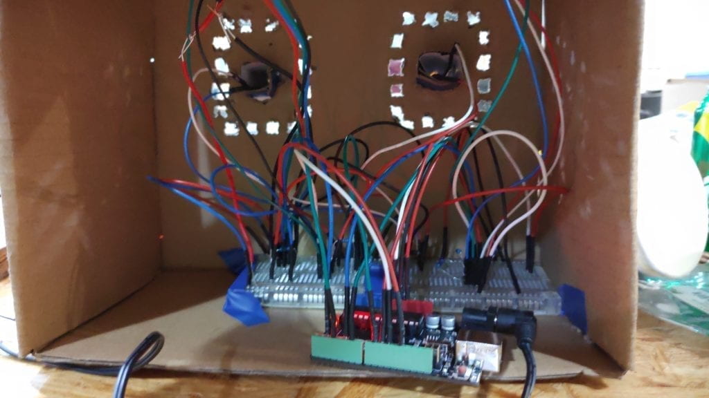
Then we decided to use two pillars to hold the motors and mount the pillar to the front panel so that the pillar can stick out to provide more air to the fan. But we did not have enough time to print 3D models before user test, so we used two cardboard pillars instead. Finally, the fans are producing enough airflow.
– User Test Session
The mechanism of the project worked well in the user test session, with only a few times that the machine didn’t work although the user did the correct movement. However, the biggest problem is that some users still can not play with this machine without our explanation. We overestimated the scale of the animation viewers, and we realized that we need to put more easy-understood instructions on it.
One of the user test cases:
– Further Improvements
First of all, is a better instruction system. We realized the fact that nobody is taking time to read anything like an operation manual. And it is difficult to describe a sequence of movements using words only. On this point, we decided to apply visual instructions. We found a picture that exactly shows the sequence of movements. And we put this picture on the panel that the user faces. In this way, they have a visual reference while preparing the movement.

Secondly, we would like to substitute the two cardboard pillars with 3D printed models. They are tougher and more beautiful to look. While in the 3D printing process, I would say that it went far beyond my expectation. We built up a model using tinkercad and firstly tried to print them on the 3D printers in the 826 Studio. A compelling situation is that, somehow, while printing, one corner of the bottom surface will rise up, causing the whole model to distort.
Then we tried to print using the printers in the FABLAB. The first model we built was not big enough that the motors didn’t fit in because of the thickness of the 3D printing material. When printing the second model that we modified, another accident happened. Somehow the printing material tangled together and material roll got stuck. It affected the movement of the printer head and thus ruined the whole model.
Having changed the materials, we started our third attempt and printed two models using two separate printers together. One of them had a problem with the distance between the printer head and the tray. The distance was too close so that print materials got stuck together. We tried to initialize the printer, which didn’t help. Finally, we had to manually adjust the bias of z-axis of the printer head to move it further away from the tray. After all, we managed to get both printers working properly.
And here are the printed pillars:
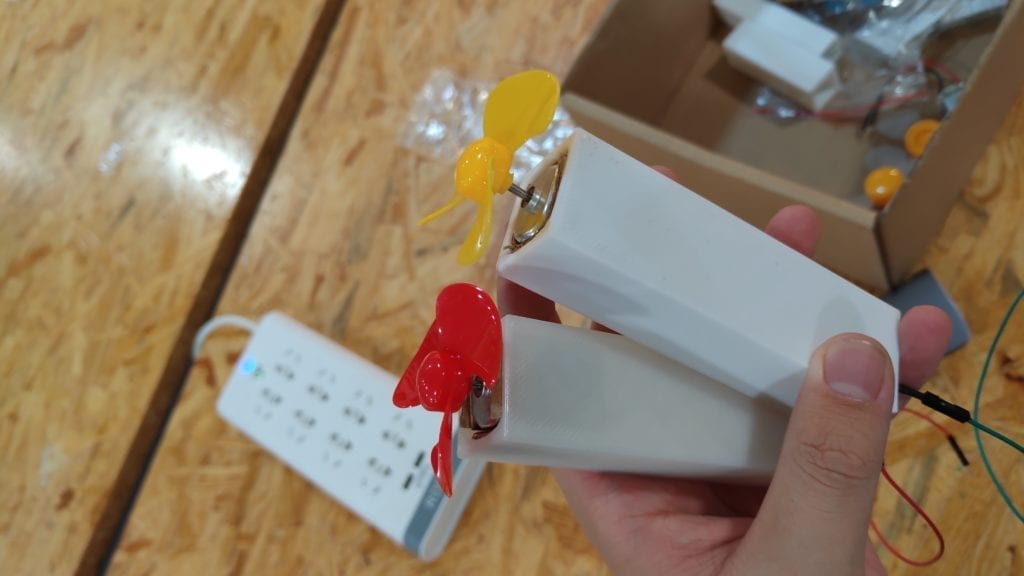
Up to this point, the main body of our project has been all set. The remaining was just some decorations. We redesigned a better side panel picture, stuck our new instruction picture on and wrapped the whole product using orange coloured paper. This marked the end of our production phase. Here is what it finally ended up look like.
4.Conclusion
Our goal was to create a gamified interactive product. I think we have done a satisfactory job. We have successfully formed interactions using this product. The users are strongly involved in. In the final presentation, though there were some users who did not look at any instructions at all, overall, the result was good. The users were competing with each other to see who can blow away more cups. I think this is an interesting and highly interactive product. If we had more time, we would build another machine which blows in the opposite way, so that two users can compete with each other at the same time. Also, we would add a speaker to it to enhance the sense of participation. Moreover, we would work harder on the instruction system so that it is easy-understood and obvious enough.
Looking back on what we succeeded and failed to do, I would say that the most important thing is to start off as a user. Only in this way will we be able to create something that the users really like. During our research phase, we all like an interactive game or other cool stuff, then why do we create an automatic fan for the users in the first place? It is interactive but boring. What we need to keep in mind is that product is always oriented at users.
As a product that is centred at game and animation, this product brings a real sense of the movements in the animation into life to the users who have previous experience with the animation before. This product can be furtherly made into a toy for the kids. As a kid, who does not want some cool stuff? Who does not want to make the clips in the animation come true? This product is bringing absolute joy and interactivity with animation to these users. Bringing joy to the users is definitely the best praise to a product, and one of the ultimate goal of interactivity itself.
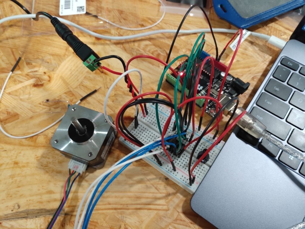
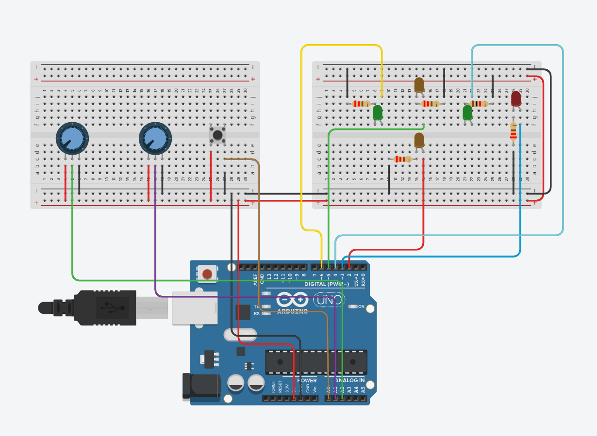
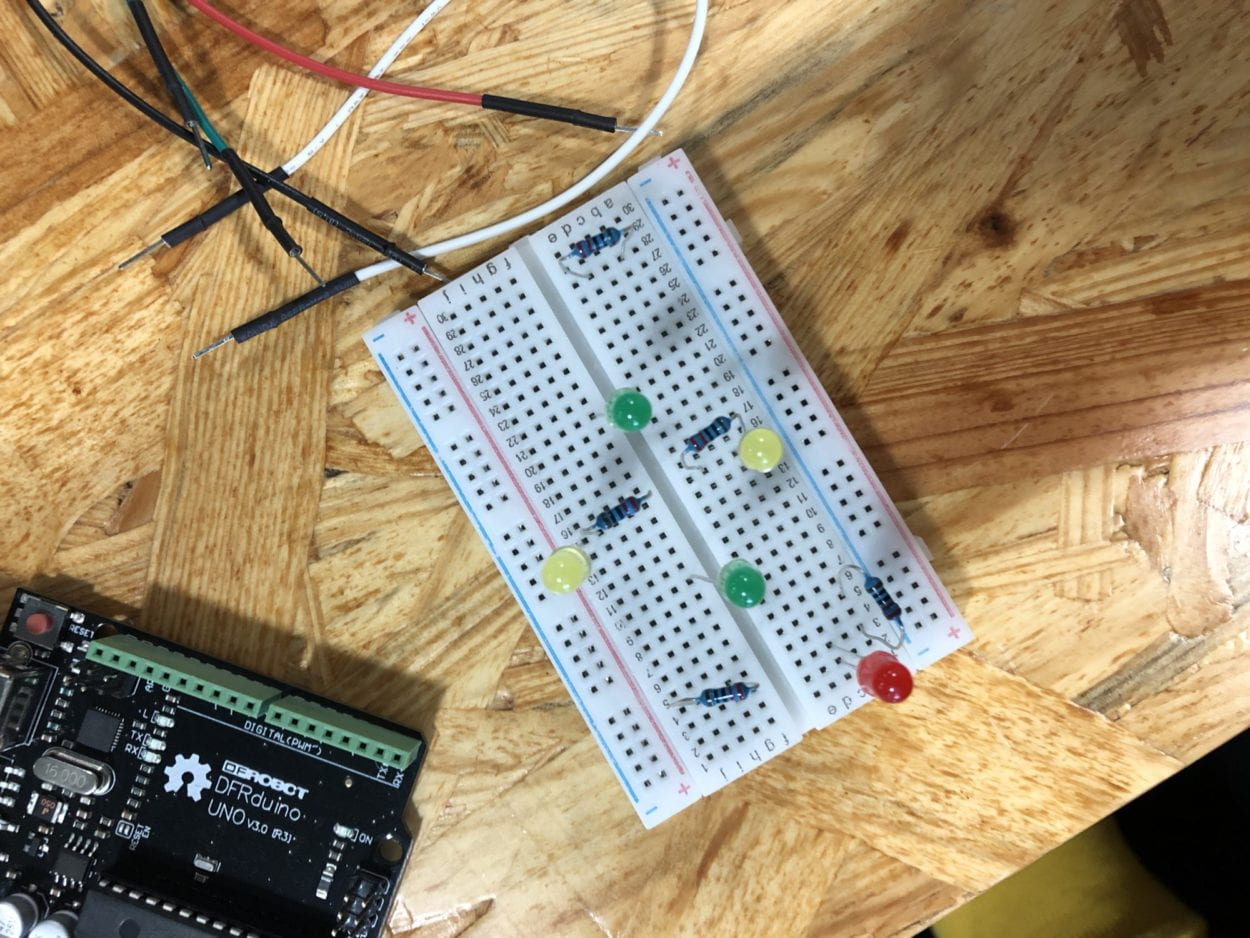
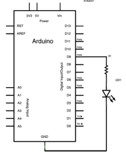 This is a straightforward circuit, which only needs to hook up the wire following the circuit diagram. In the code part, we use digitalWrite() function to switch the LED on and off at with different brightedness to create a fade effect.
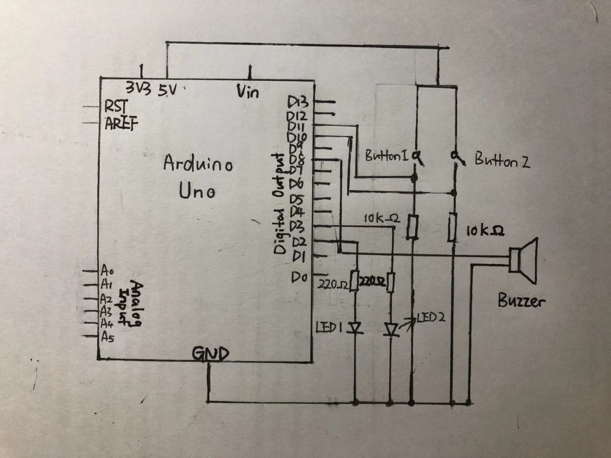
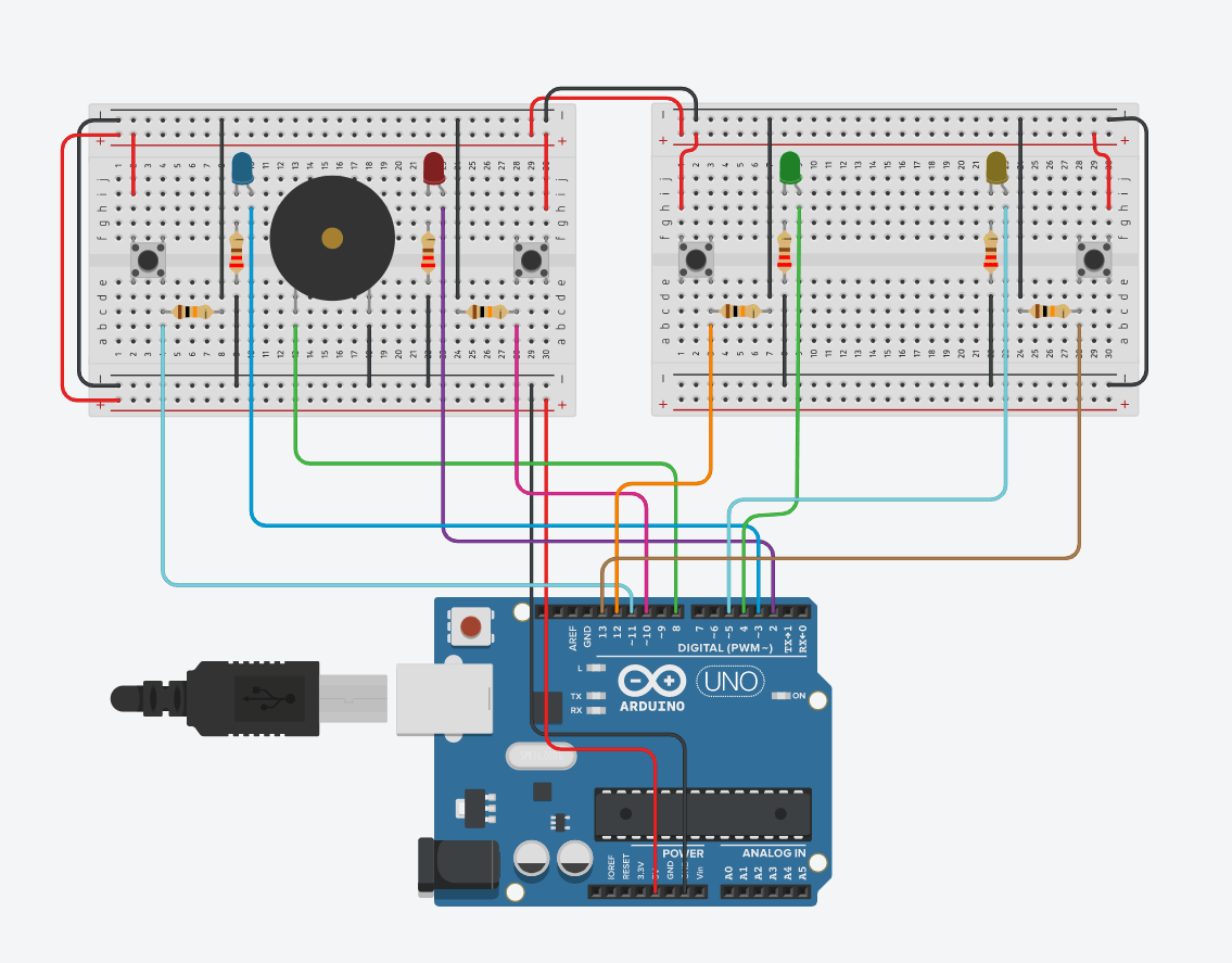
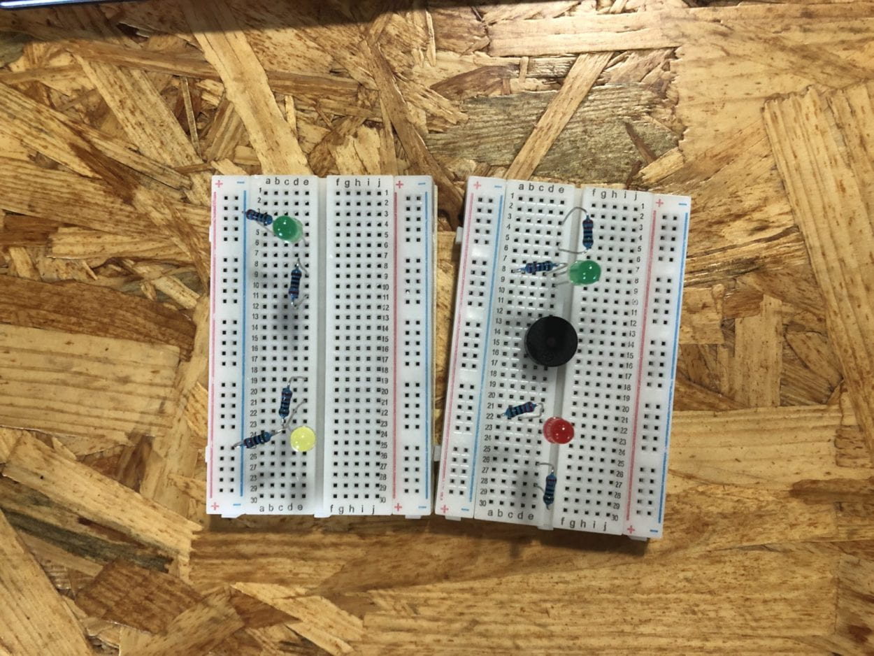 The principle is the same as circuit 3, what we are doing is basically power up another breadboard, and connect two more buttons and LEDs.