Final Project Proposal by Yifei Li

Title: Floating Keys

For this project, we want to make something like a piano keyboard with sensors connected to the computer. There will be a game in processing that plays different songs and shows which key can make the correct sound. The player should follow the hints and put his hands above the right key to play the song correctly and win the game. With the sensors, he doesn’t need to actually touch it, which we think is more interesting. This game helps people who want to get more familiar with the songs and notes, but find only practicing on the real piano for a long time could be a bit dull. For those who have never played the piano before, it can both provoke their interest and help them relax. We got the inspiration from the instrument simulator kind of games and my partner’s personal experience of practicing piano. We hope it can make the process of practicing more effective and enjoyable. 

Title: Simple Gamebox

This project will create a collection of simple games like space invaders and tic tac toe that can be played on the computer. The player can control the game by using a joystick, and the gameplay should be easy. This game has a lower requirement of computer and allows the players to play the games that normally can’t be played on the computer so that they don’t need to bring a video game console everywhere. The inspiration was the Xbox App, displayed on Windows PCs, that projects the game onto the computer’s screen. For people who want to use a controller rather than a keyboard to play games, this would be more convenient.

Title: The Maze Race(with a 4D audience experience)

We want to make a maze that exists both in reality and the screen. There will be two players, each controlling one robot to move inside the maze created in processing by the keyboard. There will also be a real maze made by 3D printing or cardboard with two physical robots inside. These two robots will move according to the key pressed, meaning they move exactly the same way as the ones inside processing. The first one to complete the maze will win. The audience can watch the race more directly in reality instead of just standing beside the computer watching the screen. Our inspiration came from the game Temple Run, and the movie The Maze Runner. The game is for people who want to win over each other and have some fun at the same time. The audience can also have a sense of participation from it. 
Recitation 07: Functions and Arrays by Yifei Li

In this recitation, we needed to use functions,  arrays and somethings else we’ve learned to make a sketch. And here’s the code and screen recording of the one I made.

Question 1:

The loop will only run once if put into setup(), but it’ll keep looping over and over again if put in draw().

Question2:

Arrays can store lists of value for later usage, and we can find and change the exact value of a parameter by using it. I think I’ll use it the same way as I use it now, but it might be more useful when doing some more complicated projects in the future.

code:

float[] x = new float[100];
float[] y = new float[100];
color[] c = new color[100];

void setup(){
size(700,700);
 background(255);

for (int i =0; i<y.length;i++ ){
 x[i]=int(random(width));
y[i]=int(random(height));
c[i]=color(int(random(200,250)),int(random(100,155)),int(random(100,150)));
}
}

void draw(){
for(int i=0;i<100;i++){
smiley(x[i],y[i],c[i]);
 
if(x[i]>width || y[i]>height){
 y[i]-= random(-3,0);
x[i]-= random(-3,0);
} else {
y[i]+= random(-3,3);
x[i]+= random(-3,3);}}
}

void smiley(float x, float y,color c) {  
  noStroke();
  fill(c); 
  circle(x,y,100);
  circle(x,y+50,20);
   fill(255);
   circle(x-20,y-25,12);
   circle(x+20,y-25,12);
   arc(x,y-5,50,50,0,PI);
  strokeWeight(5);
  stroke(c);
 line(x,y+50,x,y+200);
  }

Preparatory Research and Analysis by Yifei Li

  • The visit to the Chronus exhibition was an enjoyable experience. The installations there are combinations of both art and technology. Compared to the traditional art forms, they used more electronic components, which make them more dynamic and modern. And most of them reflect on technology and science, which is also different. The one I liked most is Beholding the Big Bang. It’ll take 13.82 billion years for the last gear to rotate once, which is the estimated age of the Universe. This kind of exhibition leaves people a deeper impression compared to traditional exhibitions who normally only show images, as it can store and present complicated information in a simpler way with modern technology.

Rechender Raum by Ralf Baecker

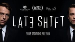
  • The first project I want to talk about is LATE SHIFT, an interactive film/adventure video game I once played. The play makes decisions throughout the game, and different decisions lead to different storylines accordingly. For me, there are two kinds of interactions inside the game. The player controls the protagonist to interact with other characters, during which he or she is also interacting with the game. It aligns with my definition of interaction in every way. The development of the storyline is changed depending on the player’s response, which will later lead to different endings. It’s a mutual process between the player and the game. Besides, the game is very interesting and the plot is overall well-made. This kind of game is a combination of game and film, both playable and of ornamental value.

The second project is ICEBERG, an interactive installation that tells the story of an iceberg. When people walk through the tunnel, the light will be turned on, and the music will be changed to show that human activity melts the iceberg. The idea of global warming and environmental protection that it tries to express is of great importance, and the lights and music of the installation are very beautiful as well. However, it is less successful in interaction. It only shows a low level of interaction by letting notes and light travel from end to end of the musical corridor, following the visitor. It tells the story and responds to the entry of the visitor, but the response might be a bit weak. It reminds me that the concept of the project should be creative and can relate to something that is of contemporary importance.

  • During the group project, I defined interaction as a sort of cyclical and mutual process based on Crawford’s metaphor of conversation and the idea of “input, output, and processing” from Physical Computing. And I still stick to the definition.

In my opinion, to be a successful interactive experience, it should consist of three parts. First, it needs to be interactive, being able to respond to the “input,” but to be successful, it should respond in a more intellectual and complicated way, and make the user feel really engaged. Instead of only using image or sound, it can be a combination of both or even more forms of expression, providing the user with a multi-sensory experience. Second, the concept of the installation should have some meaning. It can be thought-provoking, telling people something that is of contemporary importance. Or it can be a game, bringing the user pleasure and entertainment. Third, the process of the interaction should be interesting, creative and visually pleasing as well. Both the way of interaction and the appearance should be well-designed.

Works Cited

Crawford, “What Exactly is Interactivity,” The Art of Interactive Design,  pp. 1-5.

Igoe and O’Sullivan, “Introduction,” Physical Computing, pp. 1-4 

Recitation 06: Processing Animation by Yifei Li

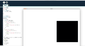
For this recitation, I made something different from the last one. I created a square, which can move around the canvas based on the keyboard’s arrow key input. And once it reaches the edges, the background will turn red, and it can’t pass.

Homework

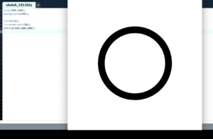
Step 1: This one was easy. I only needed to create a circle at the center of the canvas.

Step 2: I was stuck here for a while because I could only make it contract for once and it continued to expand. After searching I realized I can use a variable to represent different situations, like when to contract, when to expand.

Step 3: This one took me a while as well. I first tried random, but it didn’t work well. The color changed so suddenly. So later I used the same method in step2  to change the HSB value to make the color change smoothly. From this, I learned something about colorMode(HSB), which is hue(0-360), saturation(0-100), and brightness(0-100). It changes the color quite differently from RGB.

Step4: This step was relatively easy as I had used the keyboard code in the recitation, so I just copied it and made a few small changes.

From the homework and the recitation, I think some interesting functions I used are if&else statement (they are super helpful!), HSB colorMode, keyCode. I’m also more familiar with Processing basics.

Halloween stay away machine – Yifei Li – Eric

In the previous research, I found that interaction should be a mutual process that one responds to the action of another. No matter the process is only one cycle or more, nor who the initiator is. It requires the participation of at least two actors.  In all the projects I’ve researched, I think the response from the machine is extremely important, for it shows people that the machine has received the information and is responding to it. 

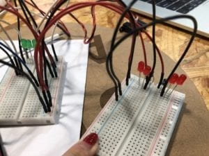
So when we first started to design our project, we decided to build a machine that uses a sensor to detect people’s approach and then reacts to it. It would send the message that they should stay away from it by lighting up the red lights when they get closer, and lighting up the green lights when they are far enough. However, we later found this device was too simple and required more improvement during the User Testing Session. We got a bunch of valuable advice and questions, such as LED was too unobvious, we should add something to make it more complicated, under what circumstances would it be used, what purpose it serves. It made us realized where we could still improve and where the problems lied, so we reflected on the original version and did a lot of adjustments after that session. Since Halloween is coming, we decided to make it a special device for this festival. It is a fun and easy-to-use device intended for kids to celebrate Halloween and bring more horror vibe. All you need to do is to place it somewhere that people would walk past.

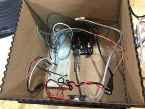
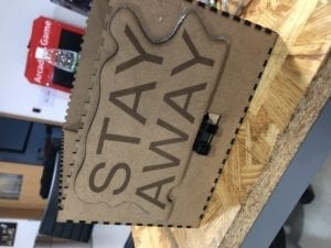
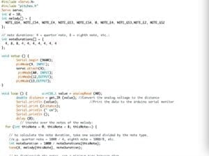
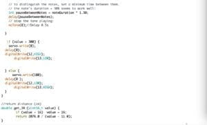
We printed a scary image of a clown and attached it to a servo motor, so it can pop up when people come closer and surprise them. The image is black and white instead of full-color, as we thought it might be scarier this way. We also added a player to play strange music to make it more creepy and draw people’s attention. We kept the LEDs stuck to both sides of the box and they served the same purpose. The code was changed accordingly. We used laser cut to make the wooden box and the big stay-away sign and put all the wires and breadboard inside the box to make the device look neater. We didn’t choose the transparent one because people could still see all the wires and they might find the clown before it pops out if the box was transparent.

the original versionthe original version

In our expectation, the device using the sign and the music to attract people to come closer, and when people come, the device responds by popping out the clown. So the device is the initiator, sending out information, and people receive it and react. Then the device processes it by collecting data from the sensor and responds to it. It is a cyclical and mutual process. We stuck the sign onto the box to make its purpose obvious—stay away from it, but with the creepy music, the sign may have an opposite effect. Though people are told to stay away, they may be attracted by the sound, and their curiosity will lead them closer to the device. Also, some people tend to do what they are told not to, so they may still go closer to see despite the warning. When the sensor detects they getting closer, the clown will pop out and people will be surprised and scared.

Our goal was to build a device that can interact with people by creating a process that happened between the device and people, and I think this device has achieved it. It aligns with the definition because it can create such a process—it in a way asks people to come closer and then responds to people’s approach. I’m proud of what we build. Though during the presentation it didn’t work well, it reacted slowlier and was less sensitive than the last time we tested it. So the user was a little confused.  If given more time, we want to add more details to it. Adding different sounds according to the changes of the distance and decorations would make it better. If the clown can pop out faster and more suddenly, it would be scarier.

From this experience, I’ve found that user experience is extremely helpful and important. It helps you to know your defects and how you can improve them. When doing something, we should take users’ opinions into consideration. And cooperation is essential too. This project is a combination of both of our efforts. I’ve learned that even though we might not do well for the first time, we can keep improving it till the last minute.