Final Project Essay——Yixuan Liu

Our project’s name is “A Melody Interactive Installation”.

We intend to create a project that has the flowers as the carriers. When users interact with flowers, then music will be played. When music is playing, we will edit the certain code in the processing so that users will have both vocal and visual experience. The focus of this project, from my perspective, is the sound part. We plan to use the traditional Chinese chimes which are also called ‘Bian Zhong.” In order to match the collective identities that bianzhong has, we will make the water lilies to carry the sound devices.  In order to create more fun, I hope that we can add more contemporary elements, hence, I decide to add some animal sounds, such as roar. This will be a hidden treasure in this project. However, this idea is still under-discussed.

For the plan to finish our project, we plan to collect materials we need this week. So we can start doing the handwork next week. If the plan goes as we expected, we will start working on the code by the end of next week. We hope for the final project, we can be able to finish it earlier so that there is more time for us to fix the non-satisfying part of it.

I and my partner are not originally planning to elaborate with each other. We did our research separately, however, we both were interested in the music and sound. The project called Akousmaflore that I found about music and plant is very similar to the one that my partner found. We both want to work on a project which combines the art of the sound with some natural elements. After all the research and preparation, I think the two-way communication that i have been looking for should be more specific. Hence, I replace the other part of the communicator with the carriers of natural, zoetic, or at least something that is connected with living beings. This is why we pick animal sounds and chimes as the final embodiment of our project. Since for animal sounds, it is easy to trigger the imaginary two-way communication process for users. Instead of using electronic sound like the buzzer, we choose chimes which have strong historical characteristic and specific collective value. This is also something that has its own life and is able to share the collective memory with. I hope that our project can create a circumstance which let users feel a specific atmosphere. I hope that the interaction of our project can include the atmosphere that it creates. The symbols that we insert in this project will have a different influence on people who are familiar with this traditional Chinese instrument and people who are not. By playing with this, I hope that people can have another way to have a little bit of taste of Chinese music, and this will be the further steps that we plan to take.  

Preparatory Research and Analysis–Yixuan Liu

In the first group project of this semester, I develop the idea that there should be a degree of interaction for different projects. Hence, I start thinking of all projects according to a certain ratio, instead of simply whether deciding whether they are interactive or not. The second theory that I develop is that the two-way process of communication during the interaction should be considered as a key concept. After almost two months since I finished my group project, now my definition of interaction has developed more comprehensive compared with two months before. I realize that it is different between let people feel simply interested and let people feel inspired. We can more easily to create interesting projects, but it is always harder to create some inspiring and thoughtful works.

Video

I found two projects online which are meaningful to analyze here. The first one called Géométries Irrationnelles from Galerie municipale de Vitry at 2008. In this project, people are able to change the image on the screen by twisting a string beside the screen. By touching the string in different ways and direction, the strings in the screen will change accordingly. For this project, I may say it has a slight difference in my definition of interaction. I do see the connection between the string and the screen and also people can engage with it to change the outcome of this process. however, I see more about a one way movement which is the machine show different appearance based on audiences’ action, but I do not see a clear procedure of the backwards. The relationship between human beings and the machines are still fixed as a subordinate category.

 Video

The other project I find is very different from this one. Its name is Akousmaflore which is made by Scenocosme. This project connect the speaker with plants, and whenever people touch the plants, speakers will play different sounds. From my description, this project is less attractive, however, after watching the video, I do believe this project  achieve a higher degree of interaction and at the same time, it creates a more intellectual conversation between human being and plants. Designers give the plants a way to express them vocally. We are so used to plants to be silent. They are sending the message that we cannot catch or understand. With this project, plants have more humanity and we are able to get feedback from the engagements we have with them. This is a two way communication, and surely provides audiences with more inspiration to think of the relationship between human being and nature in terms of having a engagement with plants.

For now, the interaction for me has changed a little bit after I learn up the theory of “human-centered” for design thinking from Norman. He claims that designers should consider human beings as the essential motivation to create something new. Norman also points out that design cannot be only for artistic enjoyment but also for exposing problems and searching for a solution for society. He writes that

               “Instead of long periods of deep analysis, thought and planning, designers move rapidly to experimentation, to construction of artifacts or new procedures which they use to probe the world relevant to the issue at hand, using the responses as evidence on how to proceed. Instead of deep, abstract thought, it is deep embodied thought, embodied in action, in physical structure, and informed not by abstract principles but by the real evidence of the responses to the probe” (Norman).

From Norman and his theory of design thinking, I realize that I use to focus on the idea much more than on the physical appearance and completeness of projects. Ideas cannot survive without the support of the technological completeness. The process of interaction happens only when the project is both spiritual and physical attractive in a certain way. If we do not have a proper design for the project, our ideas will fail to convey to the users. Hence, now my definition of interaction adds more emphasis on the way that we take effort to show the process of the two way communication instead of just the core idea of the project. Therefore, my understanding now for interaction suggests that it should be the combination of both inspiring ideas and proper appearance. Besides, it is also important to distinguish the difference between amusement and inspiration when we intent to create something that is interactive.

Works Cited

Norman, Don. “The Future of Design: When You Come to a Fork in the Road, Take It.” Jnd.org, Jnd.org, 3 Dec. 2018, jnd.org/the_future_of_design_when_you_come_to_a_fork_in_the_road_take_it/.

“Irrational Geometrics, 2005-2016.” Pascal Dombis, dombis.com/works/irrational-geo/.

“The Art Cricket | Irrational Environments: Pollock & Dombis.” Theartcricket, www.theartcricket.com/blog-13012018.

Dombis, Pascal. “Pascal Dombis, Irrational Geometrics.” YouTube, YouTube, 12 Oct. 2009, www.youtube.com/watch?v=hwgxHFIHM9c.

Lasserre, Gregory, et al. “Scenocosme – Digital Art – Interactive Art.” Scenocosme Art Numérique Interactif, Création Artistique, Installation Immersive Innovante, www.scenocosme.com/akousmaflore_en.htm.

Documentation 7 – Yixuan Liu ( Recitation Instructor Younghyun Chung, Eric Parren)

In this recitation, I add more code to the picture that I drew last week to make it more interactive. My design is that the four rectangles will change color randomly, and the colors they can have are already limited so that the design of the picture will not be so irrelevant. When people press the mouse, all four rectangles start changing color, and when you see the combination that you like, you just press the mouse again and it stops. I make this code so that I can see more possible combinations within a certain amount of colors and get unexpected results.

Recitation 7(Video Clip)

Here is my code.

color a = color(210, 170, 78);
color b = color(146, 143, 137);
color c = color(66, 125, 129);
color d = color(58, 112, 67);
color e = color(68, 119, 89);

color[] myColors = {a, b, c, d, e};

void setup() {
size(500, 500);
background(225);
frameRate(5);
//int colorPicker = int(random(0, 5));
// fill(myColors[colorPicker]);
}

int value = 0;
boolean changing = true;
boolean previous = true;
int colorPicker = int(random(0, 5));

void draw() {
if (changing) {
for (int l = 500; l>=130; l-= 100) {

colorPicker = int(random(0, 5));
fill(myColors[colorPicker]);
noStroke();

rect(250-l/2, 250-l/2, l, l);
}
}
}

void mousePressed() {
if (mousePressed == true) {
if (previous == true){
changing = false;
previous = false;
} else if(previous == false){
changing = true;
previous = true;
}
}
}

Here is my homework, both video and code.

Homework(Video Clip)

Code:

void setup() {
size(700, 700);
background(0);
colorMode(HSB, 100);
strokeWeight(25);
}

int y = 350;
int x = 350;
int d;
int steps = 3;
int a;
int step = 1;

void draw() {
background(100);
circle(x, y, d);
stroke (a, 100, 100);
d = d+steps;
if (d>250 || d<0) {
steps= -steps;
}
a = a + step;
if (a>100 || a<0) {
step = -step;
}
if (keyPressed == true) {
if (keyCode == DOWN) {
if (y<height){
y=y+1;}
} else if (keyCode == UP) {
if (y>0){
y-=1;}
} else if (keyCode == RIGHT) {
if (x<width){
x+=1;}
} else if (keyCode == LEFT) {
if (x>0){
x-=1;}
}
}
}

From this week’s recitation, I learn how to use colorPicker and also practice more of using mousePressed code. I think these two functions are really important because, for colorPicker, it provides with a way that I can limit my data into a certain rage. By doing this, I can have better control of the results that come out of the Processing. For the mousePressed function, it is able to connect the machine with people’s action, and I believe that this function will be used often in the future for acquiring an intermedia engagement between the machine and individuals. 

For the homework, I practice more about the functions of keyboard interaction as well as combining them with other elements. I think this is the third function that I prefer to use in the future study process.

Documentation 6 – Yixuan Liu ( Recitation Instructor Younghyun Chung, Eric Parren)

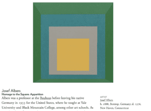
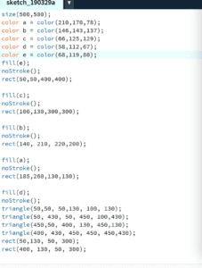
As a beginning learner for processing, I am not capable to draw some complex images in a short time. Hence, from the very beginning, I want to choose a work that is not overwhelming for me, at the same time, is also challenging. The image called Homage to the Square: Apparition from Josef Albers becomes my final decision. In the work, Albers uses the square as the basic element. With oil color applied from the white panel, audiences can see the harmony of color and shape in this painting. Besides the artistic taste, another reason why I choose this image is that I am able to practice all the new knowledge that I have learned from the class, including drawing a certain shape, filling color, marking position, and removing the stroke. I can apply all the functions and code that the professor has taught during the class and digest them in recitation.

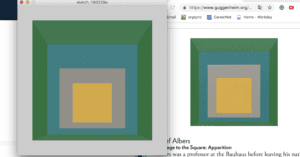
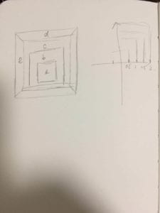
First of all, in this painting, the outside square has two different colors because there are some places with darker color which look like shadows in the painting. These darker areas make this image more stereoscopic. However, I can only draw different shapes and color to achieve this sense of stereoscopy instead of actually drawing shadows. Hence, I decide to separate the rectangle into two tangles and a smaller rectangle, then remove the stroke and fill them with the same color. By doing this, I can keep the original design as much as possible.

Then the second step is calculating the size and position coordinates for every circle. In order to ensure that every square is located in the middle of the other one, I have to calculate the specific number of their coordinates. I do not know which code or function should I refer to, hence, I just all calculate by myself then enter the number to the processing.  The last step is to decide the correct color for every shape. It is impossible for me to identify the three codes of color by simply watching them. I should find a more reliable method to pick the color. I end up using the application called “Digital Color Meter” which can read the exact number of the color mode.

However, after finishing drawing the image, I realize that color is the biggest problem that I may not be able to solve. The original work is an oil painting, and I can see the trace of the pigment on the canvas. In other words, for the original painting, color is not perfectly stable and uniform like what I draw on the computer. Moreover, the color of the original painting is also randomly distributed, which means there is no way for me to draw different shapes and then fill them with different colors. Comparing the Homage to the Square: Apparition with my drawing, people can easily distinguish which one is the oil painting and which one is the digital work. Even though I can make all the shapes and sizes perfectly match with the original work, as long as I cannot solve the problem of color, there is a huge difference between my drawing and the original work. I then ask the instructor for help wondering whether this problem can be solved by applied another function. The instructor tells that I have to learn another advanced code called Perlin Noise which is always used to deal with the problem of color. This function is without any doubt the most complex code I have ever seen so far. I try to understand it by analyzing the example code from the website, however, in the end, I still fail to apply it in my work. I think if I am going to use processing to draw in the future, how to make color more natural is definitely one of the most important learning I have to learn. Additionally, this is also very important to make digital images more acceptable and have more sense of reality.  

Works Cited

“Homage to the Square: Apparition.” Guggenheim, 20 Mar. 2019, www.guggenheim.org/artwork/173.

Massage Clothe & Blowing Hat – Yixuan Liu – Marcela Godoy

Partner:Linhui

The original inspiration of our project comes from the wearable fitness tracker which is able to keep tracking people’s heart rates and footsteps. People can benefit from this equipment by recording the daily data of their activities. However, when we think of the process that the fitness tracker achieves from reading people’s biological data, we realize that there is not enough practical feedback. In other words, people can only see the outcome of the visualization of their inside state, however, the second level of feedback remains absence. We hope that we can create a project that both show the inside statistical information and further accordingly solutions. We hope that we can design a set of projects which includes both the statistical data like fitness tracker and also functions can change the present emotional states of users. However, the problem is that we did not have comprehensive research before we started working on our project. There is another artist named Masakazu Takasu who already has similar projects published before. However, we do not know him until professor Rodolfo Cossovich tells us. Takasu has a project which is a hair clasp with cat ears on it and they will move to different directions according to people’s emotions. Even though we do not intentionally refer to Takasu’s ideas, we still borrow some concepts from him.  
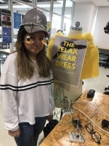
We choose the heart rate sensor between it and a vibration sensor as an input port which sends the data to the computer for further analysis. Compared with the vibration sensor, the heart rate sensor is more sensitive and accurate during the testing. Because of the essential emphasis of the representation of people’s emotional modes in this project, we choose the heart rate sensor instead of the vibration sensor to provide more reliable data. We find the code of the heart sensor on its official website. In order to apply the code to our own project, we have to change the certain value and edit the code again. During this process, we meet lots of challenges because originally we are not familiar with the code of the heart rate sensor. Even though we can refer to its official website for the correct code, it still challenging for us to further re-organize the code and fit them into the concept of our project. In order to correctly input the data from the sensor to the computer,  we ask for a lot of help. From this process, we also feel the barriers that people currently face of materializing the consciousness of people’s psychological movements by applying technologies. 

Then, by giving a certain order in the code, the external equipment will apply certain actions according to the different amounts of heart rates. For example, different colors of LED will light up to respond to users’ heart rate ranges. Additionally, when users’ heart rates are above a certain amount, two fans will start rotating to cool down the temperature. Normally the fitness tracker only shows the number of users’ heart rate, but we think we need more engaging feedback. Applying the symbolic function of color, people can get more emotional connections by contextualizing themselves into certain circumstances. Moreover, we have another wearable equipment on which we install four motors and add the soft cover. When users’ heart rates exceed a certain amount, the motors start rotating and according to our expectation, this should be able to help users to relax by massaging their acupoints on the back. We hope that this function can work as the secondary interaction that happens between users and the project.   

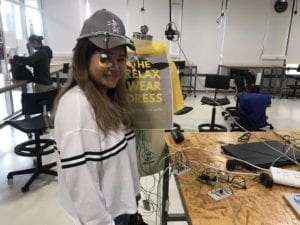
However, during the self-testing process, we find out that the heart rate sensor is highly unstable if it gets affected by external interference when it is reading the data. However, because our project is a wearable project which means we cannot limit people from moving around, so how to get the accurate data while, at the same time, keeping the idea of the wearable project becomes a problem we need to solve. We realize that during the data testing, all the wires cannot be tangled together especially the wire which connects the heart rate sensor with the Arduino, otherwise, the variable will become extremely out of range. Hence, we make a tress using wire which can both fix the fan on the hat and make all wires apart from other equipment. 

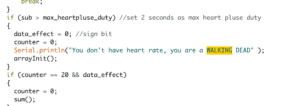
We got lots of significant feedback from the user testing process. One of our users suggests that we should change the code of the “error message” on the laptop to something funny so that when we meet some technical problem, our users fell less bored. Hence, we change the sign of “error message” to the “You don’t have a heart rate. You are a WALKING DEAD.” This adjustment does change how users feel when they receive feedback from the machine.

 

During the users testing process, we install fans on a necklace. However, after analyzing people’s reaction to using it, we decide to change our design into a hat which is less dangerous for users. We also realize that we need to solve the problem of massive wires we use in the project. We should present a tidy project by hiding the circuit into some cover decoration, however, it is really challenging for us to hide all the wires which connect the heart rate sensor with the external equipment. On the one hand, our project is supposed to be convenient to be carried around. However, on the other hand, we cannot apply the function of heart rate testing without all the wires. This is the core struggle that we face during the entire process. Unfortunately, we fail to solve it before the deadline. Consequently, the final appearance of the project does not satisfy our expectation. We realize the reason why wearable equipment is more challenging to accomplish with a certain technique we can manage. Another failure that we should reflect on is the wearable massage equipment. Firstly of all, we did not distribute our effort properly so that we did not have enough time to test all the motors for our massage equipment. The motors we use for the project keep tangling with the cloth and the wires on the back also get broken easily which fail to present the concept of wearable. We also did a lot of research about acupuncture and moxibustion of traditional Chinese medicine to find the accurate acupuncture points which can actually help people to relax, however, because of the individual difference, simply one sample cannot work well on every user. 

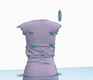
After our final presentation, I have to admit the fact that I did just less satisfying job. There are many problems both from our ideas of interaction and the actual completeness of our project. The major technical problems I have all listed above, and I think it is necessary to also discuss the problem of developing ideas in the process of our teamwork. We start with a grand brainstorm of our project and even build a 3D model to clarify our ideas.
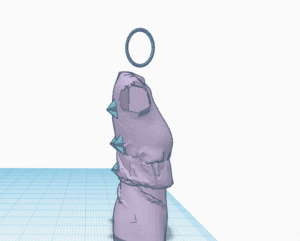
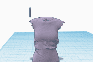
 

We always have many ideas and are eager to achieve all our ideas according to our imagination. However, the truth is, our ability to manage all the equipment in the lab is not qualified for our requirements. Hence, things turn out to be that we can either change our ideas or compromise with the current situations. This really gives me a lesson on how should we properly organize our ideas and recourses that we have. Since a good project is not simply about the idea but also about the physical appearance that is shown to audiences. If I have more time to work on my project, I probably will take more effort on solving the technical problems we have. I hope that I can make the sensor more stable so that its function process is more fluent. I also hope I can change the design of it so that it can be more visually attractive for users. Additionally, it is also important for me to think of why this project even important to people? Why they need a product to reflect their emotions and also change them? Which part should I emphasize in this project more physical useful or spiritually inspiring? If this project works on helping people with the process of self-reflection, then maybe fans are not necessary. However, if it works on providing functions to release stress and anxiety, then I think I need more efficient equipment like massage motors. 

Works Cited

Bill. “Grove – Ear-Clip Heart Rate Sensor.” Seeedstudio, wiki.seeedstudio.com/Grove-Ear-clip_Heart_Rate_Sensor/.

“Masakazu Takasu – Interactive Design from Japan.” Video Archive – The Conference by Media Evolution, videos.theconference.se/masakazu-takasu-interactive-design-from-japan.