Week 04: JS Conditional Exercise-Laura Huang

Link: http://imanas.shanghai.nyu.edu/~yh2330/week04/

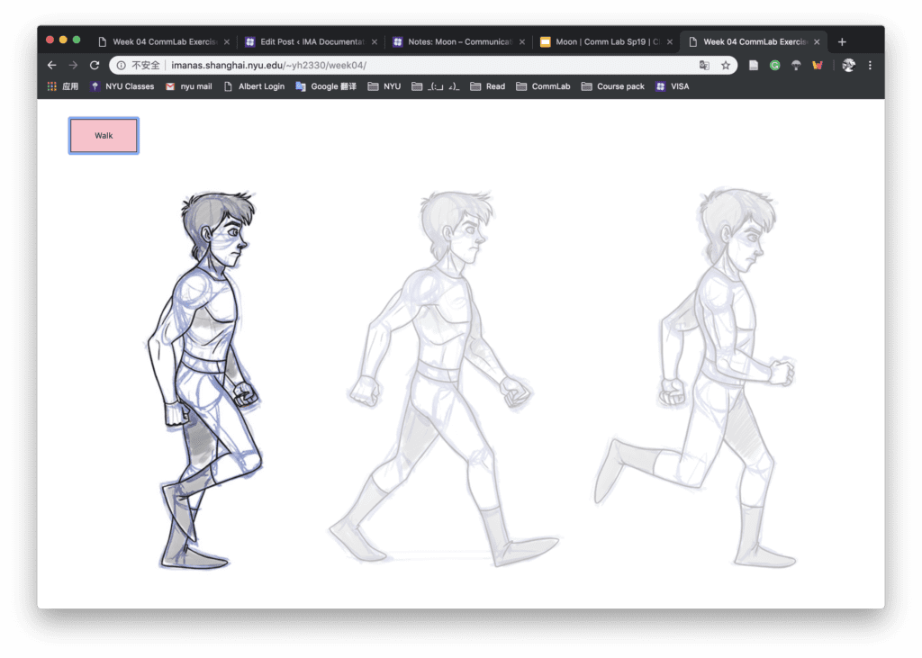
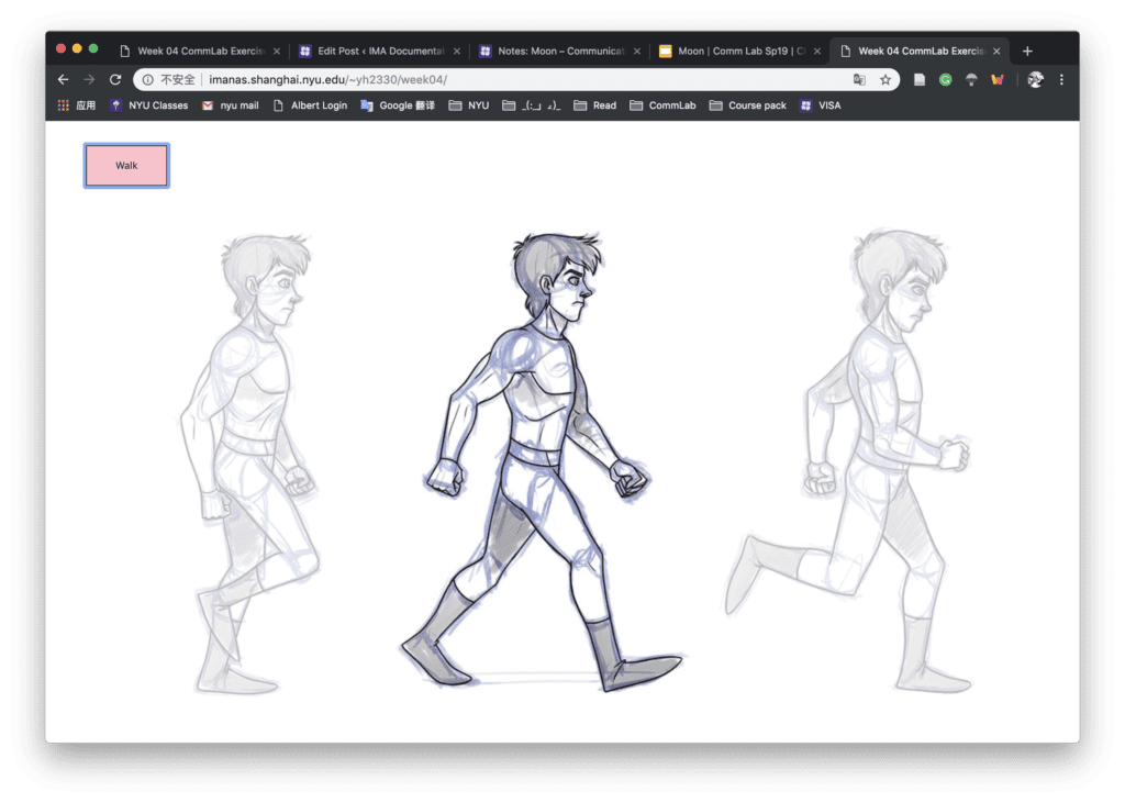
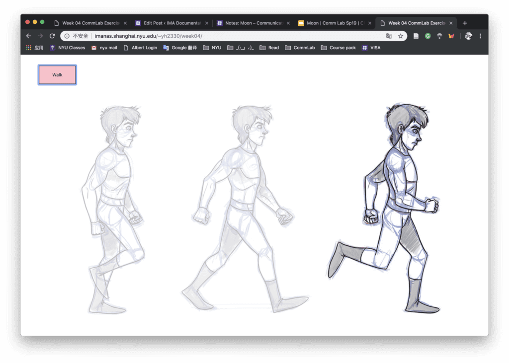
In the CSS file, I used display flex to organize the position of the box. And in the Javascript, I create a counter c with the original value of 0. It will add one every time I click the button, and change the opacity of the specific box while keeping other pictures the original opacity. Once the counter got the value of 2, it will change back to 0 so that we can continue with the new loop.

Some screenshots below:

Week 4: Comic project visual assets-Laura & Jon

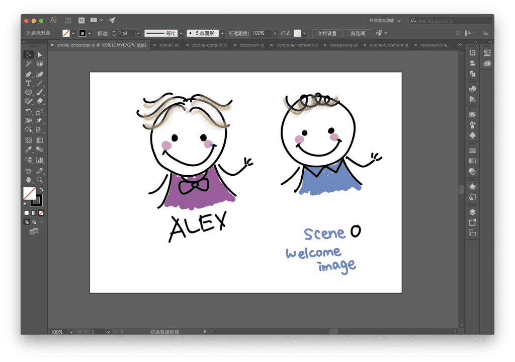
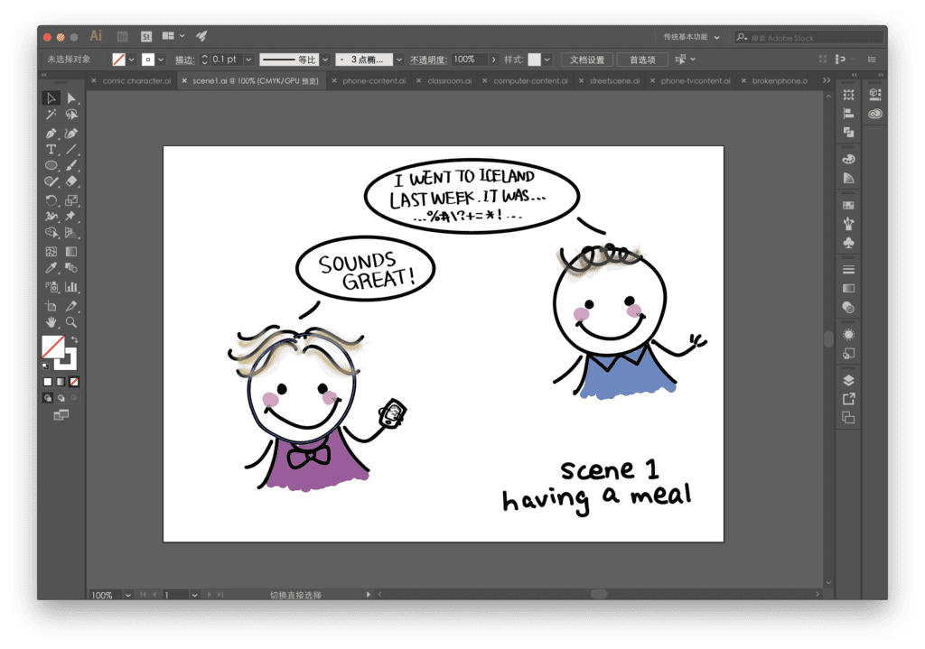
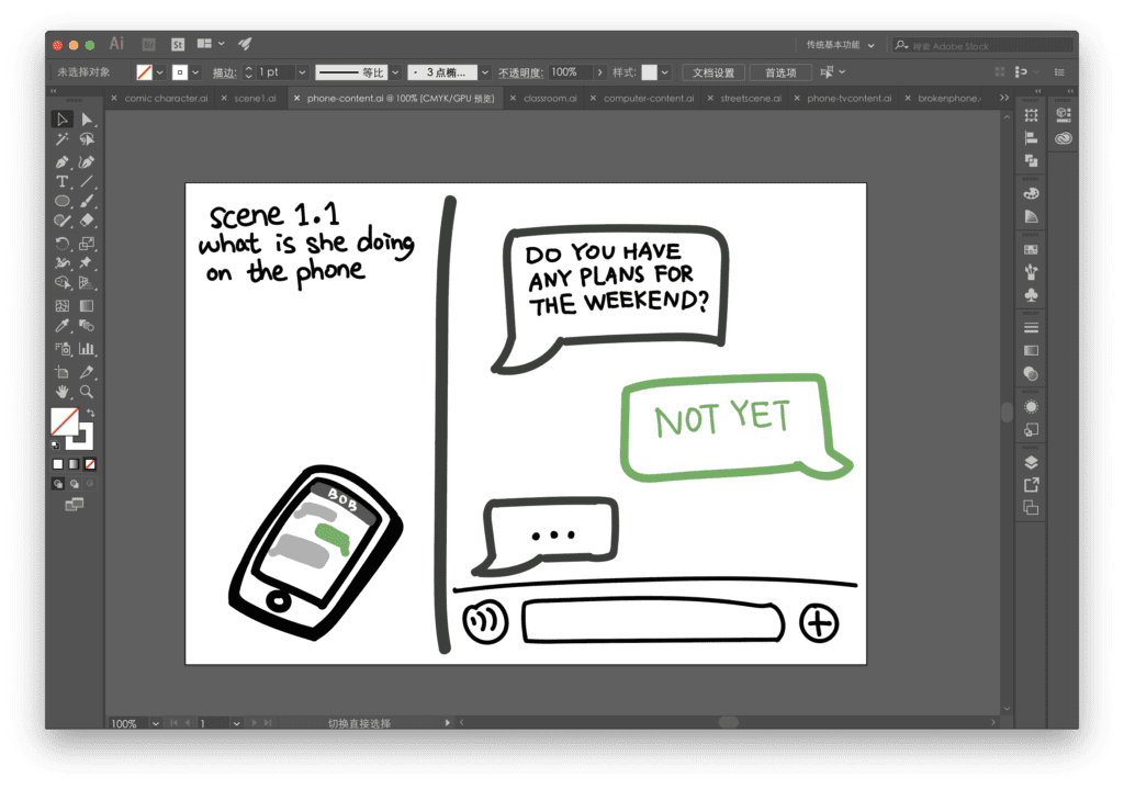
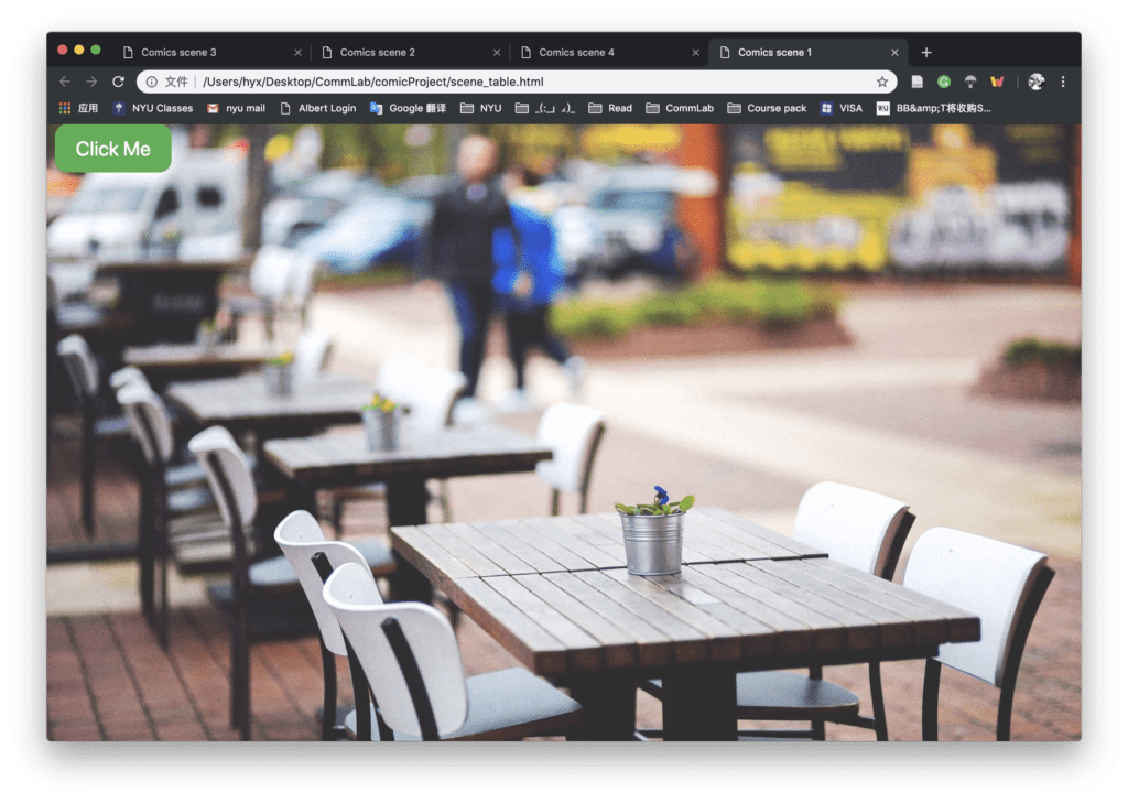
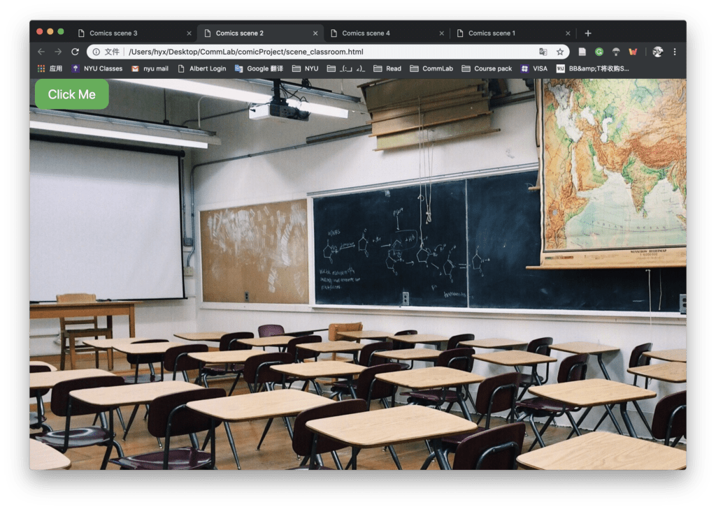
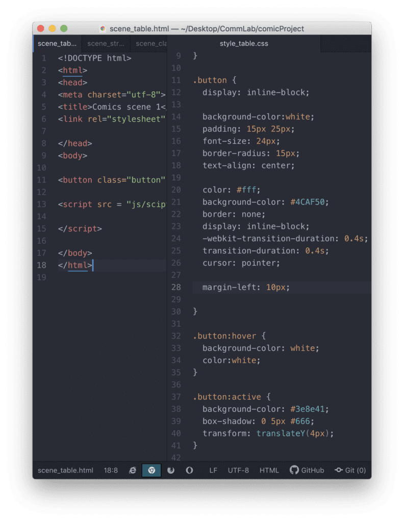
So far, we have already completed the storyboard and the background image of our comic project. I drew the characters in AI so that we can export the picture as png and make adjustment easily later in the process. We wrote some button functions but we are still working on the transition effects between the pages. Here are some screenshots.

Parts of our code:

Week 3: Java Exercise (Moon)- Laura Huang

Link: http://imanas.shanghai.nyu.edu/~yh2330/week03/

In this week’s exercise, I learned how to apply the button and write the function in javascript to control the change of picture source, border color, border size, and font size. At first, when I upload the folder to Nas, the server can’t read my CSS file. Then I figured out that it is because the name in my HTML link didn’t match the folder’s name (I forgot to capitalize it). I would be more careful about these kinds of problems next time.

Week 3: Photoshop(Moon)-Laura Huang

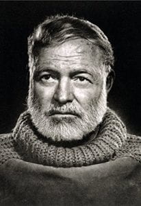
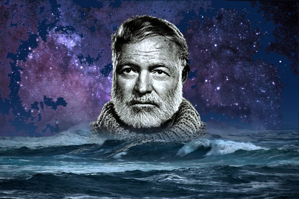
In the PS exercise, I choose three pictures and combine them together.

The original pictures:


The final picture:

I first set the background color and edit the edges of those pictures. Then I use the magic wand tool to separate the galaxy picture to make it more vivid. But at first the connection between the pictures are too sharp, so I add the mask on the layer to blur the edge. I also use the eraser and set the soft edge to make it more natural.

Week 3: Comic Idea-Laura&Jon

Our comic idea is to create a story that tells people we are missing and ignoring many detail things in our lives, these details may give us some awareness on certain issues, inspire us or just bring some warm emotions.

We want to divide the story structure into 2-3 layers. In the first layer, we want to draw several scenes in which people are having day-to-day conversations or doing daily routines. For example, we may have a main character who is having a dialogue with her working fellow in the first scene, her colleague is talking about his traveling experience while the character is responding to his words but at the same time looking at her phone.

The interaction in the process is that when the user clicks the phone, the scene will zoom in to let the user see what the character is actually doing, maybe she is reading news or chatting with someone else. The user can continue to click, for example the chatting window, then the story will go on to the second story layer and show the story of the person who is chatting with the woman character. Or the user can zoom out to change the first layer stories, which may include other scenes like a kid hiding the Mother’s Day card behind his back while talking to his mom—the same main character. When the user discovers this detail and zooms in, they can read the content on the card.

We want to create a series of stories and scenes with a center main character and hide those kinds of small details in his or her daily lives. When the users explore the deeper story behind those scenes, they may find themselves touched or inspired by those little details in our lives.