Week 07: Audio Project-Laura&Milly

Project name: Comm42’s last message

Link: http://imanas.shanghai.nyu.edu/~yh2330/audioproject/

Description: The audio project presents the last words of a robot called COMM42, who is soon out of battery, the robot displays 4 audio scenes that saved in his memory card. The 4 scenes recall the invention and production of the robot, his interesting experience with human beings and the extinction of the human in the end.
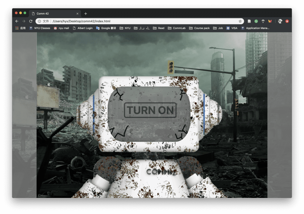
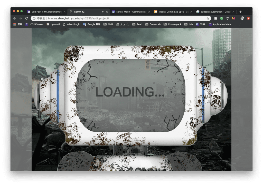
Process: Milly and I came up with the idea of robot together, we both like the topic and thought it would be fun to create the machine sound and combine them with a robotic voice. We add interesting remarks from the robot that we think the robot may have when working for human beings. We want to show that if humans don’t protect the earth, the modern society may ultimately extinct and the only witness of this history may be the memory card in the robots.

I wrote the general script of the story and edit all the audio sources. Milly is responsible for the visual part on HTML and does most of the coding. When recording the original sound source, at first, we want to use the google to read our script but the voice was not so nice. Then we found there are more choices on Mac in the voiceover, so we select the robot voice from it. We choose a more human-like voice because it is clearer and more realistic considering the current AI technology. The pure robot sound is too noisy and seems not fit the following life scenes.
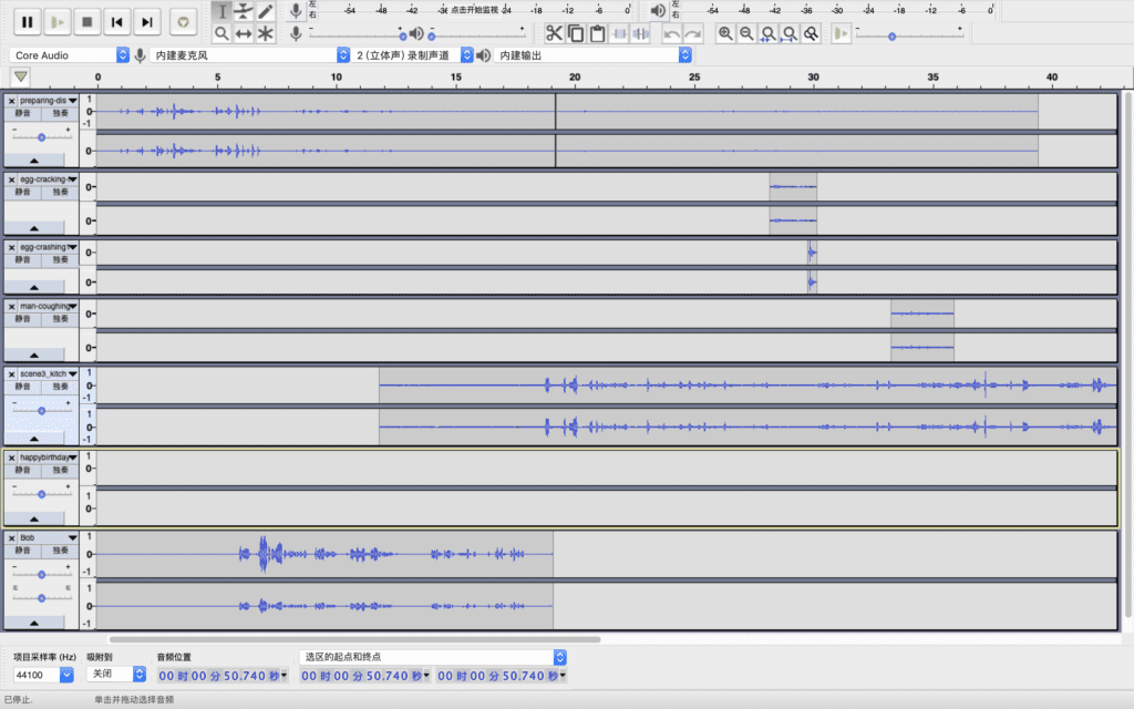
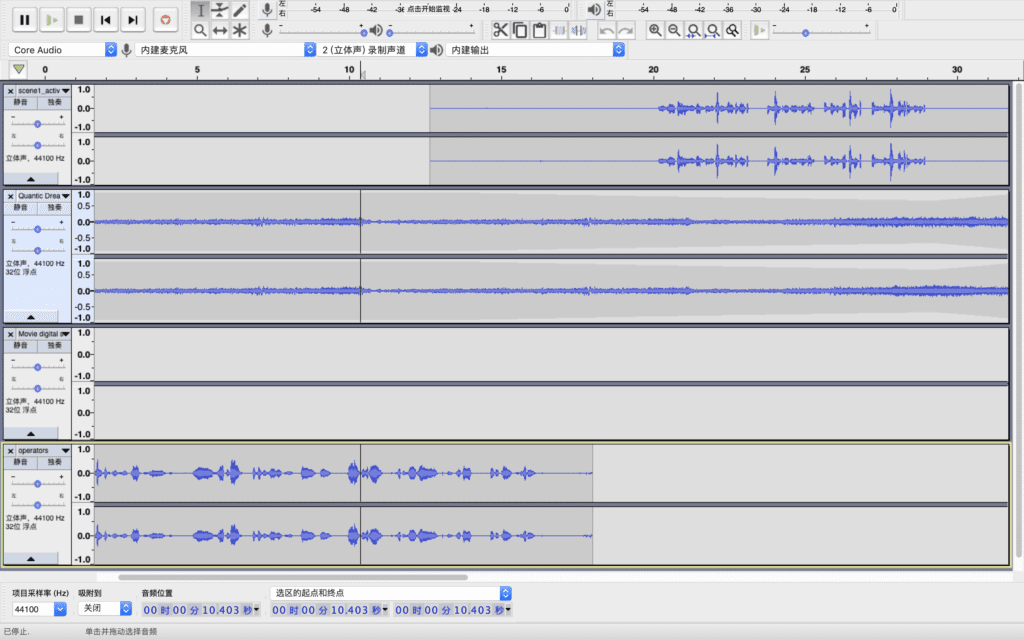
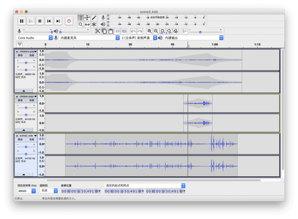
I collect the sound sources from the Internet (https://www.freesound.org/browse/),  including the general environment background sound, detail sounds of the human characters, electricity sounds from the robot and the main robot lines. I use the environment sound along each scene and only adjust the volume so that it can be more realistic. I also search for many details that match the characters’ words and insert them into the story. For example, the sound of the egg crashing, the sound of the kids running and shouting. We found some problems when processing the sound of the robot from the laptop as there is some current sound from the computer. We try to adjust the input level of the Tascam and lower the sound output from the computer and it became better. I did some further process in Audacity to add noise reduction, change the volume decibel. I also add in more pause in robot’s speak so that it becomes more natural and comfortable. When combing robot’s words and the background sound, I adjust the volume and use the envelope tool to make them more harmonious. I found that the detail sounds should overlap the main soundtrack so that they won’t be abrupt.
In the HTML page, we use the button to control the play of the audio file, We also add a sound wave gif to display when the robot is talking. We add the back button and the replay button. Once the user finished listening to all the four records, the web will jump to the final page. We achieve this by using the if function and make four scenes from 0 to 1 once it is played. When the sum of four scenes is 4 it will operate the final scene function. We also add some visual effects like the loading words and the pattern on the screen to match the audio part.

Some improvements for our projects may be: the volume of the robot is not so constant along the 4 scenes. We may record the voice in a better environment and maintain a constant record distance. Otherwise, we should adjust it in the Audacity to make the sound more comfortable with the same volume. For the HTML part, we had a subtle problem with the sound wave, which there are a few times that the gif displays randomly. We tried to debug this problem but we failed. Also, we may figure out better ways to change the image instead of using setTime out and improve the code. Overall, Milly and I worked well together and we have achieved our initial goal.
Week 06: Response to “Ecstasy of Influence” by Jonathan Lethem – Laura Huang

As the Molotov Man essay discussed the copyright issue on the artwork and photography, Jonathan Lethem wrote about the ambiguity of plagiarism in literature and music. He took the novel Lolita from Nabokov and an earlier author Heinz von Lichberg as an example to illustrate that it is hard to delimitate borrow and plagiarism in the literary works. The hardness is because, for a new writer or learner, the fastest way to improve is to imitate, which may lead to the problem of improper borrowing.

In this case, the meaning of plagiarism changes to the “appropriation, mimicry, quotation, allusion, and sublimated collaboration consist of a kind of sine qua non of the creative act”, especially in the modern forms of arts. Many forms of moderns arts of different genres all face similar problems of how much we can borrow from the old work and not get into the plagiarism. In the music field, there may be more tolerance in the open source and sources that can be freely reworked. But in other art forms, the borrow of the old artwork is a kind of “enframing” according to Martin Heidegger, since all of the reworked art pieces involves the artists’ personal intention and ideology, they are only borrowing the elements or the objects but give them different properties. In my opinion, this kind of borrowing should be alert to the artists, as the article says “A time is marked not so much by ideas that are argued about as by ideas that are taken for granted.” If we take the behavior of recreating the previous work for granted, the mark of our modern time has no unique characteristics and original thoughts that can distinguish us from the previous generation. The copyright, not only the copyright of art works or literatures, but also the intellectual property and other forms of patents should be protected so that it can “promote the progress of science and useful arts” with creativity and innovations.

Week 06: Response to “On the Rights of Molotov Man” by Joy Garnett and Susan Meiselas – Laura Huang

The article “On the Rights of Molotov Man” begins with an accident about copyright issues between two artists. Joy wasn’t expected to receive the copyright infringement charge for a photo he found online. After the related artwork stimulated the Joywar campaign, which leads to a social debate on copyright policy, the artists himself came to question the duration and eligibility that an author of a documentary photograph could own on the copyright of his or her artwork, especially when the documentary photograph involves portraits of a man.

From Joy’s perspective, he may not understand why Susan was so insisted in the copyright of the photo, even after he has clearly stated the origin on the announcement card. However, after Susan demonstrated about the background and context of the original photo. We can understand her emphasis on reclaiming of the context. Her hope is to contextualize the image within a specific context and her charge was not for her ownership of the artwork but for respecting the individuality of the character in the photograph.  The intention of the two artists vary from each other significantly. One is to convey a personal emotion or intention, the other is to record the documentary truth and history. The different purpose of this artwork cause the debate but also lead to an important problem in the context of the art. Sometimes, it is dangerous and disrespectful to the original author or character if we look at an artwork without considering its context. The decontextualized derivatives may also lose or distort the original ideology of an artist and it is also a betrayal of the character in the photograph.

Week 06: Response to “99% Invisible: Pockets”-Laura Huang

    The podcast I listened to is “99% Invisible: Pockets”, which tells a story happened in a liberal arts school about the cross-dressing dance. The two narrators who were the lender and the borrower of a dress encounter small but serious problems when Piers, the borrower, first found the dress has no pocket and merely locked himself outside.

    The simple pocket on the dress reflects many things from the history of the clothes and labor distribution to the evolution in design and the gender stereotype among society. The pocket itself is small but the speakers expand the object to common phenomenons in our daily lives, which we often neglect and make them meaningful. For instance, men’s pocket is often larger than women’s, and a pocket is really different from other containers. The pocket is a symbol of our private and internal space so the unfair size on the pocket between male and female implies the gender inequality throughout history. Besides the history and gender issue, the smaller trend of the pocket is also a sign of future development of wearable devices which somehow become a part of us.

    The form of this podcast is mainly dialogues between the characters and the story switches between scenes with the change of the background music and the sound volume of the narrators. For example, when they talked about the French revolution and the 19th-century custom style, the background music is romantic and classic. When they talk about the new technology on the wearable devices, the background music becomes more futuristic. The speakers use relaxing tones and raise questions from time to time to lead the audience to explore the story of the pocket. They also quote other experts words to increase the credibility of the story. However, one thing I found interesting not in this specific podcast but in many other audio works is the transition and connection between the words and the background music may sometimes be a little abrupt. This could become another way to call for audiences’ attention but I would prefer the connection to be more smoothly.

Week 05: Comic Project Blog Post – Laura&Jon

 Link: http://imanas.shanghai.nyu.edu/~yh2330/comicproject/

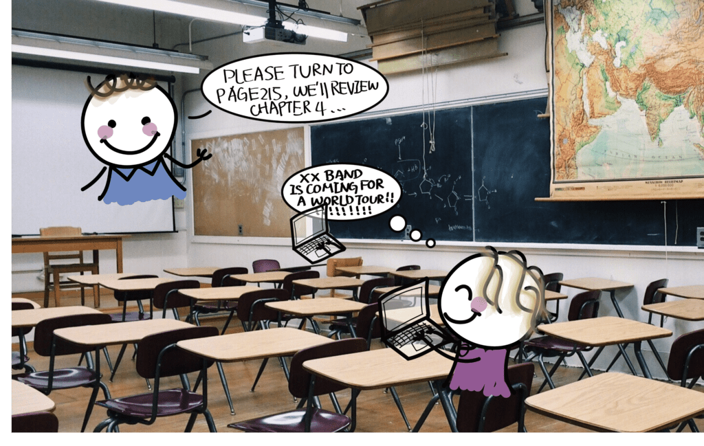
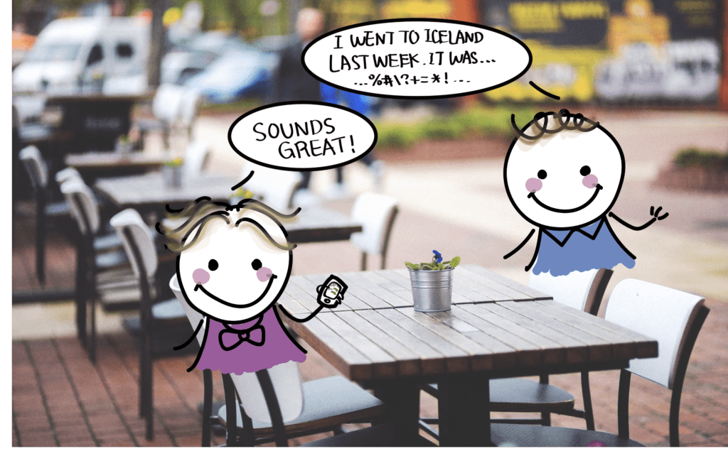
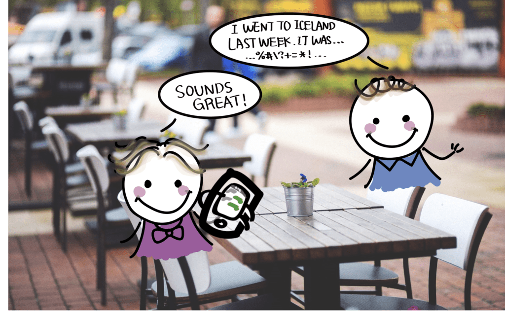
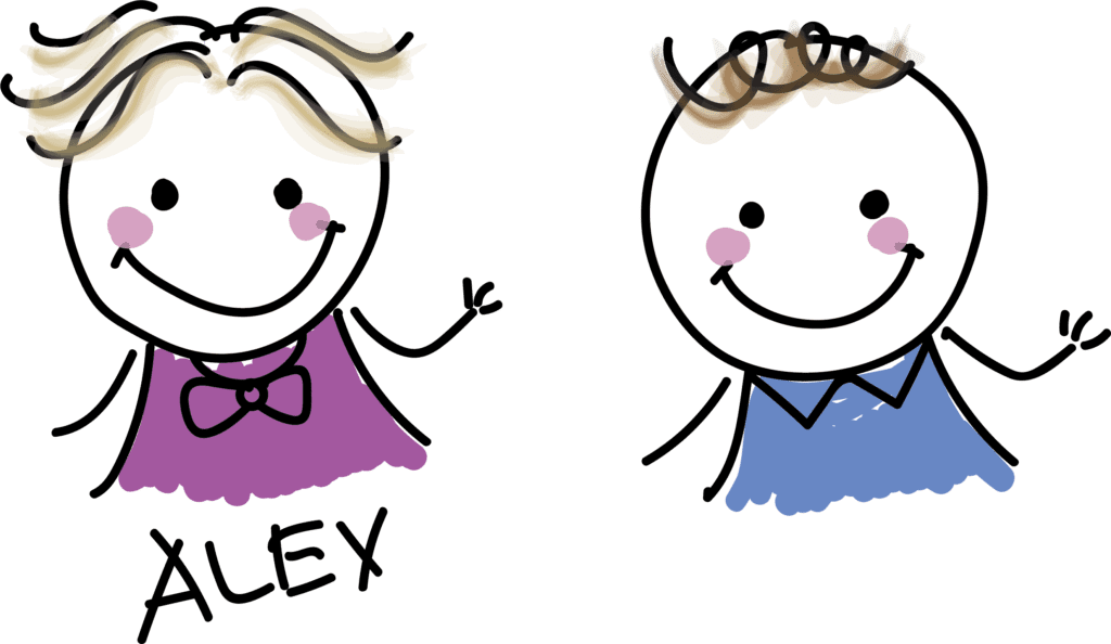
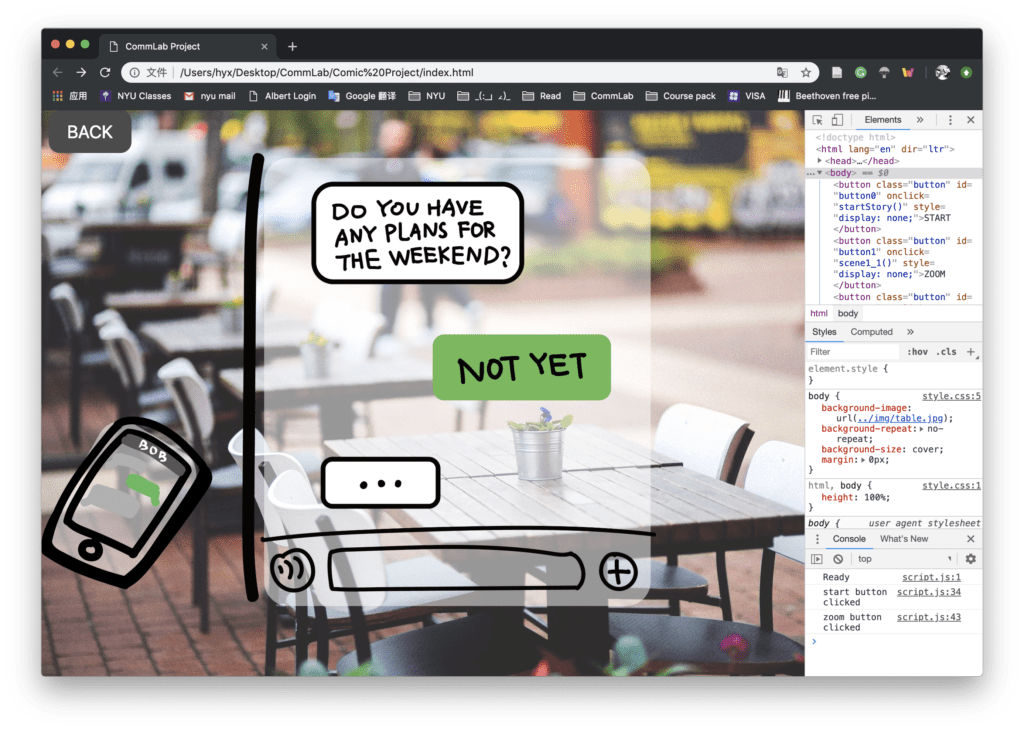
    Our comic project aims at reminding people that electronic devices are distracting our mind and influencing our daily lives. The main character, named Alex first had a meal with her friend. When the boy was talking about his trip, Alex was looking at the phone. When the user moves the mouse on the phone, it will zoom in and after clicking the phone. The user can see that Alex was actually chatting to someone else about their weekend plan, and the content of the phone will be shown on the screen. After going back to the previous scene, the user clicks NEXT and move to the second slide. Alex was having a class but she was searching for the ticket of a singer’s world tour on her laptop while the professor was talking. On the third scene, on Alex’s way home, she had her earphones on when crossing the street. The user will find out that she’s watching some TV series but accidentally she was hit by a bike because she didn’t hear the cyclist shouting. Her phone is broken and finally, on the subway to home, she found everyone was looking at their phones except her and asked an ironic question, “Why is everyone looking at their phones?”
We first determined the interaction we want to use in our project. We were inspired by the Inception movie, which the stories have one layer after another. After presenting our initial idea in the recitation, we got some feedback that multi-layer story may be too difficult if we want to make a complete story and connect every scene closely with logic. Therefore, we decided to create small separate scenes with a single topic—the distraction of electronic devices.
      I first wrote the storyboards and the dialogues and picked three scenarios in which are the most representative ones in our daily lives. Then I use the Illustrator to draw the characters and the dialogue bubbles because the Illustrator can create the PNG file more easily.

    When I was writing the code, at first, I was not sure whether to create the background images and scene pictures in the HTML file or through the JavaScript. After I tried several times, I found it is easier to create the objects in the HTML and use JavaScript to control their styles and interactions. I also found some problems when adjusting the position of the pictures in a proper place on the background image. I figured it out by adding the pictures in a div and use the absolute position to control the picture position. Also, I could add the button within the div so that the two elements can overlap each other. I worked for a long time in writing the display status of the elements because when turning to the next page, the old elements have to disappear, and it took some time to check each element.

Here are some screenshots:

    Jon wrote the zoom in and zoom out effect. I also tried this by myself but we both found it hard to find the right position of the images and keep it while adjusting the window sizes. I tried to use the div inside a parent div, but it doesn’t work because it has two layers which will all adjust based on the proportion.

    Therefore, I only test the position on my computer for the full screen.

We still need some improvement in this part. In general, we finished our project and met most of our goals. Some parts that we may want to improve are that the dialogues of the characters can be more creative and the ending of the story can be more attractive and thoughtful. As for technical skills, we may want to improve the transition both for the zoom in effect after the hover and the connection between the big scenes, instead of just click the NEXT button, scrolling the page or just clicking on the image may be another way to make the comic more coherent.